Learn two methods for constructing animated spinning globes in ArcGIS Online and ArcGIS Pro.
A spinning, global view of the earth is a useful method for showing an overview of your data. Not only does it put your story into a planetary perspective, it’s a great way to capture a reader’s attention.
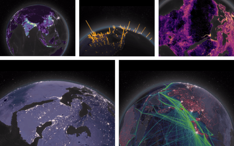
The Human Reach, the first installment of the Esri Story Maps series Living in the Age of Humans, explores the extent of the human impact on the planet. Bringing together global earth observation data with compelling visual design, this story (which uses the Cascade template) looks at urbanization, global networks, the human footprint, and more.
The premier of this series made a splash at the 2018 User Conference in San Diego. The story’s five 3D globe animations created in ArcGIS Pro greeted visitors as they took their seats at the opening of the plenary session.
Since the User Conference, many of you have asked us how to create your own spinning globe animations. This blog discusses two approaches:
- The out-of-the-box 3D Data Visualization app in ArcGIS Online; a quick and easy solution that can be spun up in a pinch.
- The ArcGIS Pro workflow we used to create our globes as MP4 videos; an advanced solution that allows for a wide range of customization.
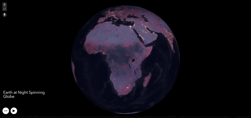
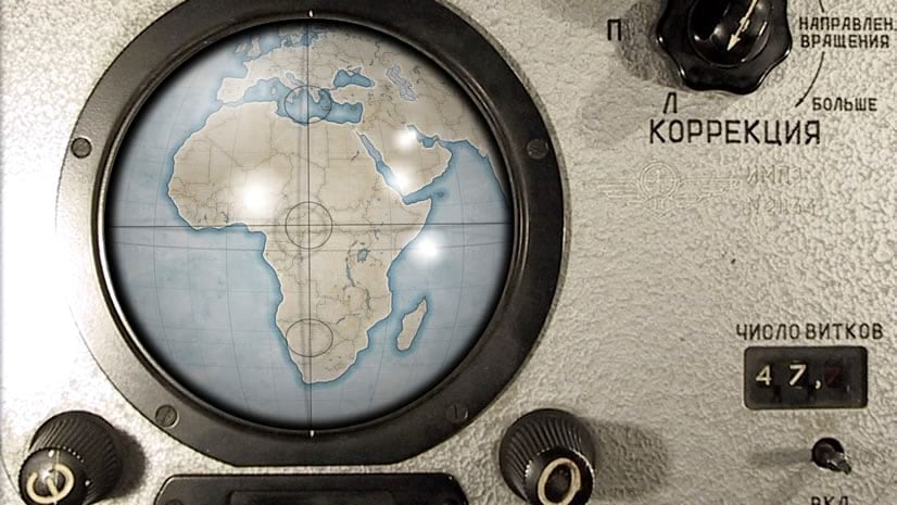
3D Data Visualization app in ArcGIS Online
The quickest way to create a spinning globe and share it online is to use a configurable application in ArcGIS Online called 3D Data Visualization. Once you’ve created and configured a scene in ArcGIS Online, added and styled your data, and saved the scene, you can then create a web app by going to Share → Create Web App → 3D Data Visualization → Create Web App.
When played, the camera centers the point of view on the equator while rotating the planet. Once you save, launch, and publicly share the app, you can copy the link and embed the application within a story map.
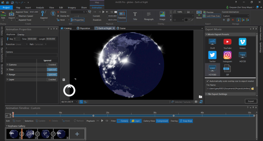
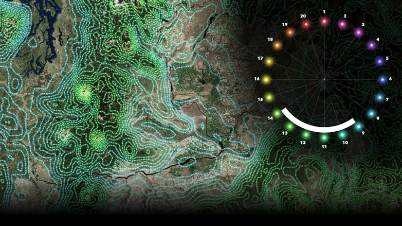
Animation tab in ArcGIS Pro
Some of you, however, will need greater flexibility. For nearly limitless customization, it’s time to break open the advanced capabilities of ArcGIS Pro and its Animation tab. The general process to build a beautiful animation in Pro goes like this:
- Build and configure a global Scene in Pro; this includes choosing an appropriate surface color, toggling star and halo visibility on or off, and increasing elevation exaggeration to improve surface texture.
- Add and symbolize your data to match your choice of overall color theme and basemap style.
- Extrude a cities population point layer with firefly symbology into 3D by moving it to the 3D Layers section under Content; this generates a night lights glow effect.
- Construct a series of key frames using the Animation Timeline and Animation Properties toolbars.
- Export the final animation from Pro to MP4 or GIF formats using the Export Movie toolbar.
For MP4s, you’ll need to upload your animation to either YouTube or Vimeo, then use the link to embed the video in a story map. For GIFs, you can upload your animation directly to the story as you would any image file. Keep in mind that smaller GIFs load faster, and the maximum GIF size is restricted to 10 MB.
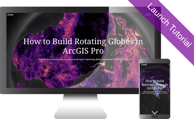
Step-by-step tutorial
Need more guidance on how to create an animation in ArcGIS Pro? Check out the step-by step tutorial below.
Go forth and spin globes! Don’t forget to check out the original story The Human Reach. Keep an eye out for subsequent installments of Living in the Age of Humans by signing up for the Planet Story Maps newsletter, and by following us @EsriStoryMaps.
Looking for the datasets used in the The Human Reach? Check out The Human Reach: Atlas.


Commenting is not enabled for this article.