As Los Angeles prepares to host the 2028 Summer Olympic Games, providing reliable and convenient public transportation to event venues is more than just a logistical concern. It’s essential to manage congestion, reduce emissions, and ensure smooth access for both residents and visitors.
This blog article presents a replicable workflow using ArcGIS Pro and Business Analyst tools to assess public transit accessibility to Olympic venues across Los Angeles County. Using points of interest (POI) data and transit data, this article provides a step-by-step GIS method that is designed to help local governments, planners, and transit agencies understand how well venues are served and where access could be improved.
What this workflow will help you do
- Apply a GIS-based method to measure transit accessibility using walk-time service areas and z-scores.
- Evaluate public transit access to Olympic venues using Business Analyst data and ArcGIS Pro tools.
- Adapt this framework for city planning or transit evaluations in other accessibility scenarios.
Key tools and data
Software used
- ArcGIS Pro 3.5 with Network Analyst extension
- Business Analyst Web App Standard (BA Web App) – for querying POI data (optional)
- ArcGIS Online with Creator, Professional, or Professional Plus user type – for accessing data and content
- ArcGIS Living Atlas
- StreetMap Premium or street network data source available in an ArcGIS Online organization.
Data layers
- Olympic Venue POI data (created using SafeGraph data in Business Analyst Web App)
- World Transit Stops Layer (filtered to LA Metro and Metrolink)
- World Topographic and Hillshade Basemaps
Method overview
We used a replicable transit accessibility model based on walkability from nearby transit stops.
This is a simple model to demonstrate the concept; other factors such as service frequency or type of transit service could also be considered for a more comprehensive approach.
The model score depends on the following factors:
- How many transit stops are within a five-minute walk of the Olympic venue?
- How many unique routes does each of these stops serve? Does the stop serve just one route or multiple routes?
- How far is the Olympic venue from the nearest transit stop? Is it a few feet or the maximum distance an individual might be willing or able to walk?
Here’s a breakdown of the main steps:
-
- Create Olympic venue point layer.
- Map transit stop data for the region of interest.
- Generate a five-minute walk area around each transit stop. Then determine how many stops are within a five-minute walk from each Olympic venue.
- Determine the number of routes available to the Olympic venue within a five-minute walk.
- Measure walking distance to the nearest transit stop from each Olympic venue.
- Generate z-scores for each variable.
- Compile composite index to generate a transit accessibility score for each Olympic venue.
1. Select Olympic venues
The official venue list for the LA28 Games was used as a reference (LA28.org/venues). Using the SafeGraph data source and the POI search workflow in BA Web App, we developed a POI layer and loaded it into our ArcGIS Pro project.
We identified 18 Olympic venues located within the City of Los Angeles using SafeGraph POI data in BA Web App. Venues in outlying areas such as Long Beach were excluded due to current transit data limitations. UCLA was included to represent the Olympic Village, where athletes will be housed.


2. Filter transit stops from ArcGIS Living Atlas
Working in ArcGIS Pro, we accessed the World Transit Stops layer from Living Atlas, which contains over one million stops globally.

To focus on our study area, we filtered this dataset to retain only active transit stops operated by LA Metro and Metrolink.
To do this, we added the World Transit Stops layer and applied the following SQL query:

This step ensures that only operational, local transit stops in the Los Angeles region are included in the analysis.
Finally, we accessed the previously saved SafeGraph Olympic venue POI layer from My Content > BA – Project Data in the Catalog pane. This layer will be used in the following analyses, including walking time modeling, nearest stop determination, spatial joins, and composite index development.

3. Run walk time analysis
We used ArcGIS Pro’s Network Analysis tools to generate five-minute walk-time areas around each filtered transit stop. This step models realistic pedestrian access and helps determine which Olympic venues are within walking range of transit stops.
To begin, we created a new Service Area Layer in the Network Analysis toolbar. We imported our filtered stops as facilities by selecting Import Facilities and assigning a unique id to the Field Name.
- Set the travel mode to Walking Time
- Defined a five minute threshold
Once the settings were configured, we ran the model to generate walk-time polygons around each stop.


4. Identify which stops serve Olympic venues
We then used the pairwise intersect tool in the Geoprocessing toolbox to determine which Olympic venues fall within the five-minute walk-time polygons generated in the previous step. This identified all Olympic venue POI that are captured within at least one transit stop walk-time area.
For each venue:
- We joined the overlapping stop polygons to identify how many stops serve the Olympic venues within a five-minute walk-time.
- We pulled in unique route count from the transit stop layer.
- We used the Summary Statistics tool to calculate route counts per venue.
After performing the pairwise intersect to identify which service area captured each Olympic venue; we used the Join Field tool to attach the number of stops serving each Olympic venue and route count from the original transit stop layer to the pairwise intersect results. This allowed us to associate each venue captured in a service area with the transit stop’s characteristics (route count).
With these attributes joined, we then used the Summary Statistics tool to calculate the total number of unique routes available for each of the Olympic venues. For example, the Crypto.com Arena in downtown Los Angeles was within the five-minute walk-time of nine transit stops, we summarized the route counts across those nine stops.


The results from the summary statistics were stored in a standalone table, which we then joined back to the Olympic venue POI layer. We have completed two of the three inputs (stops within five-minute walk of each Olympic venue and route count) needed to calculate the transit accessibility score. The final step before calculating the transit accessibility score is to determine the walking distance from each Olympic venue to its nearest transit stop.
5. Measure walking distance to the nearest stop
To complete our inputs for the transit accessibility score, we measured the walking distance between each Olympic venue to find their nearest transit stop using the Network Analyst extension Closest Facility tool in ArcGIS Pro.
We began by opening the Network Analysis drop-down menu and selecting the Closest Facility model. From the new ribbon, we imported our filtered transit stops as Facilities and the Olympic venue POIs as Incidents.
Next, we configured the Travel Settings to use Walking Distance as the travel mode and set the solver to return only the nearest (first) stop to each POI Olympic venue. Running the model generated walking distances in miles between each venue and its closest transit stop.


We will apply an inverse distance calculation on the total walking distance from each Olympic venue to its nearest transit stop. Essentially, calculating the inverse distance gives a higher score to short distances and a lower score to long distances.
This was accomplished by opening the Routes attribute table in the Closest Facility group layer and clicking Calculate. We are creating a new calculated field called ‘inverse_dist_miles’ with this formula.
1 / !Total_Miles!

Finally, we joined the inverse distance value back to the Olympic venue POI layer using the ‘esri_pid’ field. Before joining this value back to the Olympic venue layer, the ‘esri_pid’ values needed to be separated from the Name field in the Routes attribute table. We opened the Calculate Field geoprocessing tool again, and entered the following formula to create an ‘esri_pid’ field.
!Name!.split('-')[0]

We then used the Join Field tool to attach both the original walking distance and the inverse distance to the Olympic venue POI layer using the ‘esri_pid’ field.
At this point, we now have all three variables (accessible stops within five-minute walk-time, route count, and inverse distance) ready to calculate the composite index and get our transit accessibility score for each Olympic venue.
6. Create a transit accessibility score
We used the Composite Index geoprocessing tool to calculate and combine the three z-scores into a single average z-score per venue. This score represents each venue’s overall transit accessibility based on:
- Number of stops within five-minute walk-time of each Olympic venue.
- Number of transit routes providing service to each of the stops.
- Proximity to the nearest stop in walk distance mileage.
The results were also converted into percentiles to make interpretation easier.
- 0th percentile = lowest accessibility
- 100th percentile = highest accessibility
When configuring the Calculate Composite Index tool, we enabled the Append Fields to Input Table option to ensure the results were added directly to the Olympic venues POI layer.

7. Classify accessibility scores
To help with interpretation and visualization, we categorized the percentile scores into five accessibility levels:
-
- 0 – 15 %: Not Accessible
- 16 – 30 %: Low Accessibility
- 31 – 50 %: Fair Accessibility
- 51 – 70 %: Moderate Accessibility
- 71 – 100 %: High Accessibility
We used the Calculate Field tool on the Olympic venues layer with the following if-else code block to assign the classifications:

def classify(index):
    if index <= 15:
        return 'Not Accessible'
    elif 15 < index <= 30:
        return 'Low Accessibility'
    elif 30 < index <= 50:
        return 'Fair Accessibility'
    elif 50 < index  70:
        return 'High Accessibility'
    else:
        return 'NA'
These classifications formed the basis for interpreting and mapping the accessibility scores across all analyzed Olympic venues.
Results
Among the 18 venues analyzed, the Galen Center emerged as the most accessible Olympic venue by public transit. While the Rose Bowl Stadium ranked as the least accessible.
Most accessible venues included:
- Galen Center (100 %)
- Peacock Theater (94 %)
- Los Angeles Convention Center (88 %)
Least accessible venues included:
- Sepulveda Basin Recreation Area – Los Angeles (12 %)
- Riviera Country Club – Pacific Palisades (6 %)
- Rose Bowl Stadium – Pasadena (0 %)
Summary:
- Six venues were rated High Accessibility.
- Three venues were rated Not Accessible.
- The remaining venues fell into Low to Moderate categories.
These results highlight the venues in central Los Angeles as being relatively well served by transit. the outcome of these results can also help guide planning to increase service for venues in outlying areas that have lower scores. To further refine scoring, consider adding other attributes within the World Transit Stops layer to the model, such as weekly trip count and transit mode (bus, rail, light rail).

Visualization and next steps
The results from this analysis can be displayed through several tools and formats, such as:
- A dashboard showing individual venue scores
- A map aggregating transit accessibility scores to hexagons across a transit region.
- A web application for public or stakeholder engagement

We’ve chosen to build an interactive dashboard so users can dynamically explore the transit accessibility scores across Olympic venues.
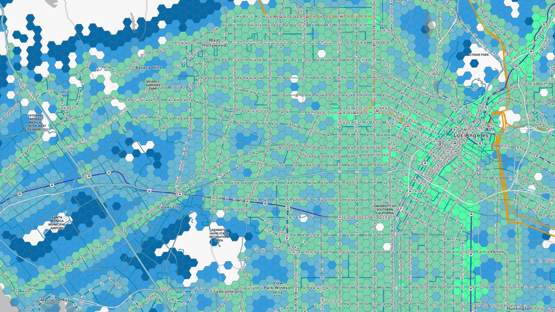
We’ve also run a more detailed transit accessibility score for all POI within Los Angeles metro region. We aggregated the scores to the tier 9 H3 hexagons to show how accessible specific regions of Los Angeles are when using public transportation.

Final takeaways
This simplified model helps identify gaps in transit access around major event venues. It offers a practical, replicable framework for any city with access to GTFS and POI data, and supports broader goals such as United Nations Sustainable Development Goal 11.2, which promotes inclusive and sustainable transportation systems.
By combining spatial analysis, normalized metrics, and categorical classification, the model provides meaningful insights for planning and investment in walkable transit infrastructure, especially large-scale events like the Olympics.
A more advanced version of this accessibility score is currently being developed at Esri that incorporates additional factors related to transit service. We look forward to sharing updates as the model evolves and our transportation datasets expand.


Article Discussion: