Across the United States and outlying territories are over 79,000 industrial facilities reporting their pollution to the U.S. Environmental Protection Agency (EPA) as part of the Toxic Release Inventory (TRI) program. Every year, since 1986 the EPA has collected a comprehensive set of attributes about each facility, including its pollution output into the land, water, and air. Historically, communities have used this data to explore how their own geographies are affected by pollution and to ask questions like “How many pounds of hazardous chemicals are in my county” “What industries are contributing the most pollution?” “Are these chemicals carcinogenic?” and more. You’ll create a national map of these facilities and use the charts functionality in ArcGIS Pro to answer some of these questions.
Read more about the Toxic Release Inventory program dataset here.
1. Download and open the ArcGIS Pro project National_TRI.
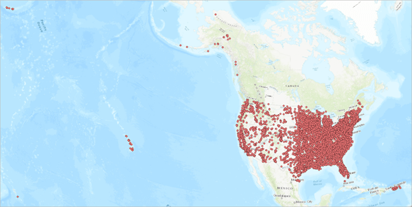
You’ll explore the facilities by geography and industry sector emissions. To do this, you’ll create 3 bar charts:
- Emissions by sector
- Emissions by state
- Emissions by county
By using the chart selection filtering option, you’ll use each chart dynamically to understand the data.
2. In the Contents pane, right-click Toxic Release Inventory > Create Chart > Bar Chart.
3. In the Chart Properties pane, for Category or Date choose IndustrySector.
4. For Numeric Fields, choose OnSiteReleaseTotal and click Apply.
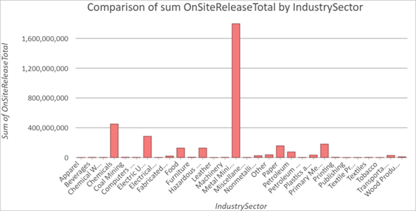
The OnSiteReleaseTotal attribute refers to the total recorded emissions through different means (i.e. air stacks, surface treatments, etc.). In the Chart Properties pane, the Aggregation is set to Sum, so the bar chart currently displays the sum of emissions for each sector. It appears that Metal Mining has the highest total emissions, but let’s compare this with the count of facilities for each sector.
Tip: Hover over a bar to see more information. You can also zoom in and out of the chart to see the labels.
5. In the Chart Properties pane, for Aggregation, choose Count.
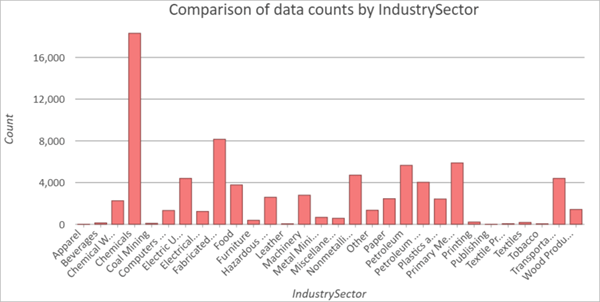
This chart shows us a different view of the data. The chemical sector appears to have the highest number of facilities, while the Metal Mining sector has relatively low facilities. This may indicate that metal mining facilities have high emissions, or that a few facilities have very high emissions and are skewing the chart. You’ll explore this more at the end. For now, you’ll continue to explore total emissions.
6. In the Chart Properties pane, for Aggregation choose Sum.
You’re also interested in potentially dangerous chemicals, so you’ll split the industry emissions based on whether they are classified as carcinogenic or not.
7. In the Chart Properties pane, for Spit By, choose Carcinogen.
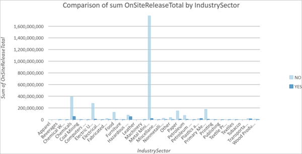
It looks like the majority of chemicals emitted are non-carcinogenic.
Next, you’ll make a bar cart of emissions by state.
8. Right-click Toxic Release Inventory > Create Chart > Bar Chart.
9. In the Chart Properties pane:
- For Category or Date, choose ST.
- For Numeric Fields, choose OnSiteReleaseTotal.
It looks like Alaska has the highest emissions, but its hard to tell which state has the lowest. You can use the Sort functionality to rearrange the bars from highest to lowest, based on their y-axis, or sum of pollution value.
10. On the Bar Chart, click Sort > Y-Axis Descending.

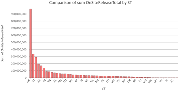
The Northern Marianna Islands (MP) have the lowest total emissions.
Next, you’ll create a bar chart for counties. At first, this chart will appear cluttered, but when you use the chart filtering options it will become cleaner.
11. Right-click Toxic Release Facilities > Create Chart > Bar Chart.
12. In the Chart Properties pane:
- For Category of Date, choose County.
- For Numeric Fields, choose OnSiteReleaseTotal.
- For Aggregation, choose Sum.
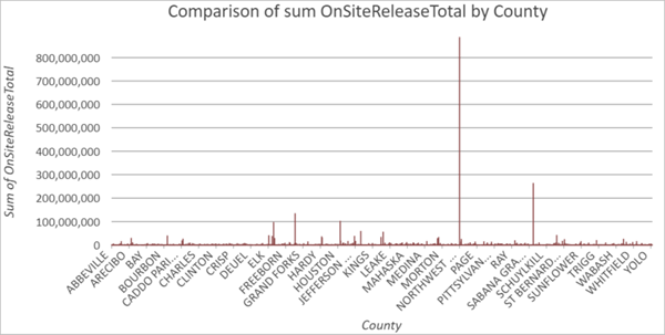
It looks like one county has extremely high emissions. You’ll zoom to that county to find out more.
13. In the Bar Chart pane, ensure that you’re in Select Mode.

14. Click and drag a selection box over the highest bar.
15. On the Bar Chart toolbar, click Attribute Table. Dock it above the charts, next to the Map

16. In the Attribute Table, click Zoom to.
17. Switch to the Map pane.
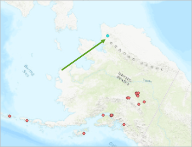
It appears the emissions are all coming from a single facility in Northwest Alaska, but notice that the Attribute Table shows 15 features selected.
18. Switch to the Attribute Table. In the bottom left, click Show Selected Records.
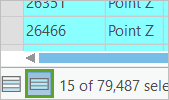
If you review the attribute table, you’ll notice all 15 points have the same company name and, notably, the same latitude and longitude. This is because all emissions are coming from a single facility, but because of the data structure each chemical pollutant is recorded separately. This is another reason to compare the total pollution instead of the count of facilities – depending on how many pollutants each facility emits, it could have multiple records. Next, you’ll look at all the charts and use the selection functionality to explore the data.
19. Dock all charts to be visible.
20. If necessary, click anywhere in a chart to deselect the county’s bar.
Note: You may want to close or hide the Chart Properties, Contents, and other panes.

21. In the Industry Emissions bar chart, drag a selection box over the Metal Mining “Yes” bar.
Note: You may want to zoom in to the chart. You can also hover over each bar to ensure you are selecting the correct category.
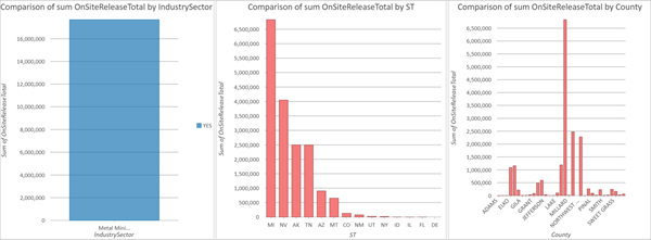
Notice that in the other two bar charts, the states and counties that have metal mining industry facilities are highlighted alongside the states and counties that do not have those facilities. To see the data more clearly, you’ll filter it.
22. In each bar chart, on the toolbar, click Filter by Selection.

Every chart updates to only show data for selected features. Using this method, you can explore where other industries are concentrated. You can also apply a selection filter based on States to view which industries are the highest emitters in that area. Or, you can select an industry and a state to filter two categories at once.
Next, try using chart selection filtering to your location to answer the three questions posed at the beginning:
- How many pounds of hazardous chemicals are in my county?
- What industries are contributing the most pollution in my county?
- Are these chemicals carcinogenic?
Note: If you live outside of the U.S., try filtering for Allegheny County in the state of Pennsylvania.
Now that you have your final charts, you’ll export them for sharing.
23. On the Comparison of data counts by ST bar chart toolbar, click Export.
24. In the Export window, type png.
Note: You must specify the file type or it will automatically save as .svg.
25. In all of the bar charts turn off the selection filter. Click anywhere to deselect the bar.
26. Save and close the project.
While the TRI dataset is useful for mapping and understanding industrial pollutions, it is by no means a comprehensive list, nor necessarily a definitive indicator of the total pollution or highest emitter in an area. To understand more about the benefits and limitations of this dataset, read Important Considerations for Using TRI Data.


Great feature Rebekah. Can you please let me know if this is available within ArcGIS Enterprise (and what version), or is it just AGOL? Also interested in the ability to edit related records in Enterprise via Smart Forms, as well as records with a many to many relationship as I don’t believe this functionality is provided in the editing tools within WAB or Exp Builder. Kind regards
Hi there Chris, Smart Forms are currently available in Enterprise! As for related records editing you many find this article helpful: https://www.esri.com/arcgis-blog/products/arcgis-online/mapping/introducing-related-record-editing-in-map-viewer/ support for enterprise services is coming, and we will be supporting other relationship types like many-to-many in future updates
thanks for your reply and useful links Rebekah. Can you confirm that when you say “currently available”, you mean Enterprise 11.1 and later? Kind regards
Initial support for Smart Forms was added into Enterprise 11.0, but other more recent feature updates may be specific to 11.1 (or still in the works)