We received a question on Ask a Cartographer recently which were both asking if it was possible to take a group of polygons and create an outline for the whole group rather than have outlines for each polygon.
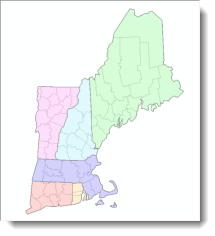
The most obvious answer is that you can use the Dissolve tool on a common attribute to create a new feature class, but what happens if you don’t want to create a new dataset solely for dealing with the cartography? There is another way which eliminates the need to create a new feature class and is based on an Esri Knowledge Base article that describes how to symbolize polygon features so that boundary lines between polygons with like attributes are dissolved. We thought it worth exploring the solution in a little more depth in this blog to demonstrate how it works. We’ll illustrate the workflow using the New England states of the USA at a county level to create a map at the state level (figure 1).
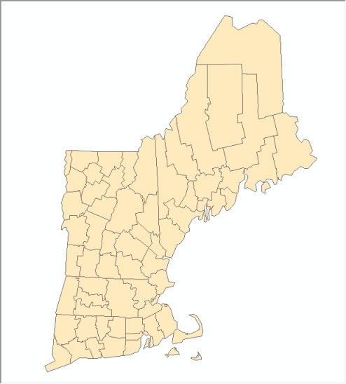
Figure 1. New England states mapped at the county level.
The data have an attribute called STATE_NAME which we will use as the field for dissolve purposes. In ArcMap, right click the counties layer in the table of contents and click Properties. On the Symbology tab, show the features as Categories – Unique Values, and then click the Value Field drop down to select the field containing the attribute that you will use to do a “virtual dissolve” (STATE_NAME, in our example). Then click the Add All Values button (figure 2).
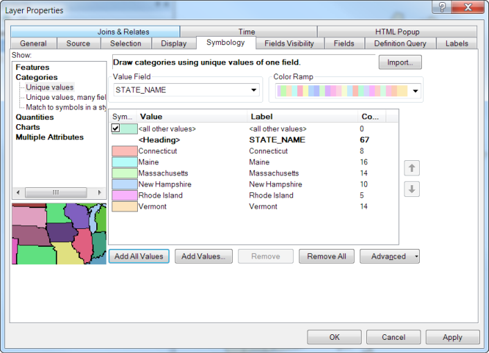
Figure 2. Symbolizing by category using the attribute that will be used for the “virtual dissolve”.
First uncheck the option to show a symbol for all other values. Now you need to make some modifications to the symbol properties for all symbols, so right click on any symbol and click Properties for All Symbols on the context menu. The Symbol Selector dialog opens up. Click Edit Symbol to open the Symbol Property Editor dialog. Here, click the “+” button under Layers to add a symbol layer.
Specify an outline width of zero for the top symbol layer and click the small padlock icon next to the top layer of the symbol to unlock this layer. Click the bottom symbol layer and click the Color drop down and select No Color as the fill color. Click the Outline Color drop down and select a color of your choice for the polygon outlines. Specify an outline width of twice the size you want to use for the final symbol…for reasons explained below. Click the small padlock symbol next to the bottom level to lock the second symbol layer (figure 3).
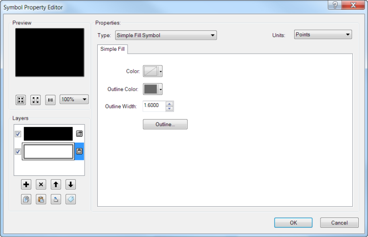
Figure 3. Modifying the properties of the multi-layer symbol.
Click OK to close the Symbol Property Editor and then the Symbol Selector. Click the top symbol, hold down the Shift key and click the bottom symbol to select all the symbols, then click the Color Ramp drop down and select a color scheme of your choice. This will apply the color ramp to the top layer of the symbol only (recall that you locked the lower layer so that one is not changing, but since it is simply an outline with a width of zero, you will not see it at this point.) At this point, you can also choose to edit the fill color of each symbol. Click Apply and move the Layer Properties dialog out of the way to see the changes.
You’ve now created a multi-layer symbol for each of county comprising a color fill in one layer and an outline in the other. Currently the layer that controls the fill symbology has a fill color but an outline width of zero, and the layer that controls the outline symbology is set to double the width of the final line symbol (figure 4).
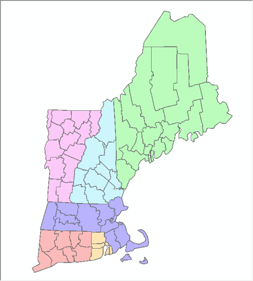
Figure 4. The symbolized counties prior to being “dissolved”.
To dissolve the county boundaries within each state requires a further modification using Symbol Level Drawing which gives you control over the drawing order of each symbol and even over the individual layers for multi-layer symbols. Symbol Level drawing can be used to “join” features with the same symbology and “merge” features with different symbology. “Joining” the counties that have the same symbology (those within a single state) will make them appear to have one outline (the outline of the state).
On the Symbology tab of the Layer Properties dialog, click the Advanced drop down at the lower right and then click Symbol Levels. The Symbol Levels dialog opens up. Check the option at the top to Draw this layer using the symbol levels specified below. Check the Join option for all symbols, and uncheck the Merge option for all symbols (figure 5).
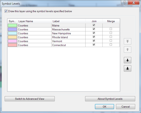
Figure 5. The symbol level drawing settings that will result in the county boundaries being “dissolved” within the states.
Click OK on the Symbol Levels dialog and then click Apply on the Layer Properties dialog to see your changes (figure 6).
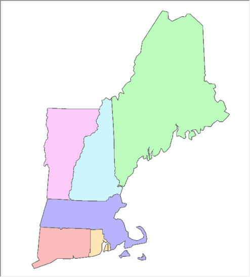
Figure 6. The counties “dissolved” into the states.
Now you will be able to see why you needed to draw the lines at twice their final width. To do this, we’ll take a look at the Advanced View of the Symbol Levels Drawing dialog. Open this up by clicking Advanced on the Symbology tab of the Layer Properties dialog then clicking Symbols Levels. At the lower right click Switch to Advanced View. If you click the drop down next to any symbol, you will see that both the bottom layer (the outline) and the top layer (the fill) of the symbol are shown. In this dialog, the numbers reflect the drawing order of EACH of the layers for EACH of the symbols (figure 7).
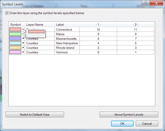
Figure 7. The advanced view of the symbol bevel drawing dialog.
Starting at the bottom of the dialog with the value zero, the outline of Vermont will be drawn, followed by its fill, then Rhode Island will be drawn, followed by its fill, and so on. This means that the state that is drawn over another one will cover up half the line symbol. You can see this in the figure 8 in which the transparent yellow lines are the same width as the original outline of the multi-layer symbol, and the gray lines under them are the outlines as they are drawn after using symbol level drawing.
Figure 8. The final lines will be drawn at half their specified width.
Note that this method only works effectively for simple line styles such as solid or dashed lines. Cartographic line styles do not render effectively.
Now you know how to control line and fill symbols through the symbology and symbol level drawing to create the cartographic effect of “virtually dissolved” internal boundaries. You can use this technique as a basis for making more complex maps that show hierarchical boundaries. This is a common cartographic approach and the method described here allows you to achieve it without changing the geometry of a feature class or creating new feature classes for cartographic purposes. The following version of the map (figure 9) was created using two copies of the same data, and both these layers are in the same data frame. The counties layer on the bottom has been symbolized with a gray outline and no fill. The layer on the top is the one we described how to crate above, then we a 40% transparency so you can see the counties within the states.
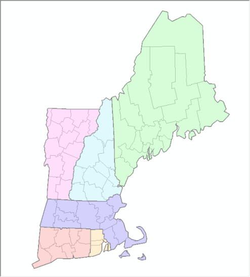
Figure 9. Map showing both dissolved fill and lines as a transparent overlay to create a composite county/state effect.
This example illustrates how to symbolize political or administrative boundaries by using one feature class that contains attributes to “dissolve” the symbology. Using multiple copies of the layer allows you to create different effects, such as the hierarchical layering shown in figure 9. Of course, you could employ the same techniques for any application in which you wanted to create regions based on attributes in your data. Examples that come to mind are school districts, hydrologic catchments, or natural resource regions.
Thanks to Craig Williams, Product Engineer Lead for Mapping, and Aileen Buckley, Mapping Center Lead, for their help with this blog entry!

Commenting is not enabled for this article.