I am a firm believer that some of the most revolutionary GIS tools can be applied in about the time it takes to microwave a Hot Pocket. So this summer I started #InAGIF, a weekly blog, where I demonstrate some of the latest and greatest GIS tools. The best part is that each episode is completed in a 45-second video—a .gif, to be more accurate. The rules are simple: no copying and pasting code, no custom tools, no advanced training, and no snipping time from the video.
In creating these videos, I learned that you could completely modernize the way an organization operates using the out-of-the-box tools that come with ArcGIS, whether it is through understanding the scope of their services, creating a custom mobile app for the community, or placing points on a map so you can start to understand patterns.
I recently released the 10th post in the series, and I want to share some of the highlights in this week’s #InAGIF: ArcGIS Blog Edition.
Turn addresses into points on a map in seconds
You’ve just added another record to the table that your organization uses to store the billing addresses for your clients. Great job! But have you considered how that new address relates to the other 10,000 in the table? Does it signal the emergence of a new hot spot of business? Or are you starting to see less business in a specific region due to unknown competition? Break your data out of the table and get ready for analysis in this #InAGIF.
Compared to using a search engine to extract coordinates line-by-line, batch geocoding is a game changer. While the drag-and-drop functionality is capped to a few thousand records, ArcGIS Online has other tools that can geocode massive datasets just as quickly, either in this interface or behind the scenes. There are also options for secure geocoding on-premises for health-related, sensitive, or big datasets.
Renter Density in 45
We’ve all done the twitch when comparing two maps—look at one map, then quickly look at another map to compare data, then back to the first map. With new ArcGIS technology, you can stop switching between maps and build an interactive visual to compare data in less than 45 seconds with the new dot density mapping feature in Map Viewer Beta. Get mapping in this #InAGIF.
Dot density maps are fantastic for the comparison of demographic information. The example in the video uses data pulled from Esri’s Living Atlas, a diverse collection of authoritative data provided to users. This particular layer has two fields for counts of renters and owners by census boundary. Using the new Map Viewer Beta, we can select a dot density symbology with multiple fields. The tool then analyzes the data and produces a color palette that looks like a graphic design masterpiece. Best of all, it performs beautifully—pan, zoom, and click for a responsive design.
Build a mobile app in under 45 seconds
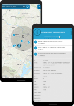
Where is the nearest early voting site to my house? Where is the nearest pharmacy to this clinic? Where is the nearest pho restaurant to my dog’s hair stylist? These are all questions that your community needs answered. Luckily, in just 45 seconds, you can build an app that empowers members of the community to find the answer on their own, and it looks awesome on mobile.
This is accomplished with the suite of ready-to-use app templates in ArcGIS Online. Just add points to a web map, save it, and share with an app template. No development, no design, no code. Just minor configurations that can be done in seconds.

Delivery in 45 seconds, or it’s free
I grew up on a rural farm in Maryland, and we had to live without the luxury of pizza delivery or readily accessible fire service—only one of those mattered to me as a kid. While fast-food response times may not be critical insight for your community, it may be helpful to know the effective distance of services such as fire stations or hospitals. We can find what communities are underserved in this quick workflow.
The tool used here is Generate Service Areas. It takes an input of facility locations (fire stations or pizza shops) and generates an area that can be reached from that point within a specified time. In this case, I’ve set the travel limit to five minutes without traffic. Once run, the tool pings Esri’s authoritative dataset, scans the latest road data files, and finds the fastest routes away from the facility. You can even account for traffic on a particular day, based on historical data. The result is a bounding area that can be used for further analysis.
Extract the coordinates from an entire Wikipedia article
Finally is the .gif that started it all, featuring LocateXT: a powerful text extraction tool accessible in ArcGIS Pro. This extension can be used to plot coordinates and place-names, extract attributes, and rapidly iterate through numerous folders of documents. You would be surprised just how fast this tool can operate to turn a large amount of unstructured text into a geodata layer.
For more information on LocateXT, visit the product page.
See more
This is just a snapshot of the series. To see more and to get updates as they are released, follow the blog on GeoNet, the Esri Community or on LinkedIn. If you have an idea for an #InAGIF or general feedback, send me a message on some of the sites above or leave a comment below, and I will be sure to give you a shout-out.

Article Discussion: