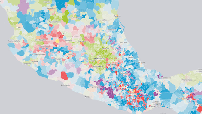
A predominance map helps us see new geographical patterns by comparing multiple attributes from our data. By showing us the largest value between many attributes, we gain new insights about how data might be grouped geographically.
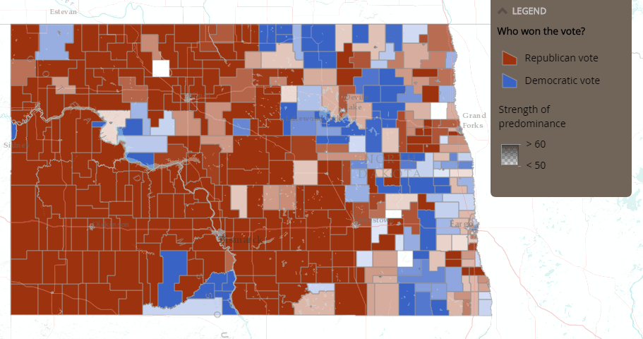
For example, an election map is an example of a predominance map where each area is red or blue based on if there are more Republicans or Democrats voting for something. By selecting the attributes within your data that you want to compare, predominance will show you which one has the largest value.
You asked, and we listened!
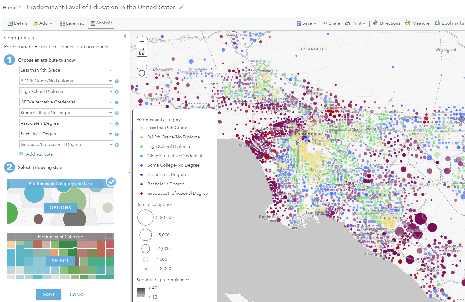
With the April 2018 release of ArcGIS Online, you can now compare up to ten attributes within your dataset using the predominance mapping style. This broadens the possibilities of maps that you can create with your data.
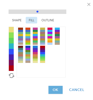
There are also new color ramps available specifically for predominance. For example, there is a new sequential color ramp designed to show a progression. In the map below, this color ramp is used to highlight the level of education for the population, where yellow is the lowest level of education and red is the highest level of education.
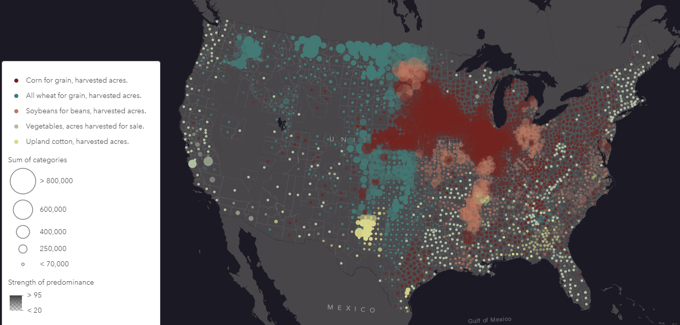
The other new color options provide a distinct and colorblind friendly view of your data. For example, if you are comparing 5 different types of crops, you can show each type of crop with a distinct color as seen in the map below. This uses one of the new color ramps which has neutral color options.
These new enhancements will allow you to create new types of predominance maps, and broaden your cartographic options.
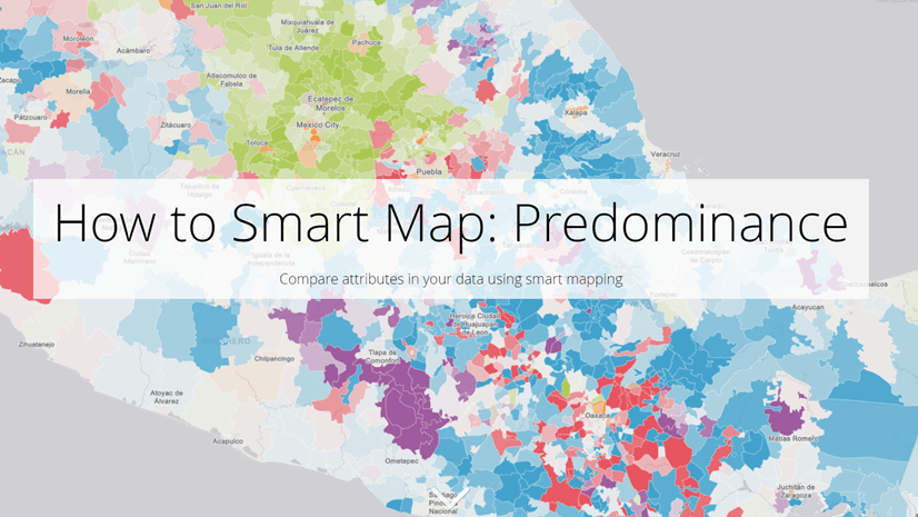
To make a predominance map, simply select the attributes you want to compare within the “Change Style” option, and smart mapping will automatically draw the largest attribute within the map. Check out this Story Map for an introduction and tutorial for getting started with predominance. You can also check out this short video to see how it’s done.
For more information about smart mapping, click here.

Article Discussion: