ArcGIS Pro 3.0 has an exciting spatial analysis tool Multiscale Geographically Weighted Regression (MGWR) in the Spatial Statistics toolbox. MGWR is a cutting-edge spatial regression technique that explores geographically varying relationships between dependent variables and explanatory variables. Since its inception in 2017, MGWR has been used to analyze a diverse set of problems in geography, urban planning, and various other disciplines.
How is MGWR different than other regression models?
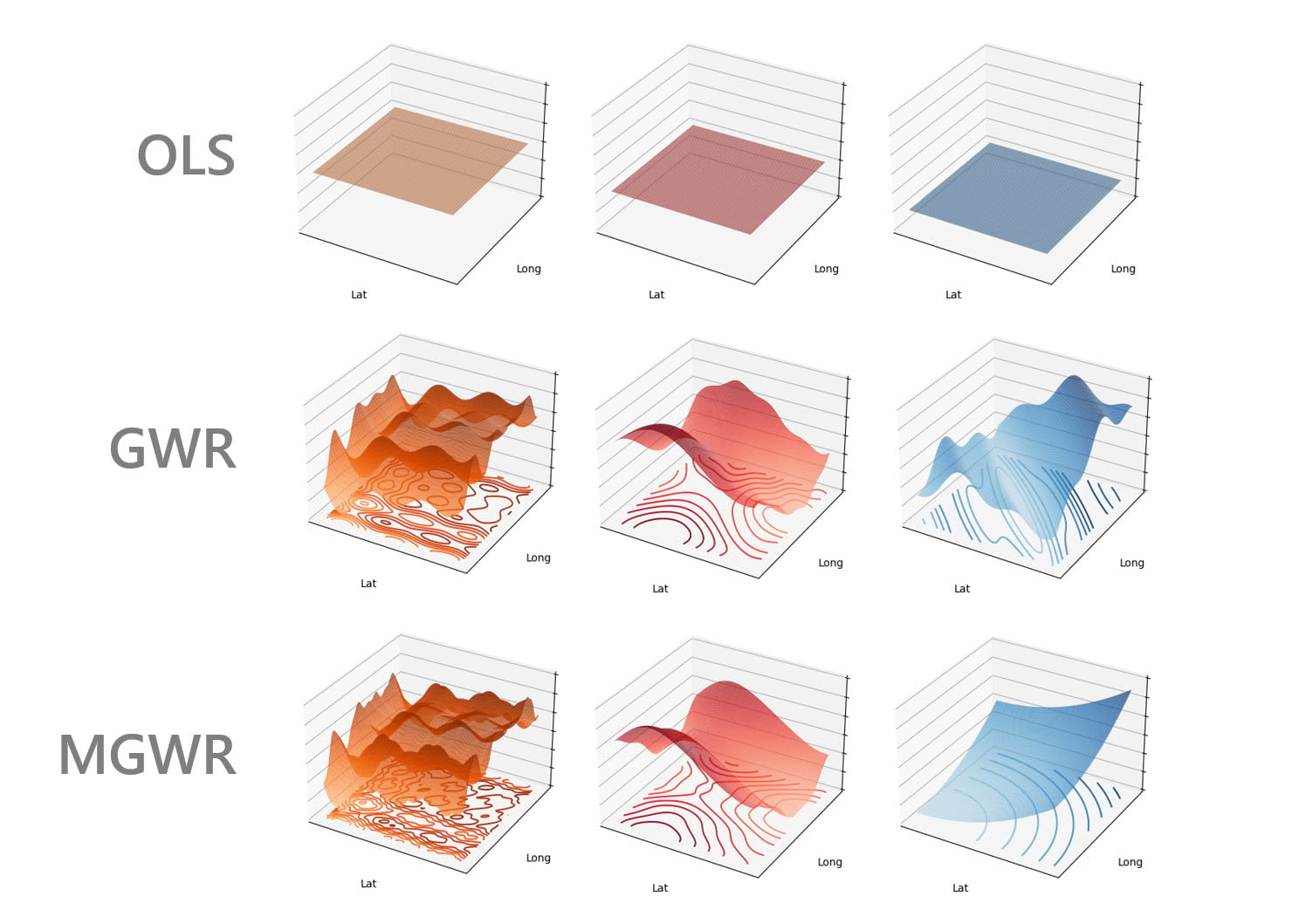
How does MGWR fit into the family of other ArcGIS regression analysis tools? Let’s look at a generic regression example with a dependent variable and three explanatory variables. Using Ordinary Least Squares regression (OLS), we assume that each explanatory variable has the same relationship with the dependent variable everywhere in the study area. That is, the three coefficients in the regression equation are constant numbers across the area: a one unit change of an explanatory variable results in same change to the dependent variable no matter the location. Using the classical Geographically Weighted Regression (GWR), we allow the coefficients to vary spatially, but all coefficients must change at a similar rate across the study area. This rate of change can be quantified as a spatial scale using a neighborhood and bandwidth. MGWR further evolved from GWR by allowing different neighborhoods for different variables. A small bandwidth indicates that the spatial process changes quickly from location to neighboring locations, vice versa.
We can compare these regression methods visually by comparing coefficient surfaces of each method (Figure 1). The relationships between explanatory and dependent variables in the OLS model are constant across the space, as shown by the flat surfaces. The relationships in the GWR model change spatially, but each variable changes according to the same bandwidth. With MGWR, the relationships change at a different rate – the bandwidths increase from left to right. On the left, only the closest neighbors are used to build the local regression models. However, on the right, neighbors that are farther away still contribute to the local regression models. By allowing differing neighborhoods and bandwidths, MGWR can model wider range of geographical phenomena than OLS or GWR. Overall, depending on the phenomenon to analyze, MGWR can provide better coefficient estimates, more meaning interpretation, more accurate prediction, and encounter fewer issues with multicollinearity.
To see what’s possible with MGWR, we explore the number of bachelor degrees obtained in the state of Georgia using data from the US Census Bureau, following the example from School of Geographical Sciences & Urban Planning at Arizona State University (Oshan et al. 2019). We will see how MGWR helps reveal and interpret spatial relationships. We will also run the GWR model for comparison.
Case study: understand bachelor’s degrees obtained in Georgia
A project package of this case study can be downloaded here, including the data and analysis results. The data is obtained from Esri data vintage 2019, accessed using the ArcGIS Pro Enrich tool.
There are 159 counties in Georgia. The dependent variable is the percentage of people having bachelor’s degrees. The explanatory variables are: the percentage of people living below the poverty level, the percentage of people speaking only English, and the percentage of people living in urban areas. We explore how the explanatory variables are related to the dependent variable and how the relationship varies spatially.
Fitting the model
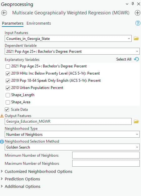
Let’s open the Multiscale Geographically Weighted Regression tool and get started (Figure 2). We will specify the Input Features, Dependent Variable and Explanatory Variables.
In addition, many essential parameters relate to defining the local neighborhoods. The neighborhood of an explanatory variable at a target location includes all the locations that will contribute to the estimate of the explanatory variable’s coefficient in the local regression model. Each neighborhood is defined by “Distance Band” or “Number of Neighbors” in Neighborhood Type. Here we choose “Number of Neighbors”.
Since we do not know the spatial scales of the relationships, we use “Golden Search” in the Neighborhood Selection Method to estimate the optimal bandwidths. For those with domain knowledge, the bandwidths can be specified using the user-defined option or customized neighborhood options.
When the tool completes its execution, the geoprocessing tool inputs should look like this:
Results and interpretation
Once the tool finishes its run, we receive various informative outputs. We focus on the messages and group layers here.
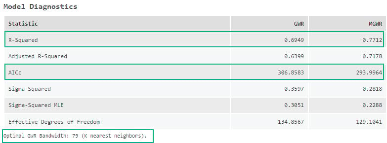
The detailed messages summarize the model results (Figure 3). In the “Model Diagnostics” table, we can see that MGWR outperforms GWR, indicated by a higher R-square (0.77 versus 0.69) and lower AICc value (294.0 versus 306.9).
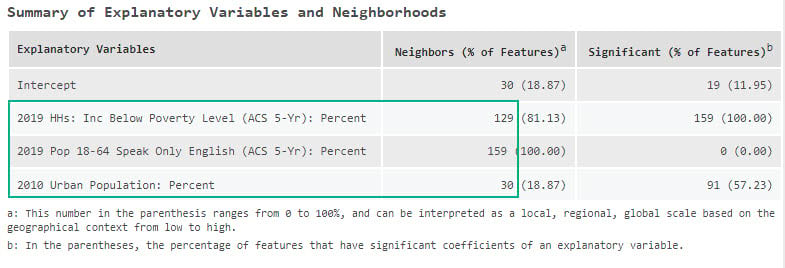
The “Summary of Explanatory Variables and Neighborhoods” table explains the bandwidths for each variable (Figure 4). GWR uses 79 neighbors for all variables. Comparing 79 neighbors with a total of 159 features, we can conclude that all the spatial relationships change at a similar rate on a regional scale, where approximately half of the features contribute to each local model. In MGWR, the percentage of people living below the poverty level operates at a larger regional scale with 129 neighbors; the percentage of people speaking only English operates at a global scale with 159 neighbors; the percentage of people living in urban areas operates at a local scale with 30 neighbors.
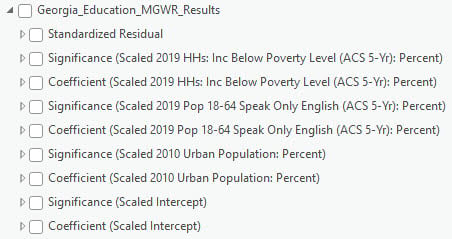
A group layer is created in the Contents pane containing different visualizations of the “Output Features:” maps of residuals of the MGWR model, coefficients, and indicators of statistical significance for each explanatory variable (Figure 5).
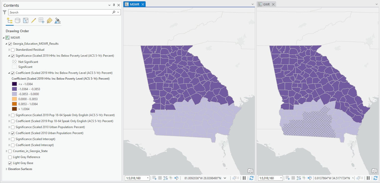
In this map, we visualize the layers of coefficient and significance for the percentage of people living below the poverty level (Figure 6). Locations with non-significant coefficients are grayed out by a grid net. The coefficients are visualized with a diverging color scheme, with the purple and orange color indicating the negative and positive relationship separately.
We can see in the MGWR map that every county has a significantly negative relationship between the percentage of people living below the poverty level and the percentage of people having bachelor’s degrees, indicating that the more people living below the poverty level, the fewer people obtaining bachelor’s degrees. However, the effect is more pronounced in the northern half of the state. In the GWR map, we can observe some areas with grayed grids indicating non-significant results.
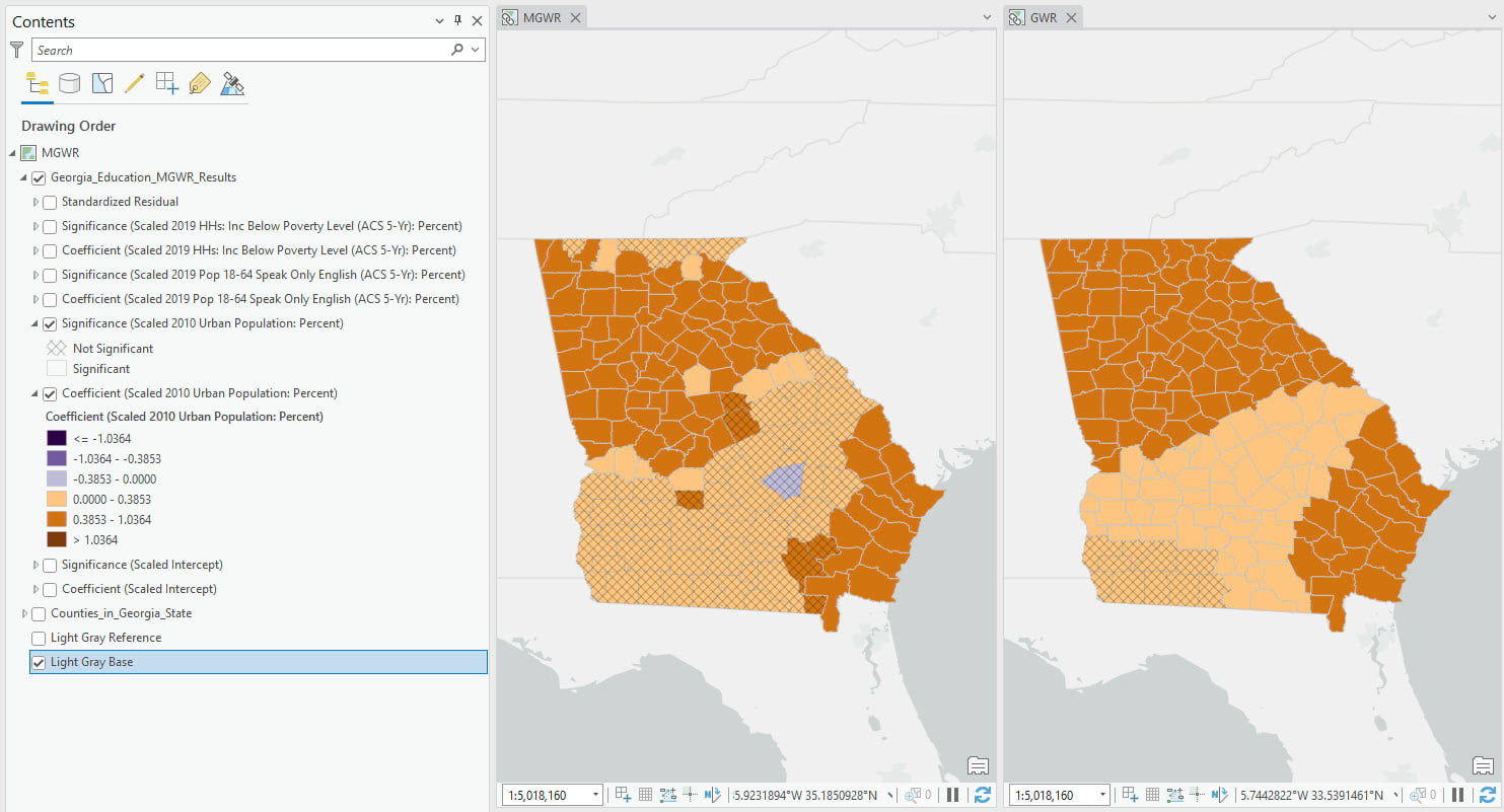
Let’s check the coefficient surfaces for percentage of people living in urban areas (Figure 7). MGWR uses 30 neighbors and GWR uses 79. These two maps share similar patterns, but MGWR shows more spatial variability. In the north and south-east area, the relationship is positive and significant. But in the middle, the relationship is less clear, with many positive but non-significant relationships.
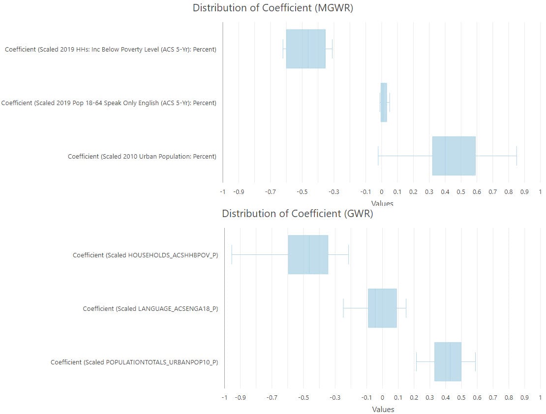
We can understand the role of bandwidth by visualizing the distribution of coefficients (Figure 8). These plots are made using “Create Chart” option in the layer context (right-click) menu. The ranges of coefficients vary across variables with MGWR, but they are similar with GWR. In the MGWR plot, the percentage of people speaking only English operates at a global scale with 159 neighbors, corresponding to a relatively small range of coefficients; the percentage of people living in urban areas operates at a local scale with 30 neighbors, corresponding to a larger range of coefficients.
Conclusion
To summarize, MGWR allows modeling spatial relationships at varying spatial scales. As a successor of GWR, MGWR expands the spatial data that we can accurately model and contributes to the growing integration of ArcGIS with the science and research community.
Resources
- Multiscale Geographically Weighted Regression Tool Documentation
- How Multiscale Geographically Weighted Regression works
- Spatial Statistics Resources
- Oshan, T. M., Z. Li, W. Kang, L. J. Wolf, and A. S. Fotheringham. 2019. “mgwr: A Python implementation of multiscale geographically weighted regression for investigating process spatial heterogeneity and scale.” ISPRS International Journal of Geo-Information 8: 269.
Article Discussion: