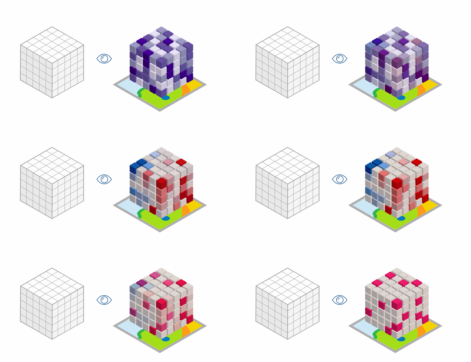
Spatiotemporal phenomena are everywhere — consider global air quality trends, car crash incidents, annual demographic measures, and seasonal ice cream sales. In ArcGIS Pro 3.5, exploring and interacting with these complex datasets just got easier. The new space-time cube layer enables you to visualize spatiotemporal data and analysis results in 3D, offering new ways to uncover patterns and insights over space and time.
Space Time Cube Layer

Space-time cubes are the data format used by the tools in the Space Time Pattern Mining toolbox to analyze spatiotemporal data. A space-time cube layer can be created from a space-time cube and activates the Space Time Cube ribbon. This ribbon provides intuitive display options and interactive tools designed for exploring space-time cube data in a 3D scene.
This visualization experience was designed to provide parity with — and enhancements to — the Space Time Cube Explorer Add-in. If you’re new to space-time cubes or want to learn how to create them, be sure to check out the additional resources listed at the end of this blog.
Read on to learn about highlights of the new space-time cube visualization experience in ArcGIS Pro!
Explore Spatiotemporal Analysis Results

The new space-time cube layer is designed to help you better explore spatiotemporal data and analysis results with curated display and interaction options. Using the Space Time Cube ribbon, you can switch between multiple variables stored in your space-time cube layer and explore the values and analysis results associated with each. The selected variable populates a gallery with display themes based on the analyses previously run on the space-time cube – like Emerging Hot Spot Analysis, Local Outlier Analysis, and Change Point Detection. Each display theme applies a preset symbology tailored to showcase patterns and trends.
In the example above, the COUNT variable is selected, representing counts of traffic crashes in each space-time bin. We seamlessly switch between display themes to visualize the different analysis results for a nuanced investigation of the crash data.
With this new capability, you can view all data associated with a space-time cube from a single layer, providing a streamlined multidimensional exploratory experience.
Visualize an Area of Interest

Drill down into specific regions or time periods by defining an Area of Interest or constraining the time range. The Configure Extent options on the Space Time Cube ribbon give you fine-grained control over which spatial and temporal bins are displayed in the scene – without needing to modify your underlying data.
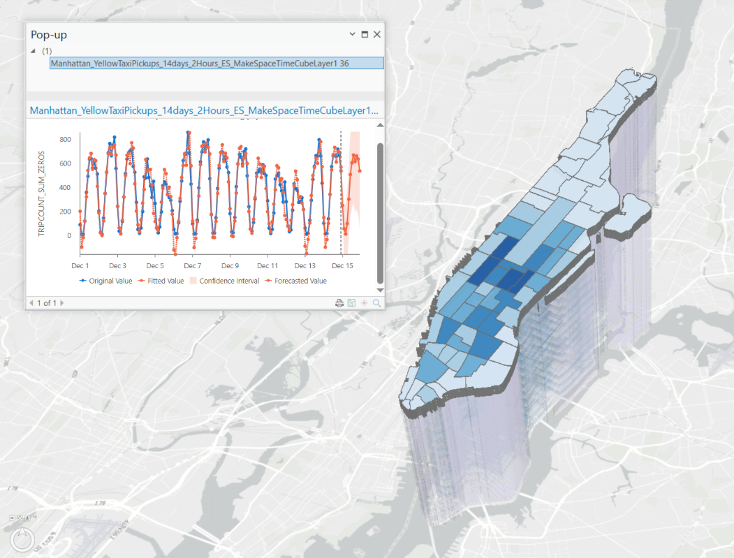
In the example above, we constrain the extent to a particular 24-hour period and neighborhood to focus on the pattern of forecasted taxi pickups in that specific window.
The flexibility provided by this capability enables clean, targeted visual presentations of a subset of your spatiotemporal data.
Add Context to 3D Visualizations

Enhance your understanding of patterns in space and time by adding 2D layers to your 3D scene. Tools in the Space Time Pattern Mining toolbox produce useful results layers that complement the 3D visualization provided by the space-time cube layer. For instance, by overlaying 2D and 3D visualizations of a Local Outlier Analysis result, you can identify locations that have been multiple cluster and outlier types over time and then drill down to understand the specific patterns – did the location change from a Low-High Outlier to a High-High Cluster over time? And is there a story behind that change?
More contextual information is readily available from the Space Time Cube ribbon. Consider adding a 2D footprints layer to show the boundaries of each space-time cube location. Or you can run the Describe Space Time Cube tool to view information about the dimensions and data stored in the space-time cube.
Interactively Explore Space and Time

Easily accessible interactive tools help you investigate your data from different angles. Use the Slice Plane tool to cut through your space-time cube to reveal interior bins and hidden patterns. With the Time Series Pop-Ups by Location tool, you can click on a specific location to generate a time series chart. Specialized charts are available for different display themes – such as Change Point Detection and Forecast results. These tools allow you to dynamically explore your data, making it easier to identify trends, anomalies, and predictions.
And More!

The Space Time Cube ribbon offers more tools and settings, such as:
- Display Options:
- Use the Time Steps control to toggle between seeing all time steps, viewing a single time step at a time, or accumulating time steps using the time slider.
- The Range Options feature lets you filter bins by selecting a variable to apply as a range. For example, while viewing the Hot Spot Type display theme for a car crash count variable, you can filter to only show bins with five or more crashes by setting the range to Variable Value and adjusting the slider.
- For grid cubes represented as point geometries, choose whether the bin symbols adaptively change size or remain fixed at all scales using the Symbol Scaling control.
- Elevation: Adjust the vertical exaggeration and cartographic offset to modify the vertical positioning and spacing of bins in your scene.
- Highlight Forecasted Time Steps: When working with a forecast space-time cube layer, emphasize the forecasted values to visually distinguish them from preceding time steps.
Get Started
Now that you understand the power of space-time cube layers, it’s time to try it out for yourself! Check out these resources to get started:
- Tutorial: Explore a space-time cube
- Publish a Space Time Cube to a Web Scene
- Introduction to Space Time Cubes
- Working with Space Time Cube Layers
- Space Time Cube Layer
- Space Time Cube Ribbon
Data Acknowledgements
Note: these data are modified from their original formats and analyzed and displayed for demonstration purposes only.
1. Oahu traffic crash locations: The data made available here are modified for use from their original source, which is opendata.hawaii.gov. The State of Hawaiʻi Department of Health, Emergency Medical Services and Injury Prevention System Branch, does not vouch for the quality and timeliness of these data presented herein, any analysis of these data presented herein, nor any content, viewpoints, products, or services presented herein.
2. NYC taxi pickup locations: Data provided by the Taxi and Limousine Commission.
3. Downy woodpecker observations: Data provided by FeederWatch with credit to the thousands of participants who have made FeederWatch possible, as well as to Birds Canada and the Cornell Lab of Ornithology for developing and managing the program.
4. Global PM 2.5: Space-time cube created based on the Investigate pollution patterns with space-time analysis tutorial, with source data from van Donkelaar, A., R. V. Martin, M. Brauer, N. C. Hsu, R. A. Kahn, R. C. Levy, A. Lyapustin, A. M. Sayer, and D. M. Winker. 2018. Global Annual PM2.5 Grids from MODIS, MISR and SeaWiFS Aerosol Optical Depth (AOD) with GWR, 1998–2016. Palisades, NY: NASA Socioeconomic Data and Applications Center (SEDAC). https://doi.org/10.7927/H4ZK5DQS. Accessed 23 December 2019.
Commenting is not enabled for this article.