**UPDATE** Great news! You can still follow along with this post if you are working in Pro and want to upload hatched fills to the ArcGIS Online Map Viewer, BUT the Map Viewer has been updated so you can apply hatched fills right in the style editor. Lots of flexibility. More info here.
What
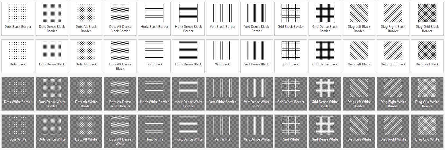
Here is an ArcGIS Pro style containing an assortment of hatched fills. You can use this style in ArcGIS Pro, but it has been specifically designed to maintain visual fidelity when sharing a layer from Pro to ArcGIS Online. More on that further down.
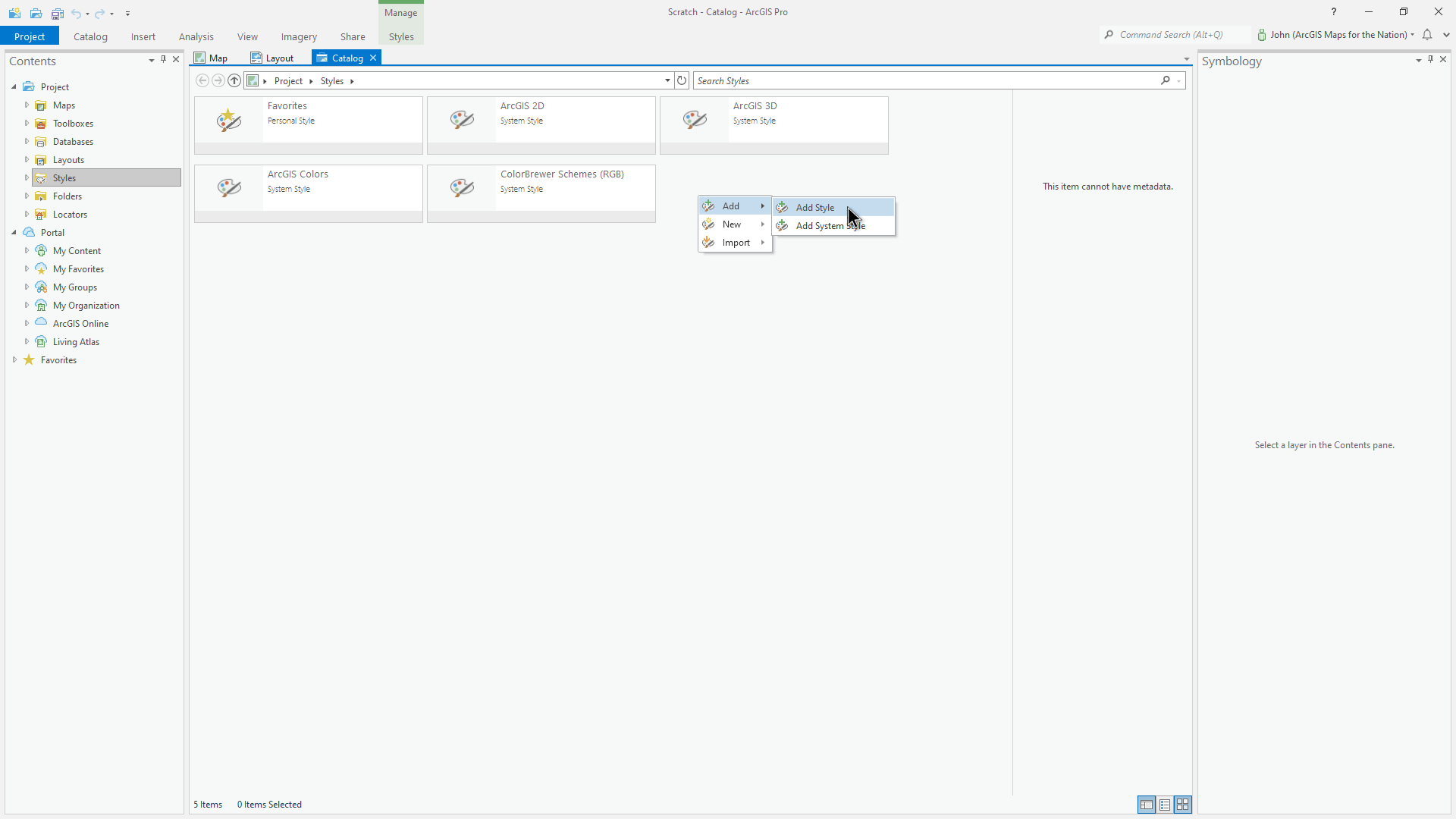
Save the style file, and add it to your Pro project via the Catalog view. Here’s how: within the styles category, right-click an empty area and choose “Add” and “Add Style.” Then point to wherever you saved the HatchedFills.stylx file.
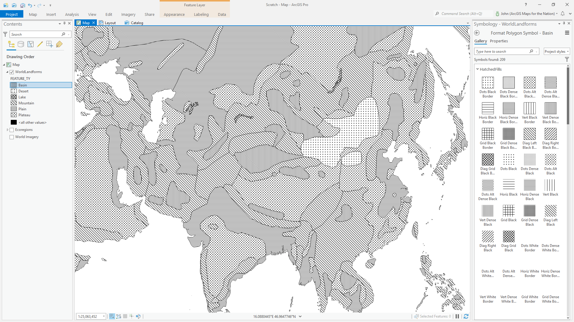
Thereafter, the Symbology Panel’s “Gallery” tab will contain 13 glorious striped and dotted symbols, each available with or without an outline, and in black or white. Happy hatching!
Why
In the digital era we’ve strayed away from the trusty old cartographic visualization tool of…hatched fills. We have high resolution full-color displays and interaction, etc. Why would you ever want to use a clunky old pattern in your map? Feels a bit dated, right?
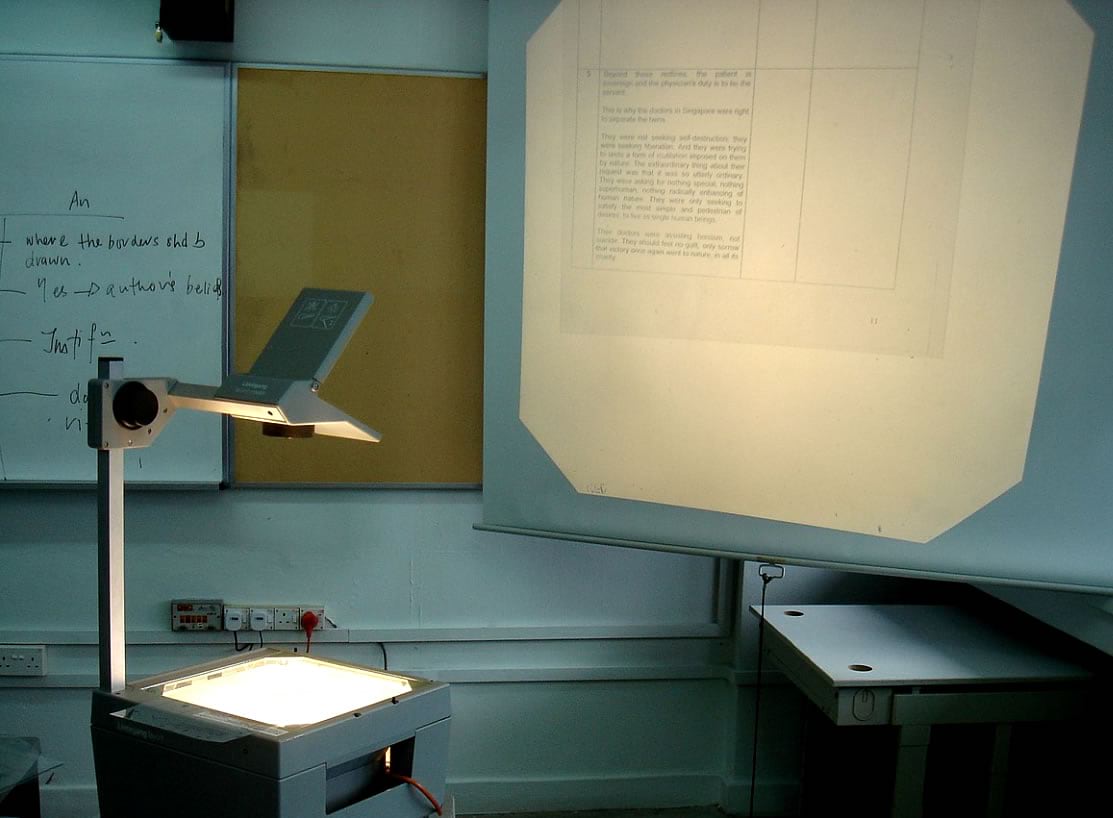
Hatched or patterned fills harken to an age of overhead transparency projectors (remember that slap sound when the presenter would drop the transparent sheet onto the overhead’s lightboard? Sounds like college) or scratching Zip-A-Tone patterns on to drafting film (I’m too young for this but maybe you remember it) or small black-ink-on-paper map illustrations for books or journals (still the case)?
But hatched fill patterns are just as useful as ever! Here is an offhand rundown of some of the instances why a hatched fill can be a helpful option:
- Colorblind-safe
- Single-color ink print scenarios
- As an additional, bivariate, layer
On that last point, we ask too much of hue and tone for the heavy lifting of data-dense thematic cartography. Hatched or patterned fills don’t have to be thought of as a bygone substitute for color, but an entirely separate visual channel that can be used in addition to color. Engineering, architectural, and landscape design drawings all currently make exquisite use of hatches and pattered fills to add a dimension of material information to renderings. Why has cartography given it the cold shoulder?
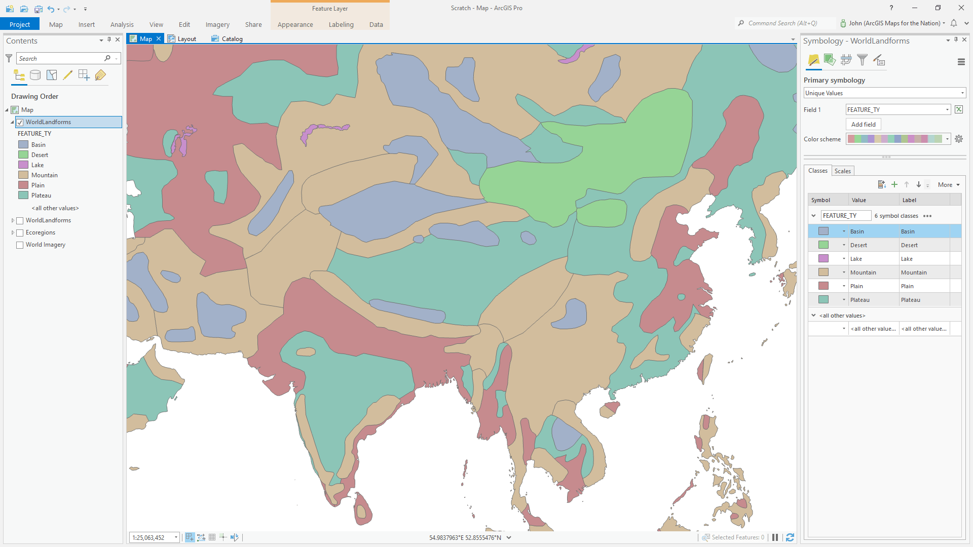
For instance, what if we want an audience to read a map that shows six distinct landform types…
…in the context of something like sixteen distinct ecoregions (already sixteen is way more than enough distinct categories to make a cartographer nervous)…
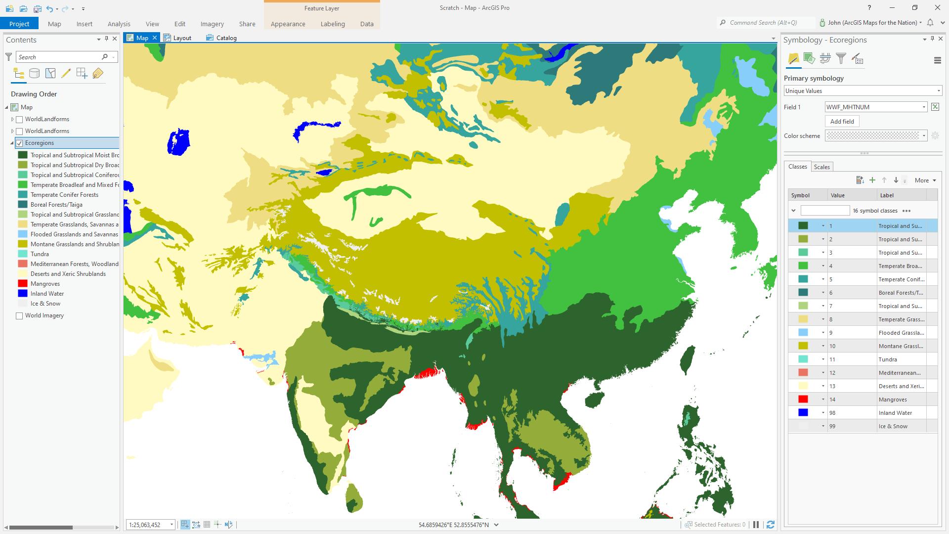
…using only color?
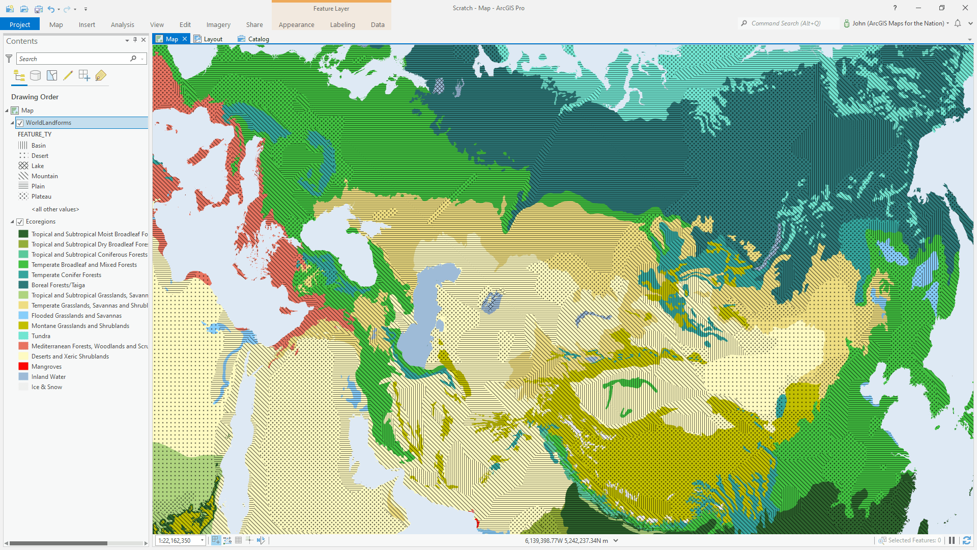
Impossible. The human visual system cannot even come close to distinguishing between the resulting 96 distinct color combinations scattered about a thematic map.
But, if you harness the glowing ember of hatched fills, you can easily overlay six distinct patterns atop the rather complex ecoregion layer and give your audience a fighting chance…
And here’s an example of that hatched layer atop something very visually complex, like imagery. With hatched fills, you can benefit from the context of imagery, and still be able to interpret the overlain layer. In this example I’ve made the outlines black, the hatched patterns white, and applied an overlay blend mode (blend modes are available in both Pro and Online).
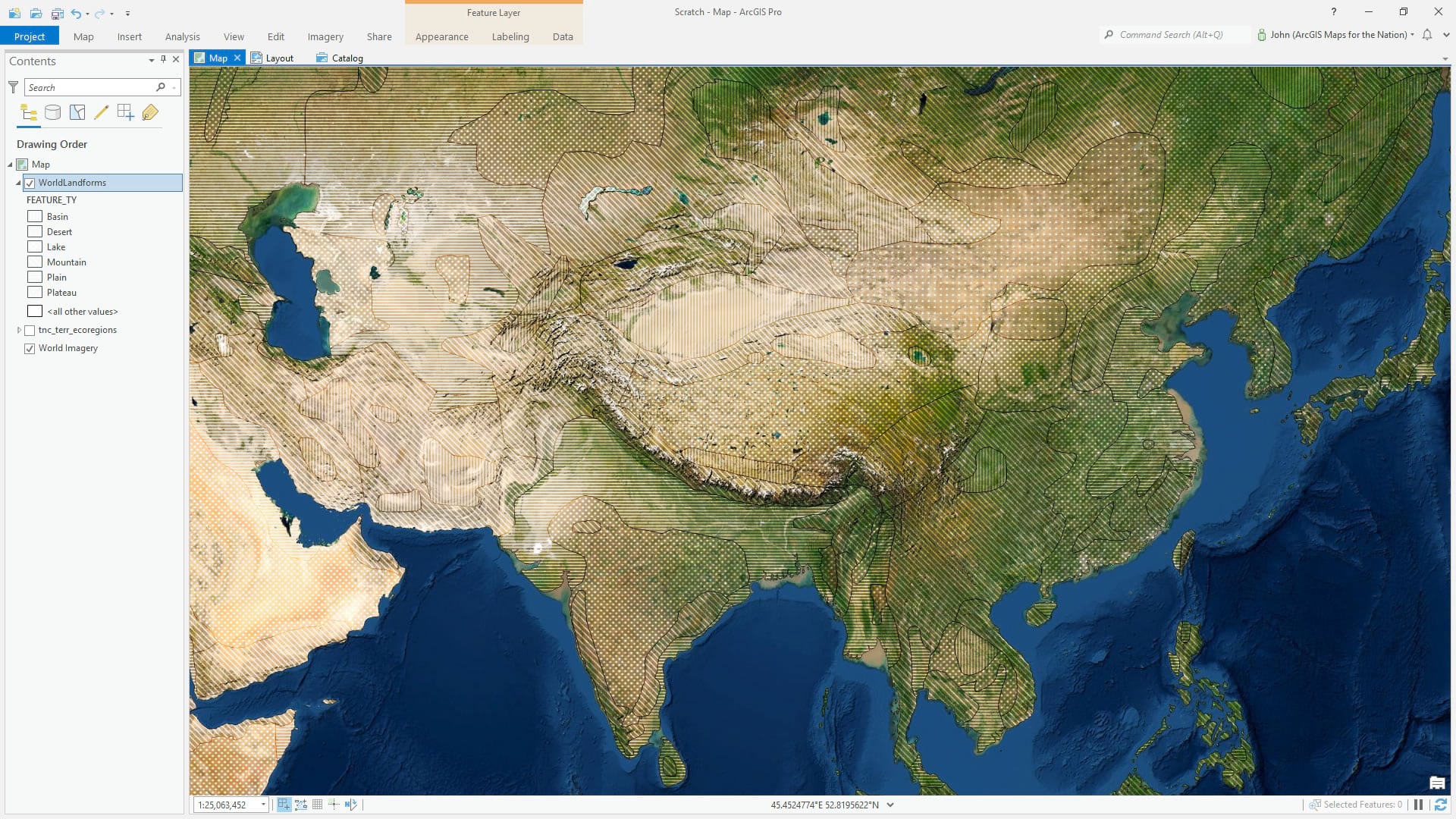
Now if I were to share this hatched layer to ArcGIS Online, it would look as it should. Nice and hatchy.
I was just chatting with my eminent cartographic colleague Andrew Skinner, who has experience with drawing hatches manually with a ratcheted ruler and with scratch-on patterns (in the UK they used “Letratone”), and he had this to say about hatched fills in cartography: Hatching is very useful as long as it doesn’t interfere too much with the linework. And labels, but that’s true of labels no matter what the circumstance.
How
Unlearn What You Have Learned
There isn’t (yet) a way to create a hatched fill symbol in the ArcGIS Online map viewer. Furthermore, the handoff between a hatched fill symbol in ArcGIS Pro and ArcGIS Online is limited, and not as flexible graphically as you might want for your map. This is all going to change later this fall with some new enhancements, but in the meantime here is a trick.
The only way to currently ensure that the hatched fill that you get in ArcGIS Online is the same as what you see in ArcGIS Pro is to…not…use a hatched fill. A picture fill, with an image of a hatch pattern, will ensure a consistent look when sharing a layer from Pro to Online. If you have no plans of ever sharing a hatched layer to ArcGIS Online, then definitely don’t bother with all this.
Here is a quick rundown of how to make repeating patterns in Adobe Illustrator for use as hatched polygon fills in…deep breath…ArcGIS Pro layers that will be uploaded to ArcGIS Online.
Pixel Powers of Two
When it comes to picture fills in ArcGIS, you’ll want to stick to square images with pixel dimensions that are powers of two. For example, the image should be 8 pixels by 8 pixels, or 16×16, or 32×32, or 64×64, or 128×128, or 256×256, or 512×15, etc. Computers just love powers of two. After the singularity, I, for one, welcome our new robot overlords’ mandate for powers-of-two thinking.
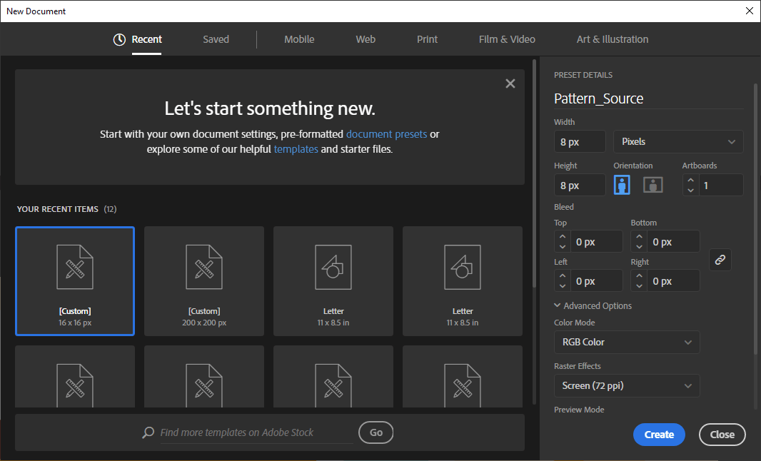
Here’s a new Illustrator document, set to RGB color, with a width of 8 pixels and a height of 8 pixels. Because we are making simple patterns the image can be surprisingly small.
Pattern Making
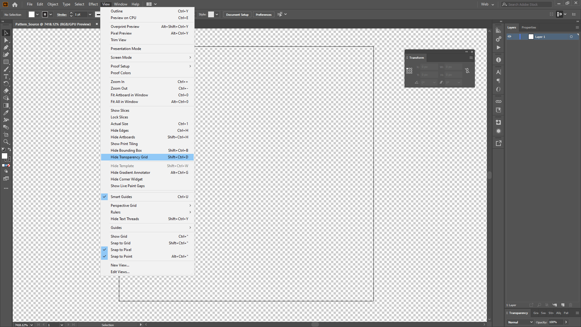
In the Illustrator document, it’s a good idea to turn on the incredibly helpful transparency grid background (oh how I love the transparency grid background), and snap to pixels. Open up the Transform panel too, so it is nice and handy for punching in pixel-perfect widths, heights, x positions and y positions of the elements you draw.
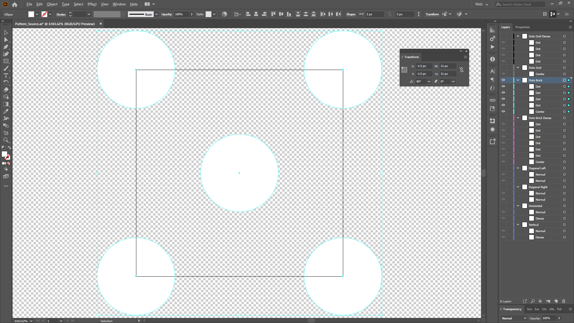
Then add the shapes with the size you want, arranged so that when the resulting image is repeated (tiled) it has a nice uninterrupted continuous pattern. If it’s your first time making repeating patterns, it will take some time for your brain to adapt, but it’s a fun process so hang in there and enjoy the ride.
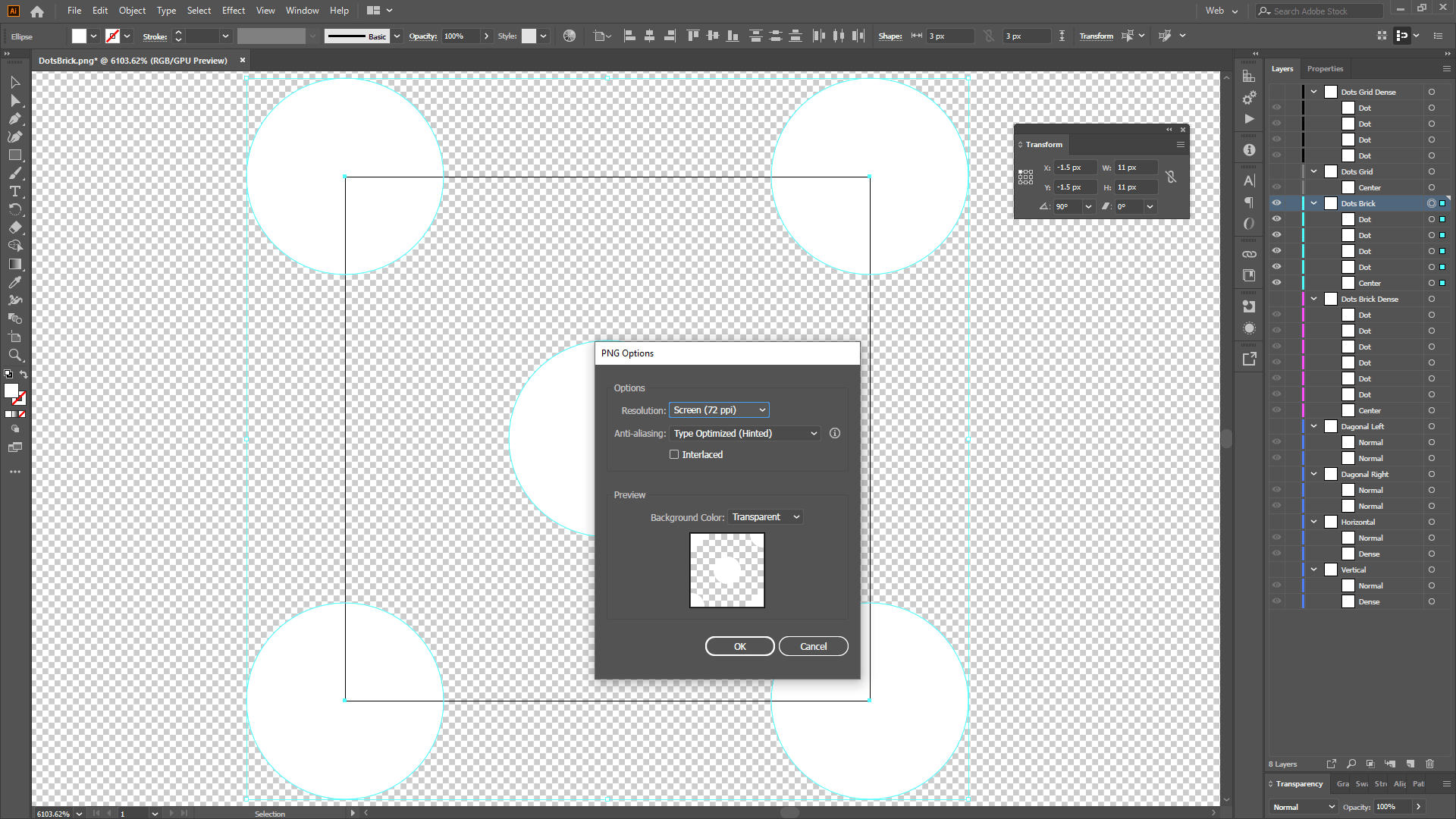
I used the same source document but added a layer for each of my patterns, and just turn layers on and off when it’s time to export. Notice that all the elements are white. This is important because later on in Pro we’ll be able to tint that white to whatever color we want. If it was any other color we’d be stuck with it.
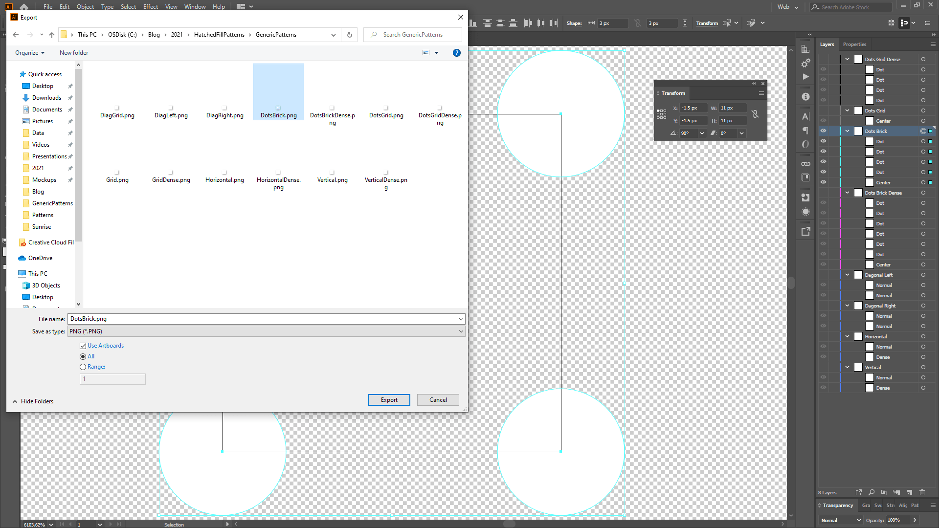
When you like a pattern, export (file, export) it as a PNG. Check the “Use Artboards” option so that it chops the image at the artboard edge (good) rather than resizing to include all of the graphics’ extent (bad).
In the resulting “PNG Options” dialog, choose the “Screen” resolution option (aka for digital displays, not high-res prints) and ensure the background color is “Transparent.”
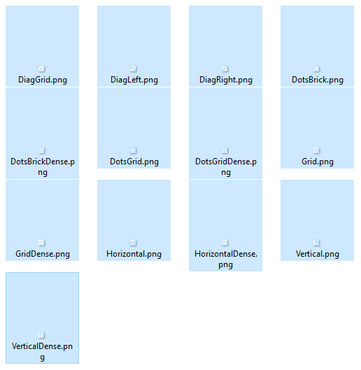
It’s a good idea to have a Pro project open so you can quickly test the appearance of your pattern image. My process was (and always is) really iterative. Here is the set of 13 patterns that I came up with (though many are just simple modifications of the other like horizontal vs vertical or stacks of two patterns like the grids). Aren’t they adorable?
Applying the Pattern to a Pro Fill
So here we are in the Pro symbology panel and there are some big things I want to point out.
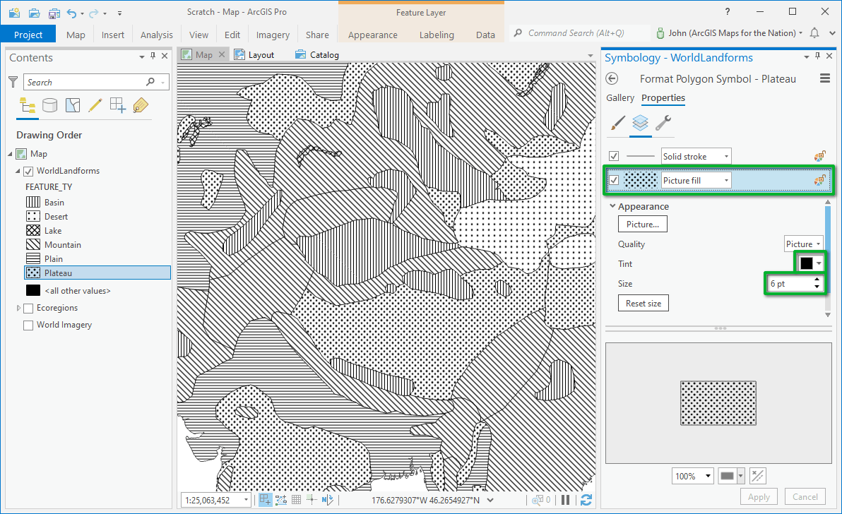
First of all, rather than the “Hatched Fill” fill option (which you would choose under normal circumstances), I’ve set it to “Picture Fill.” Again, this is to accommodate our custom pattern in ArcGIS Online.
Tint
The tint color I set to black (tint turns the whiteness of any image to the color you choose). This is just a preference and you can tint the pattern to whatever color suits you. But since I’m using these hatched fills as an overlay atop another layer, I wanted to stick with white or black.
Points are not Pixels
Ok here’s where it gets weird. Pro symbology works in the “Points” unit. Points are different than Pixels (1 pixel = 0.75 points). Our pattern image has to be a power of two, so we made it 8 pixels by 8 pixels. If I were to set the points size to 8 in the symbology panel, the image would look blurry. I need to calculate what is the equivalent of 8 pixels in points. I know, right? There are all sorts of handy web calculators that will let you convert. I like this one. In order to keep my 8×8 pixel pattern crispy in Pro, I have to set the points to 6.
Here’s a handy little reference if you want to save time.
Pixels Points
2 : 1.5
4 : 3
8 : 6
16 : 12
32 : 24
64 : 48
128 : 96
256 : 192
512 : 384
1024 : 768
Sharing to ArcGIS Online
When your hatched layer is ready to ship to ArcGIS Online, right-click it and share it as a web layer.
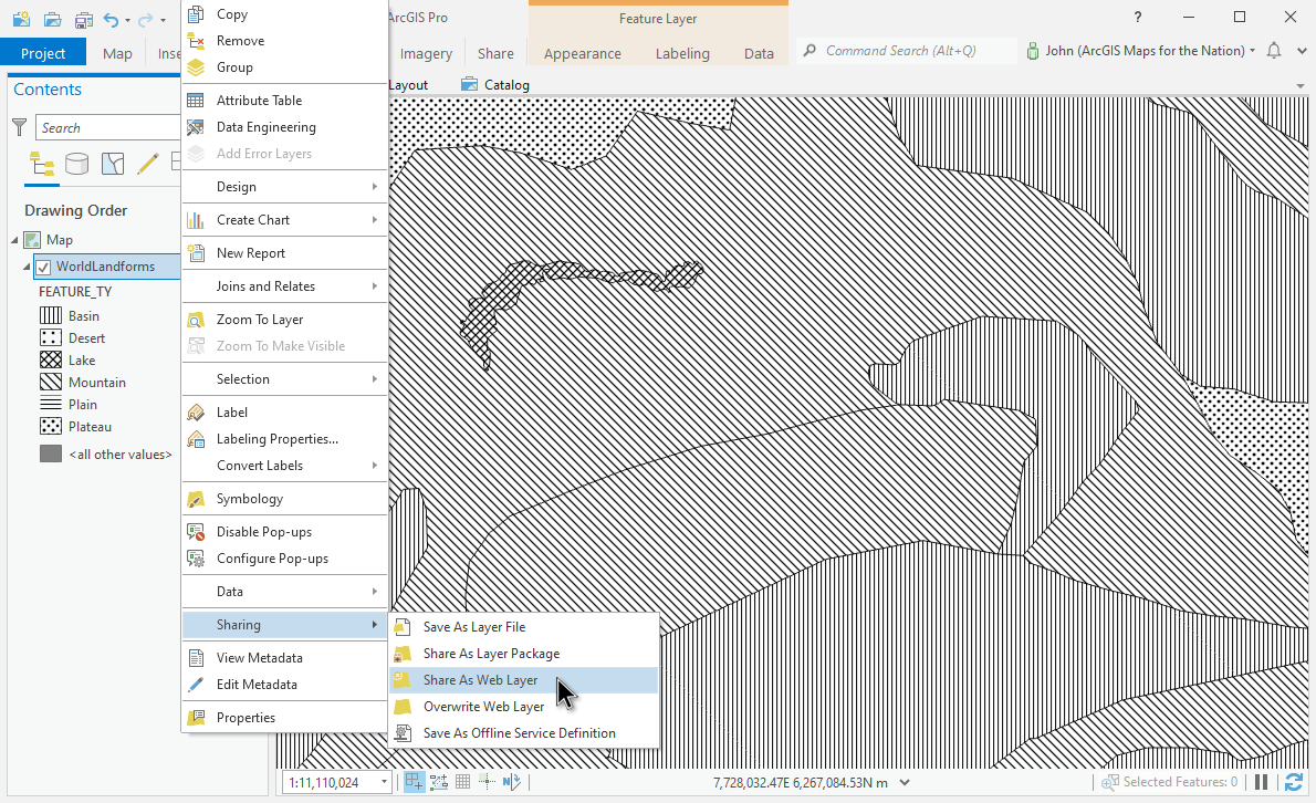
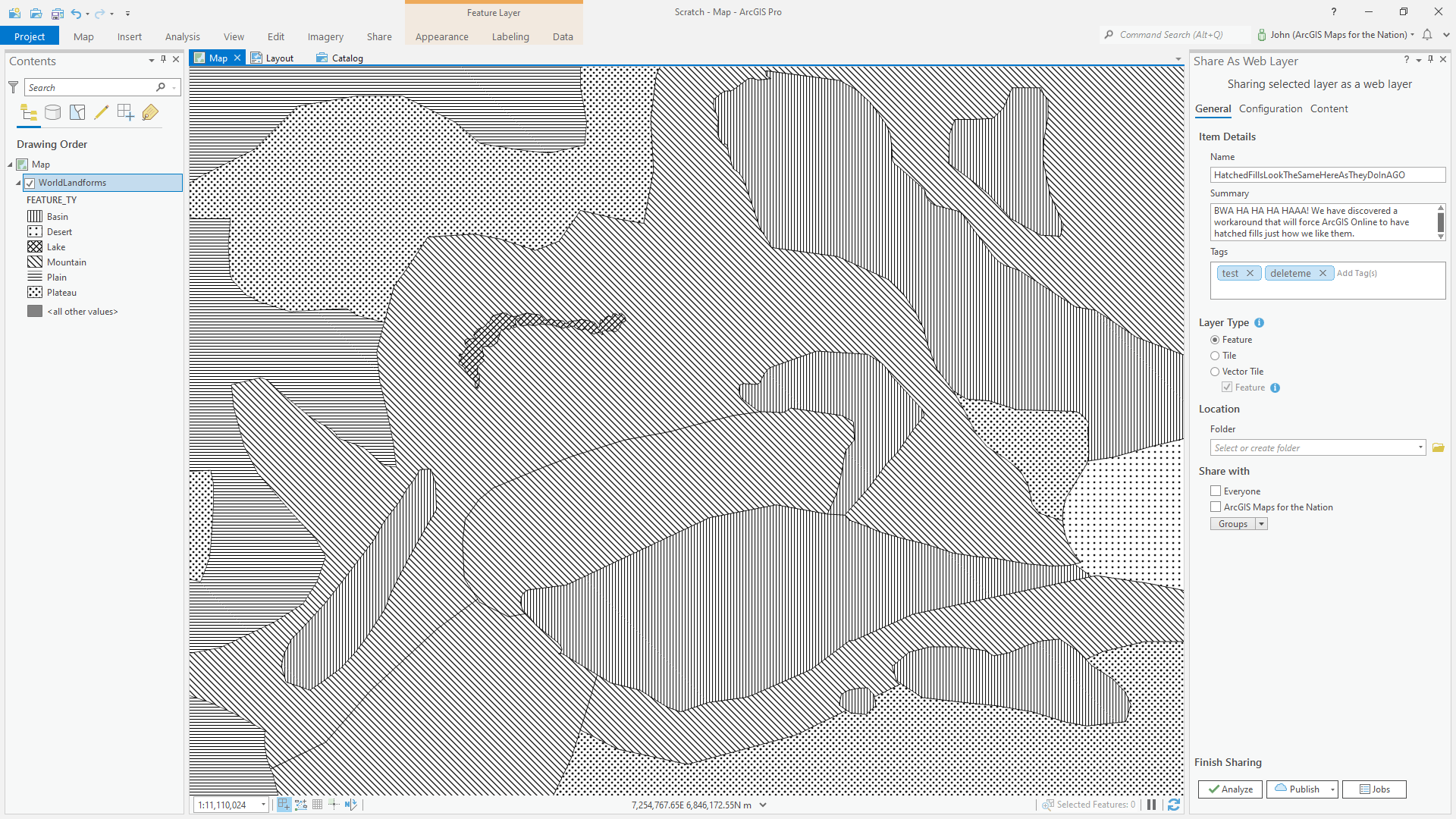
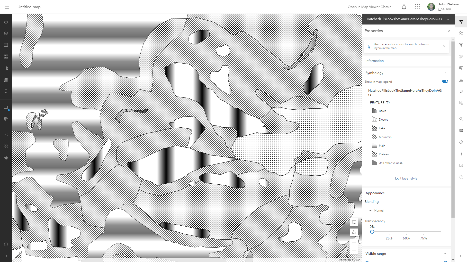
Because we’ve used a picture fill, Online will honor the symbology and you’ll have a faithful representation of it on the interwebs.
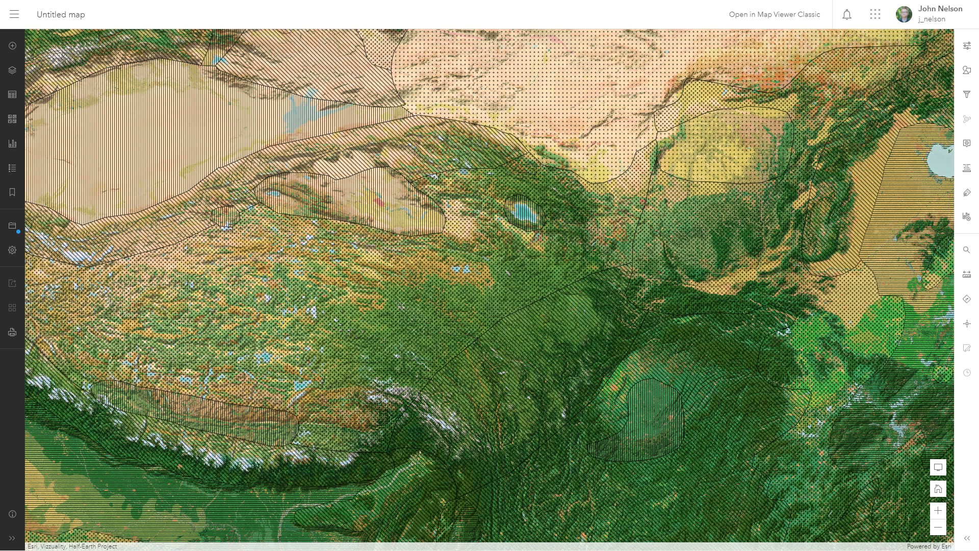
And you can show it in the context of whatever layers or basemap you like. Here it is over the Vibrant basemap.
That’s it! A temporary workaround (this will be obsolete later this fall) for creating hatched pattern fills in ArcGIS Pro that are honored in ArcGIS Online. I hope you give hatching a second thought, whether your map only ever lives in Pro, or whether you need to push some hatched layers up to Online. They are an effective and underused means of adding a visual dimension of data to thematic maps.
Hatchy Mapping!


Thanks for this article, John. Can you give an update on whether we can share maps with hatching from ArcGIS Pro to Online? I employed the hatching layer that you shared, not realizing it would not allow fills from lower layers to show through. I’d really love to be able to employ hatching in a web map to see two attributes at once! Thank you!
hi Elisabeth! good news! the map viewer now lets you apply hatched fills right in the style panel. here’s more info. i’ll also update this post. https://doc.arcgis.com/en/arcgis-online/create-maps/use-style-options-mv.htm
Fantastic! Thank you!