or…
How to Accidentally Learn ArcGIS Pro
or…
A Cartographer’s Crack at the D and I of the DIKW Hierarchy
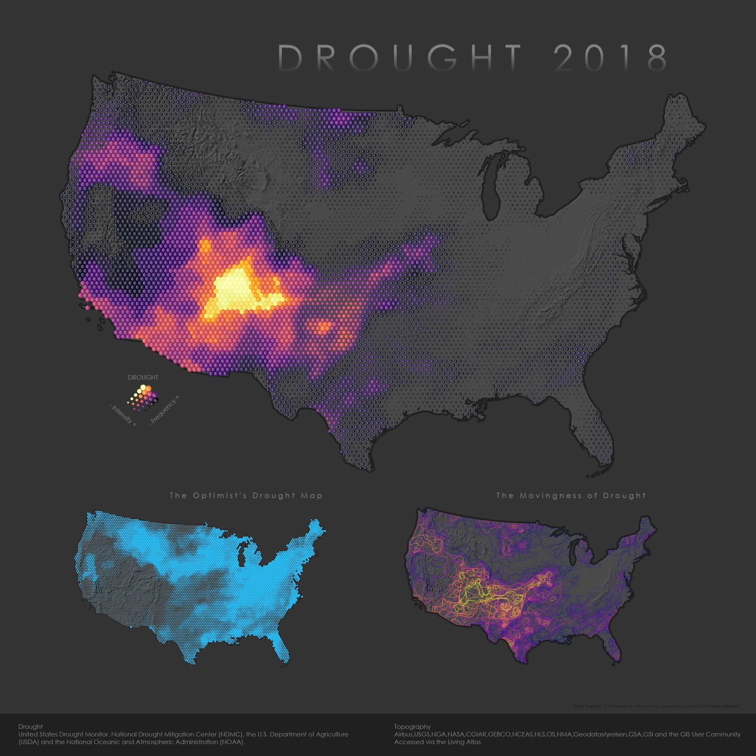
Whatever you want to call it, here is a map showing one year of drought in the contiguous United States….
This is a form of map I’ve made a couple times before. I’ve presented it here as a 4-part how-to series because I think it, more than other things I’ve made, is a tips-and-tricks trojan horse. It is stuffed with sneakily helpful little steps waiting to pour out into your workflow, no matter what your role or what sort of map you are making. Maybe. The only way to know for sure is to hurriedly scroll through this breakout of nuggets to see if something catches your eye.
Part 1, Data Wrangling
0:20 The source data.
1:35 Using a free bulk unzipping tool.
2:40 How to flatten out nested folders to get data all in one folder.
5:00 Merging 52 layers into a single layer.
7:00 Exploring transparency to detect/understand overlapping data.
7:12 Definition Queries to isolate subsets of your data.
8:36 Symbol Layer Drawing to control the order in which features draw.
9:50 Changing the projection.
Part 2, Analysis
0:44 Creating a new field.
1:03 How to calculate a field’s attribute.
1:33 Generating a hexagonal mesh overlay layer (tessellation)
2:40 Using a Spatial Join to push overlapping drought polygon data into a single handy hexagon layer.
3:37 Using graduated symbology on a polygon layer.
4:56 Hiding superfluous data with a Definition Query.
5:29 Creating a bivariate map (smashing two visualization methods into the same layer) with Vary Symbol by Attribute.
Part 3: More Interesting Symbology Stuff
0:48 Adding data layers from the Living Atlas.
1:05 Modifying the color scheme of an image.
1:39 Formatting a symbol template, duplicating and styling symbol layers (I do this too fast in the video; here’s a more reasonable how-to).
3:58 Hacking a dropshadow effect with semi-transparent, and offset, outlines.
4:00 Using the Catalog to duplicate a map (instead of making one from scratch).
5:16 Creating a new field (that I will use to hide features), and calculating its attributes.
6:04 Select by Location.
6:30 Calculating fields only for selected features.
6:53 Hiding features once again (instead of deleting them), using a Definition Query.
7:36 Applying thematic symbology to outlines instead of fills.
8:18 Formatting all symbols in a layer at once instead of by each range.
8:35 Controlling what features draw on top of others with Symbol Layer Drawing.
Part 4, Creating and Dominating a Layout
0:10 Creating a new Layout.
0:16 Modifying a layout’s dimensions.
0:22 Inserting maps into a layout.
1:05 Activating a Map Frame so we can change the map’s location.
1:30 Setting the Reference Scale for a map in a layout.
2:25 Duplicating a Map Frame and changing which map it points to (instead of starting from scratch).
3:00 How to set the same scale for multiple Map Frames.
3:50 Adding Text to a layout and styling it.
5:02 How to take control of the default “service layer credits” text that come with your map frames (credits for the basemap).
5:23 Adding and styling shapes, like a rectangle background for credits.
6:38 Using the Ctrl key and arrows to fine-tune the placement of stuff in a layout, general layout arranging.
8:42 Creating a legend manually! This includes saving a map symbol to a re-usable style (8:50), Inserting a point shape and using that saved symbol (9:05), copy/pasting the point symbol into the arrangement I need (9:18), selecting multiple point symbols and changing their color (9:37), selecting multiple point symbols and changing their size (10:26).
11:15 Exporting the layout (I like PNG) so you can blast the world with your wonderful exciting work!
Congratulations!
And that’s it! We did it! We turned a large-ish heap of wonderful data into an information product! Now we can drag our human eyeballs over this and make some observations and feel really good about ourselves.
…but that’s just the first half. The second half is the weird hard part.
Data > Information > Knowledge > Wisdom
Our jobs, in some form or another, are all wrapped into this flow, above. We ladle in Data, the most abstract entity describing some impossibly specific aspect of our universe, full of potential and secrets. We blow the dust off of it to search for that magical intersection of an inherent structure revealed in a form that our cognitive systems can process as Information. We internalize that information and distill it into gratifying statements of fact that grow around our best attempt at descriptions of truth printed collated and bound as Knowledge. But then what? So we know something, big deal. Wisdom is the intrinsic understanding that knowledge itself is impotent and the recognition that the knowledge we do possess is not enough. Thereafter is a standing invitation to allow it to roll through our actions and guide our efforts in a kinetic sense, and to return to the world with fresh ideas for scooping up new pools of data and diving into them with better and new questions.
The first two steps along the DIKW flow are questions we ask of our world. The second two are questions we ask of ourselves.
There’s joy in the asking! John

Commenting is not enabled for this article.