The journeys of animals are so fascinating to me. The expertise with which they navigate, sometimes migrating thousands of kilometres, never ceases to amaze me. Thanks to the advances in GPS tracking technology, we can get a glimpse into their movements and start to understand where they migrate and the challenges they face along the way.
In this blog, I’ll discuss how we made the map-based animations for the story, Aerial Odyssey: bird migration in the Americas.
The story is a companion to the National Audubon Society’s data-rich Bird Migration Explorer and tells the migratory story of a Swainson’s Hawk named Diego through animated maps. In our case, we used the GPS tracks of migrating birds to take the reader along on the migration. Animated maps of this sort can be an effective storytelling tool. Using animation to guide readers through a dataset, show changes over time, and visually engage audiences can help create more memorable stories. We use Diego’s migration route to drive the story’s narrative, but this animation workflow could embellish similar animated movements throughout your stories.

Storyboarding
The first step in this project was planning. Animated maps can be stunning and memorable visuals, but they often require more work. Thinking about how the animations fit within the story can help prevent costly revisions later in the animation phase. For this project, we knew the animation would be implemented within a sidecar block of ArcGIS StoryMaps, so we choreographed a storyboard for each sequence to visualize ideas, plan the pacing, and understand how the animation would support the narrative. This planning helped to understand map movements, layer visibility, and important annotations.

Knowing these details upfront also helped with constructing the map project; layers that would need to be visible together could be grouped and those that would be toggled individually could be isolated. This level of planning helped guide the creation of the map document and structure the layer list in an organized fashion.
The map
Having planned and organized our concepts, the next step was to create the map. Using ArcGIS Pro, I assembled a basemap with various contextual layers. Datasets depicting terrain, populated places, and administrative boundaries were compiled in the map. The basemap is kept muted to match the story’s design and allow greater focus and saturation for the migration path layers.

Data preparation
The data layer provided for the story consisted of track data for Diego over the full course of his annual migration. This linear dataset delineated weekly segments representing the aggregated movements recorded by the GPS tracker. Each segment was described with temporal attributes, unique identifiers, and species information. These track segments were too detailed for the purpose of animation, so I created a new layer using the Dissolve tool. This tool connected all the weekly segments into one continuous feature. Geoprocessing removed the datestamp attributes from the output, but the original segments were retained and labelled on the map as reference. These labels would help me to manually annotate the animation later.

Illustrator import
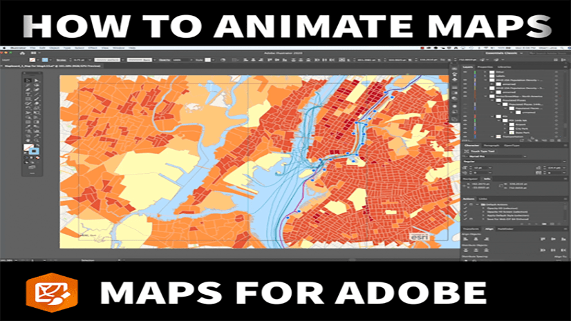
We then exported the basemap from ArcGIS Pro as an AIX file and opened in Illustrator using ArcGIS Maps for Adobe Creative Cloud. Some minor cartographic revisions were made in Illustrator to customize label halos. Of course, you could spend lots of time in Illustrator further sculpting your cartographic masterpiece but our basemap was straightforward, so the Illustrator file was simply saved.
Cartography animated
We now ventured beyond the usual cartographic tools and into the world of motion graphics and animation. The final output of the animation process would be a sequence of choreographed map movements and layer visibility changes that would be exported as a series of animated GIF files.
To start, we created a new 1920px by 1080px composition in Adobe After Effects and imported our Illustrator file. This import brought in all our individual Illustrator layers as separate objects; the time spent organizing and grouping data layers earlier really pays off!

Moving the map
However, all these imported layers no longer have spatial properties in After Effects. Therefore, we needed to keep them properly located in relation to each other. I used the null object feature in After Effects to maintain proper positioning of the layers. Null objects are invisible layers in After Effects that can be used to control properties, including location and scale, of any related layers. Relating all the layers of our basemap to a null object meant that we could efficiently control map movements by moving the single null object.

Traversing the flight path
For those just wading into the world of map animations, keyframes are an essential concept to understand. Keyframes are markers that can be placed throughout your animation and control various properties of the layers within your project. Properties such as transparency, position, scale, and many more can be keyframed at a specific point in time within your animation. These properties can also be keyframed with different values at different times in your animation and value of the property will be interpolated between the keyframes. In this way, the property gradually changes in each frame and achieves an animated image.

In our project, the GPS track of the Swainson’s Hawk was the driving force of the narrative and would be the primary subject of animation. To accomplish the progressive rendering of the track we used the dissolved GPS feature created earlier. Since some effects cannot be readily applied to features within imported Illustrator layers, we converted the dissolved GPS track to a shape layer. From here we applied a Trim Paths effect on the new shape layer.

The trim paths effect is keyframed to initially clip the length of the path to 0% at the beginning of the animation and then reveal more of the feature as the animation progresses until 100% is achieved at the end of the animation. This method is effective at conveying the sense of movement and gradually tracing the path of the hawk as the reader scrolls through the story.
In addition to the route feature, we aimed to provided context using the datestamps from the original data. These subtle annotations provided context to the animation and indicated where and when the hawk was along its migratory journey. The labels were manually placed within the map and were animated to appear as the GPS track passed through the location.

Rendering the animations
Once completely animated, we exported the composition using Adobe Media Encoder. This export step is where the various legs of the journey were rendered as separate sequences. The output series of GIFs would be choreographed when imported into the story. The result is a cinematic experience as the reader scrolls.
In the export dialog of Media Encoder, we used frame numbers and time points to carefully trim the composition into the various legs of the journey. Great attention was paid here to ensure that the start and end of each rendered output aligned with adjacent animations so that transitions would be seamless.
Building the story
The final step was to import these rendered animations into the story. A sidecar block was created using each of the sequential animations. The result was an immersive section of the story where the animated path advances the story through each leg of the journey.

Banner photo by Gary Bendig on Unsplash


Article Discussion: