Maps have always been about describing location, examining data, and telling a story. As ArcGIS users, we’re fortunate to be able to enhance our storytelling of GIS data in ways that weren’t possible before. While 2D will always enable us to create compelling stories about location, 3D and emerging interactive technologies are now enabling us to bring our data to a wider audience.
The use of game engines like Unreal and Unity with the ArcGIS Maps SDK for game engines enables you to compile your data into an immersive, interactive, and often photorealistic environment. And with the ability to author and visualize complex 3D data in ArcGIS, we can now mirror locations that immediately become recognizable to our audience. CityEngine provides procedural modeling for cities and urban regions. ArcGIS Pro enables us to consume these, visualize BIM models, Lidar, I3S, and many other complex data types in 3D.
These workflows of digital representations are now culminating into projects of need for digital twins, architecture, and synthetic environment generation. And they are often huge projects. Projects ranging from Singapore’s integrated map system, called OneMap, to the U.S. Army’s Synthetic Training Environment (STE).
The overall scope for 3D is growing exponentially, and so is our appetite to emulate our world with detail that is compelling and real.
This post will highlight some ways you can enhance a 3D scene using ArcGIS. Tricks often employed by game developers like billboarded clouds and even ArcGIS’s robust lighting will be a few of the highlighted ways that can help you develop more immersive 3D content for your GIS data.
Really, it’s all about eyeballs. Getting our data out to a larger audience often has as much to do with the delivery as the information itself. GIS data is incredibly valuable. 3D and new emerging immersive technology is just another tool to create a story that attracts a wider audience. Such as, enabling our audience to not only be able to view their building from above, but also letting them explore it in 3D. To walk the hallways, analyze the sunlight passing through the windows, and explore how large pedestrian movement is handled by the corridors. And we can do this by combining the power of visualization with delivery platforms like stereo display, VR, and AR.
As ArcGIS users, we now have a variety of tools at our disposal that enable us to tell stories about GIS with technology utilized by AAA games and films. But the key is how we, as cartographers and GIS technologists, use these tools. It’s not enough to consume and view the data in 3D, but we need to massage it to look it’s best. After all, just as we take pride in perfecting the accuracy of our data, we need to make sure we show it in it’s best light. And while things like ArcGIS’s ability to perform physically based rendering (PBR) or ambient occlusion enhances our capability to view our data, we need to be cognizant of the same workflows used across other industries for visualization.
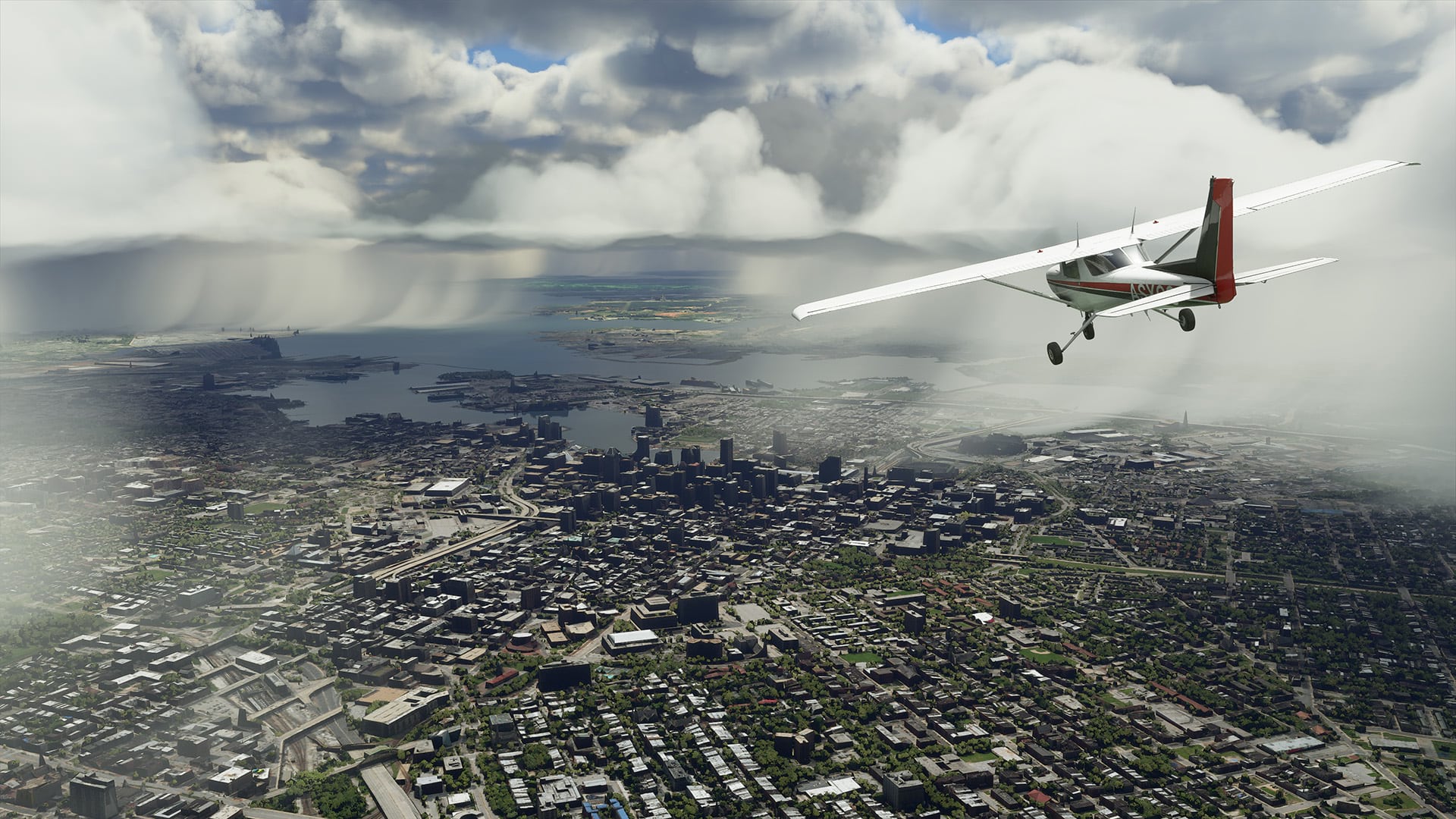
Microsoft Flight Simulator’s latest release (2020) shows off the power of high definition terrains populated with buildings and vegetation. Microsoft’s Flight Simulator’s use of high end visuals, like volumetric clouds and advanced shaders, enhance immersion and the overall believability of the experience. In fact, it’s done so well, many stills from the game almost replicate a photograph.
3D scenes can be immediately more visually engaging with reflections. As shown above, water in ArcGIS Pro has realistic variations of movement and reflectivity. This added ability to visualize your content in ArcGIS Pro adds to the immersion of your 3D map.
ArcGIS helps you tell a compelling story in 3D
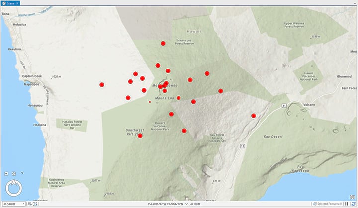
Visualizing maps in 3D is relatively new for most of us. Presenting your data in 2D poses its own set of challenges. How do you symbolize it? How do you describe regions and clumping? All these questions and more need to be answered in 3D as well.
The spatial complexities of your data in 3D are hard to simplify. For the average person viewing 3D, it might be difficult to understand the data. A couple hundred points on a 2D map is vastly different to look at than 3D, and it requires a unique approach.
Art direct your data
If you’ve spent countless hours preparing data and compiling your research material to tell a story, it’s important to take the time in displaying it properly.
Working as a visual database engineer building a defense simulator some 20 years ago was an education for me on the importance of melding the artistic sensibilities of an art director with the precise accuracy of engineers, scientists, and GIS professionals. For trainees, enhancing their tactical execution on a simulator required perfect accuracy of terrains and physical dynamics.
Immersion through photorealism was almost as vital as the data itself. This culmination of art and technology ultimately lead to a more immersive experience for the trainee. And this workflow has been further extended today with the use of the Microsoft HoloLens for the IVAS and other wearable technology that is currently being rolled up into the modeling and simulation community.
This ultimately means taking your data and displaying it in a compelling and engaging way. Let’s look at some methods to enhance your data in 3D using ArcGIS and other tools.
I3S, Scanned Meshes, and large textured urban footprints
Esri’s Indexed 3D Scene Layers (I3S) provides you with the ability to consume urban environments from scans with realism, 3D points, and 3D objects. Consuming these meshes into your 3D scene has never been easier. Not only does I3S let you consume very complex urban environments at a high level of precision, it’s often textured with realism. A detailed textured urban environment immediately enhances the terrain by placing recognizable landmarks, streets, and buildings.
If you’re not consuming a scanned mesh, creating realistic urban environments can be both time consuming and complicated. CityEngine does make procedural generation of urban areas easier. But large textured city meshes acquired via scanning workflows let’s all of us utilize realistic urban environments easily.
“An I3S data set, also referred to as a scene layer, can be streamed over the web or it can be viewed locally as large packages of content. ArcGIS Pro and ArcGIS Earth both consume scene layers either as services or as local scene layer package (SLPK) files. The Scene Viewer in ArcGIS Online and ArcGIS Enterprise is Esri’s WebGL 3D viewer and can consume I3S services coming from anywhere. In fact a huge benefit of the Scene Viewer and other Esri experiences is that they are built to consume a wide variety of open and Esri formats, all of which can be viewed together in the same experience.” – learn more about I3S
Use ArcGIS StoryMaps to tell a story with 2D, 3D, and articles
ArcGIS StoryMaps are probably one of the most effective ways to pull together a story that requires complex analysis of data. With ArcGIS StoryMaps, you can comingle 2D, 3D, and text into one cohesive experience.
StoryMaps is a powerful way to create a single online experience that shows 3D in context with descriptive writing, images, and much more. And it enables you to publish all of it as one single easy to navigate webpage.
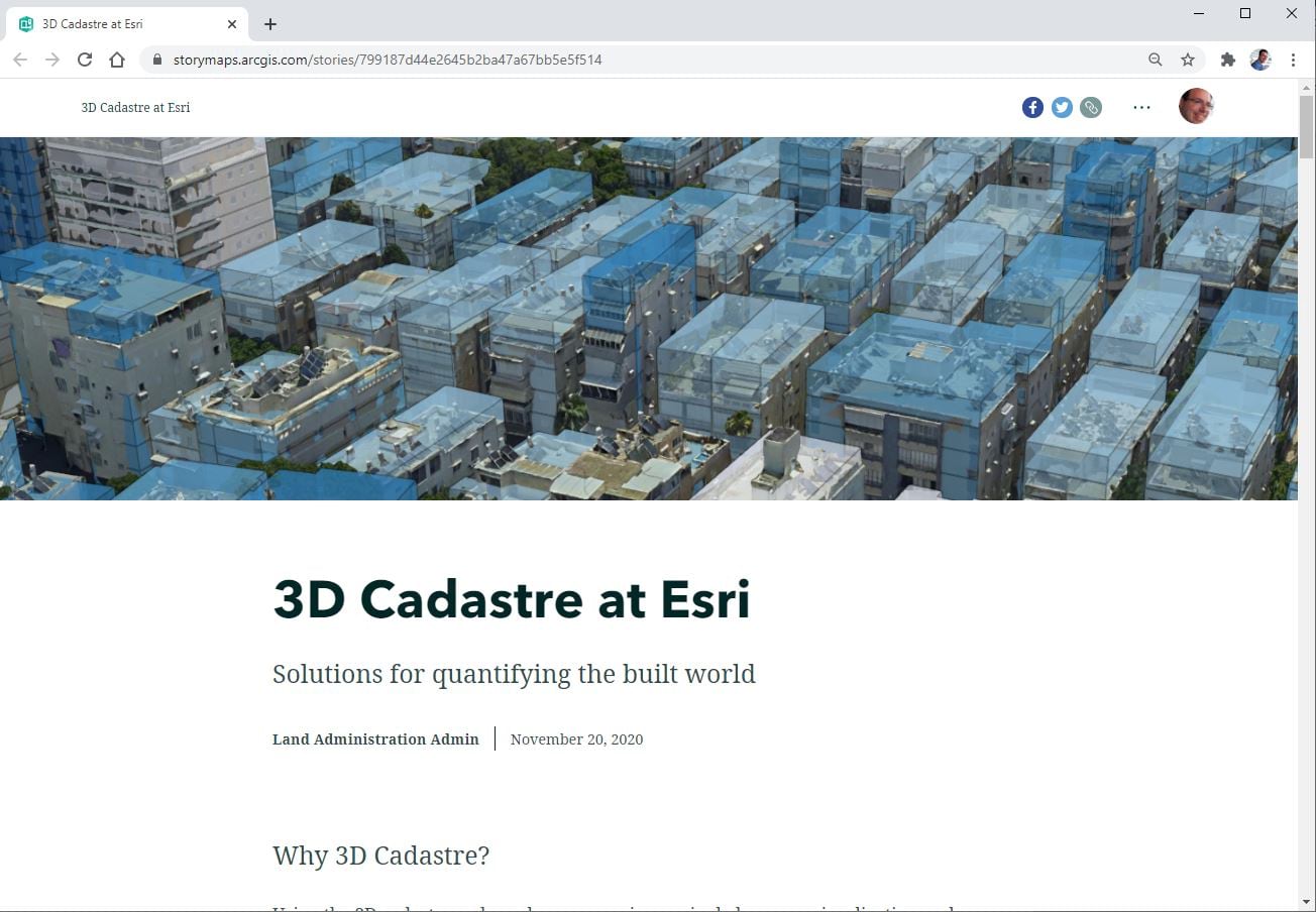
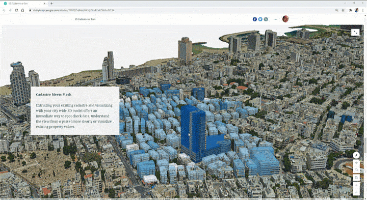
View the 3D Cadastre StoryMap here
Not only can you embed 3D into a webpage with StoryMaps, but viewers of your StoryMap can navigate the 3D freely to explore the data at their own will. This is an incredibly powerful way to take a complex 3D map and let your users interact and further understand it through their own exploration.
Call attention to important data with realistic texturing
There is a time and place for the use of textured data. While textured meshes help with realism and immersion, it can often be overwhelming to look at. Therefore, it’s important to use textured meshes to highlight areas of interest.
If your data is dense, textured meshes can often call attention to significant areas of interest. Use of textured meshes can not only improve realism, but a well textured 3D Marker will also drive your audience to the area of interest.
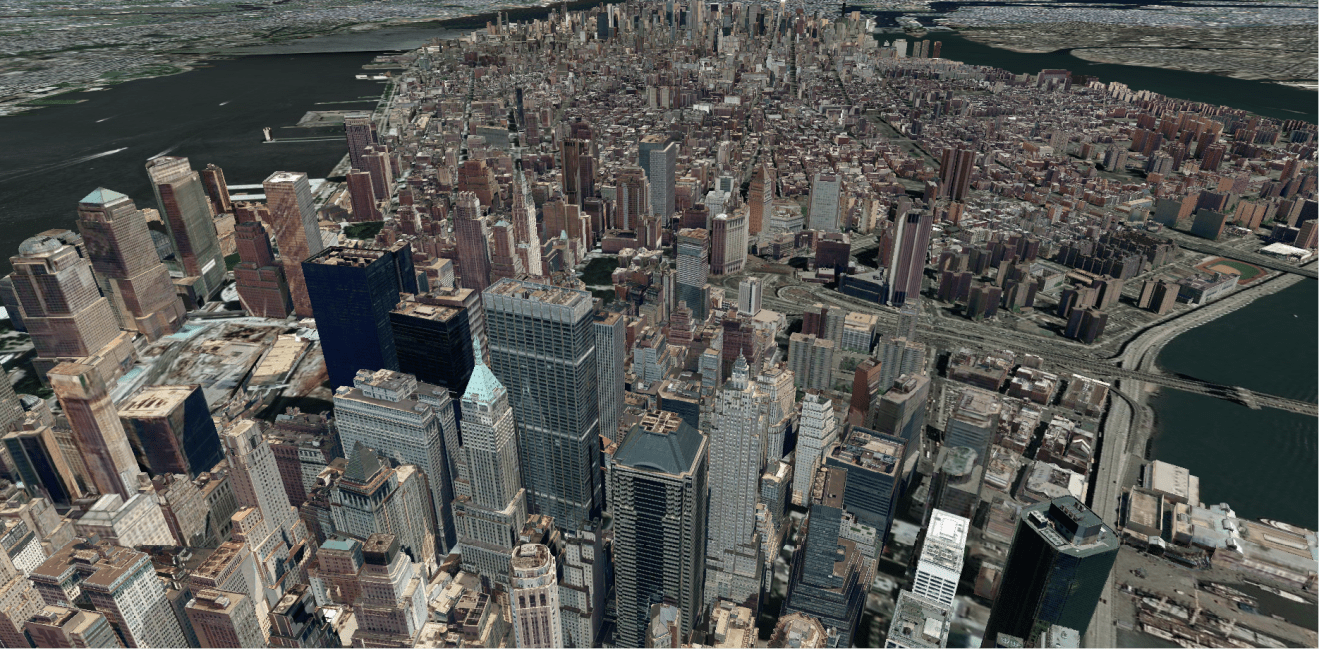
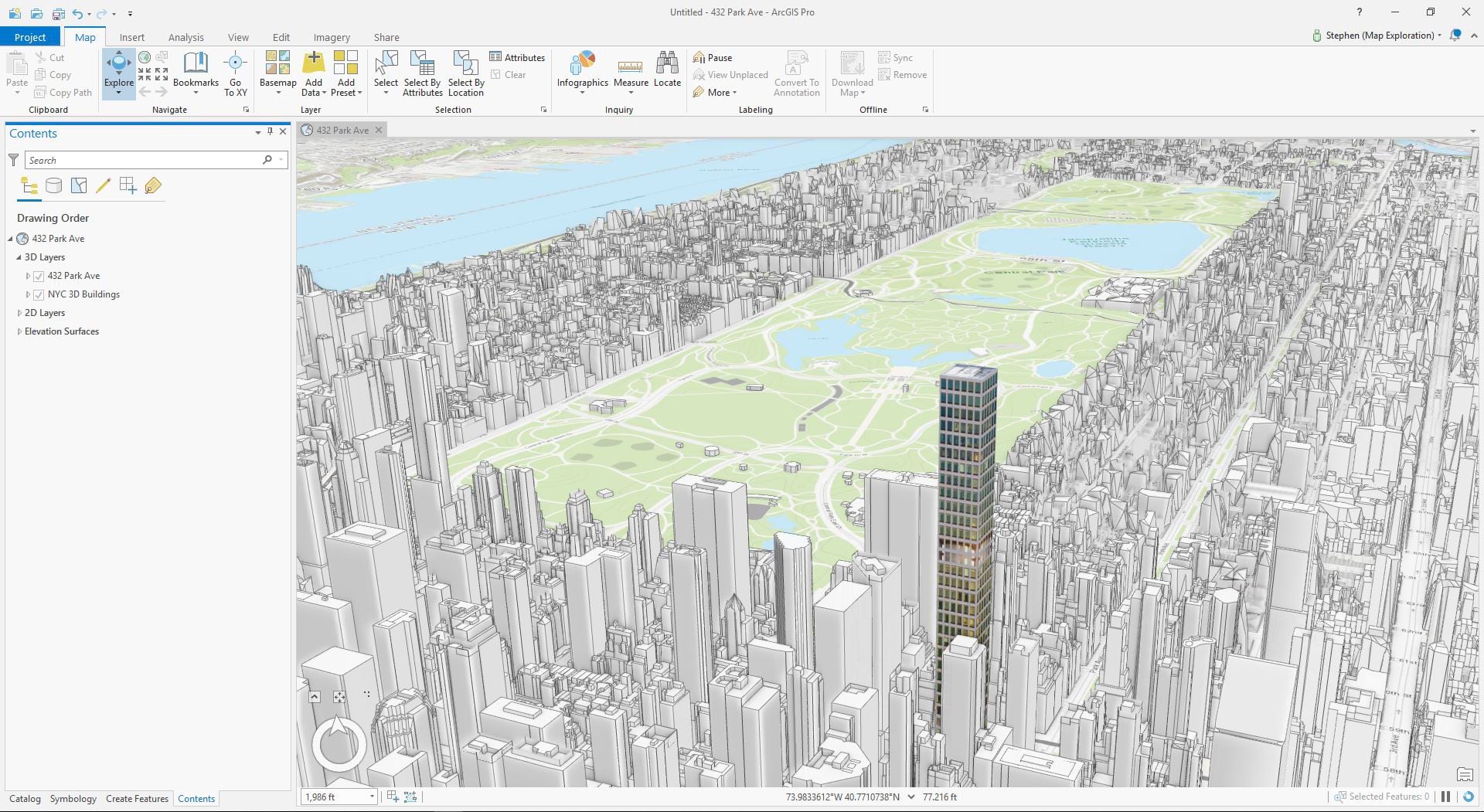
In the example image below, the audience would have a very difficult time isolating the building of interest if all of New York City’s buildings were textured. 432 Park is the only textured building in this example, and this isolates it for the audience and provides focus for any story or further analysis.
Physically Based Rendering
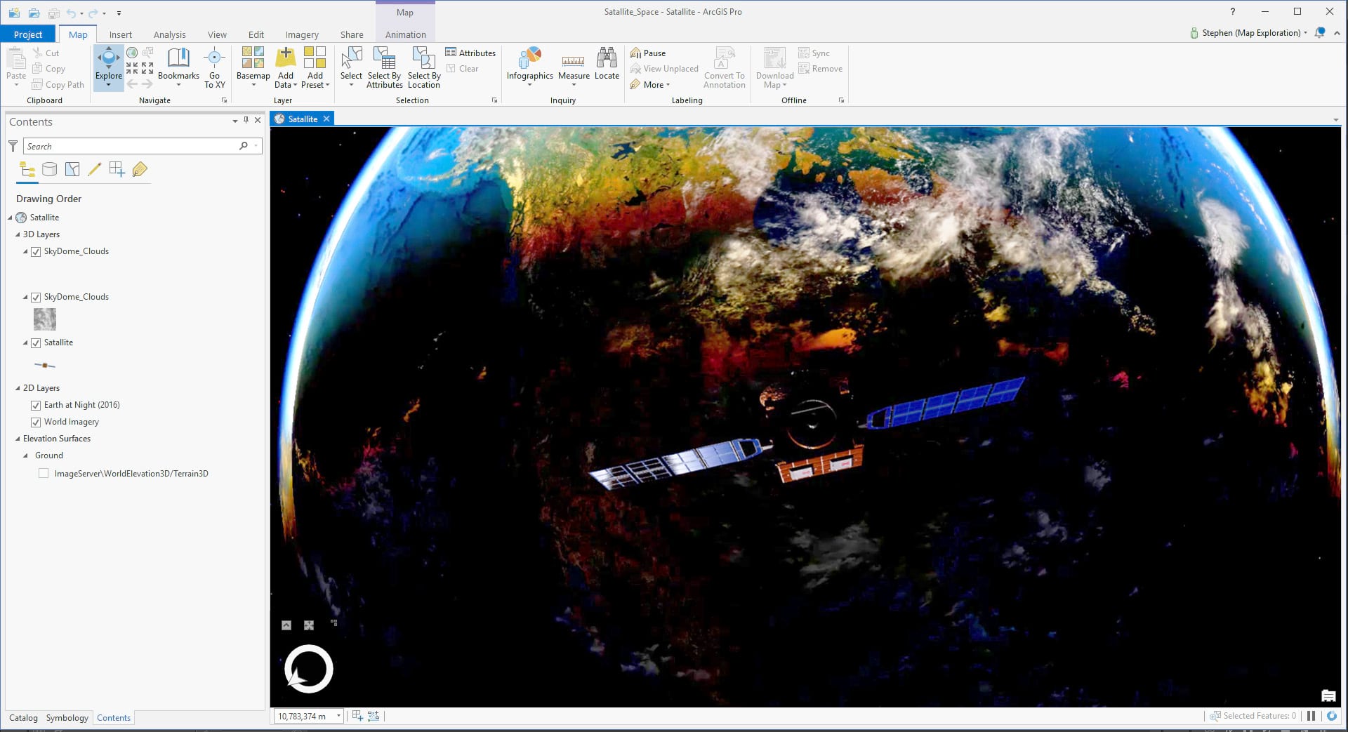
Materials or surface properties of your 3D content is important. Whether your trying to create a photorealistic look or enhance the look of your symbology, it’s important to use some techniques now available in ArcGIS. For example, ArcGIS Pro and CityEngine provide you with the ability to consume PBR (Physically Based Rendering) materials. This means you can author realistic surfaces like brick or glass in a tool like Substance Painter or Blender, and you can consume them with most of their qualities of advanced display. Things like specular highlights, reflectivity, and even bump maps will enhance the way your 3D content looks. And PBR materials will ultimately enable your scenes to be more detailed and immersive.
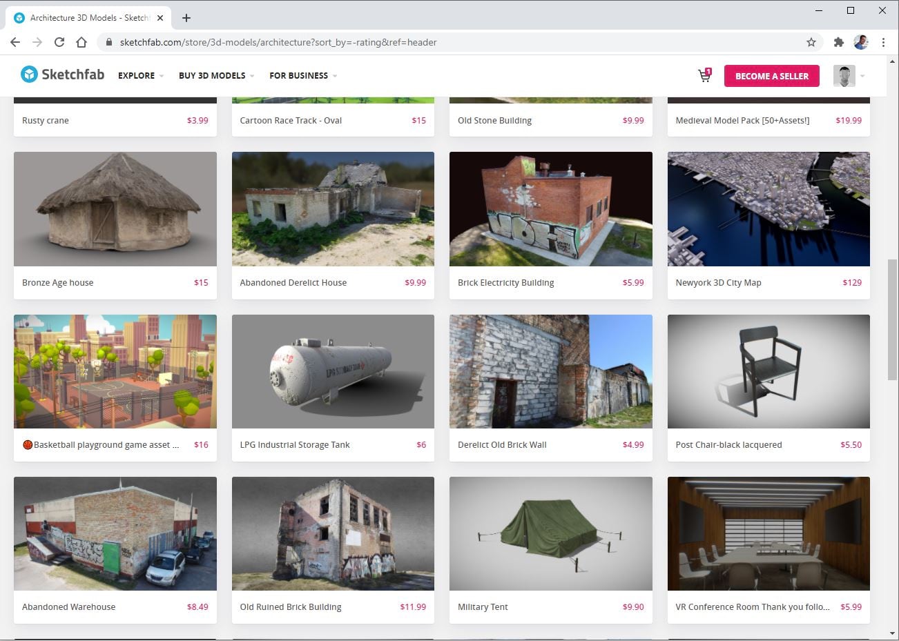
Lastly, if you aren’t comfortable creating 3D content by using modeling and surfacing workflows, you can still utilize symbology that contain PBR materials. There are several resources for content that contain quality PBR models for free or for purchase. Sketchfab is one of the fastest growing 3D marketplaces, and I’d recommend looking there for quality content.
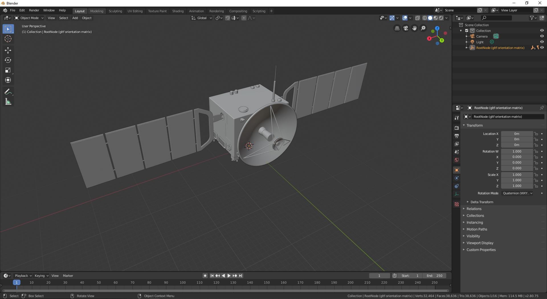
Unreal and Unity both provide their own marketplaces, although much of their content is catered for their respective game engines. ArcGIS does consume many popular formats though, and you should have no problem finding surfaced models that can be consumed across the platform. glTF or GLB is probably the easiest formats to consume that have both PBR surfaces and provide consistency within ArcGIS for rendering of models. Both these formats can be downloaded on Sketchfab.
What’s the difference between glTF and GLB?
glTF contains the model and texture files separate, and the GLB file contains the model and textures as a single file. What this means? GLB, when available, has less that can go wrong when consuming it. Although if you want to edit the materials, you’ll need the glTF to get access to the necessary texture files.
Using Blender, GIMP, and 3rd-Party 3D authoring applications with ArcGIS
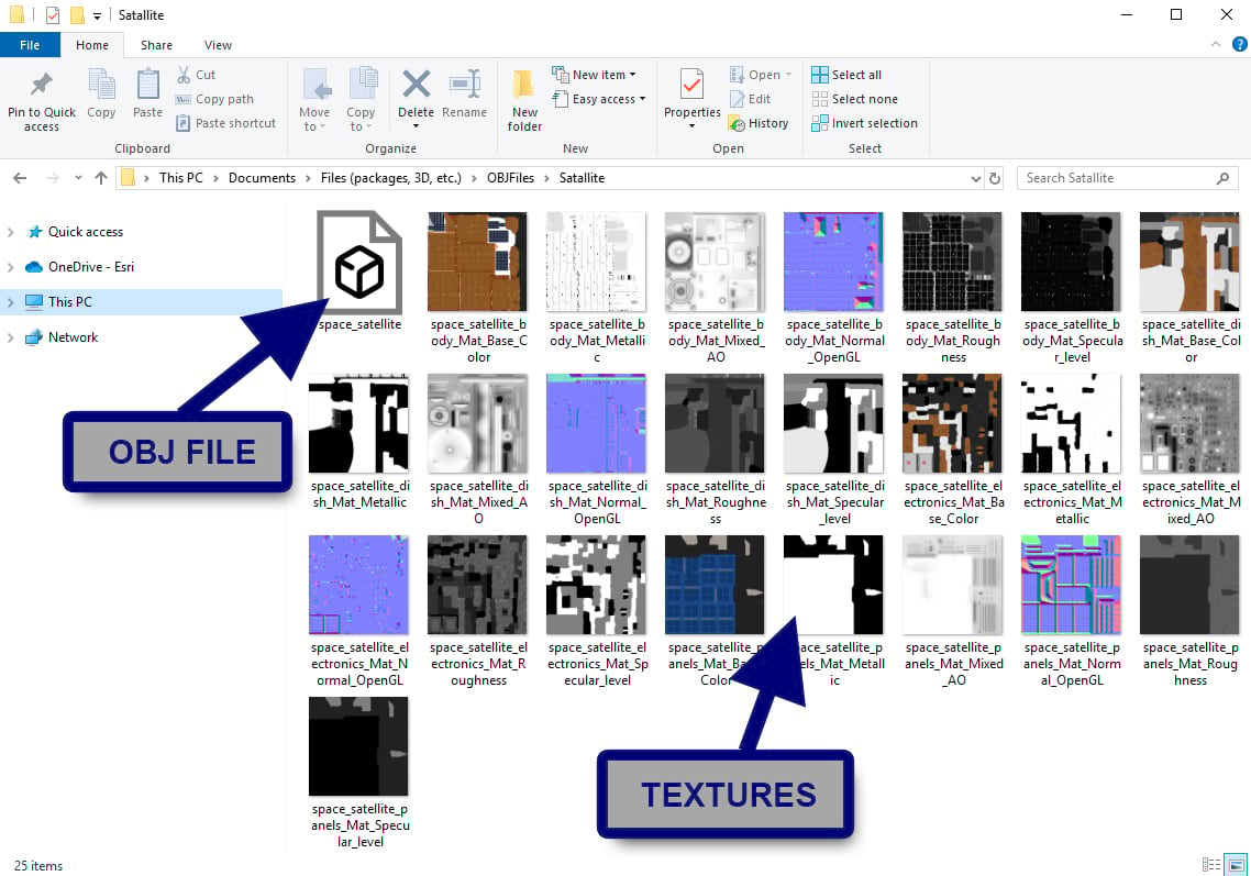
Converting industry standard formats, like OBJ or DAE, into a glTF or GLB file is relatively easy. Blender is my current go-to for conversion into glTF, although numerous 3D modeling applications are implementing plugins for the file format.
Blender is a popular and opensource application you can download for free. It not only will let you perform almost any modeling or surfacing workflow, but it’s a great tool to perform conversion of files. Both glTF and GLB is supported in Blender’s most recent version.
Blender can be downloaded here: https://www.blender.org/download/
Another method to convert a model is using Sketchfab. It isn’t a conventional method, although I’ve done it a few times and it works well. This is a good method for generating glTF models for symbology. Sketchfab does limit it’s uploads to 50mb, so the limitation will most likely exclude heavy models like terrain or photogrammetry.
Once again, Sketchfab is a huge and growing marketplace for 3D content, and it can consume many common file formats. Sketchfab can consume a number of formats, although the recommended file formats include:
- .obj (Alias Wavefront)
- .blend (Blender)
- .fbx (Autodesk Filmbox)
To make a conversion, set up an account and upload a model through the online portal. If your uploading a mesh with the textures, Sketchfab suggests you upload a Zip file containing all the files. So for example, if your uploading an OBJ with its relevant textures, you would have the OBJ and its associated textures contained in the ZIP file.
Use the power of Symbology
The ability to layer various 3D meshes and 2D images into one cohesive symbol is powerful. And while there is a lot of variety to the symbol library provided in ArcGIS, you can also customize various symbols that will display your data in a more descriptive and compelling way.
Once again, the use of billboarding 2D images is powerful. While 3D symbols are great, the ability to create smooth gradients and glows with a Picture Marker will often yield nicer results. Tie this in with varied scale and intensity, and you’ll have a symbol that communicates several things at a glance.
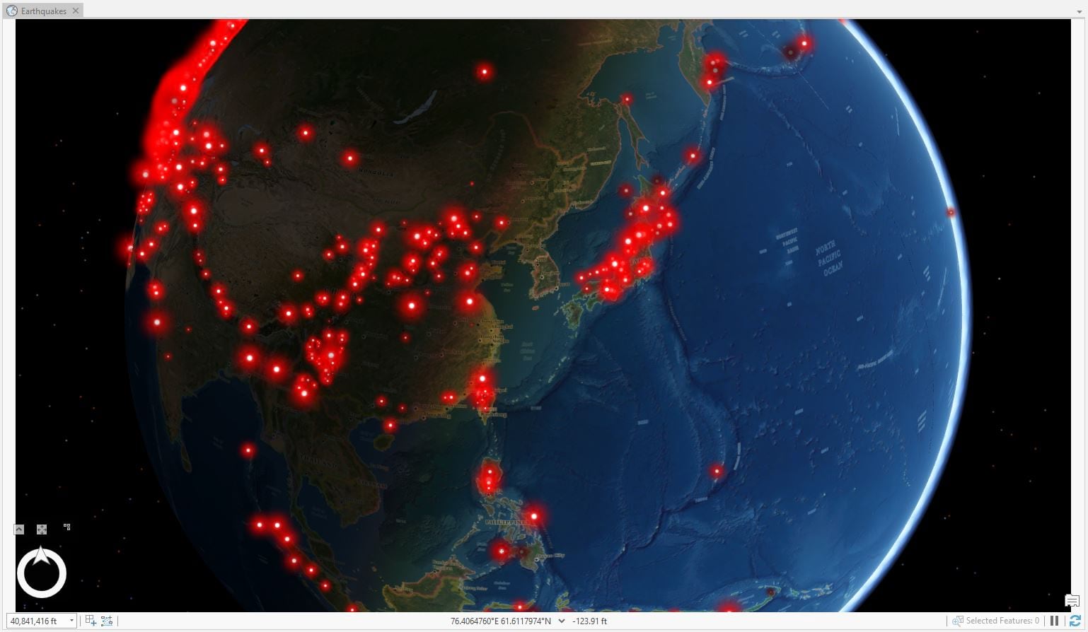
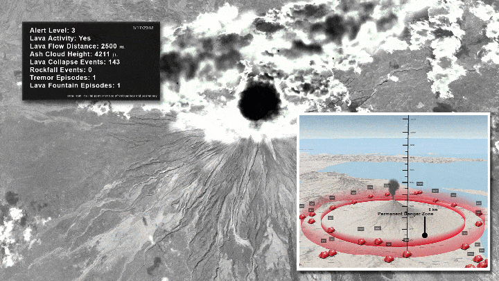
In the image below, the Ring of Fire is clearly highlighted by the symbology used. And while the red glowing balls show intensity through scale, the earthquake Richter scale is indicated by infusing an intensity map (or gradient).
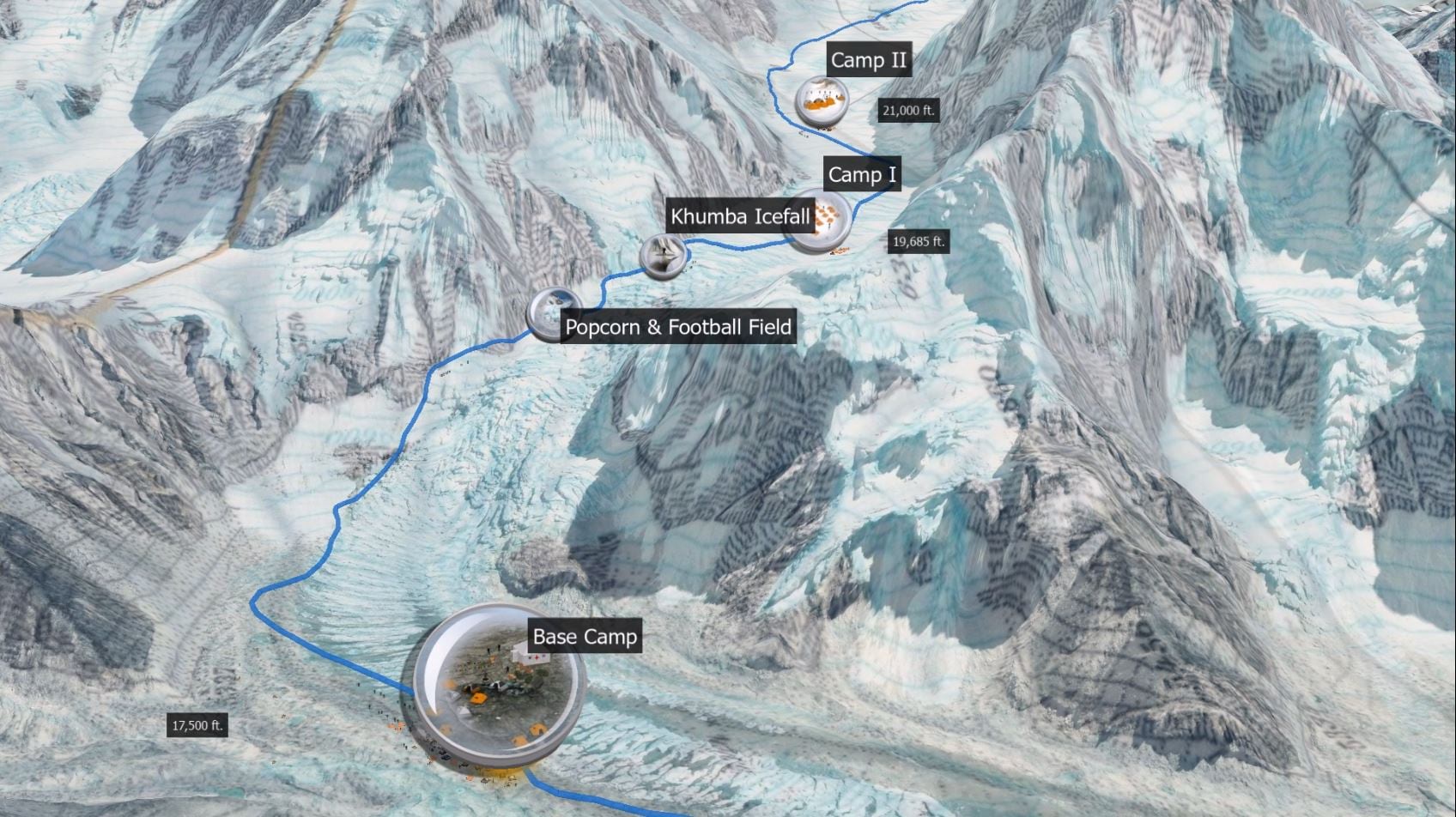
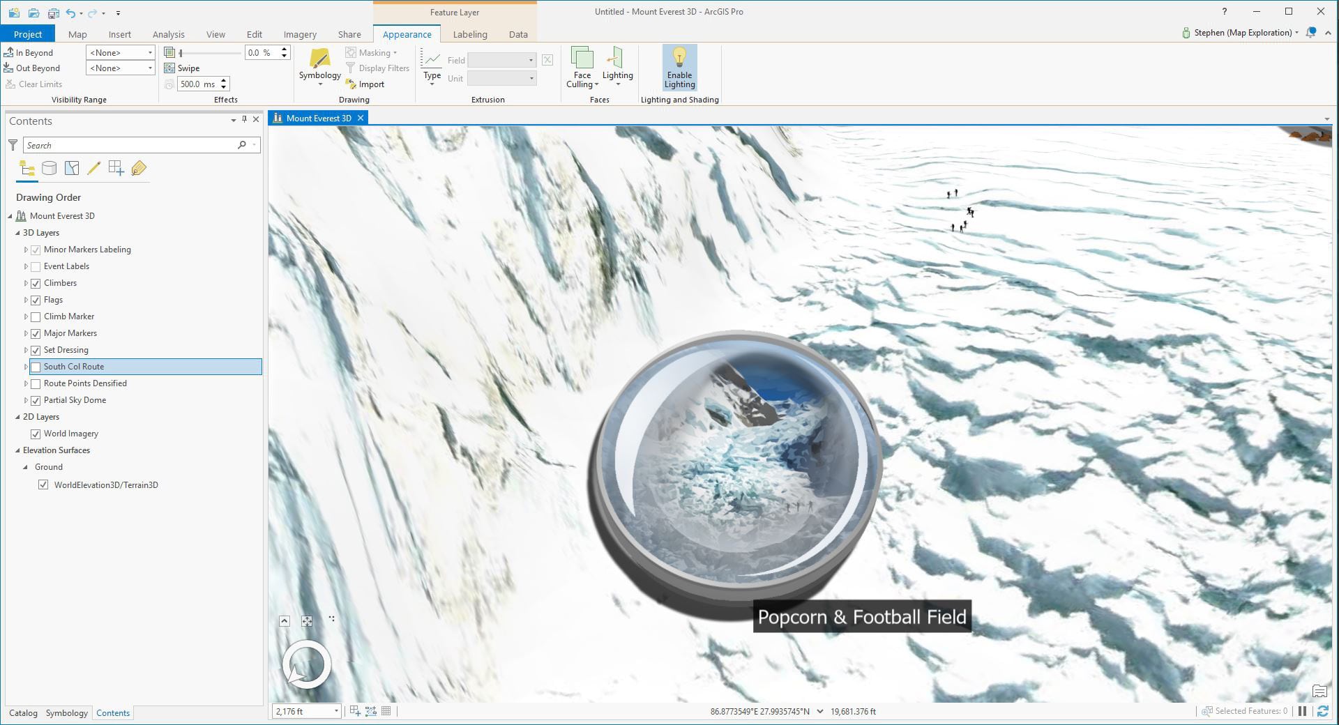
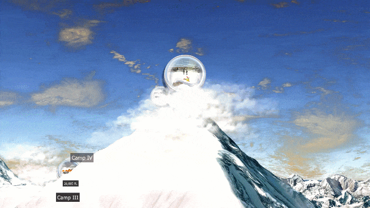
While symbology is often used as a generic place holder, it can also be a specific 3D model or 2D illustration. Oftentimes highlighting landmarks on a map that otherwise might be out of view due to the camera height is a good way to call attention to it. Additionally, varying your symbology will add an extra level of attention to each area of the map. For example, while each base camp along Mount Everest’s South Col Route are very similar, they do have various visuals that differentiate their elevation and risk level.
The Base Camp at the bottom of the route is larger and begins the journey for most climbers. This is the location of the command and medical center for climbers. And further up the mountain close to Lhotse’s peak is one of the more treacherous camps. Camp 4 sits in the death zone and is vastly different than basecamp. And since each of these points of interest along the climbing route vary, it’s important to highlight them with appropriate labels and symbology.
By using Symbology’s layer capabilities and blending Picture Markers with a 3D Model Marker, you can create added effects that might be difficult to create otherwise. These might be things like a smoke plum, the light glow of a streetlamp, or even the glow of lava.
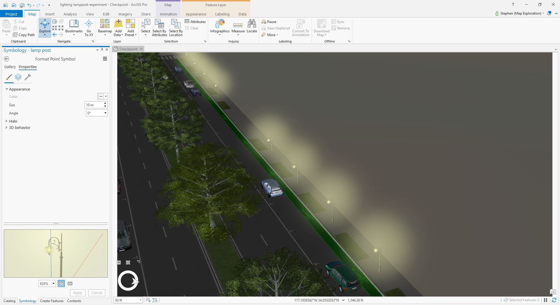
And while these elements can be considered merely lipstick, they can enhance the overall look of your data and convey a story. Using some of these symbology workflows in conjunction with ArcGIS’s in-app lighting capabilities, will enable you to create more detailed and immersive environments. Some of this might seem tedious to set up. But as mentioned before, if you’ve spent a significant amount of time planning and gathering your data, spending a bit more time enhancing it’s look will be a worthwhile effort.
Simulate lighting and effects with game development tricks
While some of the capabilities of realistic lighting are available for game engines and in pre-rendered 3D, it’s often not used in even AAA game development. Seriously! This is one of the big misconceptions of game engines. While their capabilities are impressive, often the workflow to make games still utilizes tricks of the trade to simulate reflections, lighting, and effects.
With the advancements in Unreal Engine 5’s lighting, we may see some of these techniques shift out of the game development pipeline, although it won’t happen right away. With that said, you can and should employ the same lighting and texturing tricks used in games within your ArcGIS 3D projects. Not only will it make your content feel more immersive and detailed, but it will also keep the overall performance and interactively of your project in check.
This means you’ll be able to add things like light shafts, synthetic light or shadows, clouds, smoke, mist, and more. All in ArcGIS. To do this is pretty easy. In a 3D project, you can always make an image face the camera by using billboarded symbology. By using a combination of 2D billboards with detailed PBR models, you can enhance 3D maps with an extra level of detail. This enhancement through images and meshes can let you art direct the lighting, symbology, and hide terrain artifacts.
Combining 2D billboarded light rays with realistic 3D symbology helps create a more immersive space to show. Not only can you use 2D billboards to brighten areas, but you can also use them to darken them too. Smoke, people, everything really looks decent with 2D billboards at a distance.
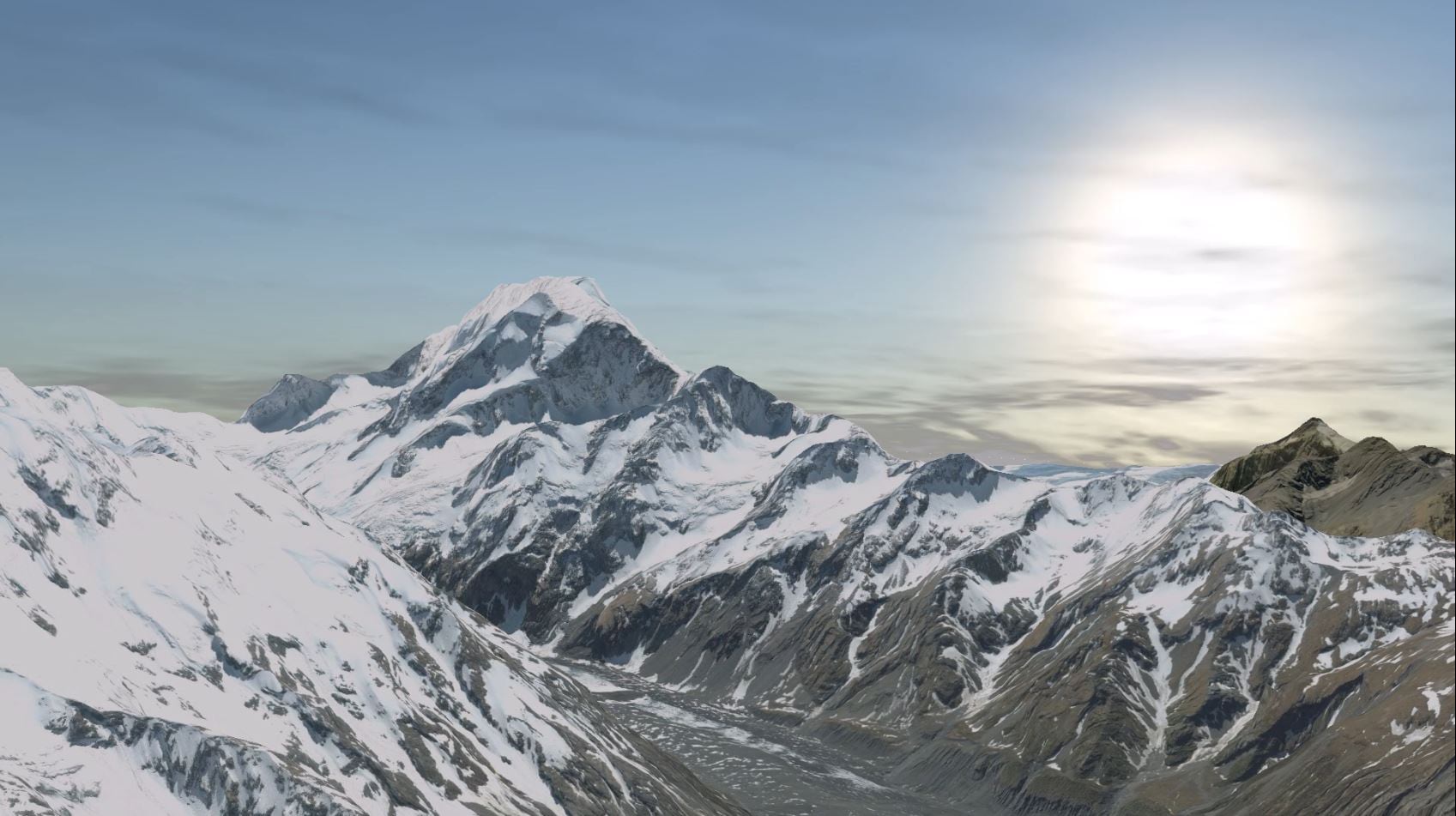
In some cases, these elements can be considered a distraction to the data. Although if your map is 3D, then the additions of these visual elements could enhance the data and make it more interesting. For example, clouds and atmosphere are both details that define the elevation of Mount Everest. While they aren’t necessary, these types of effects help the user understand where they are spatially.
Use lighting & atmosphere
Using both lighting and atmosphere in ArcGIS can both enable analysis and enhance a 3D map. While analysis workflows can be achieved with shadows, ArcGIS’s lighting capabilities can immediately enhance the overall look of a 3D map. ArcGIS Pro’s both accurate and enhanced lighting scheme immediately add realistic sunlight and atmosphere to your projects. Furthermore, the use of lighting is supported across the platform in 3D maps within the Scene Viewer, ArcGIS Earth, and CityEngine.
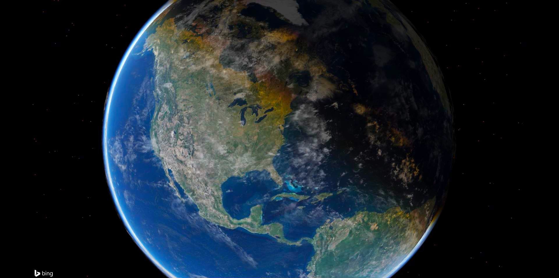
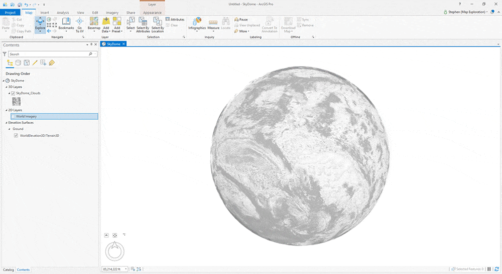
Use a sky dome
This is a simple trick you can use to spice up your 3D projects. While the skies in ArcGIS Pro look beautiful with their gradient blues, you can easily fill them with clouds by adding a Sky Dome. A Sky Dome is a spherical mesh that surrounds the globe itself. There are several ways you can bring it in, although I personally found consuming it as a 3D symbol had the best results. As a 3D symbol, you can see the clouds from below and above the atmosphere.
There are a few ways to create a Sky Dome, although traditionally it’s been a spherical mesh with a sky texture wrapped on it. The Blue Marble textures can be acquired freely through Nasa’s Visible Earth database.
Once you’ve either generated or downloaded the clouds, you’ll need to wrap them onto your spherical mesh. Lastly, if you’re implementing them as a 3D symbol, you’ll need to configure your anchor point offset to appropriately position the sphere on the globe (anchor to the center of the Globe).
Nature is full of variation
A landscape or terrain is made up of diversity. In some cases, a map’s simplicity can communicate data effectively with it’s clean and concise visuals. Although if your attempting to replicate or create a digital twin of an environment, it’s important to emulate the diversity of nature on your 3D terrain. This means not only providing diversity to the species of vegetation, but also changing the rotation and scale of the symbology populating an area. For example, rotation and scale of a pine tree that makes up a region will make it more believable.
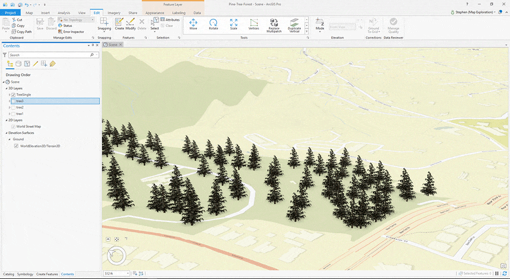
If the data explored at scale requires closeup navigation, then street furniture and people can add an extra level of immersion. Furthermore, extra symbology that doesn’t necessarily come from data can highlight the scale and context of the data itself. For example, people and vehicles, next to a landmark building can give viewers context of scale and areas of traffic. Size of trees can provide visual insight to the age of the forest. Furthermore, if your lucky enough to have time associated data, you can also utilize the time slider to support the growth of trees through animation.
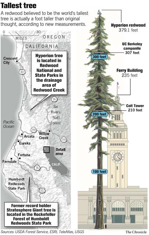
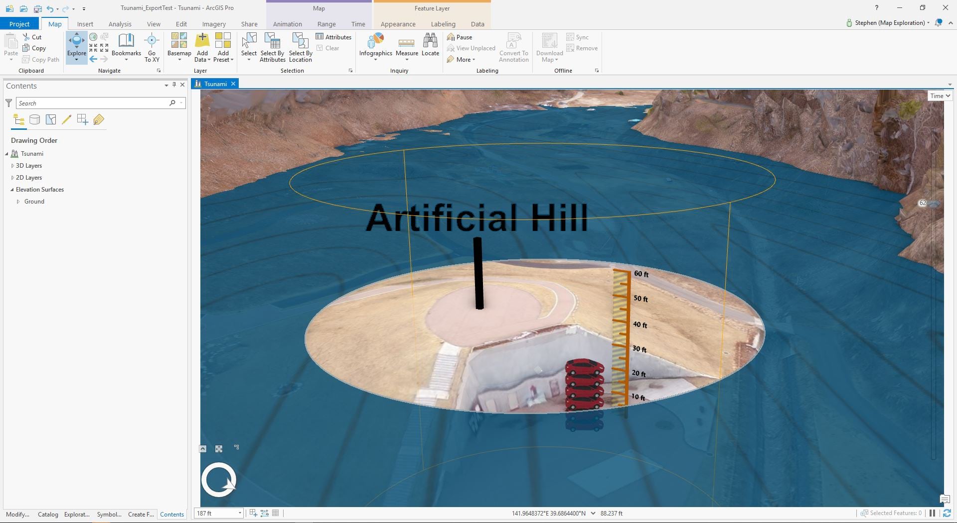
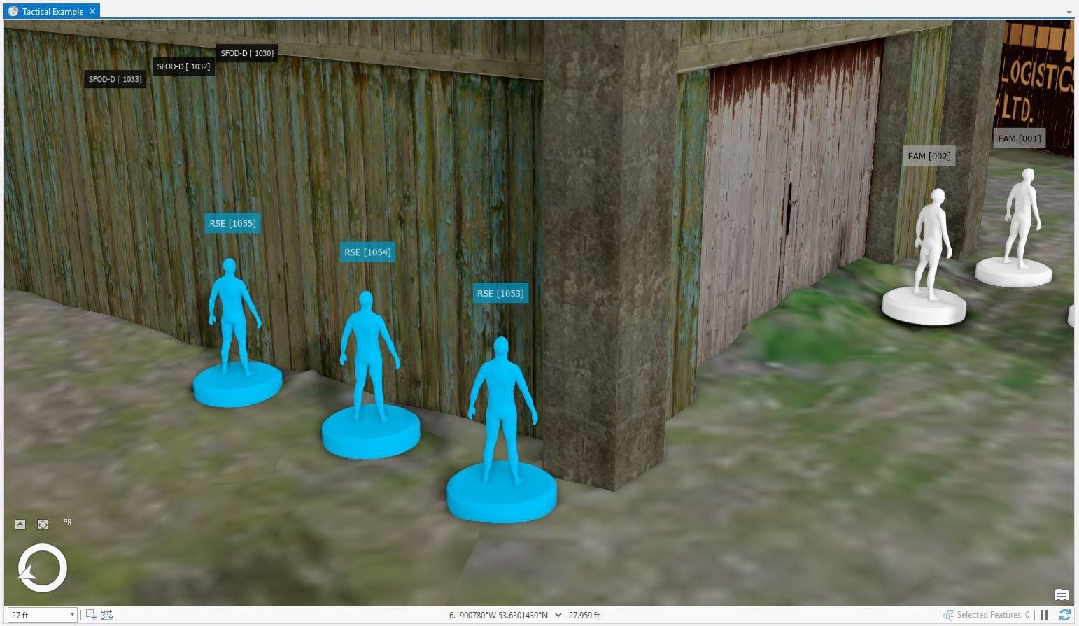
Use familiar objects to help understand size and depth
With the added Z axis, 3D environments pose an extra challenge for viewers to understand your data. Big 3D maps can often be challenging to understand depth and height. It’s helpful to configure your environment with symbology that describes measurement. Oftentimes in infographics, designers stack objects or people’s silhouettes to communicate height. But really, you can use anything people understand at a quick glance.
3D lends itself to sandbox exploration
3D maps are ideal for creating scenarios to help analyze and plan data. Laying out landmarks and players of significance help you analyze the world and it’s spacing, but it also enables others to ask questions about the world. The use of sandbox planning is very useful in planning construction, architectural design, and military strategy.
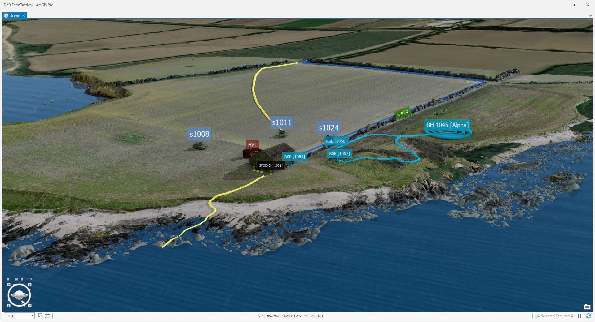
Both detailed 3D markers and industry specific symbology is important to establish context. The markers can either be temporally configured (time & range slider) or placed on layers to toggle visibility of different segments of time. The layers can then be toggled on and off to show various stages of movement over time. This could be visualization of stages of construction, generation of a deep foundation, or strategic markers. Combined workflows of interactive analysis and paths (i.e. lines, dashes, and arrows) can help others understand a plan across an area.
Use Photoshop to add quality graphics and text elements
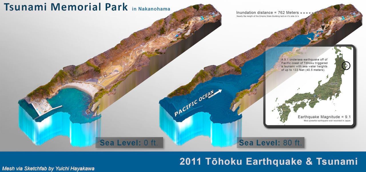
While ArcGIS offers a robust set of Overlay capabilities, Adobe Photoshop is great way to create pixel-perfect and print ready work. Below, the flooding of a park near Sendai in the Tonoku Region is highlighted with the use of Photoshop.
First and foremost, the 3D terrain was rendered and exported in ArcGIS Pro as a PNG. The PNG format’s transparency enables you to combine it with other layers like text in Photoshop. Another great trick is the ability to render a thin terrain as thick using Photoshop’s motion blur filter.
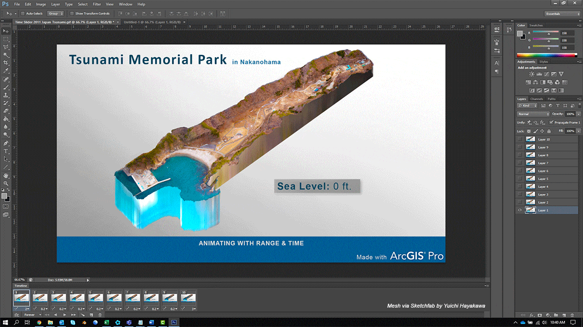
GIFs and Movies are a great way to communicate 3D and temporal data
3D space and temporal data can be complicated. Not only is it oftentimes complicated to prepare a project, but it’s overwhelming for others to potentially navigate and interact with 3D space. Movies and GIFs are a great way to share your 3D projects with others.
By exporting 3D with animation in ArcGIS, you can control the camera and environment variables for the viewer. ArcGIS Pro and CityEngine enable you to generate both Mp4 and GIFs. Mp4 is one of the more common movie formats used across the web. And as one of the more optimized or smaller formats, it’s typically used for uploads to YouTube and Vimeo. And GIFs are probably the most sharable image formats out there. While ArcGIS enables you to export GIFs, they can often become very large files if you attempt to output it directly from ArcGIS Pro. Therefore, it’s a good idea to export single frame Jpegs or PNGs and aggregate them into a GIF in Adobe Photoshop.
ArcGIS provides you with several ways to capture your data and share it with others. Oftentimes, sharing an image or movie is a simple way to communicate your data with others that aren’t familiar with using 3D.
Use ArcGIS Maps SDK with game engines to further enhance your GIS data
Tools that have high-end visualization capabilities in ArcGIS can really enhance your storytelling abilities. The capabilities of ArcGIS Pro, CityEngine, and now the ArcGIS SDK with game engines, all provide you with an ability to take your data further visually.
We’ve all seen this technology in action at some point. AAA games like Red Dead Redemption and Fortnight show the power of the game engine to build an expansive environment for exploration. Games focus on harnessing the power of this technology to create immersive rich worlds, and GIS data can now be visualized with game engines to create accurate replicas of our real world.
Game engines have proven to be an incredible tool to enhance visualizations of data and terrain. Engines like Unity and Unreal provide incredible power to render an abundant amount of objects on accurate terrain. This means you can now visualize that forest and all its associate trees with beautiful materials and animation. Or you can visualize a flooded terrain with the engines water shader capabilities. Showing ripples, foam, and accurate currents. Really, skies the limit in terms of visualization capabilities. So much so, many feature film studios are now adopting this technology to perform realtime live action shoots.
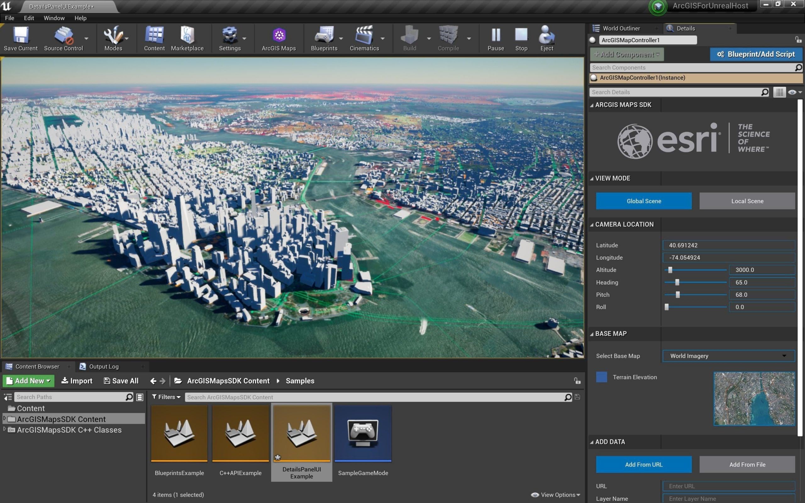
With ArcGIS Map SDK with game engines, you can consume terrain and view it with the added visualization capabilities of Unity and Unreal. This means you can plus the look of your data through high-end AAA game visualization capabilities by adding visual effects, clouds, weather, atmosphere, and more.
While 2D maps are incredibly powerful to get an understanding of scale and data, game engines enable you to immerse yourself spatially in the data.
If you’d like to learn more about game engines like Unity and Unreal and how they can be used to enhance your GIS story in ArcGIS: visit the Early Adopter program for ArcGIS Maps SDK for game engines
Take time creating a story for 3D
If you’ve spent countless hours gathering complex data for 3D, it’s important to take a considerable amount of time showcasing it. While point symbology can be effective, there are a lot more capabilities that ArcGIS can offer you for visualization. Take some time and think over how you want your data to be thought of. 3D is a tool that helps make a map an experience.
And the more detailed and aesthetically appealing you make your 3D maps, the more people will want to engage with it.

Article Discussion: