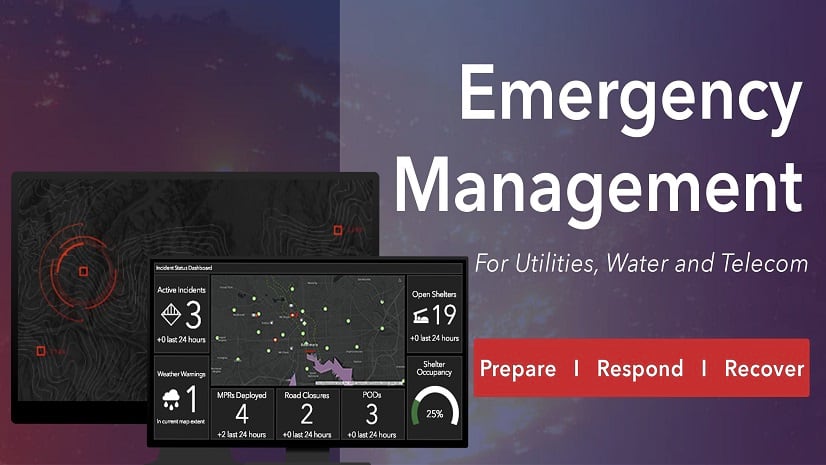
Prepare Strategically – Respond Rapidly – Recover Methodically
During May, Esri presented a three-part webinar series on Emergency Management. It explored its three stages: prepare, respond, and recover. It details how GIS plays a pivotal role.
Regardless of the type of event, location is critical. It answers these questions:
- Where are there external factors at play?
- Where Is the network most vulnerable?
- Where to stage crews?
- Where to prioritize the recovery?
Also layered on top of the emergency, utilities and telecoms must cope with the impacts of the coronavirus disease (COVID-19). It helps to identify where there are:
- Vulnerable populations
- Makeshift health care facilities
- Communities more susceptible to COVID-19
- The impacts of the pandemic most severely felt
- Clusters of cases
- Facilities being used as COVID-19 testing centers or shelters
That is why GIS is so valuable.
Prepare Strategically
The first webinar reveals how GIS solidifies planning in three ways.
External impacts
The team demonstrates how GIS provides web services about potential danger areas. Examples include fire-prone areas, high wind areas, landslide areas, and flood-prone areas. These are available from ArcGIS Living Atlas of the World. Others can come from partners such as weather services and government web services.
Network vulnerability
No network is perfect. Understanding vulnerable assets is essential for planning. ArcGIS identifies impacts in the network. It does this by intersecting assets with datasets such as floodplains, ground shaking grids, or COVID-19 social vulnerability areas. The ability to analyze specific hazard scenarios such as the 1% annual chance floodplain or a potential earthquake liquefaction predicts where failure may occur during an event. This prioritizes planning decisions. The demo creates a compelling case for how weakness such as corroded piping can have devasting impacts during an earthquake. Coupled with potential liquefaction, this GIS analysis predicts the “perfect storm” for extreme damage and asset failure.
Crafting the plan
External factors and network vulnerability provide the science for planners to craft scenarios. They help them stage crews and material. The time to build these data feeds and perform the scenarios must occur well in advance of any event. The team demonstrates several scenarios.
To view the first webinar on how best to prepare for an emergency, click here.
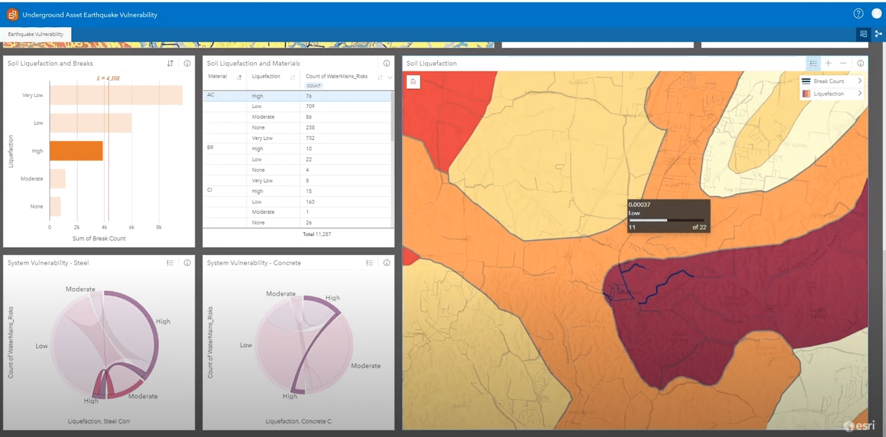
Analysis Illustrating the Potential Impact of Liquefaction on Corroded Water Mains Should an Earthquake Occur
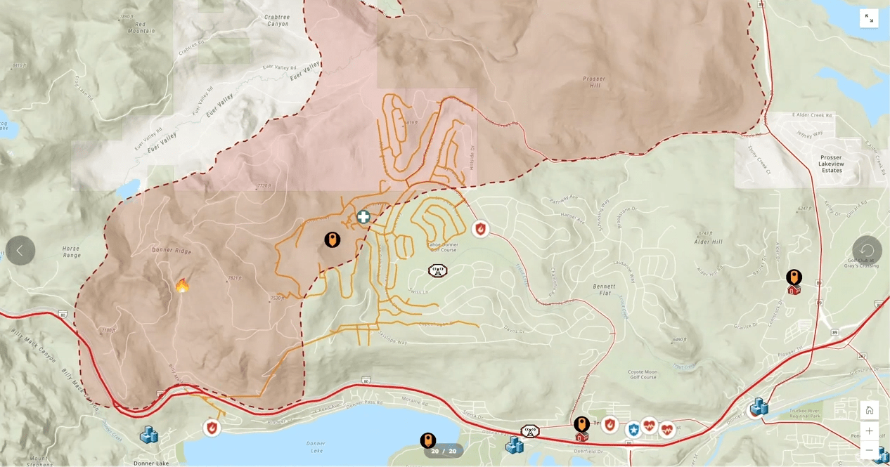
Creating the Emergency Plan – Dashboard Showing Fire-Prone Area that Intersects with the Electric Network and Critical Customers
Respond Rapidly
The storm is here. The earth is shaking. Fires are burning, or the wind is still blowing. There is no time for building data feeds or applications. Responding rapidly is the subject of the second webinar.
During this stage there are three steps:
Damage assessment
The team shows how field operations applications can collect data rapidly, short-circuiting the manual processes. They demonstrate how the use of ArcGIS QuickCapture allows untrained or mutual aid crews unfamiliar with the region to rapidly assess the damage.
Situational awareness
ArcGIS Dashboards provides the perfect way to communicate what’s happening right now. This includes showing clusters of damage. During the demo, we illustrate how planners can prioritize critical facilities, like pump stations for priority restoration. We also highlight real-time weather feeds and their relationship to the network.
We also examine how workflows can still be managed in an off-line mode when mobile communications might be compromised.
Public outreach
The team’s demonstration illustrates the power of ArcGIS to create an automated routine for public outreach by disseminating the right information to all parties impacting by the event.
The team also demonstrates tools provided by the Coronavirus Business Continuity solution. This allows staff to check-in regarding their health status. They can report when they have come into close contact with someone (like a citizen or a customer). Tracker for ArcGIS and ArcGIS Dashboards can identify potential ‘person to person’ and ‘person to asset’ contact. Analysis can be performed on Tracker for ArcGIS with the ArcGIS Pro Proximity Tracing Tool to see where these contacts have occurred.
To view the second webinar on how best to respond to an emergency, click here.
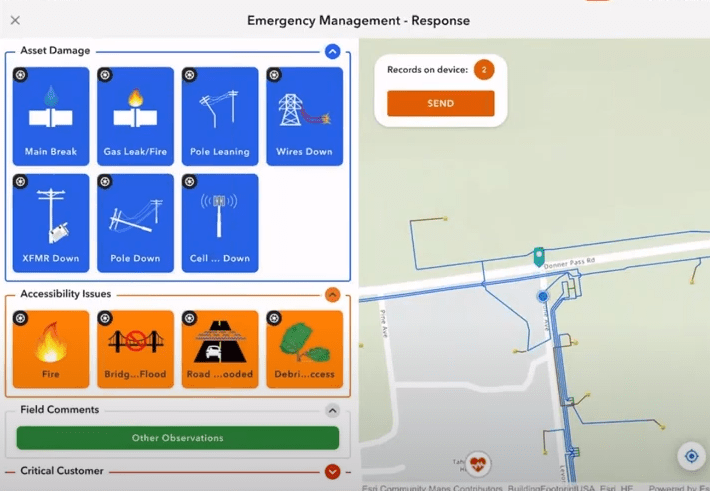
ArcGIS QuickCapture Simplifies Damage Assessment
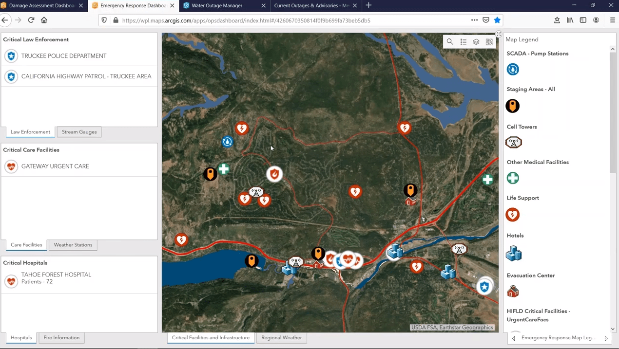
Public Outreach Dashboard – Shows Emergency Evacuation Routes and Critical Facilities
Recover Methodically
The third stage of emergency management is recover. This is the long and arduous process of putting the network back together. We were very fortunate to have a compelling video from Nashville Electric Service. It describes a devastating tornado that struck the region. It illustrates how GIS provided the means of quickly managing the recovery.
GIS supports recovery in three ways:
Priority Analysis
Damage capture is complete. Now the job is to dispatch crews and deal with critical facilities. The next step is to order the recovery process. Using ArcGIS StoryMaps we demonstrate the logistics of recovery. Given that streets may be impassible, drive time analysis provides the best path for ordering recovery. This demo addresses optimal staging areas, crew sequencing, and routing.
Workforce Execution
This can be a logistical nightmare. Utilities and telecoms must make choices. Choices include which areas are more important than others to work on. The team demonstrates how Workforce for ArcGIS and ArcGIS Dashboards assigns and monitors the work. Collector for ArcGIS provides data back to the dispatcher.
Recovery communication
People are restless. Lights are out. Water and gas aren’t flowing. Communication is limited. Businesses are shuttered. Roads and bridges are out. The team demonstrates how recovery communication is essential during extended periods of an outage. Using ArcGIS Hub the team highlights the steady progress of the recovery effort. Utilities and telecoms can communicate that progress to the public, the media, and to first responders using simple web maps.
To view the third webinar on how best to recover from an emergency, click here.
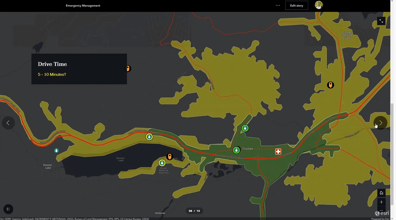
Drive Time Analysis Used to Optimize Recovery Activities To Critical Customers
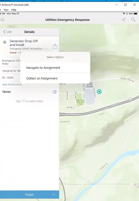
Workforce for ArcGIS Used on a Tablet to Manage the Installation of an Emergency Generator to a COVID-19 Facility
The Webinar covers the three stages of emergency management – prepare strategically, respond rapidly, and recover methodically – all enhanced by the capabilities of ArcGIS.
To learn more about how ArcGIS improves utility and telecom operations, click here.


Hi Doug! QuickCapture will persist 3D features if your feature layer is 3D enabled. The 1.7 value comes from a device variable which you can change. You can make it a user input for the user to enter the height above ground, or you can calculate it using an Arcade expression (Beta). For example, you can take the current elevation above ground and add the height (say 1.7 meters).
If I am not mistaken the imagery team was working on having the Oriented Imagery widget work with 3D Scenes. This may be a good question for the Esri Community forums.
That’s a really helpful article but is there a set of instructions out there that tells you how to create the same setup with photos which aren’t taken on the device that you have QuickCapture on? For example can you link photos from a dslr etc to the points somehow and still use the oriented imagery viewer?