A key element of the Aurora project—the next generation field data collection app—is the overall design. Here on the Collector team we’ve redesigned the user interface focused on simplifying and consistency. Below are five of the biggest UX improvements:
- An adaptive sliding panel
You no longer have to choose between looking at the map and looking at the details of your asset while you are collecting data. When you start collecting a new asset, the details use half the screen and the map the other half. Focusing on the details? Expand the panel to use the full screen. Placing the feature? Minimize the panel and see more of the map.

- A location target that helps you precisely place points by panning (say that three times fast)
Manually adding points on the map no longer means obscuring the part of the map you are interested in with your finger. Using this targeting approach, crosshairs on the map now mark where each point is placed. Pan and zoom the map to position the location for your point under the crosshairs, and see where you’ll be placing the data while you are placing it. This isn’t limited to point data, either: the same experience helps you more accurately place the vertices of lines and polygons.

- Common tasks at your fingertips
Ready to collect data? You can now add a feature from a button promoted onto the map and near where you hold your device.

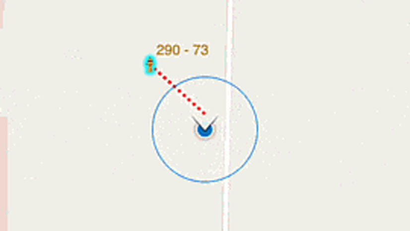
Not collecting a new point, but working with an existing one? We promoted those tasks, too: whether you need to edit or copy a feature, use the new compass tool to get to it, or get directions.

- Ease of access to the camera
Where it used to take three taps to launch the camera, now it is only one. Once your picture is taken, you see a preview, accept it, and continue to your next task.

- Consistent field apps
Many field operations use multiple Esri apps together. If your staff is used to Workforce, Explorer, Navigator, or Collector, they should feel at home when they pick up another app or transition between them. You’ll see Collector and Explorer now have a similar experience – look for it to come to Workforce and Navigator, too.

Of course, this is just the start of the list. If you want to play along, grab the beta or come visit us at the Apps Island in the Esri UC Showcase. Designers (along with other team members) will be on hand and happy to show off their work and the app.


Commenting is not enabled for this article.