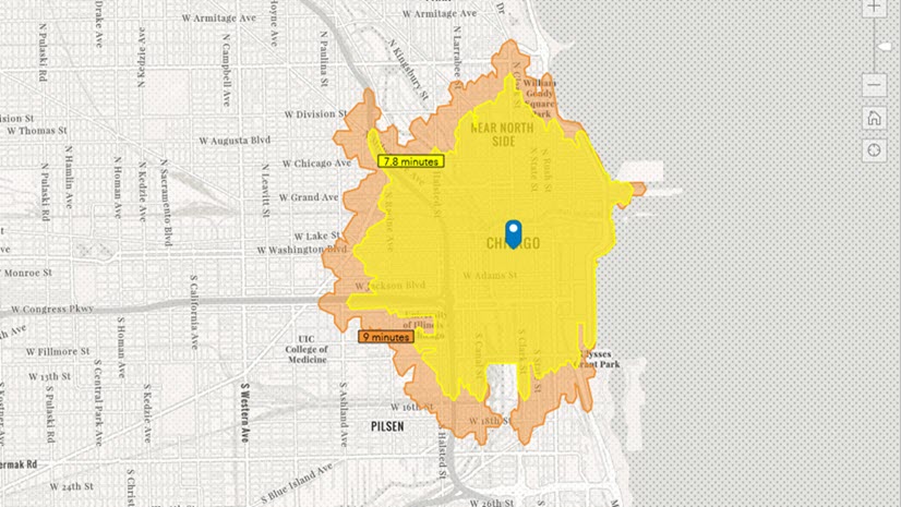
In ArcGIS Community Analyst, you can map service areas using threshold areas. Instead of creating a ring with a known distance, such as a ten-minute walking time or a two-mile radius from your site, you can map the distance needed to capture a variable, such as a population of 100,000 people. Threshold areas commonly use total population or households in an area, but you can also enrich your analysis using other variables from the data browser.
For this blog article, I will be using a single point as an example: the main branch of the New York Public Library (NYPL), the Stephen A. Schwarzman Building, at 476 5th Ave in Manhattan. According to the NYPL website, the entire NYPL system serves over sixteen million patrons. I will create threshold areas to see what the service area is for the Schwarzman Building to serve 10,000, 50,000, and 100,000 patrons. NYPL could use this threshold area analysis to plan community engagement initiatives.
Threshold areas are created using criteria that you select. I will create two threshold areas to analyze the service area using the variables 2022 Total Population (Esri) and 2021 Pop 3+ Enrolled in School (ACS 5-Yr). The population variable may be used to inform general decision-making about resource allocation depending on the population density. Comparatively, the school enrollment variable may be used to plan educational programming or accommodate youth services.
Create threshold areas for 2022 Total Population (Esri)
Let’s create the threshold area. Access the Threshold Areas workflow in Run Analysis on the Maps tab of Community Analyst.

Threshold areas use a single point, point layers, or multiple site locations. I entered the Schwarzman Building’s address into the search box.

Now, it’s time to set the threshold areas. I am using threshold areas of 10,000, 50,000, and 100,000 people. You can set your threshold areas to calculate using data from 2022 Total Population (Esri), 2022 Total Households (Esri), or browse variables for other data options. For the first example, I selected the variable 2022 Total Population (Esri). The Esri 2022 data includes an array of demographic and socioeconomic data.

A new layer is created with my sites and threshold area rings.

The Threshold Areas panel includes facts about the thresholds for your site. It shows you the number of people in each threshold area, how precise the ring is, and the ring size. The first threshold area serves 3,727 patrons within 0.3 miles of the library. The next threshold area serves 26,080 patrons within 0.5 miles of the library. The third, and largest, threshold area serves 103,911 patrons within 0.8 miles of the library. Since the threshold areas in this example are set by the population and not geographic distance, the ring size varies for each threshold area.
Use the drop-down menu to toggle between the threshold areas to view details for each area.

Threshold calculations are an approximation, as you can see with the precision percentage provided in the Threshold Areas View Results panel. For this example, the third threshold was most precise, at 96.2%. There are geographic factors to consider that may affect the area you created, such as population density, placement of census block points, and traffic patterns. You must also determine if faster calculation or more precise results is more important to your use case.

Now, I will create another threshold areas analysis using a different variable.
Create threshold areas for 2021 Pop 3+ Enrolled in School (ACS 5-Yr)
Using the same workflow as previously described, I created threshold areas using the variable 2021 Pop 3+ Enrolled in School (ACS 5-Yr). American Community Survey (ACS) data is a continuous measurement, in which a sample of the U.S. population is surveyed monthly. ACS provides two educational variables: school enrollment and educational attainment. I will be using the school enrollment variable for this blog article to analyze how the threshold area differs between general population and student population in the area surrounding the Schwarzman Building. This workflow could be used by decision-makers in their strategic planning to adjust budgets and resource allocation depending on the needs and characteristics of the community served.
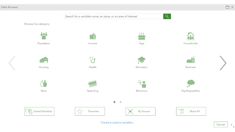
To select a new variable, I clicked Browse for a new variable.

The data browser opens, which includes a portfolio of business and demographic data that is curated and periodically updated. I selected the data collection Education, then School Enrollment to find the variable 2021 Pop 3+ Enrolled in School (ACS 5-Yr).
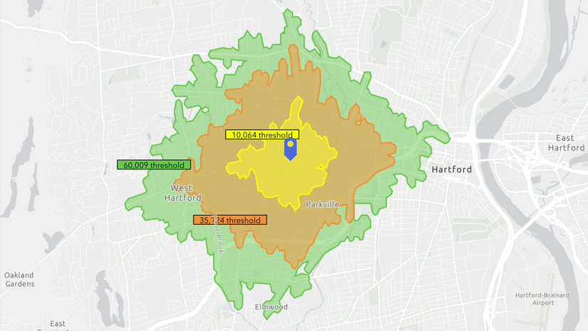
I set the threshold areas to be the same as my previous example, with rings of 10,000, 50,000, and 100,000 people. In this case, the people are students.

A new layer is created with my sites and threshold area rings.

For this threshold area analysis, our rings are much larger using the school enrollment variable compared to the total population variable. The first threshold area includes 9,769 students within 0.8 miles of the Schwarzman Building. The second threshold area includes 39,802 students within 1.3 miles. The third, and largest, threshold area includes 105,449 students within 2 miles. The most precise threshold area ring is the first threshold area, at 98% precision.
The threshold areas using the school enrollment variable provide more context to the analysis. There may be policies that each branch must serve a certain amount of people with specifications on how accessible the branches must be for student use. The threshold area analysis could be used for strategic planning for community engagement outreach or travelling library programs such as Bookmobiles. Or, other data variables may be used, such as analyzing households with access to the Internet or computers, to plan resource allocation for public technology availability.
Threshold areas have dynamic boundaries that encapsulate spatiality based on variables rather than distance or time. As we saw in the two threshold areas documented above, threshold areas change based on the density of the variable. There are less than 10,000 students within 0.5 miles of the Schwarzman Building (the smallest threshold area was 9,769 students within 0.8 miles of the Schwarzman Building), so if a buffer ring was used for this analysis rather than a threshold, the service area would not be as effectively represented. This could result in promoting educational programming to a smaller number of people, resulting in less awareness and even less attendance. Analyzing the characteristics of your service area enables you to better understand the community and create strategies to more effectively serve them.
Non-profit organizations, governmental entities, and businesses can use threshold areas to understand their service and trade areas. Other examples include a healthcare non-profit organization using threshold areas to strategize where to place pop-up vaccination stands, or a business with custom sales data mapping its most commercially viable location. There is a wealth of information in the data browser that can be used to enrich the threshold area analysis to provide a contextualized and dynamic portrait of your service and trade areas.

Article Discussion: