ArcGIS Community Analyst includes a portfolio of data that enhances your location analysis. Data can be used to create color-coded maps, perform suitability analyses, and draw threshold areas to deepen geographic searches by analyzing demographic data. The demographic data is presented in various measurements, including numeric value, percentage, and index value. These measurements allow users to select which format is most useful for specific purposes. For instance, a nonprofit organization serving households with food insecurity may find the numeric value and percentage of people without access to healthy food useful for budgetary planning. Index values may be useful for organizations with regional branches to see a normalized demographic measurement in different communities. You can explore the data through the data browser in Community Analyst.
Nonprofits and governmental organizations can use GeoEnrichment, which enhances geographic data with environmental and social data to understand the context of places. For instance, YMCA uses ArcGIS Community Analyst to create strategies for increasing membership among senior community members in Boise, Idaho. The City of Detroit created a Detroit Census Data Hub using Community Analyst to distribute accurate data using presentation-ready infographics.
In this article, you will learn how nonprofits can use the data browser, what data is available within the data browser, and how to present your analysis.
How can nonprofits use the data browser?
The data browser in ArcGIS Community Analyst is an in-app interface that displays data variables available for analysis. You can use the data browser in Smart Map Search to find relevant variables that match your criteria and view their distribution on the map.
Nonprofits can use these variables to help determine who needs service and how to find resources to deliver on that service. For instance, most nonprofits will need to fundraise and reach out to volunteers. The data browser has information about charitable spending, where charitable contributions are given, how active volunteers are, and other variables that nonprofits can use for strategic planning.
To find variables in the data browser, you can search for variables by keyword in the data browser or browse them using categories and data collections. In February 2023, a new search feature was added to the data browser to enable users to search for variables using the Variable Identifier (ID) option, which matches the Census Variable Identifier. Only the Esri version of a variable name is searchable. For instance, with census variables, we may call total population TOTPOP20, but the ‘real’ census name is P0010001.
The main page of the data browser categorizes variables for streamlined searching, such as population, housing, race, and behaviors. Here, you can search and browse variables.

Within each category, there are a variety of related variables. The data browser interface provides a search bar to search for variables within the category, displays the popular variables within that category, lists the data collections within the category, and offers options to search for all variables within the category or to create your own variable.

For example, in the category Population, there are a variety of data collections including Class of Worker, Gender, Household Type, and Internet and Computer Usage. Selecting a data collection, such as Class of Worker, displays all variables within that data collection. You can additionally filter these results by selecting a specific year or year range, dataset, and source.

Alternately, you can search all variables within a category. There are more filter options available. For instance, when searching all Population variables, you can additionally filter by Gender, Historic vintage, and Age.

If your use case requires more specific variables, you can create a custom variable. Any custom variables will be saved so that they are accessible to you in the future.

What data is included in the data browser?
Business and demographic data within Community Analyst uses datasets that are periodically updated and from a variety of credible sources. Some countries and regions use multiple demographic data sources. For the United States, the Esri 2022 demographic data source includes standard census geographies like census tracts and block groups, non-census geographies like zip codes, or you can make your own custom geographic area.

Within Esri 2022, there are several datasets available. Esri Tapestry Segmentation analyzes U.S. neighborhoods by socioeconomic and demographic composition. There are LifeMode groups that represent markets that share common interests. The Tapestry system provides qualitative data that contextualizes quantitative demographic data. Nonprofits can use this to understand their potential volunteer base, then create optimal outreach and community engagement strategies.

Esri Updated Demographics represents current-year and five-year forecasts for socioeconomic and demographic characteristics. Survey data from the U.S. Census Bureau, American Community Survey (ACS), as well as U.S. Census decennial data is available. Census data provides raw socioeconomic and demographic data that can be analyzed to understand benchmarks of geographic averages.
How can I present my analysis?
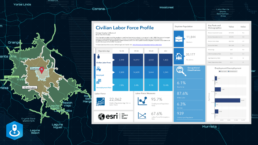
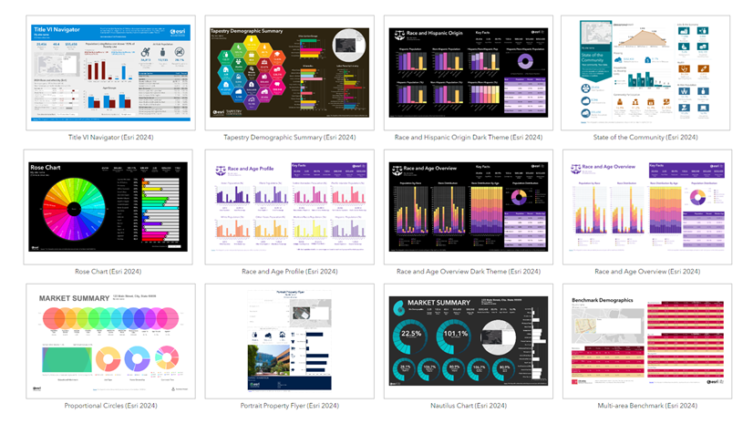
Data analysis can be shared in many ways. Infographics are a feature in Community Analyst that share presentation-ready visualizations of data. There are several templates that you can use and customize, or you can create your own. In February 2023, the Non-Profit Community Profile infographic template was added to the infographics gallery. This infographic template is “designed to help you navigate the crucial aspects of nonprofit development, including fundraising, building a strong team, and raising awareness” says Esri Product Engineer Chris Alvarez.

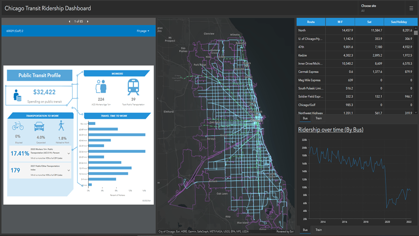
Dashboards are another Esri product that visualize data and GIS imaging. Infographics and dashboards can be used in tandem to create a unique data hub that your stakeholders can access. For instance, the City of Detroit uses Community Analyst infographics and dashboards to dynamically present demographic information by neighborhood.

Nonprofits and government organizations can use the data browser in Community Analyst to enrich geographic regions with demographic data. This analysis is seamlessly presented in readily available infographics or a combination of infographics and dashboards to create a unique user experience.

Article Discussion: