ArcGIS Drone2Map allows you to reconstruct your drone imagery into usable imagery products. However, the quality of the output products matters, and that’s where the processing report comes into play. The processing report in Drone2Map gives you insights into the quality and accuracy of your project as well as a summary of the options you defined for processing. The processing report is provided after the initial adjustment has been run and after products are generated. It is important to understand how to interpret the report to achieve the best quality products.
This blog post describes the sections of the processing report and how to quickly understand the information being presented.
Overview

The Processing Summary table shows high-level information about your project. You can quickly learn more about the camera used for the project and its overall scope.
The Quality Checks table shows more specific information related to overall project accuracy and processing performance. One of the most useful fields to reference in this section is the Calibrated Images field. This field shows how many images are in the project and how many images were calibrated. If you see that a high number of images were not calibrated, there may be issues with how the project is configured or how the flight was flown. You can narrow down the potential cause by reviewing other sections of the report.

A warning icon will appear in the quality checks table when there are uncalibrated images, significant deviations in camera parameter values or low accuracy measurements. This icon is directly related to a new closer look section that helps provide context as to why these issues may have occurred and some recommended troubleshooting.
Image Adjustment
The Image Adjustment section provides you with the most pertinent information as to why images may be dropped from processing. Much in the way that you would put together a jigsaw puzzle by matching pieces, Drone2Map uses photogrammetry to do the same with your imagery. The software looks for neighboring images that contain the same overlapping features and creates tie points between those images. This process is typically done thousands of times throughout your project and provides a network of connections (solution points) that Drone2Map uses to align the images. Simply put, the more tie points and solution points that your project has, the more likely your project is to reconstruct properly. However, this alone still doesn’t guarantee a quality reconstruction.
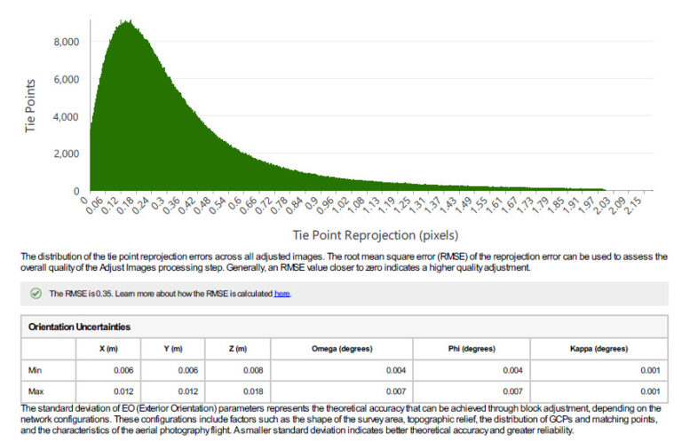
The Tie Point Reprojection Error chart helps to visualize how well the project parameters were optimized during the adjustment step to fit the observed tie points. These parameters include image locations, image attitude angles, camera settings and solution points. When multiple tie points correspond to the same ground point a single solution point is created. After the adjustment step, every solution point is projected back onto the images using the attitude angles and camera settings. These projected image points usually deviate from the observed tie points and so the Tie Point Reprojection Error shows the magnitude of that deviation. A small reprojection error confirms that the image network connected by the tie points is in good shape and will be a solid base for generating output products.
In most cases, an optimal adjustment has a Tie Point Reprojection Error that is less than 1 pixel. The graph above illustrates a good quality adjustment where most of the tie points are under 1 pixel in error.
The Orientation Uncertainties can be best described as the uncertainties of the optimized Exterior Orientation parameters, which include image location and attitude angles. The smaller the Orientation Uncertainties, the more reliable the Exterior Orientation. Which contributes directly to the accuracy of the block adjustment and output products.
Usually, images close to the border of a project have a larger Standard Deviation than images close to the project’s physical center, because they have less connections to other images in their neighborhood. Additionally, images with less tie points generally have larger Standard Deviation of Exterior Orientation than images with more tie points. Images with more evenly distributed tie points usually have a smaller Standard Deviation of Exterior Orientation. In general, less accurately adjusted images usually have a larger Standard Deviation of Exterior Orientation. A mean Standard Deviation of less than 2 times ground resolution indicates a good adjustment.
Initial vs Adjusted Image Positions
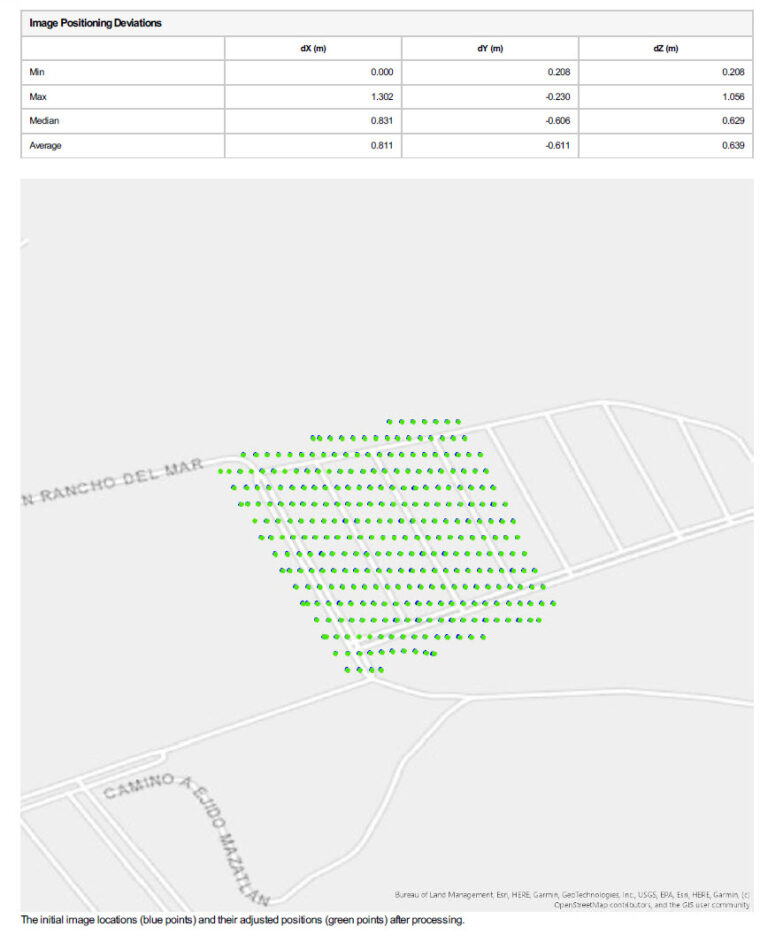
The Initial vs Adjusted Image Positions section provides general statistical information as to how much an images position needed to be adjusted after the adjustment step was run. The Image Positions Deviations table summarizes the overall shift for all image points in the X, Y and Z direction.
A graphic is also provided to help visualize the shifts that can occur to the center point of your images after the adjustment has been run. The blue points indicate where your imagery was initially positioned, and the green points show where they were reprojected. If you see significant shifts between the points, it may indicate poor GPS collection.
Cross Matches
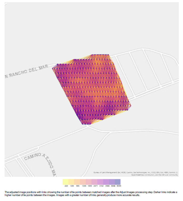
The Cross Matches graphic in the report shows you the matches between your images. This is a quick way to see which areas of your project have the highest concentrations of tie points. Areas that are toward the purple side of the scale have a higher number of tie points and subsequently will likely reconstruct better as the software will have more information from which to do so. If you see areas that are heavily yellow or low in tie point count, you may need to increase the image scale at which you are trying to generate tie points or expand the neighborhood to potentially get more matches based off neighboring images. This graphic can also give you an idea of any features in your imagery that may be consistently hard to reconstruct so if you are flying the same area or objects in the future, you can increase the flight settings accordingly.
Image Overlap
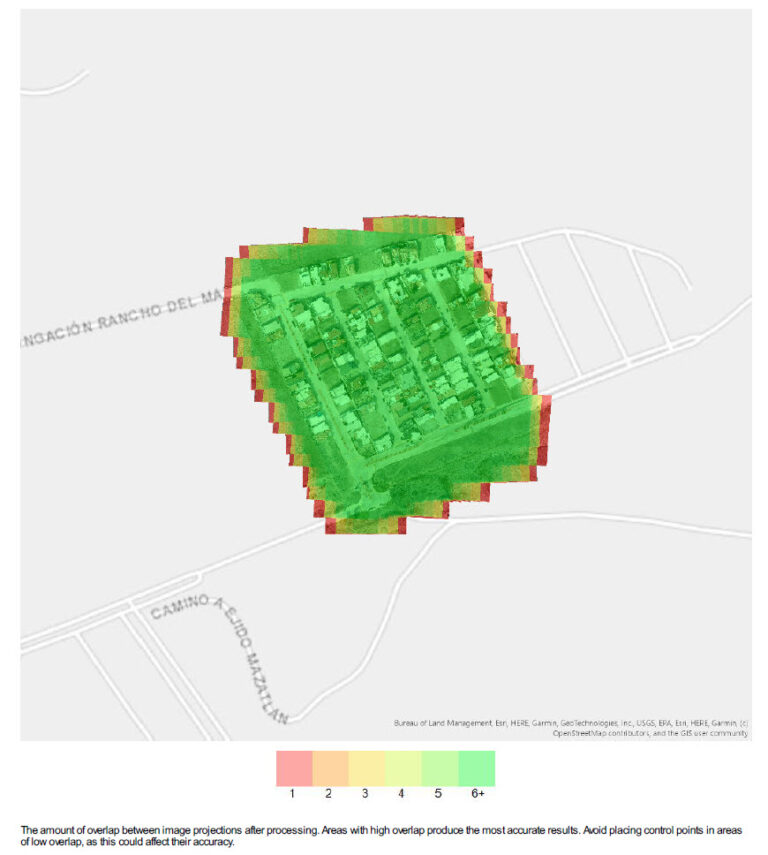
The Image Overlap graphic displays a scale of where the highest or lowest areas of overlap are within your project. It can be generated with or without an ortho preview behind the overlap graphic to help with visualization. However, turning off this preview can help save some processing time.
Dropped images can be a sign of poor overlap within a flight area. Ideally, the areas within your project should have significant overlap to achieve the best quality adjustment and output products. For more on how to configure projects for the best results, see the Tips for Collecting Drone Data for Drone2Map blog post.
Camera Parameters
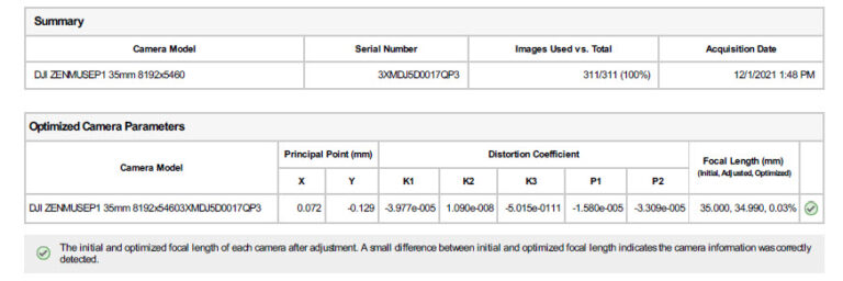
The Camera Parameters summary table provides a summary of the different camera models and how many of their images were used within the project. The number of images used per camera may be helpful when troubleshooting multi-camera projects. If less images are being used from one specific camera, then it may be useful to review those images or that cameras hardware settings.
Important camera adjustment information is also included in the Optimized Camera Parameters section. During the adjustment step, optimal image orientation values are calculated in principal point and distortion coefficients for the camera model. The defined focal length for the camera model may also be slightly adjusted to obtain the best fit result. The difference between the initial and optimized focal length value is shown within the table.
Geolocation Details
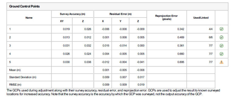
When incorporating ground control points or check points into your project, you will see the Geolocation Details section. A table for Ground Control Points or Check Points will summarize the Initial Survey Accuracy of and the residual error in the horizontal (X), vertical (Y), and elevation (Z) directions. The survey accuracy values are recorded when the points are first imported or created.
The residual error calculates the difference the point had to shift after adjustment in each of those directions compared to the original location where the point was imported. Once the Adjust Images step is run, Drone2Map adjusts the points to an optimal location using a best fit method for all the points. A projection error value shows how far the point had to shift from its initial location to fit the adjusted location. The status column will display the number of links that were used to adjust the point. This is provided as a ratio; for example, 3/5 means three out of the five links were used for the points adjustment.
Project Settings
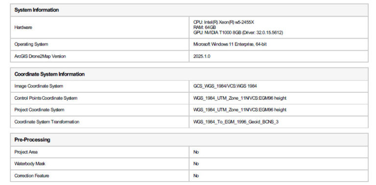
The Project Settings section summarizes the hardware, software version, coordinate systems, and resolution used on the project. If you are using preprocessing layers, you will also see if those layers were enabled. While the section may seem like basic information, it can be useful when troubleshooting issues, especially when this report is shared with Esri Technical Support.
Processing Options
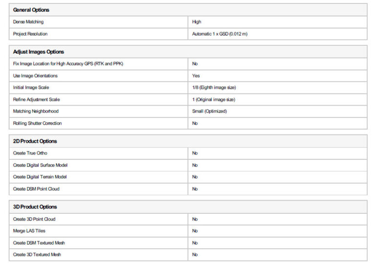
The processing options that you initially select have a substantial bearing on the level of detail that the photogrammetry process can pull from your imagery. These options tend to be a trade-off between speed and quality. For example, setting Initial Image Scale to 1 (Original Image Size) results in the most points and matched images, but the process takes much longer since the software is matching images at their native resolution. You may also only end up with a slight increase in tie points or solution points versus setting the image scale to ½ (Half image size). In the end, the extra time spent on processing may not actually increase quality.
Since doing the image adjustment is a time-consuming process, most project templates in Drone2Map have the Refine Adjustment box checked on by default. This saves time by setting Initial Image Scale to a lower image size to provide a rough image adjustment. Then once you have the images in the rough location, another pass is done at a higher image resolution for a more detailed tie-point extraction.
Though it is often overlooked, one of the biggest contributors to uncalibrated images is the size of the matching neighborhood being used. When Drone2Map is looking for matching images, this setting limits the bounds to how far out it can search. If imagery is not calibrating properly but your overlap between images is high, increasing the neighborhood to the next level (for example, Small to Medium) will likely provide more matches and subsequently more calibrated images. Much like increasing the Initial Image Scale setting, there are diminishing returns on increasing the neighborhood. If you set the neighborhood too large, you increase your processing time with little gained in terms of improved quality.
The 2D and 3D Product Options settings are also included within this section so you can quickly tell what output products were generated with the project.
The Drone2Map processing report is designed to be a detailed overview of all the important aspects of your project. It is generated as an html and PDF to be easily embedded or shared to other individuals. We understand its importance in quickly conveying processing results and plan to continue improving upon its readability and incorporating into it the key information that is most important to users.

Article Discussion: