ArcGIS Experience Builder allows you to deliver responsive web app experiences without writing code. You can create apps and pages that contain 2D and 3D maps, text, and media. Experiences can focus on one type of content or can combine and link many types of content to create a complete experience and destination for your audience. ArcGIS Experience Builder is built into ArcGIS Online and ArcGIS Enterprise, so you can use all your existing content. For more information, see the following:
This tutorial
This tutorial takes you through the steps of creating and configuring an app from a custom template that uses a screen group layout with two screens to organize the content in a scrolling page. You’ll add a Map widget, configure a Filter widget, and modify the layout for multiple screen sizes.
In this scenario, the government of the United Kingdom launched a new program called Creating Homes for Future Growth. This initiative provides homebuilders with the opportunity to build high quality homes that the local areas need. As the public information coordinator, you’ve been tasked with getting this information to the general public. You’ll create an immersive web experience to find the availability of land for housing and development, including land sites that are on the market, in the pipeline, and that have been sold.
You can view the completed experience and follow along using the LandTour template, which also already includes the data source. The data used in this template was acquired from Homes England through ArcGIS Hub and slightly modified to use in this tutorial.
Create a web experience from a custom template
To create apps with Experience Builder, you need an ArcGIS organizational account with privileges to create content. (If you don’t have an applicable ArcGIS account, get a free trial.) To save time, you’ll create an app using a template that was generated from a partially completed web experience that already has several configured widgets and a data connection.
1. Open the item page for the LandTour tutorial web experience template: https://www.arcgis.com/home/item.html?id=31ffa030ead14be49f6e13f768bcfac1
2. Click Sign in at the top of the page and sign in with your account.
3. Click Create Web Experience.
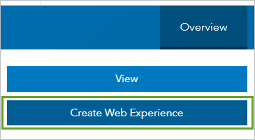
Your new web experience opens and is created as an item in your content. The app uses the configuration that was saved in the template. The item name is the same as the template with a number appended.
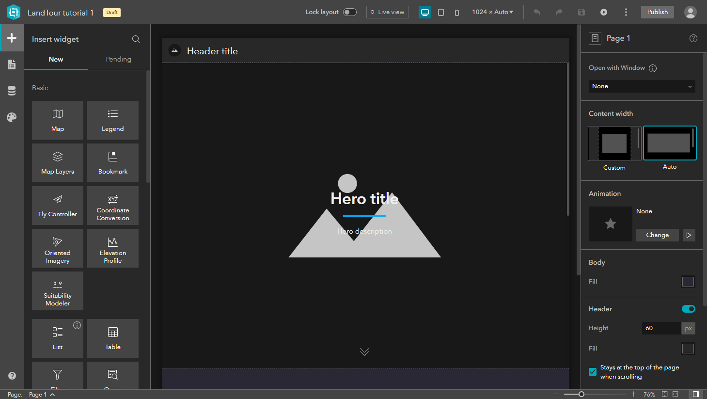
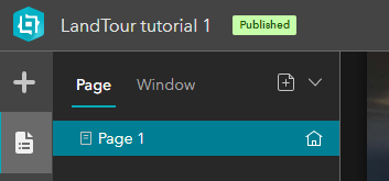
4. Click the LandTour tutorial 1 item name at the top of the window to optionally change the name.
5. Click the Page button.
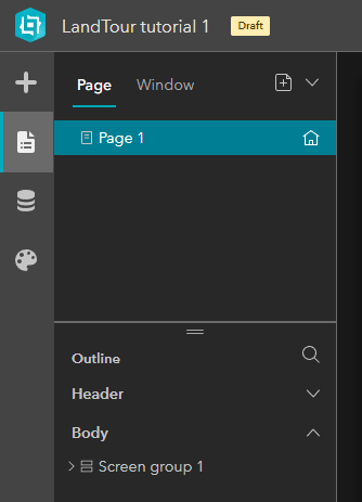
Widgets in the current layout are listed in the body node of the page outline. The outline is a good place to review and understand the layout. The outline also makes it easier to find and select widgets in the screen groups.
This template already includes the screen group in the app. To add a screen group to your web experiences, use the Insert screen group button in an empty block on a scrolling page. You can choose from several screen group templates that you can then customize. Point to the thumbnail for each template to preview its layout.
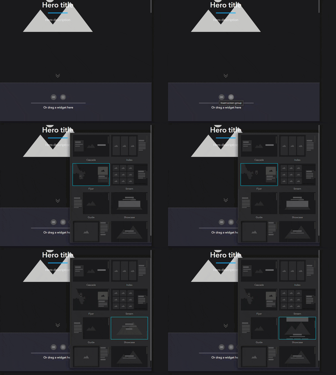
6. In the outline, expand the screen group, screens, and their contents to see the widgets that are used in this template.
TIP: Point to a widget in the outline to highlight it in the canvas. Click a widget in the outline to select it in the canvas and open its settings panel.
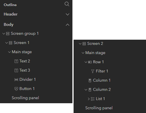
The screens in this screen group include a main stage for a hero banner with widgets for the title and subtitle, a Filter widget that you’ll configure, and a List widget connected to public data for displaying feature information. Content in the list is connected to a window to show more detail from the data. You’ll also add a Map widget to the empty column and configure it to automatically filter data in the app based on the map extent. This template also includes a header.
Update the header with a title and icon
The header will include a logo and title for your web experience.
1. In the outline, expand Header, and click Text 1.
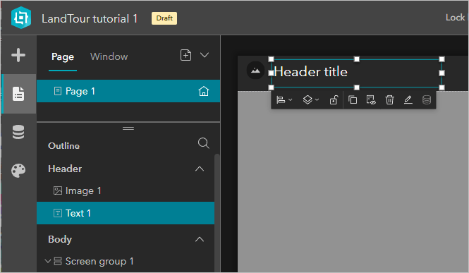
The Text widget in the header is now selected in the canvas and the settings panel displays the properties and options for configuring the widget.
2. Replace the existing text with Land Tour.
3. In the header, click the image thumbnail (or click Image 11 in the page outline) to access its settings.
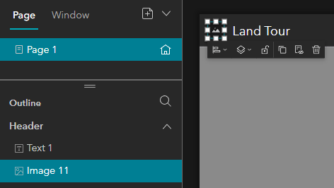
The image settings include options to connect the widget to data, select an image source, and add a link. You can also provide a tooltip and alt text for accessibility.
4. Download and extract the Images for this app (Images.zip file).
5. In the Content panel for the selected Image widget, click Select an image.
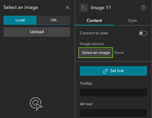
6. Click Upload and browse to and select exb-logo.png.
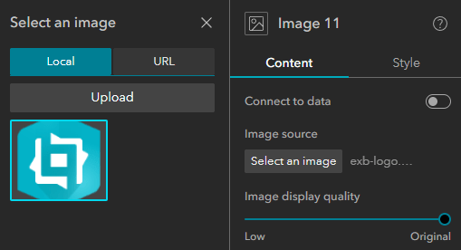
7. Provide a description for the Alt text setting, such as Company logo.
8. On the builder toolbar, click the Save button.

Configure the main stage with a hero banner
Your audience is interested in land development. It’s important that the content on the cover page reflect the purpose of the app. You’ll use a high-resolution image for the hero banner with a high-contrast title and description.
1. In the outline, in the Body section, click Screen group 1 to select it in the canvas and display its settings.
2. In the settings panel, click Screen 1 to access the Main stage style properties.
You can choose a fill color for the background or use an image.
3. For Image, click Browse.

4. In the Select an image panel, click Upload and add and select the landtourhero.jpg file that you downloaded.
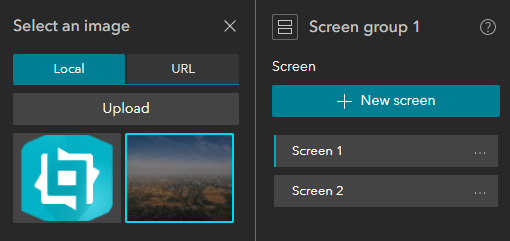
5. Close the Select an image panel.
6. Change the Position setting to Fill.
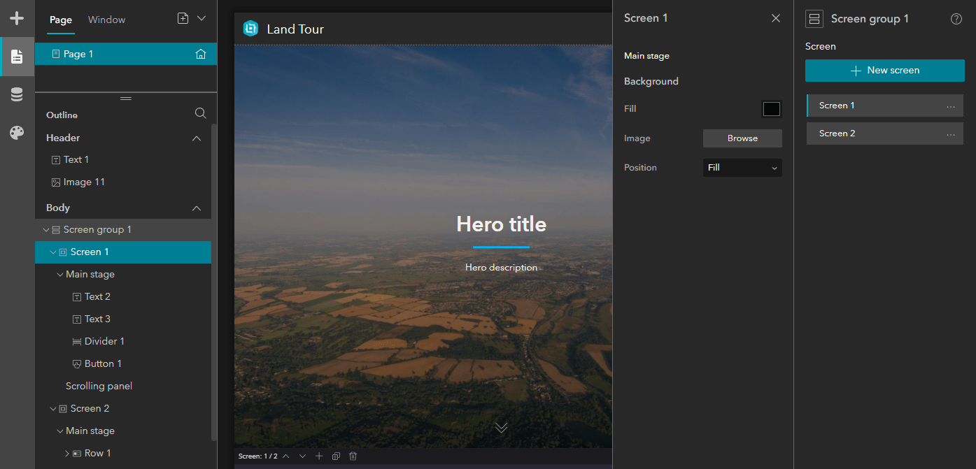
7. In the canvas, double-click Hero title to edit the Text widget. Replace the default text with the new title: Creating homes for future growth.
8. Double-click Hero description and type the following text: LandTour provides homebuilders with the opportunity to build high quality homes that the local areas need.
9. In the toolbar above the text, click the alignment button and choose Horizontal center.

10. Save the app.
Test and modify a preconfigured List widget
The List widget and its Image and Text widgets have been preconfigured with data connections to the LandTour site layer in a web map that was added as the data source in the template. First, you’ll test how the list works in the app.
1. In the outline, in the Body section, click Screen 2 to scroll the canvas down to the second screen in the screen group layout.
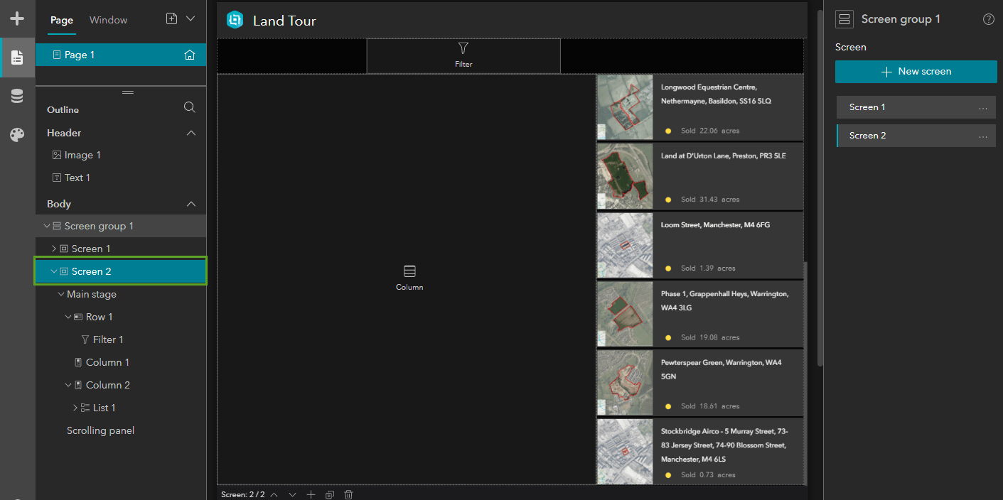
Screen 2 includes two Column widgets. One contains the preconfigured List widget, which displays information from the data. Later, you’ll add a Map widget to the empty column.
2. Click List 1 to select the widget in the canvas and display its settings. (Screen 2 > Main stage > Column 2)
The list contains two Image widgets that display data from the layer: one shows the parcel image and one shows the symbol style. It also includes two Text widgets: one for the parcel name and one to include the status of the feature and the acres of the parcel. The parcel image includes a link to open a window configured to show more feature information using dynamic text. All these widgets are connected to the data source in the app.
3. Click the Data button.
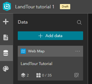
The data that’s added to an experience is listed in the Data panel. Labels with icons help you differentiate between data types. This template includes a web map data source that’s used throughout the app.
4. In the Data panel, click the Web Map item card to see more information.
The Layers tab displays the data sources in the map, which are connected to widgets. The In use section identifies layers that are selected in widget settings. The Widgets tab displays widgets that are directly connected to the web map. For example, when you add the Map widget later and connect it to this data source, it will be listed here. Clicking the Feature Layer item card displays similar information for the layer and provides additional settings, including options to define sort fields and filters and create data views.
Notice that the Content panel for the List widget settings shows that the LandTour sites layer is the data source being used by the list.

5. On the builder toolbar, click Live view to test the linked images in the list.
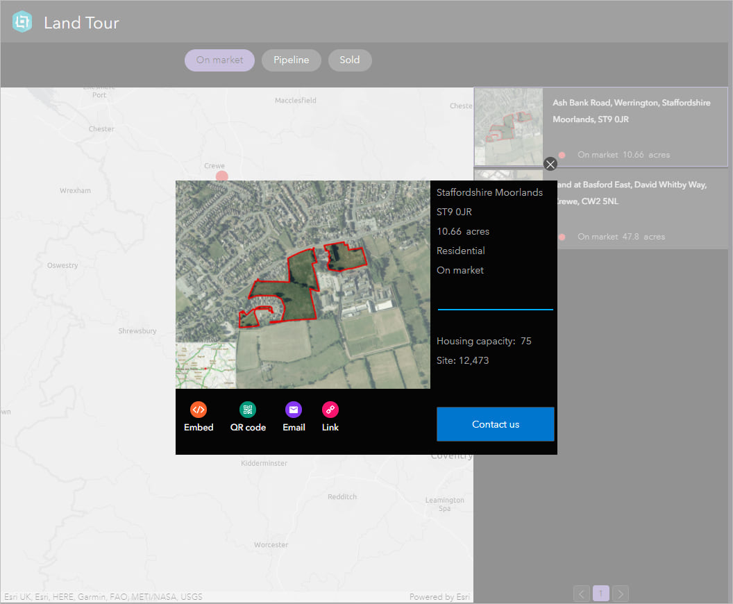
6. Click an image in the list to display the preconfigured window with more information about the feature.
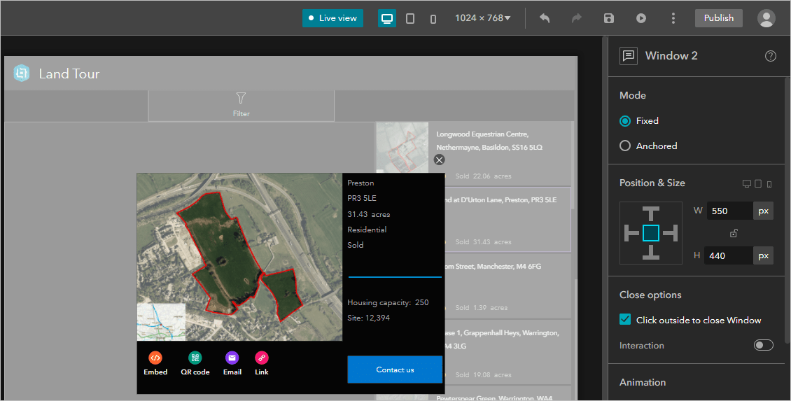
The window is configured as a fixed window with several widgets, including Image, Text, Divider, Share, and Button. You can select each widget in the window to explore the settings and how they’re configured.
7. Close the window and click Live view to turn it off.
Next, you’ll modify the list settings to display twenty items at a time instead of a scrolling list of approximately 150 features.
8. In the Content panel for the List widget, expand Arrangement.
9. For Paging style, choose Multi-page. For Items per page, type 20.

10. Save the app.
Add a Map widget to the second screen
Next, you’ll add a Map widget and connect it to the web map data source. The map will display the same land tour sites that appear in the list.
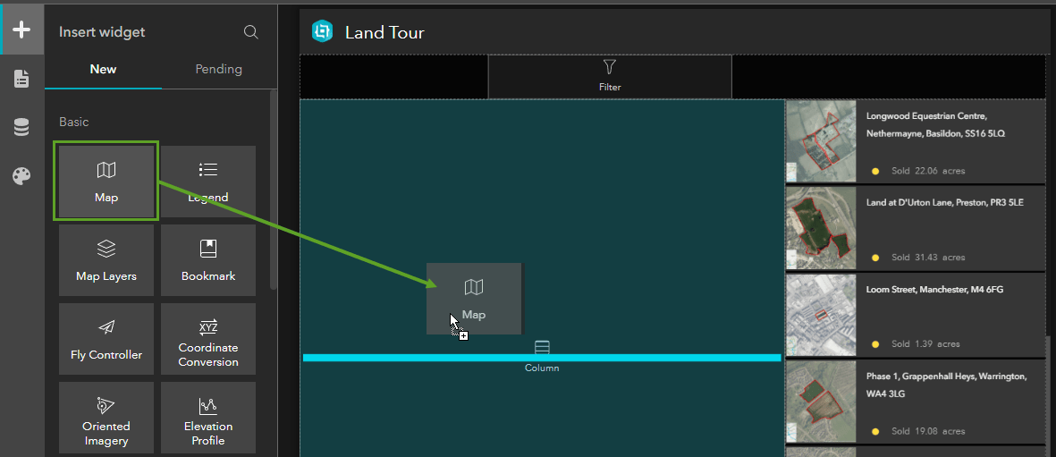
1. Click the Insert button. Drag a Map widget into the empty Column widget on the canvas.
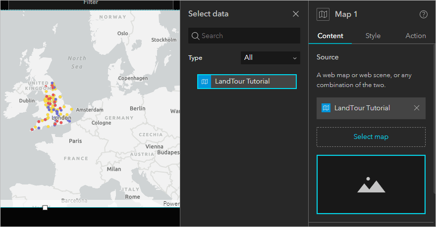
2. In the Content panel for the Map widget, click Select map and click LandTour Tutorial.
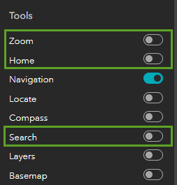
3. In the Tools section, turn off Zoom, Home, and Search.
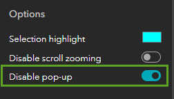
4. In the Options section at the bottom, turn on Disable pop-up.
5. Click the Style tab in the settings panel.
The Column widget, like other layout widgets, controls the position of the Map widget nested within it, including how much space is used for the gap and padding around the inner edge of the column. You’ll set the height of the map to occupy all the space in the column.
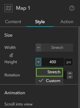
6. For Size, change the Height setting to Stretch.
Configure data interactions
Experience Builder apps are data-driven, which allows the data displayed in widgets to change across the app based on different interactions. You can define interactions between a widget and the data by adding actions in response to triggers. You’ll add a trigger to the map and configure a message action to filter data throughout the app when the extent changes in the Map widget. The other widgets connected to the same feature layer source, such as the List widget, will only display content for features within the current map extent. For example, when users zoom in the map, the list updates to show only features that appear in the map.
1. Click the Action tab in the settings panel for the Map widget and click Add a trigger.
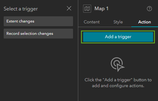
2. In the Select a trigger panel, click Extent changes.
3. In the Select a target panel, click Framework.
4. In the Select an action panel, click Filter data records.
5. In the Action settings panel, click Select data.
6. Click the Open button next to the LandTour Tutorial web map and click the LandTour sites feature layer.
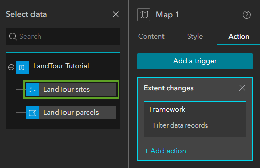
7. Save the app.
8. Click Live view to test the interactive components on the page.
9. Scroll down to the Map widget, if necessary, and zoom in to a few of the point features.
The List widget updates as you zoom in the map to show only the sites that appear in the map.

Configure a Filter widget
Next, you’ll configure a Filter widget for users to find land tour sites based on status. The filter applied by this widget affects what appears in the app’s other widgets that use the same data source. You’ll use the SQL Expression Builder window, which provides several options for creating interactive queries for the filter criteria.
1. In the outline, click the Filter widget to select it on the canvas. (Screen 2 > Main stage > Row 1).
2. In the Content panel, click +New filter. In the Create new filter panel, click Select data.
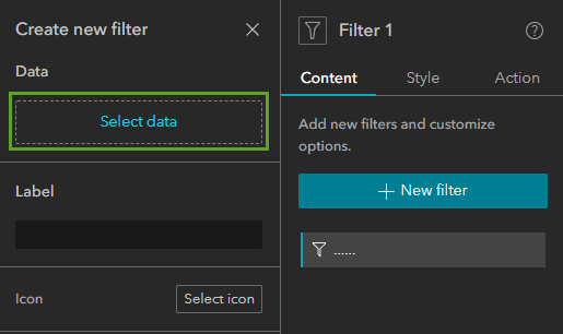
3. Click the Open button next to the LandTour Tutorial web map and click LandTour sites.
4. In the Create new filter panel, for the Icon setting, click the Remove icon button.
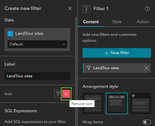
5. Click SQL Expression Builder and click +Add clause.
6. In the first menu, choose Marketing Status. In the second menu, choose is any of.
7. Click the More input settings button and select Ask for values.
8. Click Choose input style and click Pill selector.
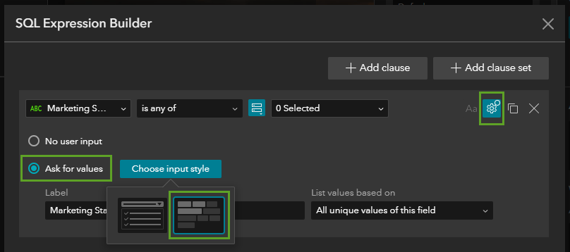
9. Delete the text in the Label setting and click OK. Close the Create new filter panel and save.
10. In Live view, zoom the map to see all the features and click the new filters for On market and Pipeline.
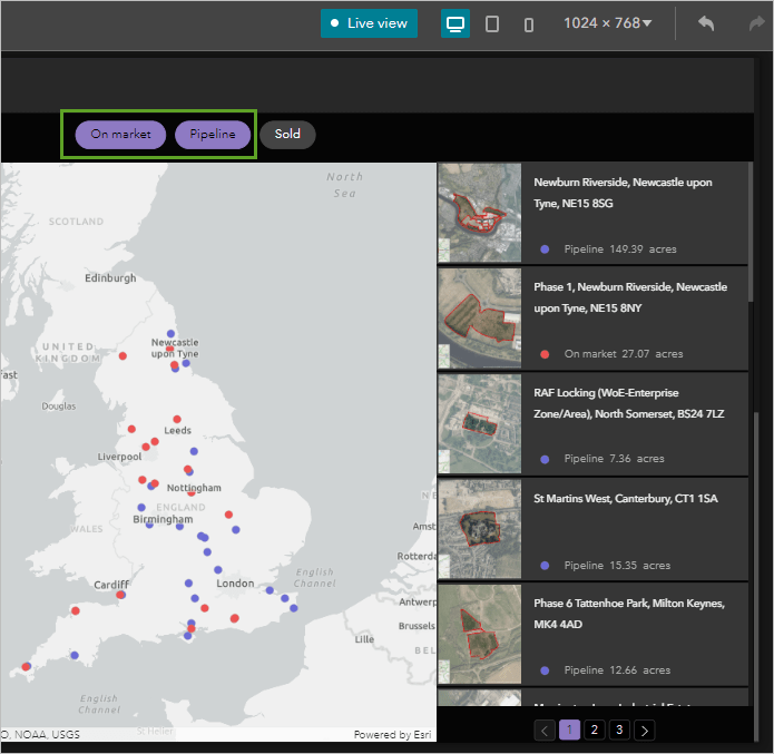
The content that appears in the map and the list is filtered to hide sites that have been sold, so users can explore land sites that are on the market or in the pipeline.
Support multiple screen sizes
When designing a web experience, the layout might be different when viewed on a large screen compared to a small screen. The configuration of each separate layout is based on adaptive design; you can create unique designs for large, medium, and small screen sizes. The templates included in Experience Builder have been built and designed to work with multiple screen sizes. To ensure that your app works seamlessly across all screen sizes, the tutorial template was saved with a custom layout enabled. When custom layout is enabled, widgets added in one device mode aren’t automatically added to other device modes. You’ll need to add your Map widget from the pending list to the medium and small device layouts. You’ll also change a setting in the List widget for small devices.
1. On the builder toolbar, click the Edit your page for medium screen devices button.

2. Turn off Live view.
3. In the outline, expand Screen group 1 and click Screen 2 to scroll to the second screen in the canvas.
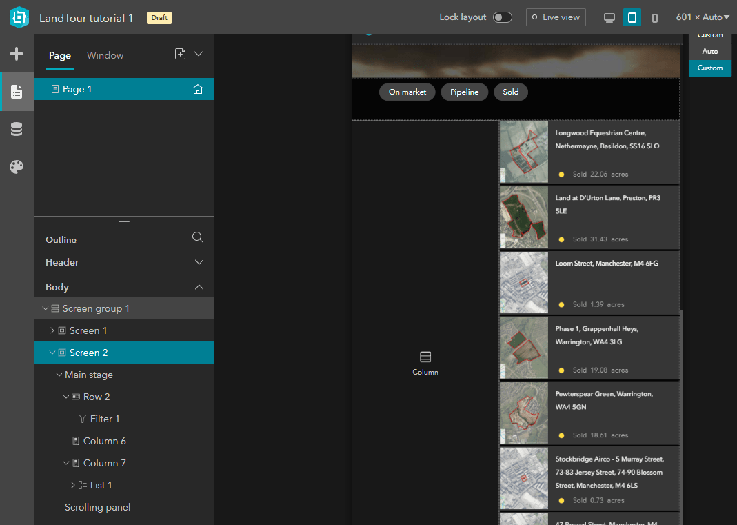
4. Click the Insert button. In the Insert widget panel, click the Pending tab and drag the Map 1 widget into the empty Column widget on the canvas.
The Pending tab is also useful when you need to design your app for multiple-screen sizes. For instance, you might have a design requirement for which the Map widget is implemented on large and medium screen sizes, but not small screen sizes, in which case, you could exclude the Map widget from the small screen size design and move it to the pending list.
Notice that the Content and Action settings for the widget are the same: the data is connected, the map tools are off, pop-ups are disabled, and the extent changes trigger is set. But you need to make changes in the Style settings specific to the layout for this screen size.
5. Click the Style tab for the selected Map widget. For Size, set Height to Stretch so the map fills the column container.
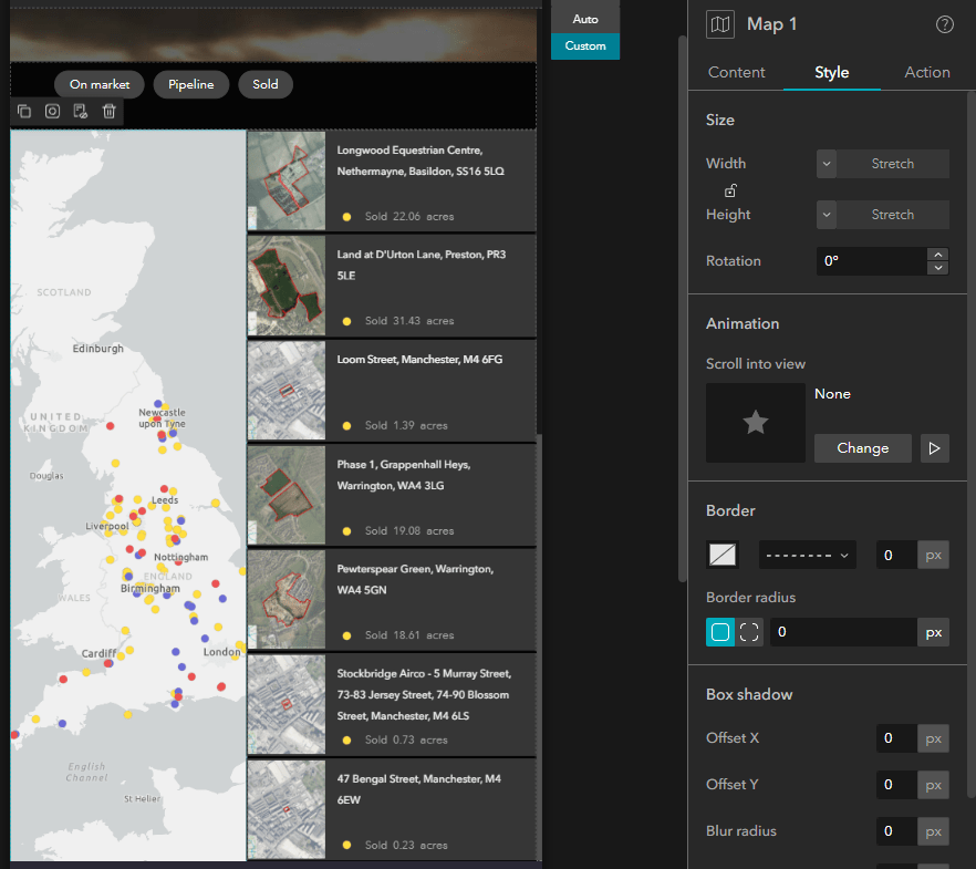
6. On the builder toolbar, click the Edit your page for small screen devices button.

7. In the Insert widget panel, on the Pending tab, drag the Map 1 widget into the Column widget.
8. In the Style settings, set Height to Stretch.
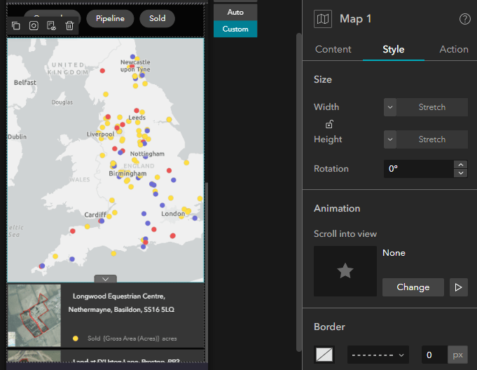
The small screen layout in this template was designed to use a Sidebar widget as a container for the filter, map, and list. (You can see this in the Page panel’s outline.) The Sidebar widget has two containers. The top one includes the filter, which is nested in a row for alignment, and the map is nested in a column. Both the filter and the map share the space allocated in the top container. The bottom container includes the list, which uses 100% of the space.
9. Click the List widget on the canvas to access its settings.
10. In the Content panel, expand Arrangement and turn off the Scroll bar setting.
Publish and test your web experience
Now that you’ve created your web experience, the final step is to preview and test your app, publish it, and share it.
1. Save the app.
2. On the builder toolbar, click the Preview button.

3. In the browser window that opens, test the web experience by scrolling to the second screen and navigating the multipage list.
4. Zoom in the map to see the list update with fewer records.
5. Use the filter to show sites that are on the market.
6. Click images in the list to view more information in a pop-up window.
7. Close the app preview window.
8. In Experience Builder, click Publish.
The Published status badge appears next to the item title.
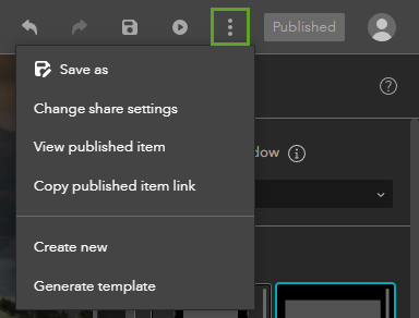
The More button on the builder toolbar includes item options, such as changing the share settings, copying the item link, and opening the published app. (This menu also includes options to save a copy, generate a template, and create a new app.) To view all your experiences and templates, click the icon in the corner next to the item name to open the Experience Builder Home page.
In this tutorial, you used ArcGIS Experience Builder to create a web experience that shares information about the availability of land for housing and development in the United Kingdom. You added and configured several common widgets nested in a screen group on a scrolling page. You also finalized the layout to support smaller screen sizes.
More information
For more examples of how to create and configure web experiences like this one, try the following blog articles:
- Create a Public Information App Using Experience Builder: This article discusses a public template that’s designed differently for all three screen sizes.
- Make an app: Part 2 of this Pink Lakes project goes over how to add and configure a window that opens when users click a button in your app.
- Make a list widget: Part 3 of the same Pink Lakes project steps through how to configure a List widget with dynamic text and images and an action that zooms the corresponding map to a selected item.
For more information about Experience Builder, see the following resources:

Commenting is not enabled for this article.