Shortly after Arcade was first released as an expression language for the ArcGIS platform, I wrote about how you can write Arcade expressions for creating predominance visualizations in web apps using the ArcGIS API for JavaScript (JS API). As of version 4.9 of the JS API, we made it easier for you to create predominance visualizations with the new predominance Smart Mapping module.
As stated in my earlier post,
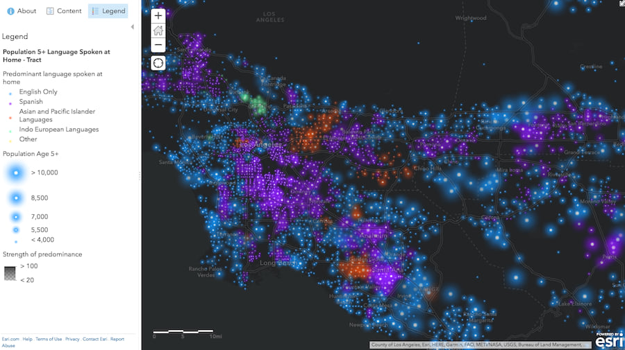
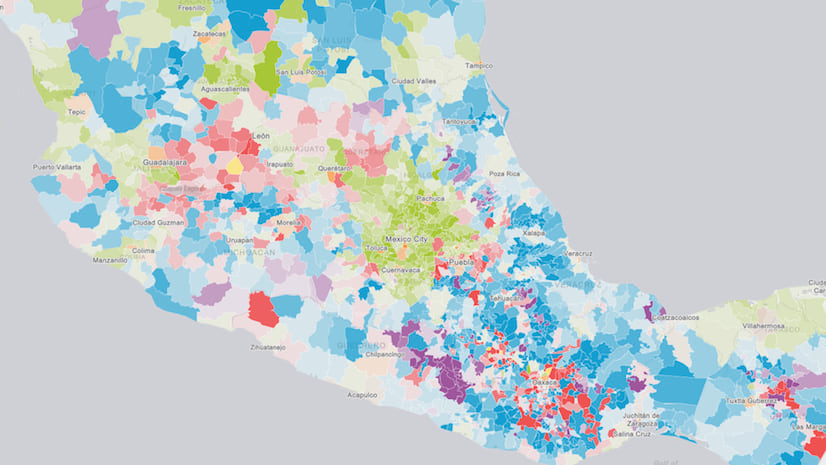
Visualizing predominance involves coloring a layer’s features based on which attribute among a set of competing numeric attributes wins or beats the others in total count. Common applications of this include visualizing election results, survey results, and demographic majorities.
Curious cartographic minds have created predominance maps for a number of cases including the following:
-
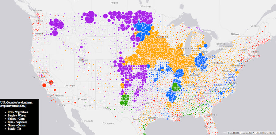
This map visualizes the predominant crop of each U.S. county. Icon size indicates total crop yield.


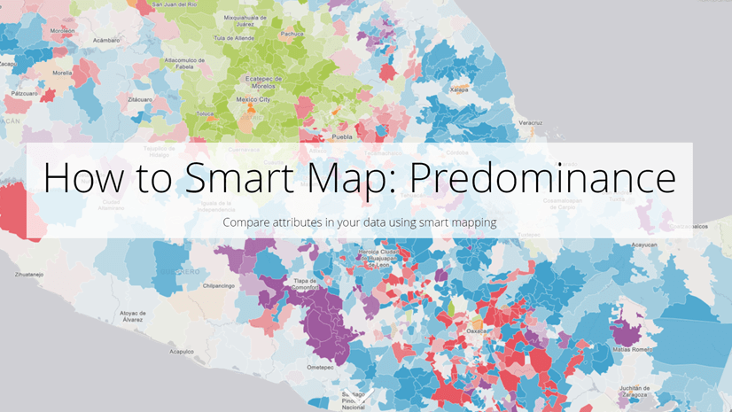
Create a predominance visualization with Smart Mapping
Thanks to the createRenderer method in the predominance module, you no longer have to construct an Arcade expression on your own to create these awesome visualizations. You can let the JS API do it for you.
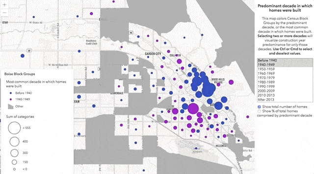
In the following example, I visualize block groups in Boise, Idaho based on the most common decade in which homes (single-family housing units) were constructed. The feature service contains attributes tallying the number of homes located within each block group for each decade.
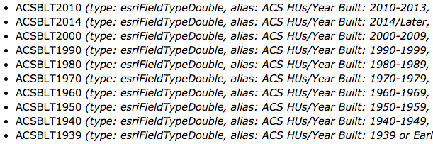
These fields compete with one another because a home cannot be built in more than one decade. Therefore, we can use predominance to visualize these features by the predominant decade in which homes were built within each block group.
All we have to do is provide the list of fields to the parameters of the createRenderer method, along with the layer instance, the view, and a basemap. Once the renderer is generated, you can set it on the input layer and it will automatically render in the view.
const fields = [{
  name: "ACSBLT1939",
  label: "Before 1940"
}, {
  name: "ACSBLT1940",
  label: "1940s"
}, {
  name: "ACSBLT1950",
  label: "1950s"
}
  // continue with other competing fields
  // for the 1960s, 70s, 80s, 90s, etc.
];

const params = {
  view,
  layer,
  fields,
  basemap: map.basemap,
  legendOptions: {
    title: "Most common decade in which homes were built"
  }
};

const predominanceResponse = await predominanceRendererCreator.createRenderer(params);
layer.renderer = predominanceResponse.renderer;
The createRenderer method also has parameters for including a size visual variable and/or an opacity visual variable. When set to true, these options provide additional context to the predominance visualization.
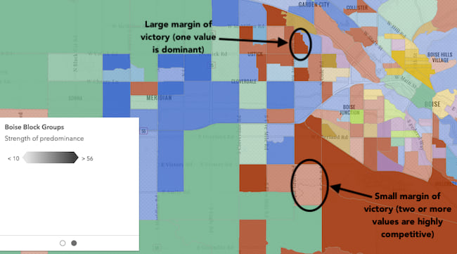
Opacity is used to visualize the strength of the predominant feature. The more predominant the feature (or the greater the margin of victory), the more opaque it will render. The slimmer the margin of victory, the feature will render with more transparency, indicating that while the predominant field wins, it doesn’t completely dominate the other competing fields.
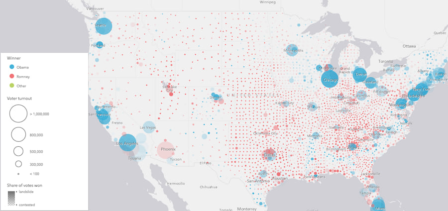
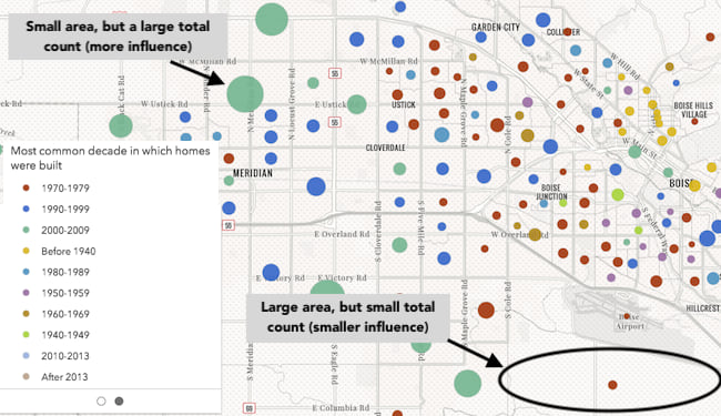
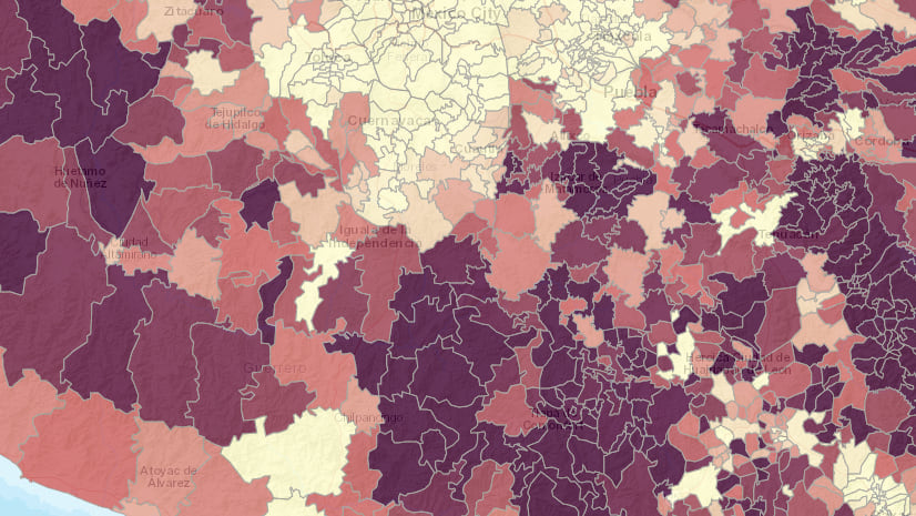
Size is used to visualize the total sum of the competing categories. This provides context to how the feature compares to the dataset as a whole. For example, in an election map, if a candidate wins a particular geographic area in a landslide, the opacity will show the strength of the win. But the size will indicate how much that win matters compared to other features. See the image below. While individual counties in the midwest voted overwhelmingly for the Republican candidate, each feature individually doesn’t account for many votes compared to areas with much higher populations.

In our housing app, we can use size to see where more homes are built in the Boise area. In the image below, it is clear there are areas where homes built before 1940 outnumber homes built in any other decade. But the total number of these homes is small compared to other block groups where homes built after 2000 far outnumber homes built in other decades. It is clear that more homes are built in recent years than in previous decades.
Create a data exploration app
We can turn the housing visualization into a more interactive data exploration visualization by allowing the user to specify which fields will be used in the predominance calculation. This allows you to compare various decades for housing booms or even see the movement of housing growth from inner cities to suburbs over time. Click the image below to view the app.
You may notice this app references an alternate color scheme than what is returned by default. You can access any predominance scheme we provide in the JS API by calling the getSchemes method on the predominanceSchemes symbology object.
const fieldList = document.getElementById("fieldList") as HTMLSelectElement;
const includeSizeCheckbox = document.getElementById("includeSize") as HTMLInputElement;
const includeOpacityCheckbox = document.getElementById("includeOpacity") as HTMLInputElement;

// Create an array of fields based on the options selected by the user
const selectedOptions = [].slice.call(fieldList.selectedOptions);
const fields = selectedOptions.map(function(option){
  return {
    name: option.value,
    label: option.text
  };
});

// Gets all the predominance schemes available in the JS API
const schemes = predominanceSchemes.getSchemes({
  basemap: map.basemap,
  geometryType: "polygon",
  numColors: 10
});

const params = {
  view,
  layer,
  fields,
  predominanceScheme: schemes.secondarySchemes[6],
  sortBy: "value",
  basemap: view.map.basemap,
  includeSizeVariable: includeSizeCheckbox.checked,
  includeOpacityVariable: includeOpacityCheckbox.checked,
  legendOptions: {
    title: "Most common decade in which homes were built"
  }
};

const predominanceResponse = predominanceRendererCreator.createRenderer(params);
layer.renderer = predominanceResponse.renderer;
How it works
Predominance visualizations are based on pre-generated Arcade expressions referenced in a UniqueValueRenderer instance. The Arcade expression relies on at least two field names provided to the fields parameter of the method. These fields are added to the expression, which will compare each field with all others to determine which one has the maximum value.
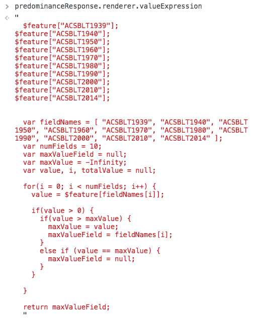
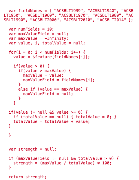
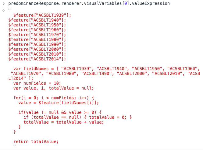
If specified, the opacity and size visual variables are also driven by data returned from Arcade expressions. You can view these expressions by logging the visual variables in the developer tools console of your browser.
The opacity Arcade expression looks like this:
And the size expression looks like the following:
As alluded to earlier, the predominance Smart Mapping module is particularly designed for building data exploration applications. It isn’t really suitable for generating renderers in typical web apps only intended to display one view of the visualization. If you would like to author a predominance visualization that will be consumed in multiple client apps, then I encourage you to read this blog post by Lisa Berry, which demonstrates how to create a predominance visualization in ArcGIS Online.

Commenting is not enabled for this article.