This blog uses the results of the workflow detailed here, only this time it focuses on the Dallas-Fort Worth area.
What’s different is making a cartographic comparison using layers available in ArcGIS Living Atlas to highlight the enormousness of the geography.
National Land Cover Database (NLCD)
This year the 2001-2016 National Land Cover Database (NLCD) was released in Living Atlas and for the first time ever there are 16 years worth of land cover displayed as a time series.
The changes in some areas, in terms of the human footprint, are remarkable to watch.
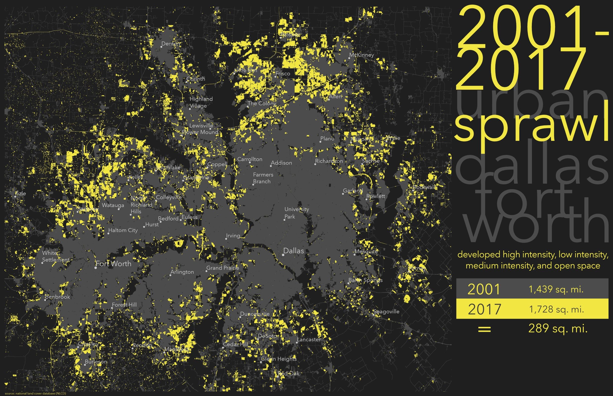
Urban Sprawl
Growing up in San José, California during the 70’s-90’s the mix of agricultural and urban diverged into the spread now known as Silicon Valley and beyond (the South Bay).
Housing developments went up on the surrounding foothills and like many subdivisions on the fringes the streets were given names of what they displaced – Hawks Crest Circle, Oak Hill Drive, Old Orchard Road, Coyote Court, Meadow Lane, etc.

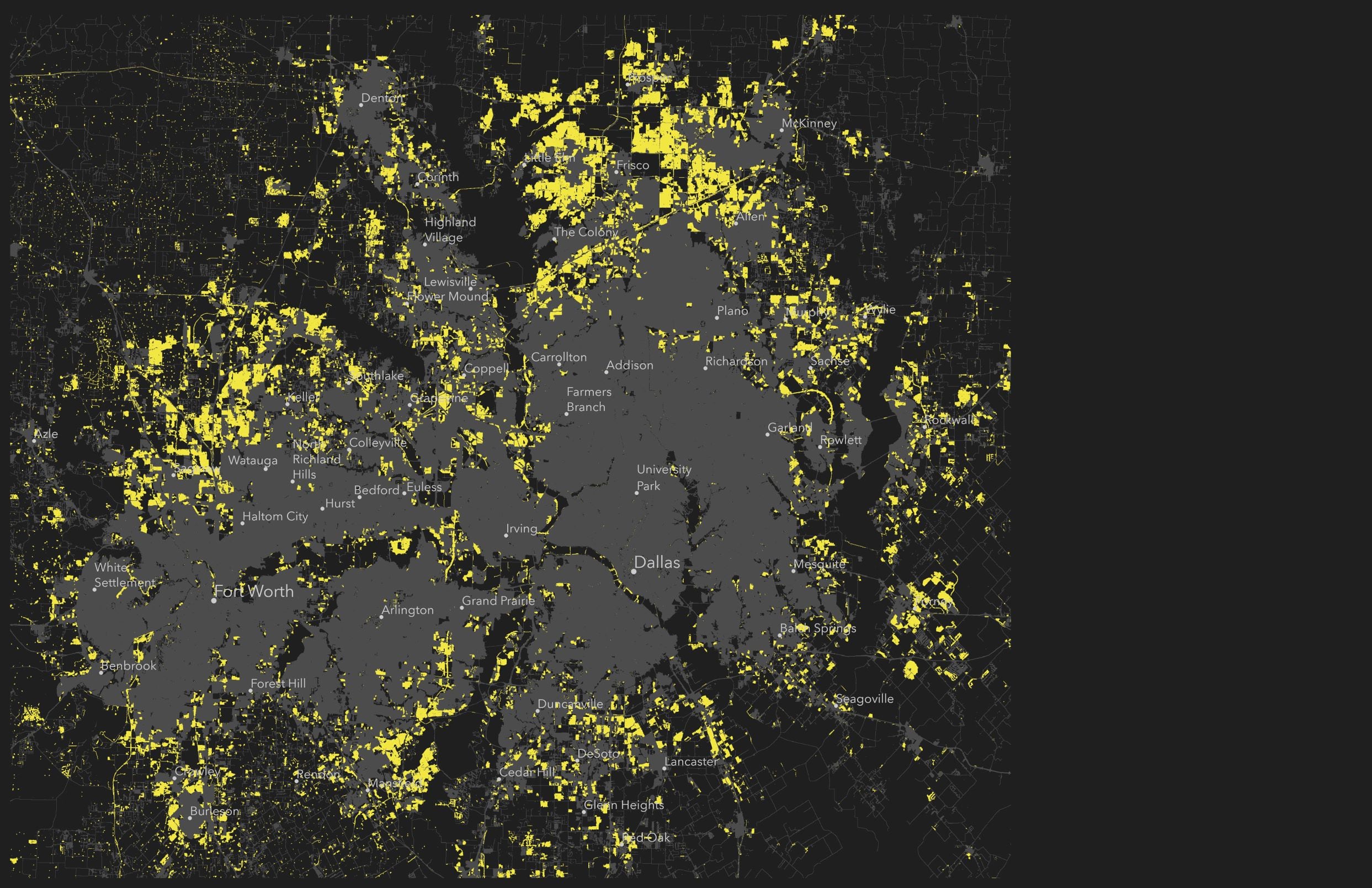
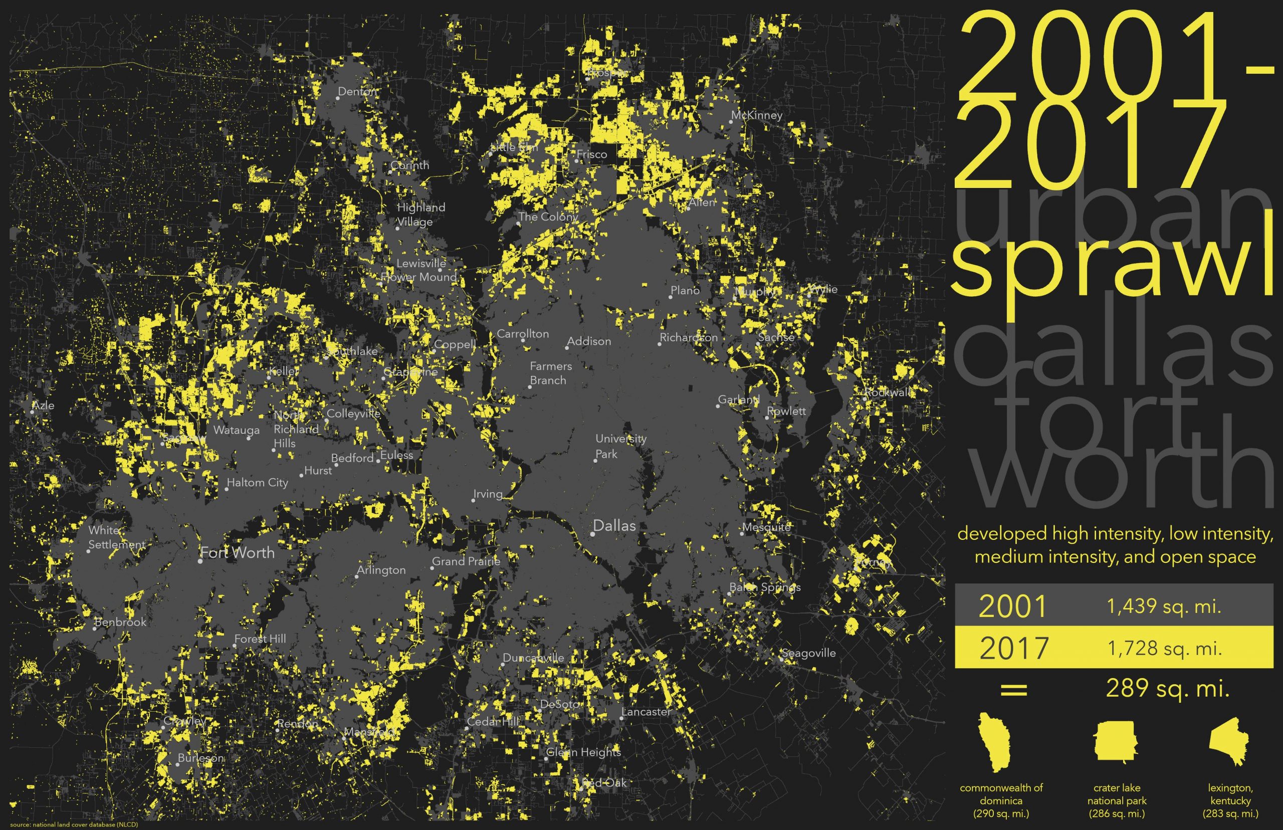
Mapping Loss: Dallas-Fort Worth
In 2016, Dallas–Fort Worth (DFW) ascended to the number one spot in the nation in year-over-year population growth.
This was quite apparent in the NLCD when you watch the time series, but just how much was it and what does that really look like anyways?

Prepare the Living Atlas layers
In ArcGIS Pro use this workflow by bringing in the NLCD layers and applying a Defination Query. The general process is: NLCD Clip –> Raster to Polygon –>Frequency (no water class for this map).
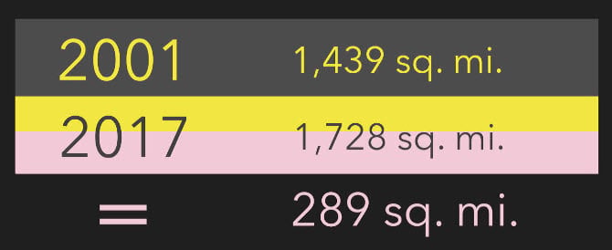
We now have two layers with 2001 and 2016 land classified as Developed High, Medium, and Low Intensity and Open Space.
The results tell us there is a whopping increase in these land classifications from 2001-2016 of 289 square miles!
Map Design
Mimic a dark night sky (#1E1F1E) for the background color and use yellow for lights (like in the above space station picture) only bump the 2016 developed color to an almost CAUTION sort of yellow #F2E643, something super bright and artificial neon like.
This map does not need any more color than that, as the focus should be on the change. Use a soft gray #4C4C4C for 2001 developed NLCD land.
The cities get a 4 pt simple circle symbol.
Give the labels Avenir Next LT Pro (#CCCCCC) at 15 pt for Dallas-Fort Worth and 11 pt for other cities.
Make the Map Crowded
Let’s incorporate that feeling of sprawl in the map and the title is a great place to do that right out of the gate.
Make the words run into each other and move off one another, so you get that feeling of connected, yet cramped.
Pop with color the words ‘year’ and ‘sprawl’ in the same yellow so that they tie into the map.

The statistics need to stand out and be prominent and a traditional legend, well is traditional.
Go with something that fills the space and also provide the viewer’s eyes a resting spot that’s solid and predictable. Like stacked cement blocks.
Everything is coming together and is neatly crowded, but just how big is 289 square miles? What does that look like?
Comparing Apples to Apples with Geography
289 square miles needs to be put into perspective. Living Atlas has an abundance of other geographies to visually quantify the tremendous growth that DFW experienced.

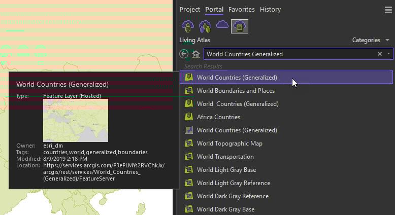
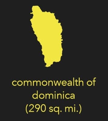
Geography Compare #1: World Countries
Create a new map in your Pro document and go to Living Atlas Portal and add World Countries Generalized.
Using this list online the Commonwealth of Dominica, an island country in the West Indies, is 290 m2. Zoom to the Commonwealth of Dominica and symbolize it with the same yellow #F2E643.
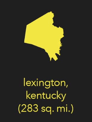
Geography Compare #2: US Cities
Using this list online, Lexington, Kentucky is similar in size at 285.6 m2. Create a second map in your Pro document and from Living Atlas Portal add the American Community Survey (ACS) Population Estimates. Using the Tract boundaries, isolate all of those that list Fayette County, Kentucky using a Definition Query.
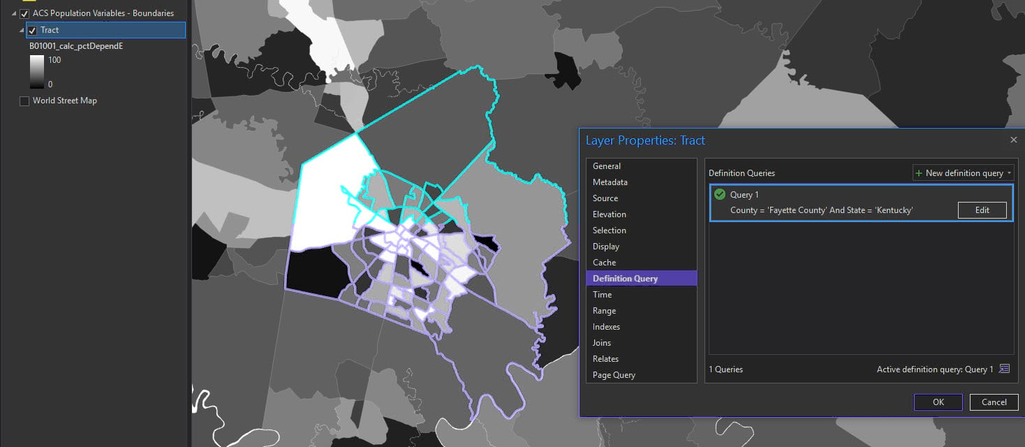
Symbolize it with yellow #F2E643.
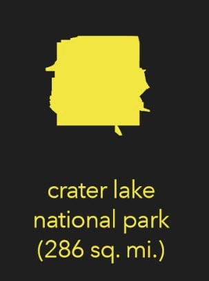
Geography Compare #3: National Park Boundaries
Source directly from the National Park Service and using this list, Crater Lake National Park is 741.5 km2 which is 286 m2.
Add in a third and final map and zoom to Crater Lake. Symbolize it with yellow #F2E643.
The map is all together. Comparing the amount of NLCD development to known geographies gives context to just how big 289 miles really is. Especially grown within 16 years!
It’s the size of an entire country, city and decent sized National Park!
Living Atlas Layers
There are many layers available that can be used similarly in your maps and analysis. Here are a few others worth your time checking out:
USA Flood Hazard Areas
Critical Habitat
Soils
Cropland
World Protected Areas
Weather Radar Imagery
Daily Sea Surface Temperature
Recent Earthquakes
Thank you
Please reach out to me for any questions or feedback and be sure to check out the NLCD time series for your own community…and please replicate the workflow for this geography compare map!


Commenting is not enabled for this article.