In October 2023, ArcGIS Maps for Adobe Creative Cloud version 3.6 was released with improvements to the charts experience. With the latest update, charts made in ArcGIS Pro can be exported as organized vector layers into Adobe Illustrator. These improvements to layer organization make it faster to create selections and change the styles of your charts.
While exploring data for a mapping project, I came across interesting National Park statistics that I wanted to visualize with Maps for Adobe Creative Cloud’s improved chart support. I am a frequent visitor of Joshua Tree National Park in Southern California and had some assumptions about visitor patterns and daily temperature. Follow my workflow to learn how I created an infographic combining these statistics.
Start in ArcGIS Pro
Make a chart out of a map layer or table in ArcGIS Pro and add your chart frame to a map layout.
In my example, I created a line chart and bar chart with statistics on average temperature and number of overnight stays in Joshua Tree National Park. The charts on the left side of my layout have a default style, and the charts on the right have a few customizations with different themes, titles, and colors.

Then, export your layout as an .aix file. Click Share > Export.

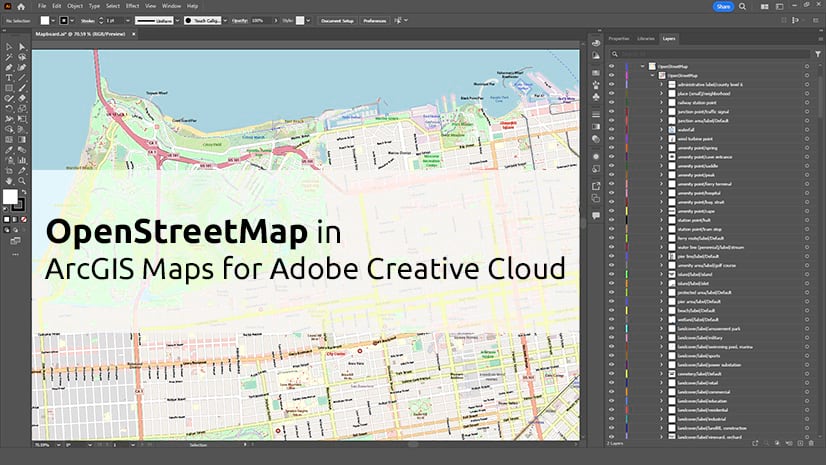
Launch Maps for Adobe Creative Cloud
In Adobe Illustrator, sign in to the Maps for Adobe Creative Cloud extension with your ArcGIS Online or Enterprise account before opening your .aix file. Visit the resources page to learn more about getting started.

Open your .aix file in Adobe Illustrator and see the same layout exported from ArcGIS Pro.
Review your chart in the layers panel by clicking Window > Layers to see how the chart vector layers are organized and grouped.

In the image above, I selected the bar chart layers in the layers panel. Notice the titles and colors I set up in ArcGIS Pro are reflected in the Illustrator layers.
Labels, grids, polygons, or any details of your chart can be selected for further editing.
Design further in Illustrator
With your ArcGIS Pro chart now in Adobe Illustrator, you have the flexibility to modify any element and customize it to match your style.

I edited the Illustrator vector layers to combine the line and bar charts. Viewing temperature data and visitor data in the same chart helps interpret data trends, with fewer visitors staying at the park during its hottest months. My assumptions about visitor patterns were correct, but seeing the drastic variation displayed in a chart surprised me.
As a fun style choice, I masked the bar chart columns with an image of the iconic rock formations that are found in Joshua Tree National Park, and I changed the background to a picture I took while stargazing at the park.
Use your creativity to start designing custom charts and maps with the help of ArcGIS Pro and ArcGIS Maps for Adobe Creative Cloud.
Resources
Visit the ArcGIS Maps for Adobe Creative Cloud product page.
Connect with the ArcGIS Maps for Adobe Creative Cloud user community.
Learn more about ArcGIS Pro charts.

Commenting is not enabled for this article.