Dashboards created with ArcGIS Dashboards have a wide variety of use cases, from visualizing real time data feeds to informational and executive dashboards. They have also been deployed by disaster response and emergency management agencies with the aim of providing a central view of operations. To better support these needs, the ArcGIS Dashboards Beta release includes the support of the percentile statistic in the indicator, gauge and serial chart elements.
Why percentiles?
When looking at your data, sometimes using the average is…well…just average. Sometimes you need to go beyond to better understand your key metrics and relay the information that’s important. One industry where percentiles are used frequently is emergency management, in particular fire agencies. To assist fire agencies with setting high quality standards and communicating these metrics to their stakeholders, several organizations like the Center for Public Safety Excellence have built frameworks for fire agency self-accreditation. Many components from the size of the fire crew to total equipment are evaluated as part of the accreditation process. Integral to this process is showing how quickly an agency responds to emergency calls. From when a call is received by the emergency call operator to when the first unit arrives at the incident site, agencies measure the time it takes for each step of the process.

Components of a fire call timeline:
- Dispatch time – Time from when the call is received by an operator to when it’s assigned to a fire department.
- Turnout time – Time from when the call is received by a fire department to when the first unit leaves fire station.
- Travel time – Time taken for first unit to arrive at the incident site.
- Total response time – Sum of dispatch, turnout and travel times.
These time measurements often have extreme values that can be a result of many different things, like a remote incident site which takes longer to reach, an operator error, or another incident that is impacting traffic. Using statistics like average on this data can provide a skewed picture of an agency’s performance, as a few extreme values can tilt a metric one way or the other. Percentiles on the other hand can eliminate extreme values in a dataset, thereby providing credible measure of the most likely performance of an agency.
A crash course in percentiles
If you don’t recall what percentiles mean, we have you covered. An nth percentile of a dataset represents a datapoint under which n% of the ordered values fall under. Still confusing? Let’s simplify this with an example.
Say we have a dataset of 10 values – {70, 90, 15, 12, 6, 100, 150, 180, 120, 200} and we want to calculate the 90th percentile. To find this value, we have to first order the dataset from the smallest to largest values i.e. {6, 12, 15, 70, 90, 100, 120, 150, 180, 200}. By default, the 0th and 100th percentile values are the lowest and greatest values, which are 6 and 200 in this dataset.
Now, we have to choose a value under which 90 percent of the values fall. There are two ways to do this – either using the discrete or continuous method of calculating percentiles. Choosing the discrete percentile will return a value from your dataset, which in this example, will be 180. The continuous percentile will interpolate the value from the dataset, which in this example will be 182. Both methods are available in dashboards. The discrete method is ideal for large datasets with good coverage, while the continuous method is better for small datasets with gaps in the data.
In a nutshell, when a fire agency reports that it’s 90th percentile total response time is 600 seconds, it means that 90% of the times, the agency’s first unit will be at the incident site within 600 seconds.
Using percentiles as a metric in Dashboards
You can choose to use the Percentile statistic type in the indicator, gauge or serial chart elements when configuring the Data tab. Using percentiles is as easy as 1-2-3.

1. Choose the percentile type
When you choose the percentile statistic, you have the option to either use the Discrete or Continuous method. Choosing discrete will return a value calculated your data and continuous will return an interpolated value.
2. Choose your data
After choosing your percentile type, select a field. Remember, percentiles are a numerical statistic, which means the fields you use need to be of the numeric field type.
3. Choose your percentile value
Finally, choose your percentile value. Your percentile value indicates the percentage of your data that your values fall below. Since this is a percentage of your total data, enter a value between 0 and 100.
It’s that easy.
Building an accreditation dashboard
Let’s build a fire agency accreditation dashboard with sample data from San Diego County, California. We’ll start by configuring indicators with the standards of cover, or key performance indicators (KPI) for the agency. The three components of a fire call timeline, dispatch time, turnout time, and travel time, all have set to the 90th percentile with a fixed value KPI as reference.

These indicators are helpful in answering questions like:
- Which portions of the call time are meeting our goals?
- Are there any weaknesses in the call response timeline?
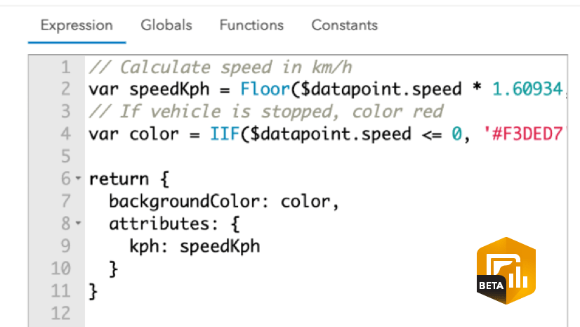
To call attention to any metric that is exceeding the KPI, these elements have been configured with conditional formatting. We see the 90th percentile for dispatch time is exceeding the KPI, highlighted using conditionally formatted font color and icon. Using Arcade expressions (new in the beta), the metrics measured in seconds have been converted to and displayed in minutes.
Similarly, the percentile statistic can be used to set up gauges for these metrics. The gauge in the image below has been configured to monitor the performance of the total response time. The 90th percentile for total response time is represented by the needle. The guide has been configured to show the acceptable range of values in blue, and in red to indicate that the KPI is exceeded. The gauge can function as an overall measure of the department’s performance.

Finally, let’s add serial charts to keep track of trends in total response time and across jurisdictions, to answer questions like:
- Did we have a particularly good or bad month?
- Are we always performing well on certain days? Are certain days worse?
- Are all zones within the standards of cover?
In this first serial chart, we have a time series showing the 90th percentile for total response time by date, from the beginning of the year. The guide has been set to the KPI of 14 minutes. We see overall this year has been pretty to good, with the response time well within KPI, although on some days the performance is nearly breaching the KPI.

The second serial chart shows the performance across three zones, each set to 90th percentile for total response time. We see that all the zones are performing well and are within the KPI of 14 minutes.

Bringing all these elements together, we can set up an accreditation dashboard (like the one below) providing an overview of the key metrics that fire agencies need to keep an eye on and the standards they need to meet for accreditation.
Please note that this is not real or live data.

Now that we’ve seen how we can understand data a bit differently using percentiles, there are some things to keep in mind when configuring your elements to show this statistic.
- The percentile statistic is available in the indicator, gauge, and serial chart elements.
- Percentile statistics can only reference feature layers. CSV layers and other feature collections do not currently support percentiles.
Percentiles are a great way of seeing your data in a new way and getting a better sense of your key metrics. Beyond emergency response dashboards, percentiles can also be used to show metrics like daily stream flow measured by stream gauges or prices in the rental market across a state and so on.
The Dashboards team at Esri is excited to see how you make use of percentiles in your dashboards. If you’re able to, please share them with us on Twitter and LinkedIn using #ArcGISDashboards.
Join the ArcGIS Dashboards Beta GeoNet community for discussions, updates, and blogs.


This really moves dashboard capabilities in an advanced direction – thanks!
FYI – the example accreditation dashboard (which is a great idea) has no data, or the sources are broken:
https://www.arcgis.com/apps/dashboards/be9ea3a77029418194ee2054e172c776
Hi Jay,
Looks like there was an issue with the webmap. The dashboard loads fine now. Could you please retry? Thanks!
I love this feature. However, if it’s okay, could you please clarify whether ‘discrete’ takes the:
LowerHigheror Nearestvalue from the dataset when it falls between two values?
After some experimenting, it seems that ArcGIS Dashboards use the lower method. It would be great to have this confirmed in writing. Thanks!
Also, if possible, could you add the ability to choose the other two options (upper and nearest) when calculating discrete percentiles?
Thanks so much
Gee