Operations Dashboard for ArcGIS has grown considerably since our web launch in December of 2017. We updated in April and now again with the June release of ArcGIS Online. It’s wonderful to see the new and exciting ways that you are using Dashboard, and the updates you will find in this release are in response to your feedback.
Here are many of the key new updates you will find…
New Dashboard Settings
With this release, we are opening the door to a wealth of new settings that you can use to tweak your Dashboards to fit the style you need and the content you are authoring.
New Layout Settings
Organizations like the City of Johns Creek, GA, are embedding Dashboards inside their websites. Check out this cool Public Works Tasks & Projects web site. Arizona Department of Emergency Management are embedding Dashboards into Story Maps as well. Look at all the embedded Dashboards for the Governors briefing.
The Dark/Light theme and background color choices for each visualization provide a level of control over the color of your Dashboard but not enough when embedding them into a web site. Now you can set color choices for a number of additional properties that will override the theme you choose.
- Text Color
- Dashboard Background Color
- Element Background and Outline Colors
- Tab Border Colors (including Active/Inactive colors and the Inactive Text Color)
New Map Settings
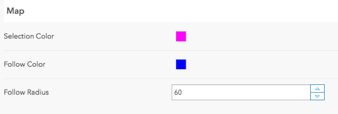
Depending on the symbology of your map layers and the basemap that you use, the Dashboard selection color may not be effective. Now you can choose the best color to display selection on your maps.
With the new Follow Feature action you will read about soon, you can set the Follow Color and the Follow radius as well.
General Settings
When you need to build a single Dashboard that is used on laptops as well as large wall-mounted displays, being able to re-size elements to best fit the monitor being used without having to edit or create multiple Dashboards is key. Clicking on the General settings, you can Allow element resize so that the Dashboard viewer can resize elements.
Number Prefixes
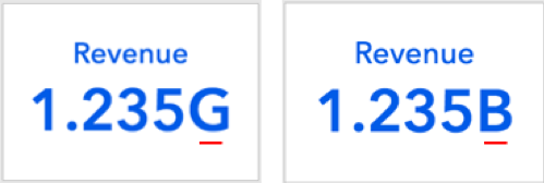
The Indicator, Gauge, and Charting Dashboard elements support unit prefixing. Prefixing can be quite useful when indicating a multiple or fraction of a unit, such as “kilo” for thousand. Until now, Dashboard would simply apply the standard metric prefix symbol. However, with this update, when you access the Dashboard Settings, and click on the General tab, you can set the symbol used for the prefix. In the example below, you will see that the standard metric prefix for billion is G, for “giga”, but can be overridden to B for “billion”.
Icons
As with our last update, we are continuing to add new icons for use with both the indicator and header elements. Remember that if you don’t find what you need in our gallery, you can always insert your own svg.
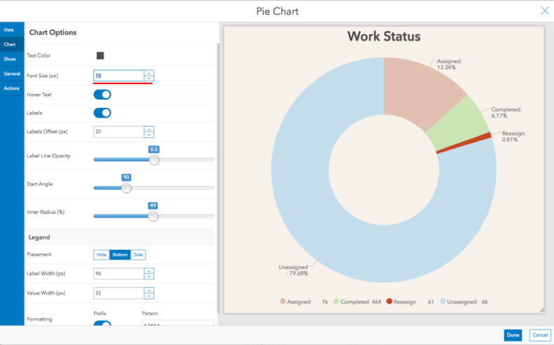
Pie Charts
The label and legend text size for pie charts are now configurable so that your slices are easily understood.
Serial Charts
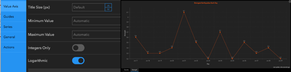
When representing nonlinear data, such as the strength of earthquakes, or percentage change, applying a logarithmic scale for the value axis can be quite useful.
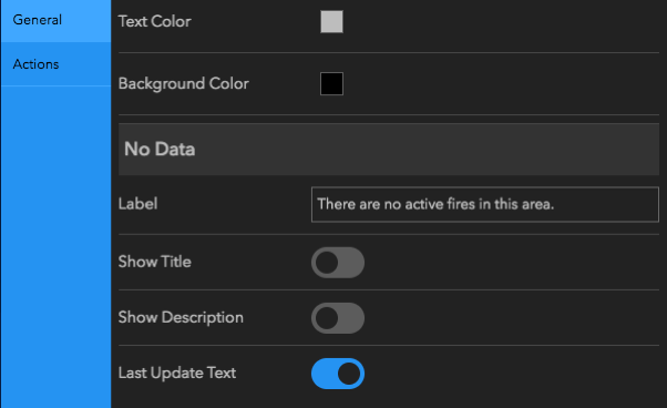
No Data
When authoring and configuring elements, you may encounter a flow were the visualization is empty. Perhaps it needs to be filled by a selection from another visualization, maybe it’s content is driven by the map extent. Regardless of the reason, having control over what happens inside of your element when there isn’t any data is important. In our March release, you could create your own label for No Data. We have added the ability to turn off the Title and Description. Doing so provides additional focus on what is required to fill your visualization with data.
Interactivity Improvements
There are two new actions with this update that improve the way you work with real-time data and provide focus on the map when selecting features.
Follow Feature Action
As you know, Dashboard is a great app for monitoring data that moves. Updates are at the cadence of your layer update frequency and your maps do not flash. Now you can follow people, vehicles and vessels using a new Follow Feature action.
You can tap on a feature and from it’s popup, you can put the map into a follow mode. Or, you could select a feature in a list and use the action framework to pan/zoom and follow feature.
Show Popup Action
When selecting a feature in a list, you can apply actions that pan, zoom or highlight the feature on the map. Now with the Show Popup action you can also display a popup to provide additional context and focus to the feature you have selected.
Here is a short video that shows both the Show Popup action from a list as well as the Follow Feature mode. Never will a snow plow get lost again.
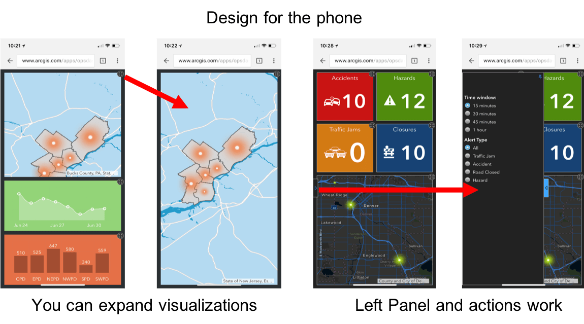
Dashboards on Smartphones
Last but definitely not least, we have lifted the restriction put in place that prevented opening a Dashboard on a smartphone. That doesn’t mean the Dashboards on your laptop will just look amazing on your phone though. You will need to design your Dashboard so that it can be used effectively on a phone form factor and there are many considerations. Here is a blog article that highlights some of those considerations.
In addition to the new capabilities we have listed above, you will find additional updates and many stability and performance fixes as well. We are getting ready to release ArcGIS Enterprise 10.6.1 very soon and this will be the first release where Operations Dashboard is embedded within the Portal setup. You will not need a separate installer. Note that the functionality within 10.6.1 includes details within the April update but does not include the updates in this June release. They will be coming in ArcGIS Enterprise 10.7 early next year.
We hope you have a great summer and enjoy the June update to Dashboard!
Dashboard Team

Commenting is not enabled for this article.