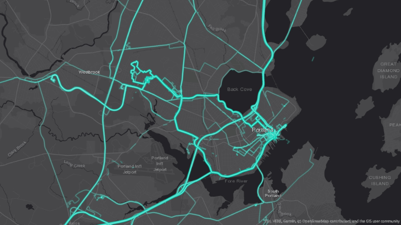
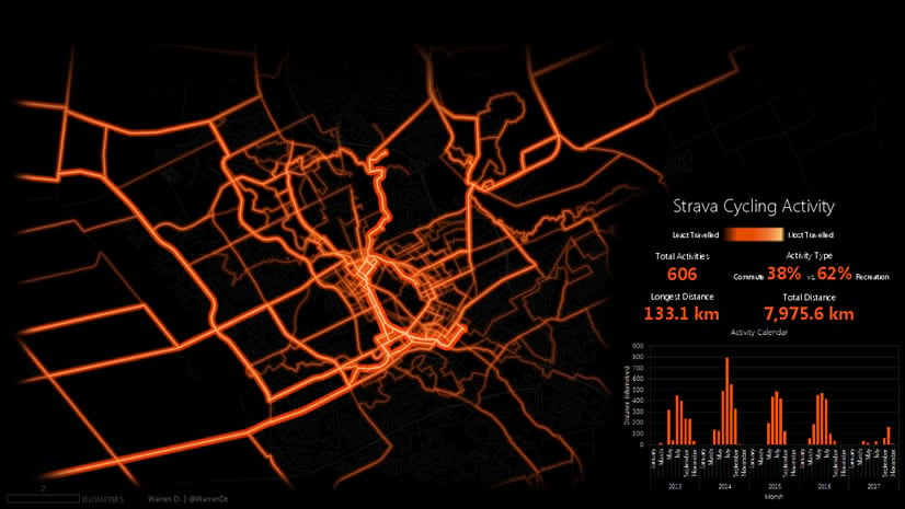
One of my favorite ways to visualize data collected by ArcGIS Tracker or ArcGIS Field Maps is through a linear heatmap. A linear heatmap shows the most frequently traveled routes and hot spots of activity. Although it’s not statistically based, it is a great way to visualize large amounts of track data. The linear heatmap below clearly shows the popular routes and destinations used by our team in the Portland, ME R&D center.

Let’s see how we can build a similar map in ArcGIS Pro and then publish it to our organization as a Vector Tile Layer. The following steps are adapted from a great blog post by John Nelson, a cartographer at ESRI.
Create a map
This visualization uses stacked lines with varying colors and opacity to create the effect shown above. Since Tracker and Field Maps store the data as points, we first need to build track lines. In this blog we’ll be using the Reconstruct Tracks tool powered by GeoAnalytics Server. If you do not have access to GeoAnalytics Server, you can use the Points to Line tool in ArcGIS Pro or a custom script.
First, let’s create a new map and add a track view tracks layer. You can see there are a ton of points on the map and it’s difficult to see any clear patterns.

Build track lines
Next, let’s open the Reconstruct Tracks tool; it’s under the Feature Analysis menu.

The Reconstruct Tracks tool allows us to turn all of the point data into lines. It allows these lines to be unique per user and also to be split based on time and distance thresholds. Since it uses distributed computation, it’s pretty quick for large datasets.
Once the tool is open, we’ll need to fill in some of the parameters:
- Input Layer – Provide the name of the tracks layer containing your data
- Output Name – Provide the name of the new layer that will be created
- Track Fields – Provide the fields that uniquely identify the tracks. This should be Created User
- Time Split – Provide a value that will cause track lines to be split into separate lines if two consecutive points are more than this time interval apart.
- Distance Split – Provide a value that will cause track lines to be split into separate lines if two consecutive points are more than this distance apart.
- Data Store – Choose which datastore you would like the resulting layer to be hosted in. You may run into pagination issues if you choose Spatiotemporal data store.
- Output Coordinate System –You may want to set the output coordinate system. This is located under the Environment tab. I used Web Mercator since this data will primarily be used in web maps.
You can leave the other parameters as is and run the tool.


Export the data to a local feature class
Once the tool has finished executing, you will have a new layer in your map. Since our end goal is to publish a vector tile layer, we need to export all of the lines to a local file geodatabase. Publishing a vector tile layer from an existing hosted feature service is not supported in ArcGIS Pro, so right-click on the track lines layer and hover over Data. Click Export Features.

In the Feature Class to Feature Class panel, fill in the following parameters:
- Output Location – The file geodatabase to store the local feature class in
- Output Feature Class – The name of the feature class to create
You can leave the other parameters as is and run the tool.

Create custom symbology
Once the new feature class is created, you can remove the other layers from your map. We’re only focused on using the local line data. The linear heat map uses Symbol Layer Drawing to emulate having multiple overlapping layers of data. Let’s see how to create this cool lightsaber effect.
Open the symbology for the track lines and navigate to the Structure tab (it has the wrench icon). Once there we’re going to add four additional symbol layers to the symbol. Click Add symbol layer four times as shown below.

Now switch to the Layer tab. You should see five total symbol layers. Select the first layer and open the Color Properties dialog as shown below.

In the Color Editor, set the Transparency to 85 and set the Hex # to FFFFFF, then click OK.

Repeat this for the other four symbol layers using the values outlined in the table below:
| Color (Hex #) | Weight (pt) | Transparency (%) |
FFFFFF |
0.5 | 85 |
00FFC5 |
3 | 90 |
00C5FF |
6 | 90 |
00F4C7 |
8 | 95 |
005CE6 |
12 | 98 |
Once each symbol layer has been configured, click Apply to have the changes applied to the map. It should look similar to the image below.

Create the Vector Tile Layer
Let’s publish our layer as a vector tile layer. First, remove the basemap layers from your map, then open the Share tab in ArcGIS Pro and select Publish Web Layer.

In the Share As Web Layer panel, enter these parameters:
- Name – Provide the name of the vector tile package and layer you’d like to create
- Summary – Provide a short description of your new vector tile layer
- Tags – Provide at least one tag for the new vector tile layer
- Data – Select Copy all data
- Layer Type - Check Vector Tile
The other parameters can be left as is. Click Publish to publish the new layer.

Once your new layer is published, you can verify it works by opening it in a webmap as shown below.

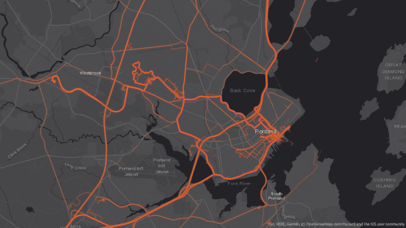
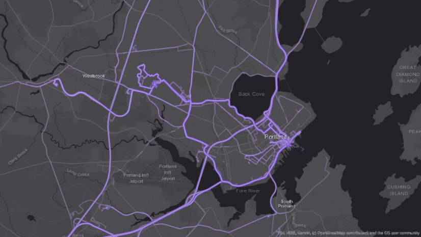
This guide demonstrates one interesting way to highlight your organizations’ track data. Some other example color schemes are listed below.
Orange Tracks:
| Color (Hex #) | Weight (pt) | Transparency (%) |
FFFFFF |
0.5 | 85 |
E65C00 |
2 | 90 |
E63D00 |
3 | 90 |
E64D00 |
4 | 95 |
E62600 |
5 | 98 |
Purple Tracks:
| Color (Hex #) | Weight (pt) | Transparency (%) |
D1C4E9 |
0.5 | 65 |
B39DDB |
2 | 90 |
9575CD |
3 | 90 |
7357C2 |
4 | 95 |
673AB7 |
5 | 98 |
Green Tracks:
| Color (Hex #) | Weight (pt) | Transparency (%) |
D4F6F2 |
0.5 | 65 |
92E9DC |
2 | 90 |
03DAC4 |
3 | 90 |
00C7AB |
4 | 95 |
00B797 |
5 | 98 |
-
...


Commenting is not enabled for this article.