ArcGIS Workforce is designed around two primary roles: the Dispatcher who creates and assigns work and the Mobile Worker that completes work. However, there may be a third role, the Supervisor who needs to see the high-level status of the project. The supervisor may be interested in key performance metrics such as the number of assignments that were completed in a given week, the number assignments due by the end of the week, or the number of assignments completed by each worker. Although the Workforce web app allows dispatchers to view and edit assignments, a much easier way to share and visualize this information in a read-only manner is to use ArcGIS Dashboards. Let’s see how to create a simple dashboard from an existing Workforce project:
Make a copy of the dispatcher map
- In the ArcGIS Online Map Viewer open the dispatcher map for the Project and save a copy of the map.
- Set a refresh interval of 0.5 minutes for the assignments and workers layers and save the map.
Create a new Dashboard using the new map
- ArcGIS Dashboards is a configurable web app that is available with ArcGIS Online and Enterprise 10.6+. After signing into your organization, you can open ArcGIS Dashboards using the App Switcher in the upper right corner of the ArcGIS Online home page.

- After ArcGIS Dashboards opens, create a new dashboard by clicking the Create Dashboard button and filling out the simple form.
- You will now have an empty dashboard. Let’s add a map. In the upper right corner, there are four dropdown menus. Use the first menu to add an existing map to the dashboard.
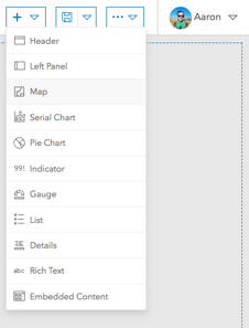
- Search for the map that was just created and select it. Using the map configuration dialog, click Done to finish adding the map to the dashboard. You should now see your map in the dashboard with the default settings.

Tip: From the webmap you can also click “Share”. Then select “Create Web App”. Then select the “ArcGIS Dashboards” tab, fill out the form and click “Done”. This will automatically add the webmap to a new dashboard.
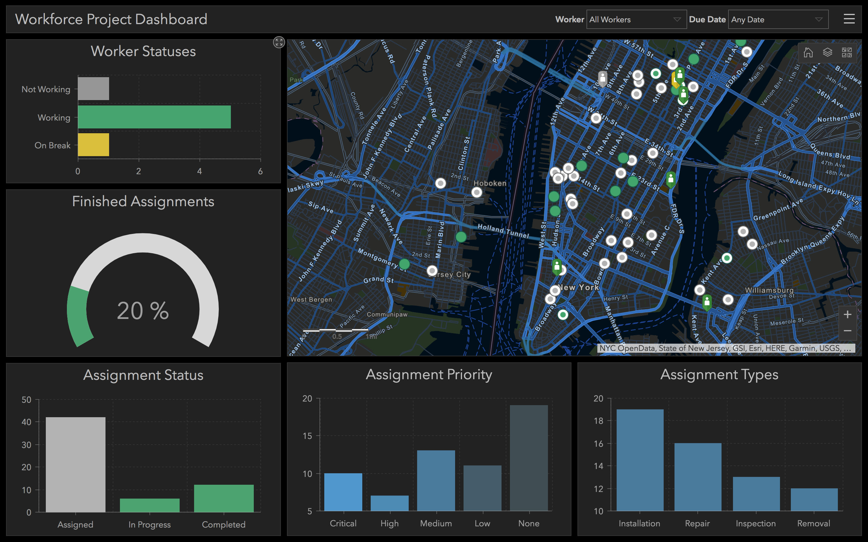
Add some Indicators to show assignment statuses
- Let’s add an indicator to show the number of completed assignments. Using the add menu, add a new Indicator. When prompted to select a layer, choose “Assignments”. You should now be seeing the indicator configuration dialog.

- By default, the indicator is showing the total number of assignments. Let’s add a filter to only show completed assignments. Click the +Filter button, select the “status” field, use equal as the operator, and set the value to “Completed.”
- Let’s now add a descriptive title to this indicator. Open the General tab, and add a Name of “Completed Assignments”. Additionally, use the rich text editor to set the Title to “Completed”. Center the text and change the paragraph format to Heading 3. The indicator should now look like the following:
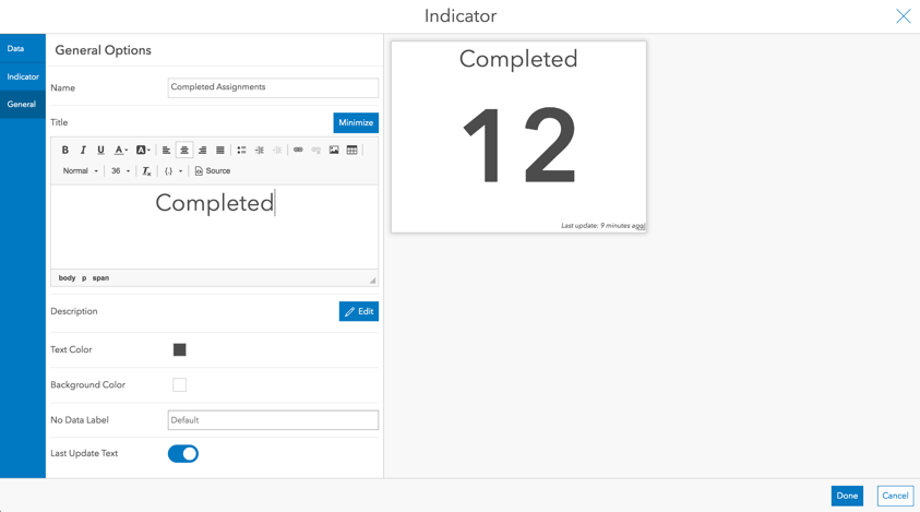
- Click Done to finish and add the indicator to the dashboard.
- Repeat steps 1 through 4 for assignment statuses of “Unassigned”, “Assigned”, “In Progress”, “Paused”, and a combination of “Declined” and “Canceled”. The dashboard should look similar to this:

- Let’s clean up the dashboard so it looks nice. Hover over one of the indicators. Notice the blue icons that appear in the upper left. Click and drag the “drag item” icon and place the indicator at the top of the map (in a row). Repeat this for all indicators (using “dock as a column”). Use the visualization dividers to re-size the map and indicators. More information on dashboard layouts can be found here. The dashboard should look similar to the following screenshot:

Add a List of workers
- Let’s add a List of all the workers in our project. Using the add menu, add a new List. When prompted to select a layer, choose “Workers”. You are now on the list configuration dialog.
- Open the List tab on the left and edit the “Line Item Text”. Let’s show the workers name and their contact number as shown in the following screenshot:

- Click Done to finish the configuration
- Resize and move the list so that it is to the left of the map and under the indicators.
Add a Pie Chart to show the status of workers
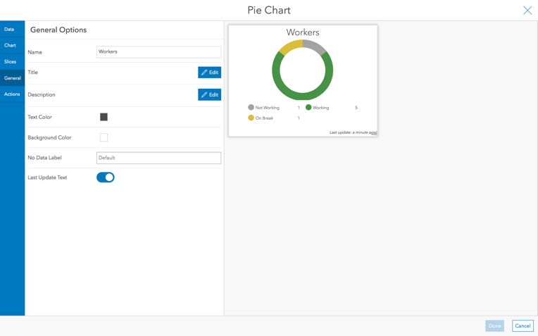
- Let’s add a pie chart that shows the current break down of the workers. Using the add menu, add a new Pie Chart. When prompted to select a layer, choose “Workers”. You are now on the pie chart configuration dialog.
- The default type of pie chart uses categories from Grouped Values. Let’s use this option since we want to show the number of workers that are “working”, “not working”, or “on break.”
- In the category field dropdown, select the “Status” field. You should now see a preview of the pie chart.
- Let’s style this chart a bit. First open the Chart tab, and set the inner radius to 75%. Let’s turn off the labels and set the legend placement to Bottom.
- Next, open the Slices tab and set the category colors as follows:
Not Working -> #A3A3A3 (Grey)
Working -> #479347 (Green)
On Break -> #D8BE3C (Yellow)
Tip: If you don’t have one of these categories, you can add a new category.
- Finally, open the General tab and add a Title and Name of “Workers” to the pie chart using a paragraph style of Heading 3.
- The Pie chart should look similar to following screenshot.
- Click Done to add the pie chart to your dashboard.
- Let’s group the pie chart with the list. While holding the shift key down (to enable grouping), move the pie chart so that it is directly above the list. The dashboard should look similar to the following screenshot:
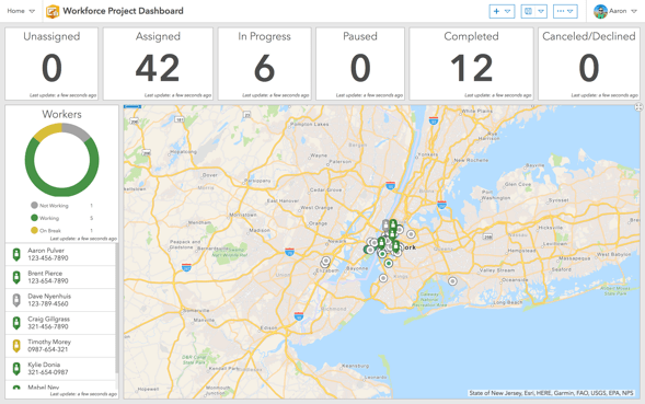
You now have a fully functioning dashboard that shows the breakdown of assignments by status, the number of workers working, and a map showing where the workers and assignments are located.
Some additional tips:
- Consider disabling the “Last Update Text” for each visualization. This can save valuable screen real-estate and make the dashboard look cleaner.
- Use colors that match your map and layer symbology
- Consider using additional visualizations such as Serial Charts and Gauges to show assignment information and progression of the project.
- Bring the dashboard to life by configuring Actions between visualizations and/or by adding Selectors.
Some examples could include:- Clicking on a worker to zoom the map to their location
- Clicking on an assignment and filtering a list to see who it assigned to
- Clicking on a section of the pie chart to filter the workers in the list and on the map
- Filtering the indicators based on the extent of the map
- Using a date selector to only show assignments created this week
- If using Collector or Survey123 to collect or update existing data, add those layers to the map and monitor their progress as well.
- If the supervisor wants to view the Dashboard on a smartphone, learn more about Smartphone design practices
Here are examples of more advanced Dashboards built using data from a Workforce Project:


Commenting is not enabled for this article.