Coral reefs are home to about 25% of marine species and are one of the most important ecosystems on the planet. Unfortunately, reefs worldwide face many risks, including climate change. This includes ocean temperatures that are too warm for coral survival, which may result in coral bleaching.
In Vinay’s plenary demo, he leveraged multidimensional analysis tools in raster analytics to process rich, multidimensional data. Using notebooks and the Python API, he was able to create a model that uses powerful time-series forecasting capabilities to understand the impact of sea surface temperature on coral bleaching. Watch the plenary video below, and then we can take a closer look at the processes he used for the analysis.
Vinay started by using a Living Atlas multidimensional data cube with daily temperature slices going back to 2008. By leveraging raster analytics on the backend for his analysis, he was able to process large datasets efficiently throughout his demo. Using the aggregate multidimensional raster function he was able to produce weekly data to be used in the analysis.

Next, the generate trend raster function was used to create a time-series model to determine whether each cell has warmed or cooled over time – and we can see already that a lot of areas have warmed over time.

Using this trend output, the predict using trend function was run to predict future sea surface temperatures through to 2022. The output is a multitemporal data cube which we can use to predict possible coral bleaching time periods.
Before continuing with the modeling, Vinay compared 12 observed temperature points with the predicted values, and we can see that the model lined up very well with the observed data.

Next, Vinay wanted to find areas where the temperature is higher than a certain threshold, which would mean that the temperature is contributing to coral bleaching. This is done using the generate multidimensional anomaly function. The result was a multidimensional data cube representing temperature anomalies over time.
If temperature anomalies are prolonged the coral may eventually die; however, if exposure is for shorter periods of time, the coral has a chance to recover. Using the find argument statistics function Vinay was able to predict when extended periods of heating could occur.
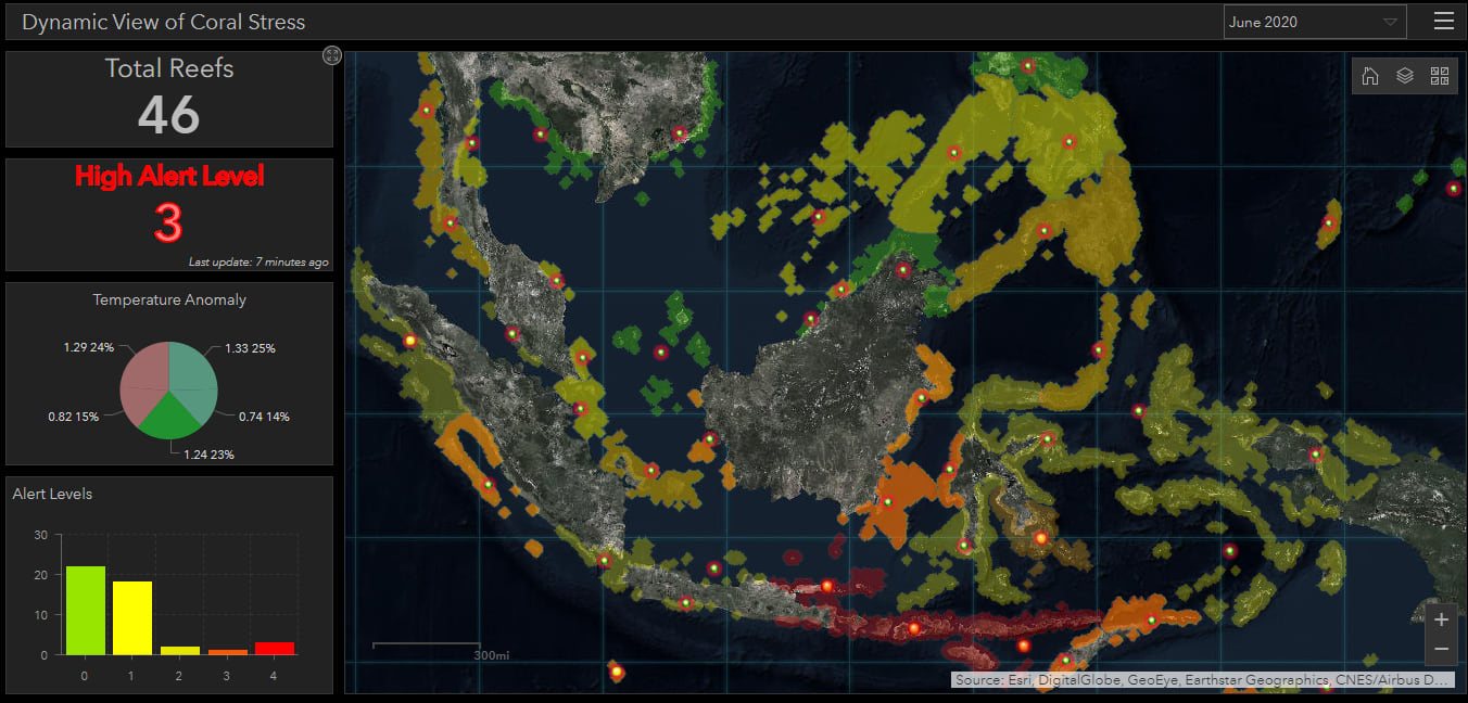
Based on the results coral bleaching can be predicted for any given time period we have data for. In the demo, Vinay mapped the data into 5 alert levels provided by the National Oceanic and Atmospheric Administration (NOAA), then enriched the data to cover key station points along the reefs. With all the generated outputs and focused coral reef bleaching data we are able to quickly monitor alert levels.

This high-level information can be communicated using an interactive dashboard which gives us a dynamic view of coral stress for varying periods of time predicted into the future.
Today, we saw how you can use raster analytics to process rich, multidimensional data on a global scale. These tools are accessible through the python API, enabling developers to build custom applications or automate their workflows using an environment like notebooks. You can check out some of our sample notebooks on the ArcGIS API for Python site here.
To learn more about multidimensional analysis and data science in ArcGIS check out these blogs:
- Let’s do data science! Multidimensional analysis in ArcGIS Pro
- Let’s do data science Part II: Multidimensional Raster Analysis in ArcGIS Pro
And if you’re interested in learning more about coral bleaching through a hands-on Python lesson, check out this lesson: Update Real-Time Data with Python.


Article Discussion: