ArcGIS Living Atlas of the World is the foremost collection of curated geographic information from around the globe. It includes ready-to-use maps, apps, and data layers from Esri and the global GIS user community that support your work. Visit the ArcGIS Living Atlas of the World website where you can browse content, view the blog, and learn how you can contribute.
ArcGIS Living Atlas is an integral part of the ArcGIS system; you can use it to make maps in ArcGIS Online, ArcGIS Desktop, ArcGIS Enterprise, or use it within ArcGIS Web APIs and SDKs.
ArcGIS Living Atlas is updated frequently, and has evolved and expanded greatly over the past year. Content is often published on its own release schedule, so it’s possible to miss an update or new offerings during the course of the year. The following is a compilation of what’s happened with ArcGIS Living Atlas in 2020, summarized using ArcGIS Online release milestones.
Quick links
Use the links below to jump to a specific release milestone.

March 2020
COVID-19 focused the world’s attention and one of the authoritative sources to monitor its progression was using the Coronavirus COVID-19 Dashboard by Johns Hopkins University. Using Living Atlas of the World live feeds methodology, and built using ArcGIS Dashboards, it delivered, and continues to deliver, the latest information from around the globe.

National Urban Change Indicator (NUCI) was introduced. Developed in collaboration with Maxar Technologies, it provides a 30-year history of persistent land cover changes for the conterminous United States. For more information, see 30 Years of Human-Related Change.
New OpenStreetMap layers were hosted in ArcGIS Online and became available as a set of beta layers in the Living Atlas. These feature layers allow you to access the latest OpenStreetMap data (e.g. buildings, highways, and amenities), created and edited by OpenStreetMap contributors, for visualization and analysis.
Demographics
The American Community Survey (ACS) is an ongoing survey by the U.S. Census Bureau. It compiles information such as ancestry, citizenship, educational attainment, income, language proficiency, migration, disability, employment, and housing characteristics.
In December, 2019, 78 Living Atlas layers containing American Community Survey (ACS) data were updated within 48 hours of the Census Bureau releasing the 2014-2018 values. The layers are grouped by topic, such as health insurance, internet access, and living arrangements, and can be found in the American Community Survey (ACS) group.
Additional highlight layers were added, including:
- ACS Population and Housing Basics (centroids and boundaries)
- ACS Context for Child Well-Being (centroids and boundaries)
- ACS Context for Senior Well-Being (centroids and boundaries)
- ACS Context for Emergency Response (centroids and boundaries)
For more information, see Industry-specific ACS layer now in ArcGIS Online.
Basemaps
Esri vector basemaps were updated using data from commercial, open, and community sources. Ukrainian and Dutch were added.
Places such as restaurants, stores, businesses, and other points of interest, were added to Esri vector basemaps. These included several million places in the United States using SafeGraph Places as the source.

OpenStreetMap (OSM) vector basemaps are updated regularly and are available in a variety of styles. A new OSM light gray canvas style was introduced, and is designed to match Esri’s Light Gray Canvas using thinned content from the full OSM data.

The World Imagery basemap was updated with imagery from Maxar, including 1-meter Vivid imagery across 30 countries, 50-centimeter Vivid imagery across Alaska, and 30-centimeter Metro imagery for more than 450 cities around the world.
The USA NAIP imagery service began to be updated with NAIP 2018 60 centimeter imagery, and was completed in early April. These updates were also included in the following layers:
Environment
Earthquake live feed layers were improved and became publicly available, with no subscription required for access. The updated content offers faster performance, a simplified layer structure, and is time-enabled. Live earthquake mapping for everyone covered the updates.
The Map of Biodiversity Importance (MoBI) data collection was introduced. It is a series of layers from NatureServe that identifies areas of high importance for protecting species from extinction in the contiguous United States.

The layers use outputs from habitat suitability models for 2,216 of the most imperiled species in the lower 48 United States and combine those outputs with information on range size and degree of protection to create a series of layers to inform conservation efforts. View the layers at the Living Atlas website. For more information on the release of the content, see Map of Biodiversity Importance now available.
Risk of Tree Mortality Due to Insects and Disease became available. The layer identifies lands in three classes: areas with risk of tree mortality from insects and disease between 2013 and 2027, areas with lower tree mortality risk, and areas that were formerly at risk but are no longer at risk due to disturbance (human or natural) between 2012 and 2018.
The Global Solar Atlas provides relevant information of solar power potential for energy generation. The goal of the atlas is to publish solar resource and photovoltaic power potential data. Newly published layers for March, 2020, included the following:
- Global Solar Atlas
- Direct and Diffuse Irradiations
- Horizontal and Tilted Irradiations
- PV Electricity Output
USA Soils layers and maps were updated using October 2019 data from USDA NRCS. The updates included 26 items and the SSURGO downloader app.
USA Wetlands layers were updated using October, 2019, data from the USFWS.
The Global Water Model was updated for islands, North America, and Western Asia.
European Space Agency (ESA) Climate Change Initiative (CCI) Land Cover Time Series layer was published, classifying the world into 36 land cover classes. The classes include agriculture, forests, grasslands, urban, and other categories. ESA has produced land cover maps for the years since 1992 and the layer will display as a time series animation, one year per frame. For more information on the layer, see Three decades of global land cover change or view the item description.

World Terrestrial Ecosystems was introduced, the first-of-its-kind effort to characterize and map global terrestrial ecosystems at a much finer spatial resolution (250 m) than existing ecoregionalizations, and a much finer thematic resolution than existing global land cover products. The layer uses land cover as input to generate 431 unique terrestrial ecosystems on Earth. See the item description for more details.
Community Maps
The Community Maps Editor application reached a new milestone crossing 120,000 features created in the app to add detail and context to the Esri Vector Basemaps.

ArcGIS Learn and Living Atlas
Get started with ArcGIS Living Atlas of The World was released as a new three-part Learn lesson that will teach you how to browse, find, and use spatial content from the Living Atlas website, ArcGIS Online, and ArcGIS Pro.
Make Powerful Maps Using ArcGIS Living Atlas of the World was also published as a learning path offering hands-on exercises that use Living Atlas maps, apps, and layers.
All the details
ArcGIS Living Atlas in What New in ArcGIS Online (March 2020)
June 2020
Basemaps
Esri vector basemaps continued to be updated regularly with data from commercial, open, and community sources. The following summarizes changes and additions for the June, 2020, timeframe.
The localized vector basemap galleries were expanded. Danish, Portuguese (Portugal), Norwegian, and Romanian were added. Localized basemaps automatically appear depending on your organization’s language and locale setting. See all localized content.

Places, such as restaurants, stores, businesses, and other points of interest, were added to Esri vector basemaps. These additions included several million places in the United States using SafeGraph Places as the source. Millions of HERE Places were also added in many countries outside the United States.
The Places layer became available in many of the styles available for the Esri Vector Basemaps. For more information, see New places in Esri vector basemaps.

OpenStreetMap (OSM) vector basemaps continued to be updated regularly and are available in a variety of styles. A new OSM Dark Gray Canvas style was released, and is designed to match Esri’s Dark Gray Canvas using thinned content from the full OSM data.
Imagery
World Imagery Firefly was enhanced using bumpification – a technique and style that includes terrain to accentuate and add elevation context to imagery. Bumpification applies a topographic texture to imagery at broad scales to convey the tactile surface of the earth that isn’t necessarily apparent in imagery alone.

In addition, the graticules that used to appear as part of the Firefly basemap became independently controlled, providing additional options in configuring the appearance of the Firefly basemap. For more information, see Firefly imagery updates.
Imagery metadata was improved. When World Imagery is loaded as a layer in your map, as you pan across different geographic locations, and zoom in and out through different levels of World Imagery, you will encounter different sources of imagery.
Previously, when clicking a location in the map, the pop-up returned multiple records, including information about imagery above and below your current zoom level. After this update, the pop-up only returns the metadata for the imagery currently visible at your geographic location of interest. See Learning more about the World Imagery basemap for more information.
Environment
Satellite (VIIRS) Thermal Hotspots and Fire Activity was introduced. It’s a new layer which presents the most frequently updated and most detailed global remotely sensed wildfire information from VIIRS satellites for the last seven days. The layer is updated hourly using the aggregated live feed methodology, and shows the location of thermal hotspots as a time-enabled service so that the progress of fires can be reproduced as an animation. Fire points in the layer are generally available within 3 ¼ hours after detection by the VIIRS satellite.
 thermal hotspots and fire activity")
USA Current Wildfires was published as a new layer presenting the best-known point and perimeter locations of wildfire occurrences within the United States over the past seven days sourced from Integrated Reporting of Wildland-Fire Information (IRWIN) and National Interagency Fire Center (NIFC). Points mark a location within the wildfire area and provide current information about that wildfire. Perimeters are the lines surrounding land that has been impacted by a wildfire. The layer is updated every 15 minutes using the aggregated live feed methodology, and is also used in the USA Wildfire Activity App.

Recent Conditions in Air Quality (PM25) is published as a new layer that shows the latest PM2.5 value from the OpenAQ Community. PM2.5 represents particles of 2.5 micrometers or less which are a health hazard because they can get deep into respiratory system and damage delicate tissues. Activities such as driving, burning coal for electricity, wildfires, and running factories release such particles into the air. The exposure of populations to high levels of PM2.5 increases the risk of respiratory and cardiovascular illnesses. The layer is updated every hour using the aggregated live feed methodology.
")
Anti-Shipping Activity Messages is published, presenting the locations and descriptive accounts of specific hostile acts against ships and mariners, also known as Piracy. These reports are useful for recognition, prevention and avoidance of potential hostile activity. The layer is updated weekly using the Living Atlas aggregated live feed methodology.
USA Crop Frequency layer was updated with 2019 data.
USA Cropland time-enabled imagery layer was updated with 2019 data for the default view and all of its processing templates.
USA Federal Lands image layers and feature layers were updated. Each of the six agencies in the collection have various data vintages. See individual layers for more information.
Image Layers: USA Federal Lands, USA Bureau of Land Management Lands, USA Bureau of Reclamation Lands, USA Department of Defense Lands, USA National Park Service Lands, USA Fish and Wildlife Service Lands, USA Forest Service Lands
Feature Layers: USA Federal Lands, USA Bureau of Land Mangement Lands, USA Bureau of Reclamation Lands, USA Department of Defense Lands, USA National Park Service Lands, USA Fish and Wildlife Service Lands, USA Forest Service Lands
USA Historic Sites image layer and feature layer was updated with PADUS 2.0 data, from September 2018.
Elevation
World Elevation tiled layers (World Hillshade, World Hillshade (Dark), Terrain 3D, and TopoBathy 3D) were enhanced with high resolution elevation datasets from the USGS 3D Elevation Program (3DEP) at 1-meter resolution, Madrid 1-meter data, and Vienna 1-meter data.
World Elevation dynamic image service layers (Terrain and TopoBathy ) received 1-meter updates from the USGS 3D Elevation Program (3DEP), 5-meter updates from 3DEP for Alaska, and 1-meter updates for Australia (from Geoscience Australia and Moreton Bay regional council). These layers are suitable for analysis and visualization.

See High resolution data updates to Living Atlas world elevation layers for more information.
Other additions
U.S. Bureau of Labor Statistics (BLS) unemployment figures spanning the most recent 14 months is updated monthly, and is offered at the nationwide, state, and county levels. Layer attributes specify which month is associated with each statistic. This layer is used to author a collection of Living Atlas web maps for those wanting ready-to-use content for dashboards and StoryMaps. For more information, see County-level unemployment layer updated monthly now in ArcGIS Living Atlas.

Investigate annual air quality patterns in the United States with new maps and layers that were added to Living Atlas. Topics include trends over time and impacts on populations.
USA Particulate Matter (PM) 2.5 between 1998-2016 was added, showing particulate matter in the air sized 2.5 micrometers of smaller (PM 2.5). The data is aggregated from NASA Socioeconomic Data and Applications Center (SEDAC) gridded data into state, county, congressional district (116th) and 50 km hex bins. Each layer is enriched with a set of 2019 US demographic attributes (excluding Puerto Rico) apportioned to the geography in order to map patterns alongside each other. For more information, see Explore Air Quality with New Layers and Maps in ArcGIS Living Atlas.
Over 100 race and ethnicity layers and maps became available, using current and past data, to help understand your community. Visit the Racial Equity GIS Hub for resources, content, and help in getting started.

A number of OpenStreetMap layers were hosted in ArcGIS Online and became available in beta in the Living Atlas. Each layer is a feature layer view which references the OSM data in ArcGIS Online. The layers are updated at frequent intervals ranging from 1 to 15 minutes.
The set of layers was expanded to include North America, Africa, Central America and Caribbean, Australia and Oceania.
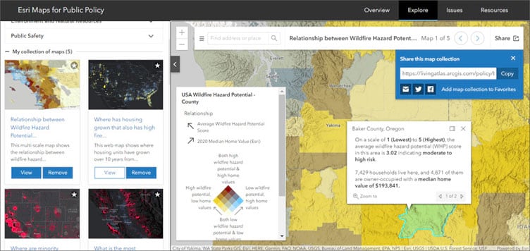
Esri Maps for Public Policy
Esri Maps for Public Policy were updated to include maps crafted from the latest data, including U.S. Census Bureau’s American Community Survey (ACS) and U.S. Bureau of Labor Statics (BLS). Esri Maps for Public Policy added more environmental content, such as air quality and solar potential, as well as other topics important for policy discussions.

Some collection examples of the maps can be explored below:
- Unemployment
- Air quality and demographics
- Race and ethnicity maps for your community
- COVID-19 trends
To learn more, and explore and create your own collections, visit Esri Maps for Public Policy.
All the details
ArcGIS Living Atlas in What New in ArcGIS Online (June 2020)
September 2020
ArcGIS Living Atlas apps
Content from ArcGIS Living Atlas of the World is used to make valuable apps for visualization and analysis. These apps can be found under the apps tab at the Living Atlas website.
CovidPulse
CovidPulse was introduced, delivering visualizations of the rates of COVID-19 cases and deaths in the United States as compact trend lines that are updated daily. CovidPulse shows the trends of the epidemic for all 50 states (including the District of Columbia) and all 3,000+ counties.

CovidPulse provides three day-over-day trend visualization options: new cases per capita, deaths per capita, and cumulative cases. The trend lines reach back to February, just before confirmed cases of SARS-CoV-2 began appearing in the United States (though the spread had already begun).
For more information, see CovidPulse and A tour of CovidPulse and its inception.
Wildfire Public Information Map
The Wildfire Public Information Map was updated. The application is hosted by the Esri Disaster Response Program and uses Living Atlas live feeds to provide current wildfire incidents and perimeters, along with satellite (MODIS and VIIRS) thermal hotspot locations, smoke forecast, and weather watches and warnings.

For more information, see New wildfire and weather map for public information or visit the Disaster Response Program website.
Air Quality Aware
Air Quality Aware is introduced, the latest in a series of easy-to-use apps that simplify access to environmental and demographic information. Air Quality Aware is intended to provide information about the current air quality conditions in the United States, along with the potential human health impacts.

For more information, see Access the latest air quality and human impact information with Air Quality Aware.
ArcGIS Living Atlas Indicators of the Planet (Beta)
ArcGIS Living Atlas Indicators of the Planet was a new addition to the Living Atlas, and a one-stop destination where you can learn about various global indicators and see the current status and conditions. The app showcases authoritative information via geocards for 18 themes of interest for tracking the state of the planet.

Each card presents information about a specific topic and displays the current status. Each topic includes customized pages that contain additional information and apps that leverage existing Living Atlas live feeds content, automatically updating at various intervals. For example, Conservation content is updated monthly, drought is updated weekly, and air quality and wildfire daily or hourly.
For more information, see Introducing ArcGIS Living Atlas Indicators of the Planet (Beta) and Live Feeds powering updates of ArcGIS Living Atlas Indicators of the Planet.
Basemaps
All vector basemaps were updated using data from Here, SafeGraph Places, and content contributed to the Community Maps Program.
An updated World Topographic vector basemap including contours became available in beta. This web map provides a detailed vector basemap for the world featuring a classic Esri topographic map style with contours and includes World Hillshade. The vector map and layer requires the use of Map Viewer Beta to view contours. Contours were also incorporated into the tile layer version which does not require Map Viewer Beta.

For more information, see Topographic (with Contours) Multisource vector tile layers.
In order to focus on Esri vector basemaps, several raster basemaps were placed into Mature Support:
- Arctic Ocean Reference
- DeLorme World Base Map
- World Ocean Reference
For more information, see Esri’s hosted raster basemap services moving to Mature Support. Also see Esri Product Life Cycle Policy (PDF).
Imagery
NAIP 2019, high-resolution aerial photography from the National Agriculture Imagery Program, became available through the Living Atlas NAIP Image Service.
Time enabled MODIS and VIIRS imagery visualization layers, sourced by NASA GIBS, became available. MODIS is not new to Living Atlas, but the VIIRS layers were.
Use the World Imagery Publication Summary app to stay current with content updates.
Environment
A new USA Wildfire Hazard Potential with Demographics layer became available, enabling you to explore areas where people and their communities are at risk from wildfire. The new feature layer contains wildfire hazard potential (WHP) statistics for the conterminous United States based on the USDA Forest Service, Fire Modeling Institute’s wildfire hazard potential analysis. Wildfire hazard potential provides information on the relative potential for a wildfire that would be difficult for fire crews to contain.
The data has been aggregated into seven levels allowing the display of hazard potential in a variety of familiar ways: by state, congressional district, county, ZIP code, tract, block group, and 50 km hex bins. Demographic attributes were added to the dataset to let you visualize where people live that also have high wildfire potential.

For more information, see Wildfire Hazard Potential Enriched with Demographics now in ArcGIS Living Atlas. You can also view a map gallery and group containing maps using the layer.
Collecting consistent information on when a fire starts, the cause, and how large of an area they impact can be difficult as many different agencies (local, state, federal) are involved in responding. Using Landsat’s 40+ year archive of satellite observations of burn scars, the USA Fire Burned Areas 1984-2018 layer is able to consistently assess and document the effects of fire at a national scale. Currently showing 1984-2018, the layer is updated annually from USGS and USFS.

A new collection of global air quality content, including layers, maps, and story maps, was added to the Living Atlas. These help you explore and learn more about how global air quality patterns have changed over time and how poor air quality impacts human populations.
Global Particulate Matter (PM) 2.5 between 1998-2016 shows particulate matter concentrations aggregated from NASA Socioeconomic Data and Applications Center (SEDAC) gridded data into country boundaries, administrative 1 boundaries, and 50 km hex bins.
 2.5 between 1998-2016")
At each geography level you can learn more about trends, statistical patterns, and the human impacts of air quality at global, regional, and local levels. A series of map were authored answering questions such as:
- How many people are impacted by poor air quality globally?
- How many people have died from air pollution causes?
- What is the global trend in air quality between 1998 and 2016?
- What is the population weighted impact of air quality globally?
- Where are there hot spots of poor air quality globally?
- Where do people live in comparison to air quality patterns?
- Which year had the worst air quality?
For more information, see:
Recent Conditions in Air Quality (PM2.5) was introduced, showing the latest values for global air quality (PM2.5) from ground-based monitoring stations. The source is the OpenAQ community which reports measured concentrations on a global scale by aggregating station data from national networks of air quality.
Activities such as driving, burning coal for electricity, wildfires, running factories, and even cooking and cleaning release particles into the air. Small particles of 2.5 micrometers or less (PM2.5) are an irritant and health hazard since they can get deep into the respiratory system and damage tissue.
")
The layer is updated every hour using the Aggregated Live Feed (ALF) methodology. It shows the latest PM2.5 value of the stations in the OpenAQ data set with at least one value reported in the past 30 days.
A series of layers and maps were published in Living Atlas that provide the Standardized Precipitation Index (SPI) for the latest 1, 3, 6, 9, and 12-month periods, along with 40 years of past measurements.
")
The Standardized Precipitation Index (SPI) is used to analyze meteorological droughts. Droughts occur when areas go for prolonged periods of time with lower than normal precipitation. One way to estimate drought intensity is to use the SPI, which classifies how much rain has fallen in an area compared to normal.
A new Wildfire and Weather Information map was published, improving situational awareness around wildland fires.

For more information, see New Wildfire and Weather Map for Public Information.
GOES Satellite Imagery Colorized Transparent Background is published as a new tile layer from NOAA. The layer updates every 10 minutes with near-global coverage from three satellites. Cloud top temperatures are colorized to reveal areas of intensity and lower levels are transparent, allowing underlying data to show through.

The Half-Earth Project continued to contribute new layers to Living Atlas that show areas deserving of conservation efforts. The latest layer shows the intersection of species richness and species rarity. For more layers, maps, and apps, view the Half-Earth content in the Living Atlas.
World Elevation
World Elevation dynamic image service layers (Terrain and TopoBathy ) were updated with Natural Resources Canada’s HRDEM 1 m, Värnamo Kommun’s (Sweden) 0.5 m and IGN Spain 2m. TopoBathy was updated with GEBCO_2019 15 arc sec (~ 464 meters) global dataset.
")
These layers are suitable for analysis and visualization. See High resolution data updates to Living Atlas World Elevation Layers (July 2020) for more information.
World Elevation tiled layers (World Hillshade, World Hillshade (Dark), Terrain 3D and TopoBathy 3D) were enhanced with high resolution elevation datasets from USGS 3D Elevation Program (3DEP) 1 m, 3DEP Alaska 5m, Australia 1m (South East region) from Geoscience Australia and Moreton Bay regional council.
Other Living Atlas additions
California Fire Perimeters was updated to include 2019 perimeters. This layer now contains fire perimeters from 2019 and dating back to 1878 for California.

Perimeters are sourced yearly from the Fire and Resource Assessment Program (FRAP) and are updated shortly after the end of each calendar year. For more information see Historical California wildfire perimeters in Living Atlas.
The Home Owners’ Loan Corporation (HOLC) was created in the New Deal Era and trained many home appraisers in the 1930s. The HOLC created a neighborhood ranking system known today as redlining. Local real estate developers and appraisers in over 200 cities assigned grades to residential neighborhoods. These neighborhood ratings set the rules for decades of real estate practices.
A redlining layer of 143 cities became available in ArcGIS Living Atlas. This ready-to-use layer of historical redlining data can be used to help understand how historical inequities continue to contribute to inequities today.
 Neighborhood Redlining Grade")
For more information, see Historical redlining data now in ArcGIS Living Atlas.
Support for new content types was added to the ArcGIS Living Atlas: Deep learning packages (.dlpk), Raster function templates (.rft), Web Experience, and Web Experience Templates.
Esri Maps for Public Policy
Esri Maps for Public Policy was updated and now includes maps crafted from the latest data, including U.S. Census Bureau’s American Community Survey (ACS) and U.S. Bureau of Labor Statics (BLS). Esri Maps for Public Policy includes environmental topics, such as wildfire risk, air quality and solar potential summarized by state, county, congressional district and other useful geographic boundaries.
Some collections you can explore and share:
- Wildfire risk to population
- Unemployment
- Air quality and demographics
- Race and ethnicity maps for your community
- COVID-19 trends
These collections are only a sample of the available policy maps. To learn more, and explore and create your own collections, visit Esri Maps for Public Policy.
All the details
ArcGIS Living Atlas in What’s new in ArcGIS Online (September 2020)
December 2020
ArcGIS Living Atlas apps
Content from ArcGIS Living Atlas of the World is used to make valuable apps for visualization and analysis. These apps can be found under the apps tab at the Living Atlas website.
World Imagery Wayback
Wayback imagery is a digital archive of the World Imagery basemap, with more than 100 different versions of the map archived over the last 6 years. The World Imagery Wayback app lets you browse for changes in your area of interest and lets you make a map with versions of interest. Swipe mode was added, a capability that makes it easy to compare selected imagery.

When in swipe mode, you can click share to copy and paste the URL to save the selected imagery and geographic location with others. For example:
- View change over time in Las Vegas, Nevada
- View change over time at Beijing Daxing International Airport
For more information, see Do the Wayback swipe.
CovidPulse
CovidPulse was updated to include a grid view, providing additional context and value for those looking for local and national trends in the ongoing pandemic. CovidPulse illustrates the local rises and falls of Coronavirus throughout the pandemic via sparkline map symbols at state and local levels, but now it more readily provides a comparative sense of local rates using various grid view options.

For more information, see CovidPulse update: Grid view.
Policy Maps
American Community Survey (ACS) updates
The Living Atlas Policy Maps team maintains a collection of 104 layers containing a wealth of data from U.S. Census Bureau’s American Community Survey (ACS). ACS is an ongoing survey by the U.S. Census Bureau that provides vital information on a yearly basis about our nation and its people.
On December 10, 2020, ACS released the newest data values for their 5-year estimates. Within days of that release, existing Living Atlas ACS layers were updated with the newest 2015-2019 data. Along with the updated layers, a subset of 2010-2014 layers were added to Living Atlas to allow for comparison over time for many ACS topics.
For more information, see What’s new with Census ACS Living Atlas layers (Fall 2020).
New maps based on ACS
A new set of maps was produced based on ACS data. Like other maps, they are available in the Living Atlas as well as Esri Maps for Public Policy.
Where were native persons (US citizens at birth) born relative to current residence?
What year did foreign-born population most commonly naturalize?
Where do Black or African Americans not have an internet subscription at home?
Where are youth who don’t have access to internet?
Where are youth who don’t have access to a computer?
Where are children with a single working mother?
What is the relationship between households without internet or vehicles?
What is the relationship between households without internet or smartphones?
Do Black or African Americans own or rent their housing?

View the entire collection of ACS content in the Current-Year ACS Map and App Examples group, or view all ACS layers in Living Atlas.
Census 2020 self-response rates
Were self-response rates higher for the 2010 or 2020 Census? The layers in this feature layer are updated daily from the Census API to display Census 2020 self-response rates, with a useful set of attributes to explore and utilize.

For more information, view the self-response rates item details.
Centers for Disease Control and Prevention (CDC)
The Centers for Disease Control and Prevention (CDC) contributed the most recent county-level hospitalization and mortality rates for both heart disease and stroke from the CDC Interactive Atlas of Heart Disease and Stroke to ArcGIS Living Atlas, as well as high blood pressure medication nonadherence rates. High blood pressure is a key risk factor for heart disease. Newly released layers included the following:
- U.S. Heart Disease Mortality Rates, 2016-2018
- U.S. Heart Disease Hospitalization Rates, 2015-2017
- U.S. Stroke Mortality Rates, 2016-2018
- U.S. Stroke Hospitalization Rates, 2015-2017
- U.S. High Blood Pressure Medication Nonadherence Rates, 2017
For more information, see Most recent hospitalization and mortality data for heart disease and stroke now available.
Broadband
A collection of layers and maps in ArcGIS Living Atlas were published, assigning a broadband score to every county in the U.S. For more information, see the item details.

Other Living Atlas policy maps
Regular updates continued for US unemployment data from the Bureau of Labor Statistics (updated monthly) and COVID-19 layers, maps, and apps (updated daily or weekly).
OpenStreetMap
New additions were made to the OpenStreetMap layers group including several new feature layers, such as buildings and roads for Europe and Asia, which completed the global coverage of these OSM layers.
A new OpenStreetMap Daylight map (beta) became available, based on the latest version of Facebook’s Daylight Map Distribution that includes enhancements to the OSM data made in collaboration with Facebook and Microsoft.

Explore the map using the OpenStreetMap Daylight app, or visit the OpenStreetMap Daylight group. For additional details, see Dawn of OSM Daylight in ArcGIS.
Imagery
In 2020, more than 1,200 metropolitan areas were updated with 30cm resolution Maxar imagery. Many additional areas were updated with high resolution imagery through the Community Maps Program. Check the World Imagery Publication Summary app for recent or pending updates for your location of interest.

Three new VIIRS imagery layers, featuring imagery captured daily by the NOAA-20 satellite, became available. For more details, see all of the MODIS and VIIRS layers available in Living Atlas. The layers are the result of collaboration with NASA’s Global Imagery Browse Services (GIBS) team.
The Arctic Imagery basemap was updated to include TerraColor NextGen Imagery, along with a new black background styling.
World Elevation
Living Atlas provides foundation elevation layers and tools to support analysis and visualization across the ArcGIS platform. These layers were updated with high-resolution elevation data from various sources and the Community Maps Program.

World Hillshade tiled layers (World Hillshade, World Hillshade (Dark)) and elevation tiled layers (Terrain 3D and TopoBathy 3D) were enhanced with Natural Resources Canada’s HRDEM 1 m, Värnamo Kommun’s (Sweden) 0.5 m, and IGN Spain 2m resolution data. TopoBathy 3D was updated with GEBCO_2019 15 arc sec (~ 464 meters) global dataset, which enhanced the bathymetry resolution 2x for oceans.
To see the coverage extents of each source comprising World Elevation services, check out the Elevation coverage map.
Environment
NOAA Storm Events
NOAA Storm Events Database 1950-2019 is introduced as a new feature layer of all severe weather reported to the National Weather Service for the United States from 1950-2019. The storm reports are aggregated and archived by NOAA’s National Centers for Environmental Information. With over 1.5 million records over 70 years, the Storm Events Database is the most comprehensive, official record of severe weather in the U.S.

Standardized Precipitation Index (SPI)
Standardized Precipitation Index (SPI) and Standardized Precipitation Index (SPI) 1981 – Present are new layers which are used to characterize meteorological droughts. The Standardized Precipitation Index estimates the deviation of precipitation from the long-term probability function at different temporal periods, such as 1, 3, 6, 9, and 12 months. Both of these layers are calculated from Climate Hazards Center InfraRed Precipitation with Station (CHIRPS) data from the Department of Interior, and provide users with the most current condition or a time series of past years, going back to 1981.
USA Fire Burned Areas
USA Fire Burned Areas 1984 – 2018 is a new layer sourced from the Monitoring Trends in Burn Severity (MTBS) program that displays unplanned wildfires, intentionally ignited prescribed fires, and wildland use fires, which are naturally ignited to accomplish a specific management objective.

Other environment updates
Updated symbology on the GEOGloWS ECMWF Streamflow System (6 Day Forecast) layer makes the stream reaches with higher than normal streamflow stand-out and get the attention they deserve against a dark or light base map. This layer has the ability to animate, so you can visualize the movement of high flows down the stream network which is not only interesting, but also quite effective for flood preparedness planning across the world.
Live Stream Gauges moved to a hosted feature layer, including gauges from the United Kingdom, Canada, and Brazil. Older map services (Live Stream Gauges, Live Stream Gauges (Flooding), Live Stream Gauges (Feature Service) will be deprecated, and the new feature layer should be used instead.
A new Hawaii Land Cover Imagery Layer, created from the NOAA Office for Coastal Management Coastal Change Analysis Program (CCAP), was added. The layer displays 2.4m cell size land cover data covering the major islands of the State of Hawaii. Landcover classes include vegetation type, development density, agricultural use, and areas of barren lands and water were also included.
USA Flood Hazard Areas layer is updated using the August 31, 2020, version of FEMA’s Flood Insurance Rate Maps. The imagery layer, hosted feature layer, and hosted tile layer have all been updated with the most current information from FEMA.
The National Land Cover Database (NLCD) layer was updated using 2016 data. The USA NLCD Tree Canopy Cover Imagery layer updates can be seen across the United States, while the USA NLCD Land Cover Imagery layer only has updates in Alaska and Hawaii.
Basemaps
All vector basemaps were updated using data from Here, SafeGraph Places, and content contributed to the Community Maps Program. Esri Vector Basemaps and OpenStreetMap basemap are updated on a regular basis, typically every three weeks.
Community Maps
The Community Maps Program enables community contributions of authoritative data to help build the ArcGIS Living Atlas. You can provide feedback, create detailed features, and share data layers and services, contributing to Esri basemaps that anyone can use.

The Community Maps Editor lets you edit parts of the Esri Community Maps basemap to add detailed features for universities, schools, parks, landmarks, and other special areas of interest. The editor has been updated with new features and capabilities. For more information, see Community Maps editor updated.
Community Maps Data Prep Tools version 4.0 became available. For more information, see Contributing to Community Maps just got easier.
All the details
ArcGIS Living Atlas in What’s New in ArcGIS Online (December 2020)
More information
For more information and additional details about ArcGIS Living Atlas, see the following:


Article Discussion: