How do you make the cover for GIS for Science volume 3? You have amazing colleagues like Dawn Wright and Christian Harder who work at the speed of trust! This cover came together remarkably fast, and was a fun and interactive experience with creative collaborators and top-notch content providers.
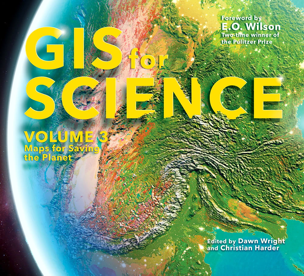
The Half-Earth Project features prominently in this volume so it was a fast call that something like the Vibrant globe, designed along with Vizzuality’s Estefanía Casal for the Half-Earth Project, should festoon the cover.
The Globe
This 3D globe graphic was made entirely in ArcGIS Pro. Here is a Global Scene in Pro, with some imagery. The imagery’s color is given a red-ish boost by bumping up the red channel’s gamma value in the symbology panel. Give those settings a look. There are lots of crazy things you can do with rasters.
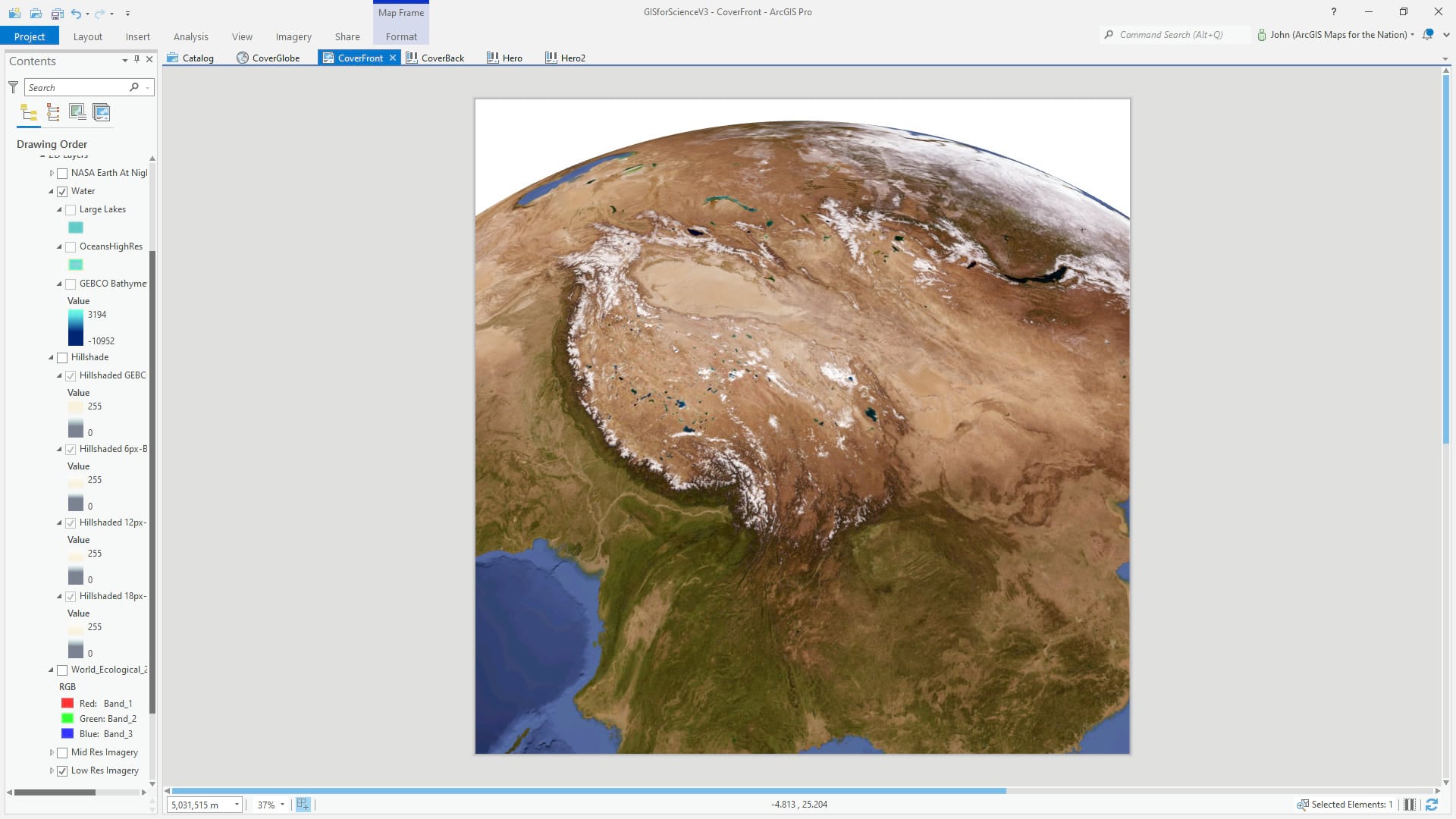
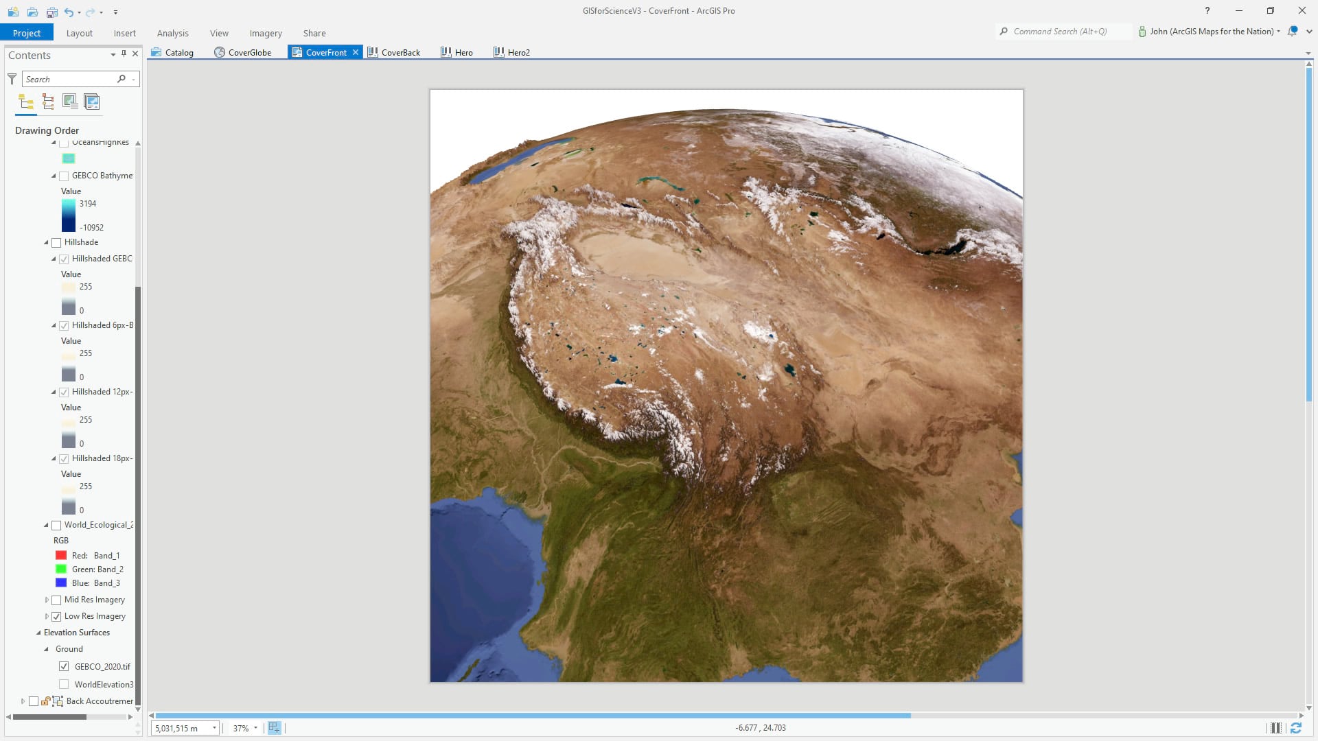
To make this surprisingly smooth planet of ours a little more ragged, we exaggerated the terrain by a factor of 20! With the “Ground” layer group selected, you can change the vertical exaggeration in the appearance tab.
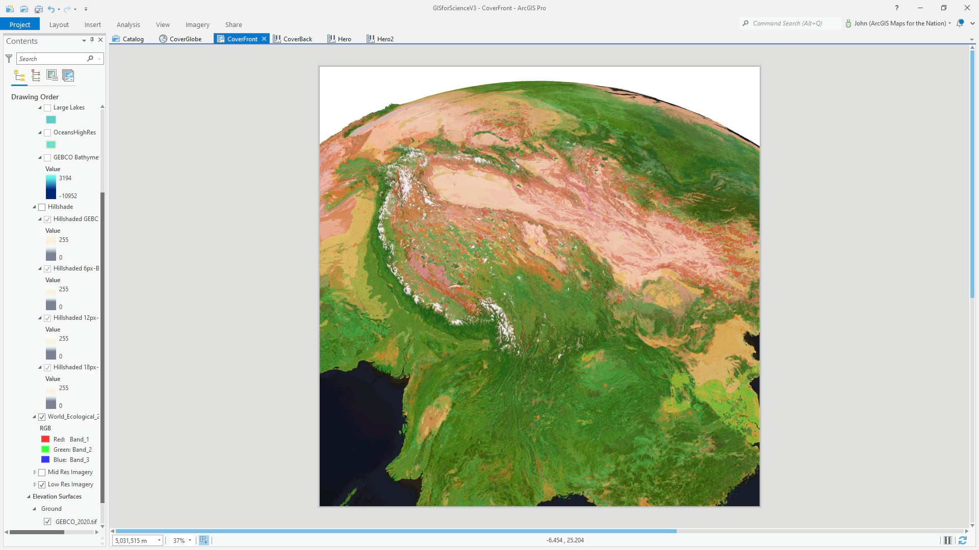
Then we added a color-boosted version of the global Ecological Land Units and gave it a transparency of 20% so you could see a little bit of the content and texture of the imagery below.
To add some texture realism to this globe, we pulled in the glorious Terrain image service from Living Atlas and give it a hillshade raster function. There are a handfull of versions of this, with varying amounts of blur. Check out how to do that realistic/blurry hillshade hack here.
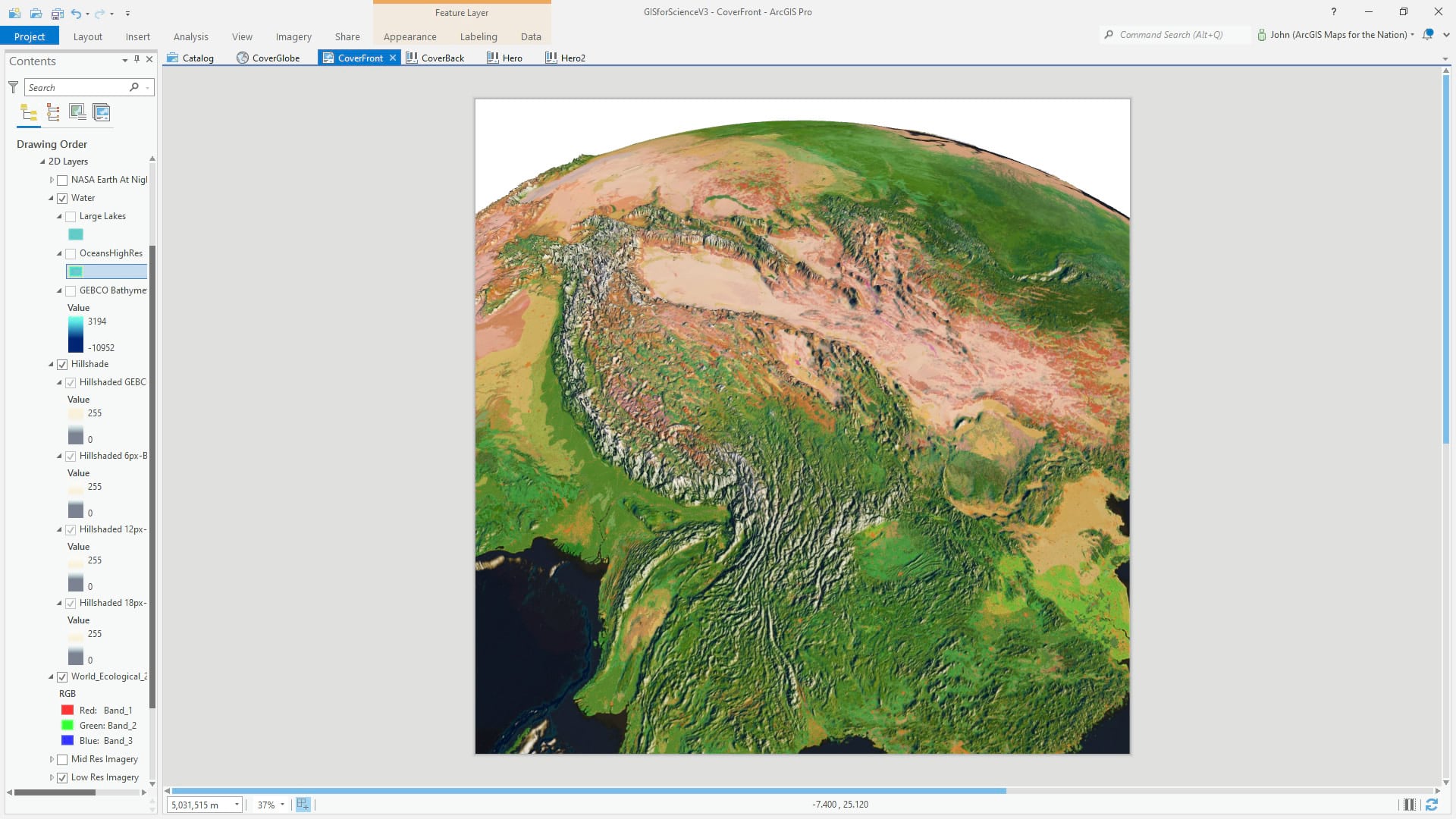
What an amazing difference, right? Hillshade is a wonderful thing. Atop this we pulled in a GEBCO bathymetry layer, clipped to just oceans, and gave it a deep blue to cyan gradient. This is an ongoing collaboration of multiple teams to map the seafloor in more detail and make it available to the public. Not a ton of bathymetry in this extent, but it sure does help.
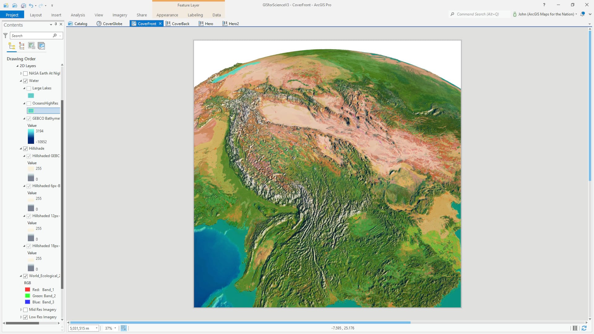
After this we layered in some vector water features. Lakes and oceans. They were given a coastal stroke with beachy tan and a cyan inner gradient, and a rippled water texture in the form of a picture fill symbol layer. See those cute little waves?
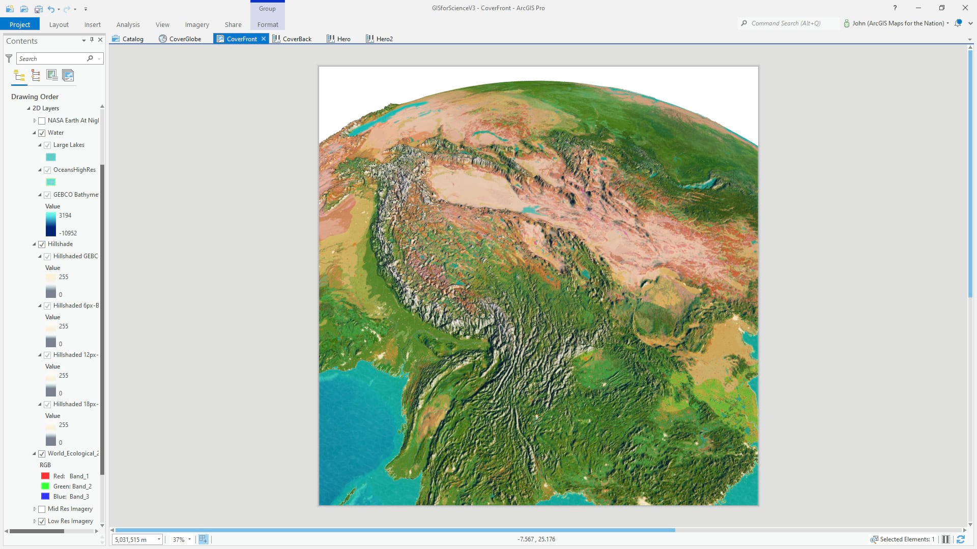
To create a glowy sense of human settlements, we added Nasa Earth at Night imagery and symbolized it so only the brighter night-light pixels appear. And to turn that up to 11, we added a cities point layer, put it in the “3D” layer group, and give them shimmering Firefly point symbols.
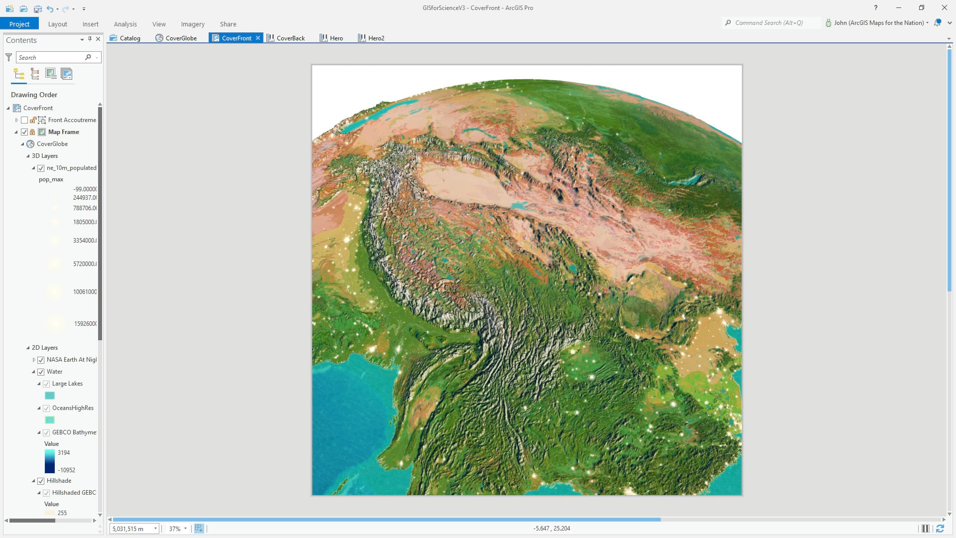
Lastly, to create a dramatic sense of weird fake/realism, we added some rectangles to the layout and gave them gradient fills that approximate the atmosphere that blankets our planet. This is a total blast; learn how to embark on that journey of cartographic madness here. Seriously.
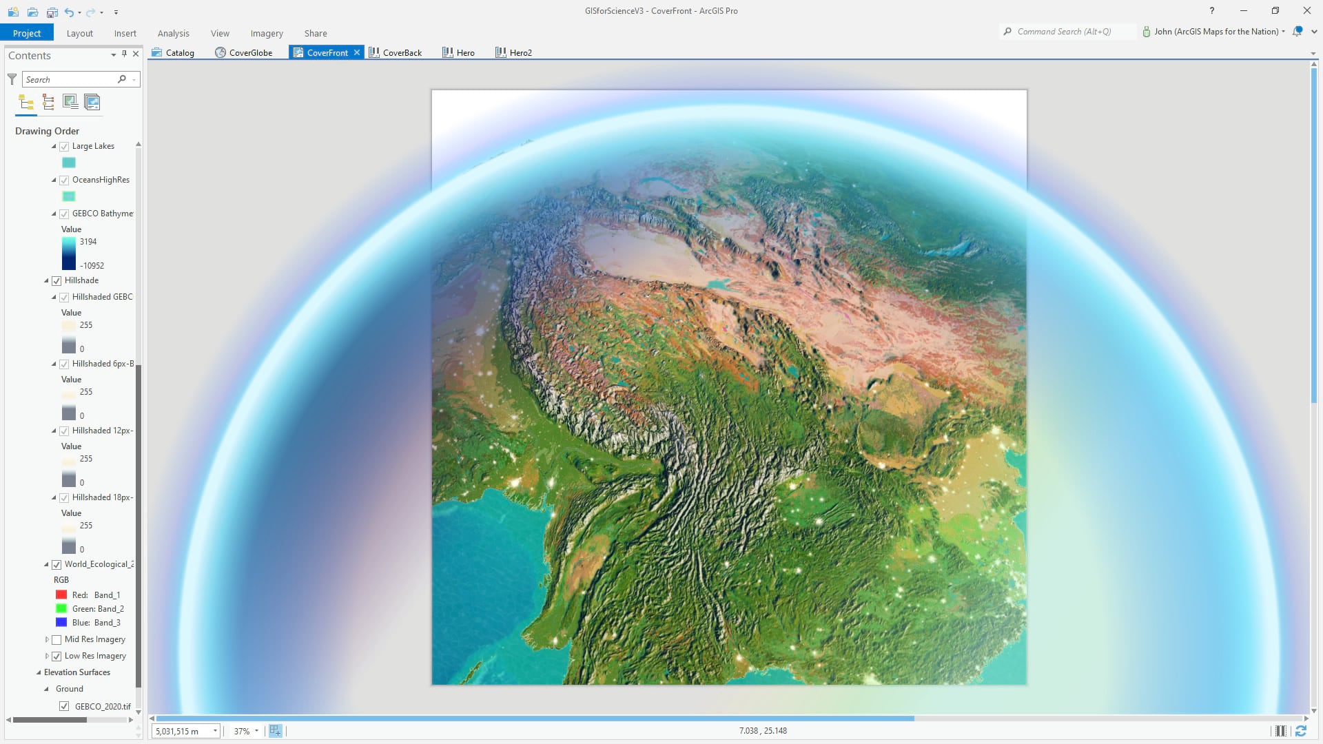
Export that layout as a high-res image and you have yourself a sweet sweet vibrant globe image just ready for the presses.
Or is it?
Cover Design
Here is that globe image (rotated counter-clockwise) in Photoshop, with its title and other cover text.
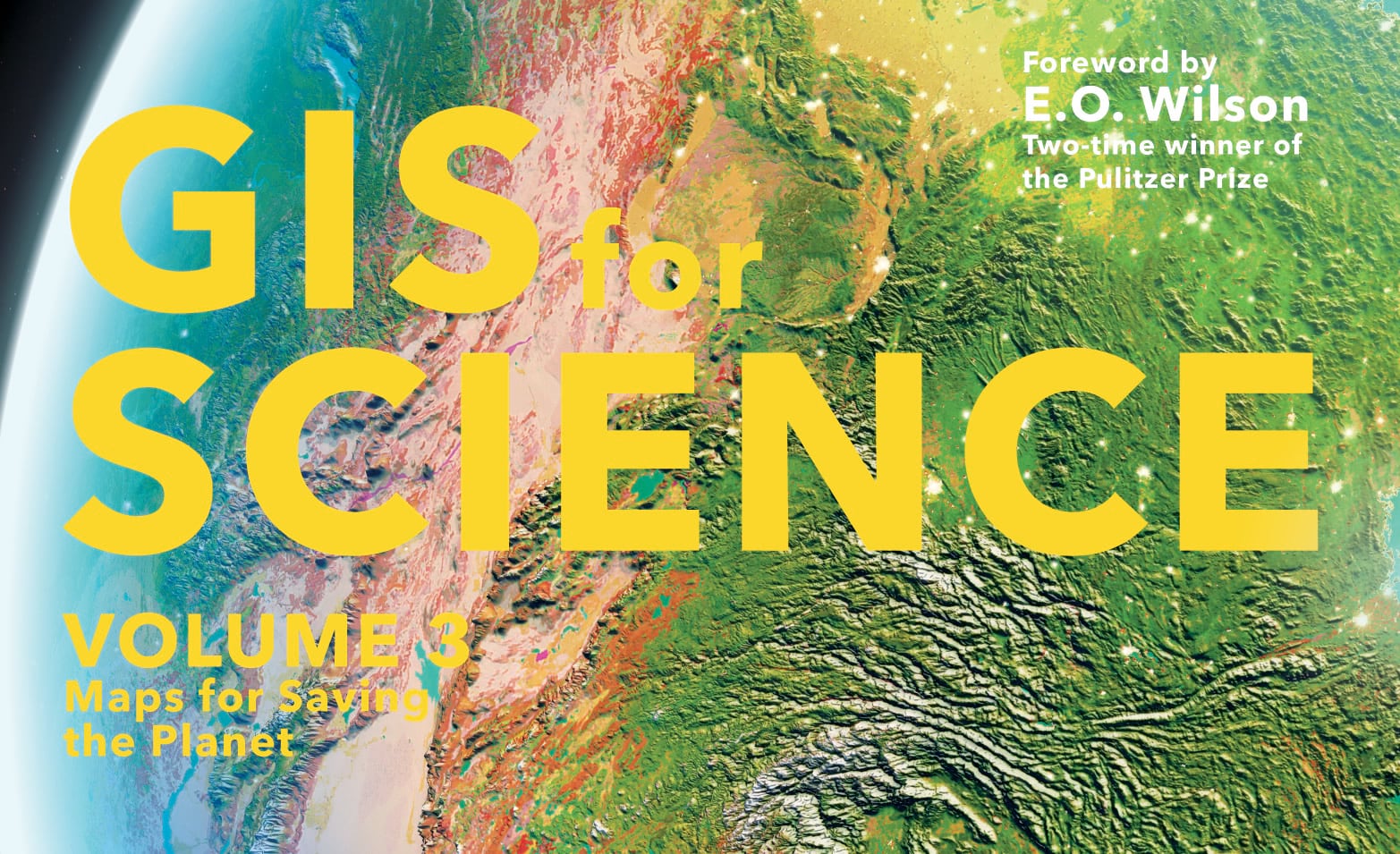
To give the sense that this cover is hovering in low earth orbit, we applied a couple blurry and distorted versions of it to look like the text shadow was following the curve of the earth as it falls away at the periphery.
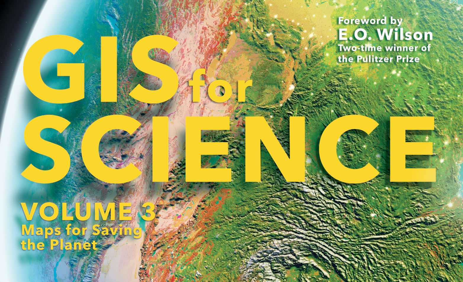
And to make the text look like an actual thing, with form and lighting (how else could it cast a shadow?), we added a subtle inner highlight and a couple of Firefly-like glow flares on its edges. Too much? Come on…
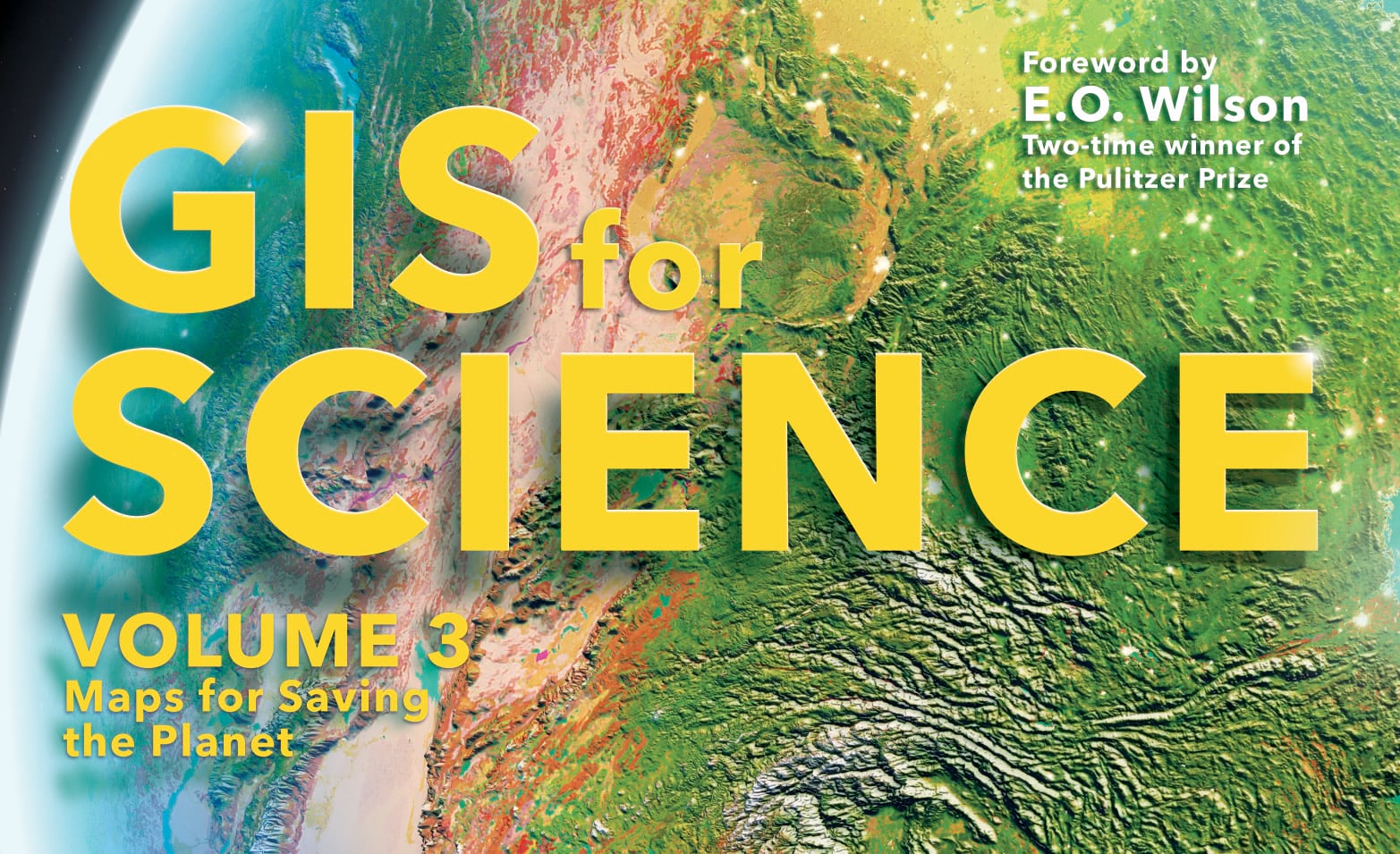
And last but certainly not least, we embedded that text into the mountains a bit. Because mountains! Here are a couple images of me turning that Photoshop layer on and off, to give you an idea of the hack.
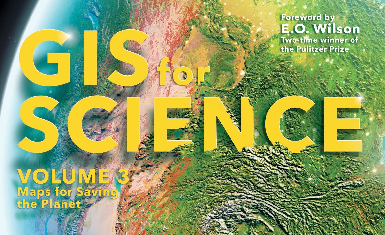
And that’s it, friends! It was a blast to make and one more opportunity to make map software do weird and fun stuff for the sake of engagement and joy. We hope you check out GIS for Science volume 3, and dig the many many more maps that await within!
Love, John

Article Discussion: