The November 2022 update of the ArcGIS Online Map Viewer added support for binning as an alternative to clustering and heat maps. Binning aggregates data to predefined cells, effectively representing point data as a gridded polygon layer. This post will demonstrate how you can use Arcade to create dynamic popup elements summarizing attributes from aggregated points in a bin’s popup.

Aggregate fields
The aggregation panel in the map viewer allows you to define aggregate fields summarizing the features contained within a bin based on a set of statistics. For example, assume you enable binning on a point layer representing cities that has a POPULATION field on the layer. You can create a field named POPULATION_SUM that calculates the sum of the POPULATION field for all features within the bin.

Previously (in clustering visualizations), you would have had to use Arcade math functions (such as sum) to display aggregate statistics in the popups.
// returns the sum of the POPULATION
// field for all features in the bin
SUM($aggregatedFeatures, "POPULATION")
You should always favor defining bin statistics using aggregate fields instead of using Arcade, since aggregate fields are precomputed and can be used anywhere in the binning configuration, including labels and styles. However, this begs an important question…
Do aggregate fields remove the need for Arcade in binning visualizations?
No! Arcade does much more than calculate values. In fact, you can use it to create dynamic, flexible popup elements, including the following:
- An ordered list of categories (or unique values) from a field in descending order by count or any other statistic
- Charts based on statistics grouped by distinct values from a single field
- Conditional popup elements based on the statistics of features within a bin.
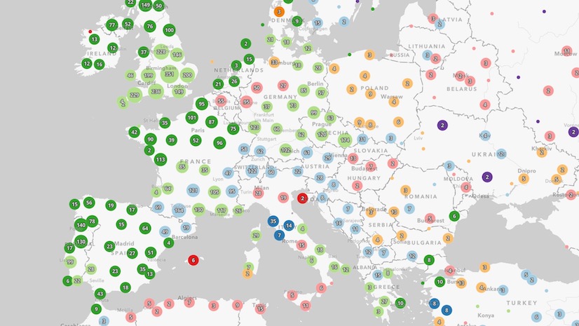
We’ll explore these scenarios in the San Diego crimes web map.
Arcade terminology
Before diving into each example, you should be familiar with the following Arcade language concepts. Each of the following are used in the example expressions:
- FeatureSet – A list (or set) of features originating from a layer, cluster, or bin. Functions that allow you to filter or work with a FeatureSet are referred to as FeatureSet functions.
- $aggregatedFeatures – An Arcade profile variable representing a set of features contained by the bin. If there is a count of 100 features in the bin, then the number of features in
$aggregatedFeaturesis 100. This variable gives you access to each feature inside the bin. - Expects – A built-in Arcade function that tells the client (in this case the web browser) to download the provided list of fields for the given variable. By default, the browser only downloads attributes required for drawing the layer. Since some fields aren’t used by the renderer (or style) of the layer, this function is essential for ensuring all attributes required for the expression are available in the
$aggregatedFeaturesFeatureSet. - GroupBy – A built-in Arcade function that queries statistics from a FeatureSet (or layer) grouped by a categorical field. In the expressions below, it is used to return the total count of crimes, and the average number of crimes committed at night for each crime type.
- OrderBy – A built-in Arcade function that sorts the features in a FeatureSet by a given field in either ascending (small numbers first) or descending (large numbers first) order.
- Top – A built-in Arcade function that returns the top given number of features from a FeatureSet.
- Count – A built-in Arcade function that returns the count or number of features in a FeatureSet.
Ordered list of categories
The San Diego crimes dataset classifies crimes under generic types, such as “drugs and alcohol”, “burglary”, and “theft”. Unfortunately, the Map Viewer does not allow you to create new fields that report the count of each of these categories within the cluster.
However, you can use Arcade to dynamically create a table for a binning popup as illustrated below.

Let’s explore the expression used to create this table. The following expression queries the top 5 crime types for each bin in San Diego, and calculates two statistics for each type: the total count and the percentage of those crimes that were reported at night.
Read the comments to follow the logic of the expression if you are unfamiliar with Arcade.
.")
Note that this expression returns different popup elements based on a condition. In this case if there are no categories discovered, then the popup will return a message indicating there are no reported crimes in the area. The expression continues below if a bin does contain at least one category…
.")
The for loop in the expression iterates through each category and creates a new row in the HTML table describing the crime type, number of crimes, and percent that were reported at night.
The result displays the following table. Note that rows are ordered from the most common to least common. If we had defined aggregate fields in this scenario, then these rows could not be ordered without the help of Arcade.
Create charts based on statistics grouped by distinct values from a single field
This example will demonstrate how to create a single media popup element containing two charts. The following charts will be created:
- Pie chart – the total number of crimes for each type.
- Line chart – the total number of crimes that occurred in each month of the year.


While the result of the expression may look very different from the first example, the fundamental logic is very similar in both examples. Read the comments in the expression below to understand how the expression creates two charts in the same popup element: a pie chart that visualizes the number of crimes by type, and a line chart that visualizes the number of crimes committed in each month of the year.
.")
The expression must return a dictionary that follows the web map specification for any of the following content elements.
- Fields – for displaying a list of field values in the popup as a table.
- Text – for displaying rich text in the popup, including HTML.
- Media – for rendering interactive charts. This is the element we’ll use in this example.
Since we want charts to render in the popup, we must set up a dictionary defining the attributes (or data) used in the chart. The expression continues below…
.")
Conclusion
Aggregate fields remove the need to write Arcade expressions for use in binning popups, styles, and labels for the majority of cases. However, you still need Arcade if you would like to dynamically render summary statistics for categories from a single field, such as a sorted table or chart.
If you’re a web developer, be sure to check out the Summarize binned data using Arcade in the ArcGIS API for JavaScript documentation. This sample demonstrates how to create the same web map outside of Map Viewer using JavaScript.

When will labels be coming to Charts made with Arcade? I got the code to work for a Pie chart but with no labels on it at all it does not have much use for us.
thanks a lot