After the rousing rip roaring adventure of the expression-driven CMYK map of multivariate health factors, Este Geraghty sent me this interesting article about the relationship between climate factors and binge drinking.
As is the case with nearly any geographic exploration of a phenomenon, the results invariably invite more, and better, questions–a virtuous flow of maps and discovery that sweep us all downstream toward adventure and better understanding.
I wondered how varying amounts of sunlight might compare to some of the county health factors available in the Living Atlas. But how? Where?
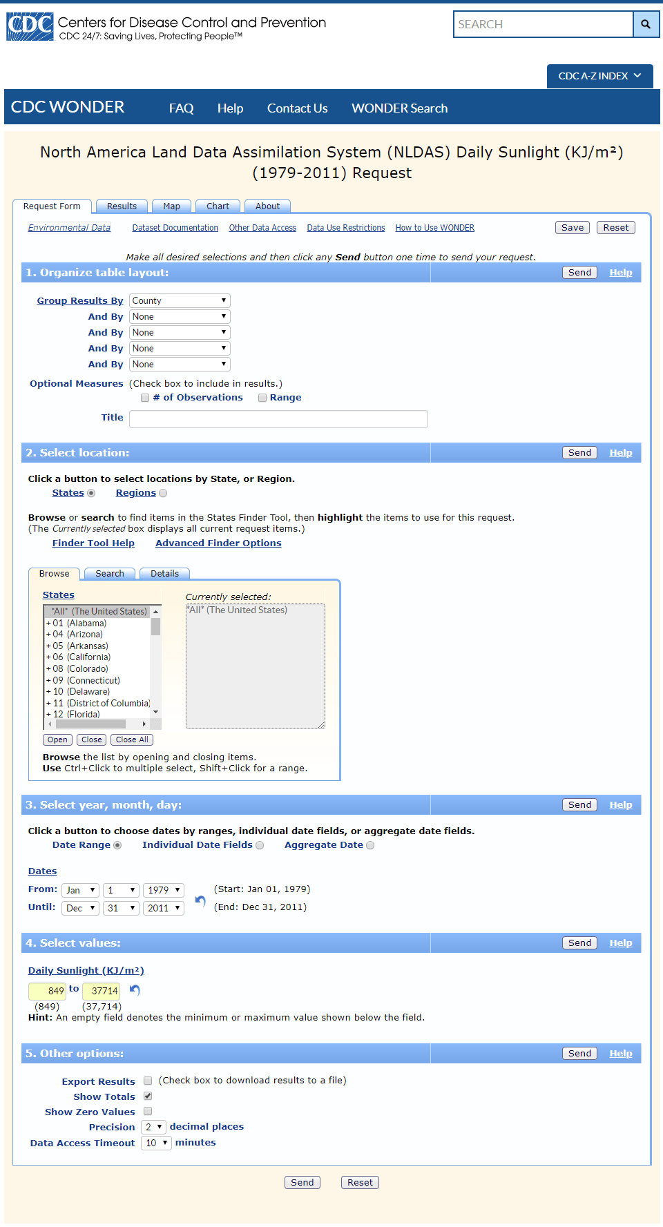
A twitter friend pointed me right to the data, an amazing service from the CDC that aggregates NASA insolation (sunlight) per day.
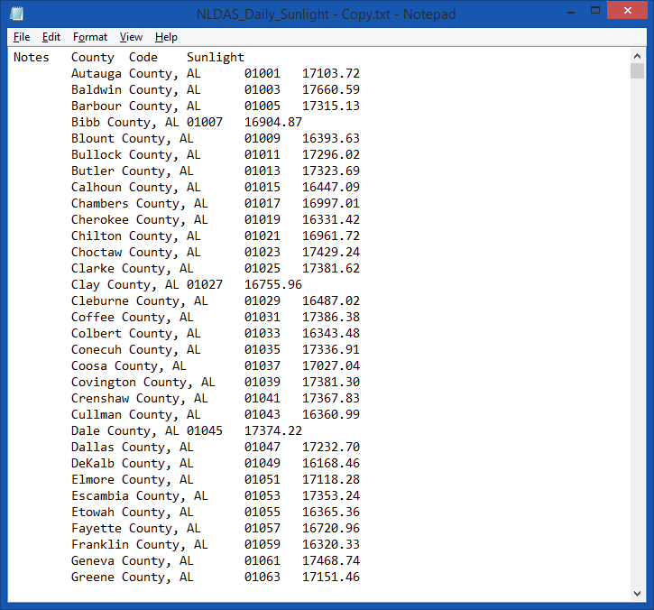
The resulting table download is a nice tidy listing of each US County’s average sunlight per day. Looks like this (after I tidied up the column headers to make them shorter and without special characters).
There’s just something marvelous about seeing a table of geographic locations, each with a unique ID (in this case, FIPS code). This means I have a sneaky hook into the world of GIS and all that that enables.
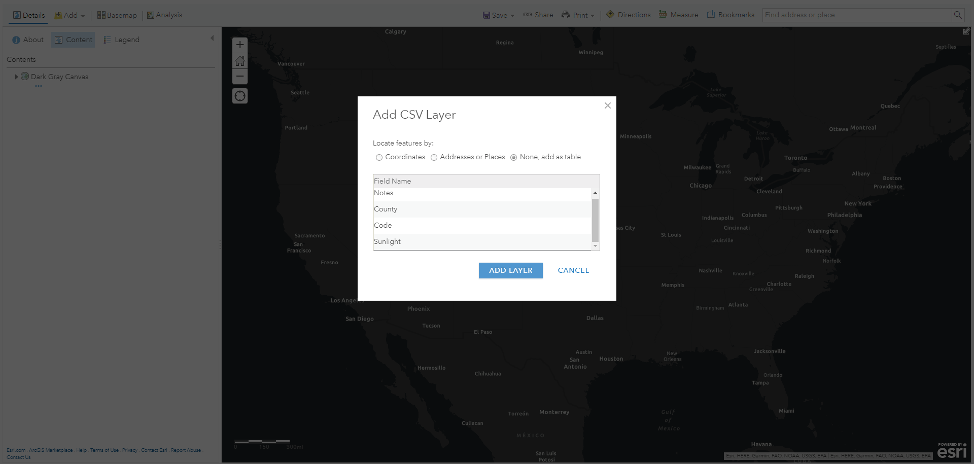
I added the file to an empty ArcGIS Online map.
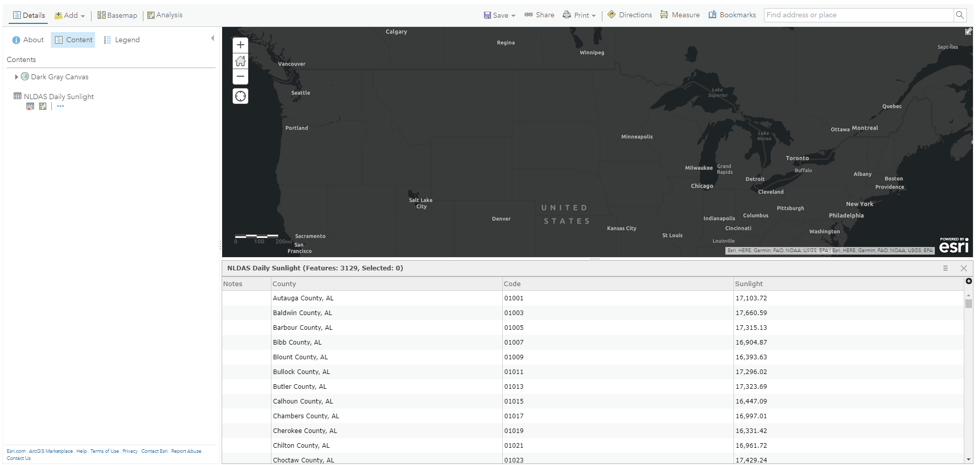
There it is! And it even retained the leading zeros in the county FIPS codes! Bless you.
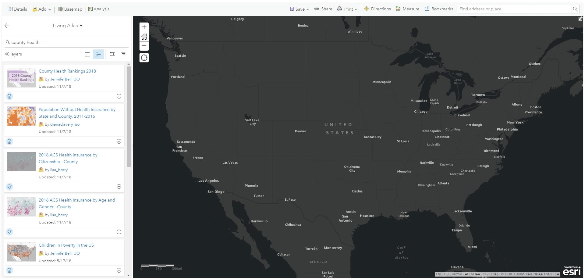
Now to add the insanely useful data-packed county health rankings layer from the Living Atlas.
This layer of US counties also has a FIPS code attribute, so it’s easy to join the two based on this common key…
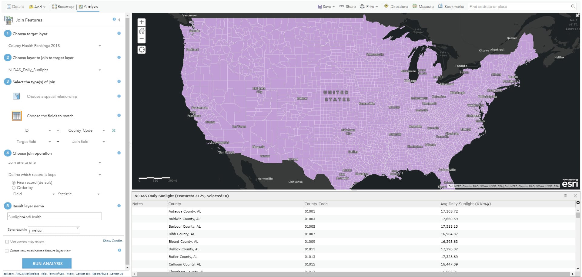
…blasting some sunlight right into the counties, creating a new insolation-drenched copy of the county health data.
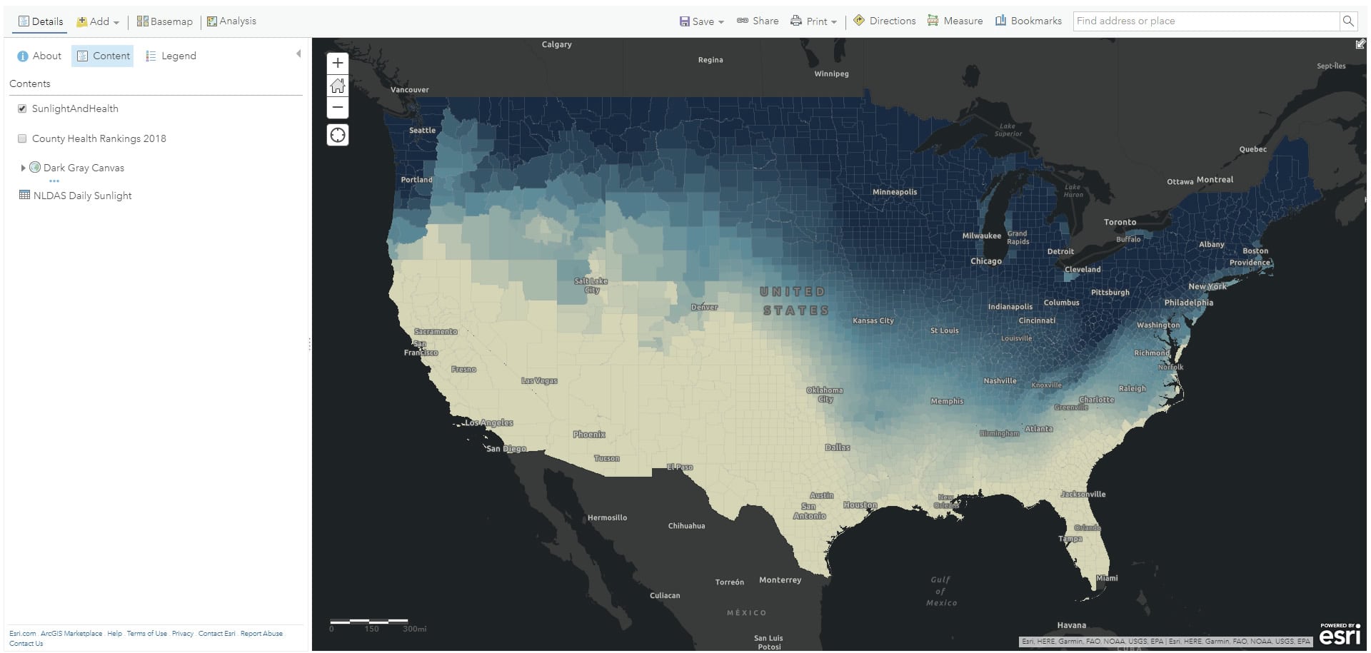
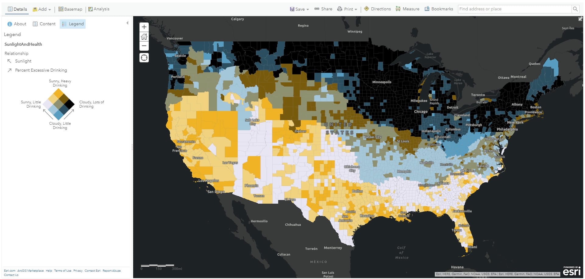
Now all sorts of relationships can be mapped. Here’s an example comparing average sunlight to excessive drinking…
And one comparing average sunlight to the number of “physically unhealthy days”…
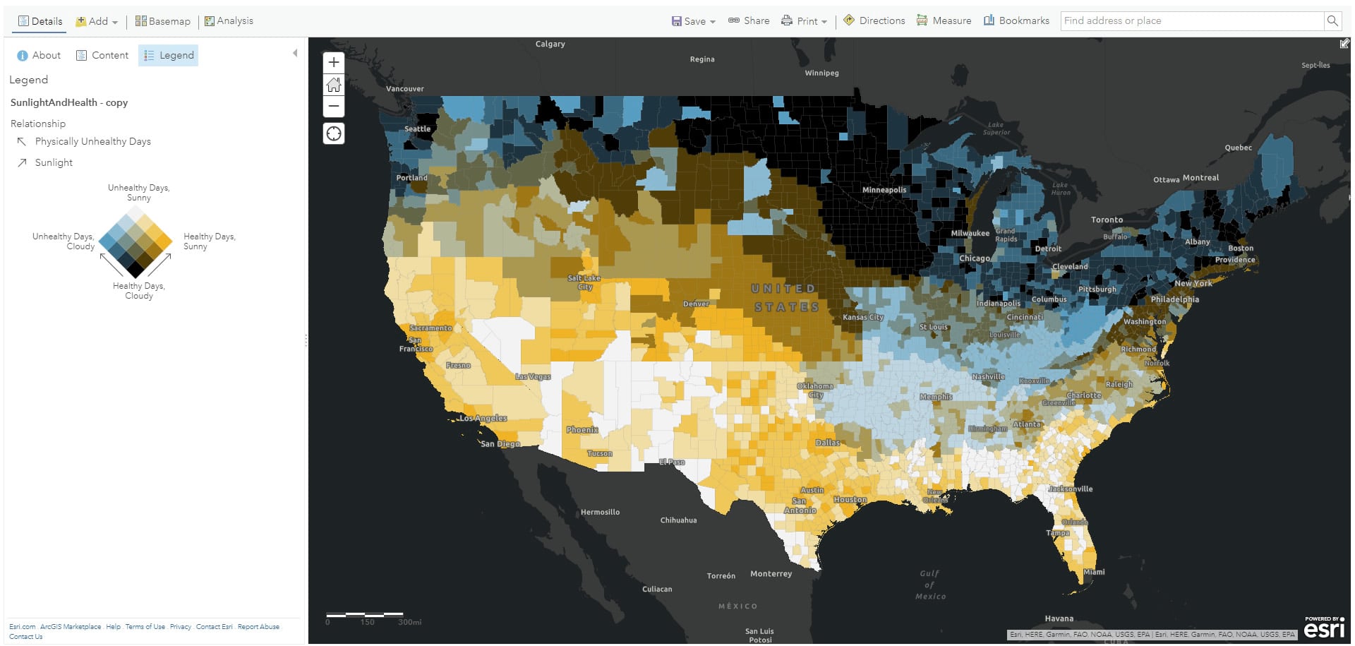
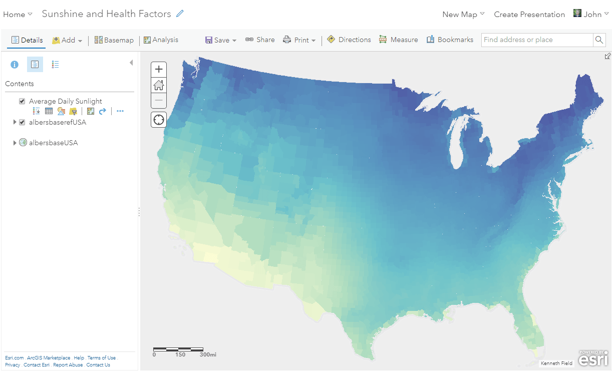
And if you would rather an equal area projection, as I do, here it is in Ken Field’s minimalist Albers basemap…
Have fun cooking up all sorts of relationship maps and looking for patterns that might raise questions. And, in general, have fun smooshing data found in the wild up with your ArcGIS Online layers!
Happy Smooshing! John

Commenting is not enabled for this article.