As cartographers we wish our data was perfect. But this being the real world we know all data is to varying degrees uncertain, out-of-date, based on incomplete samples, and so forth. Other times as cartographers we need to highlight certain areas on the map and call attention to critical places, like where freezing rain is forecast tomorrow or where there has been a significant increase in COVID-19 cases. In other words, sometimes just symbolizing the data and using software defaults isn’t enough: We need to make sure some places get extra visual attention so they’re not missed. Or conversely, we need to make sure some places recede into the background so they’re not oversold. What follows is a quick tour of some of my favorite techniques for emphasizing and muting with texture fills.
Think of these as analogous to using bold and italics for cartography.
The solution to imperfect data is not to stop mapping altogether. Nor is it to pretend all data are perfect. Rather, our job is to use the available data but to also do our due diligence and—when possible and appropriate for your audience—provide readers with some sense of data quality, completeness, currency and consistency. For example, if I know some regions have data that is more than 10 years old or maybe has a high margin of error, I might use a texture overlay to partially mask that region, or decrease its opacity, or lightly blur it. The region is still mapped, but muted, reflecting our confidence in the data.
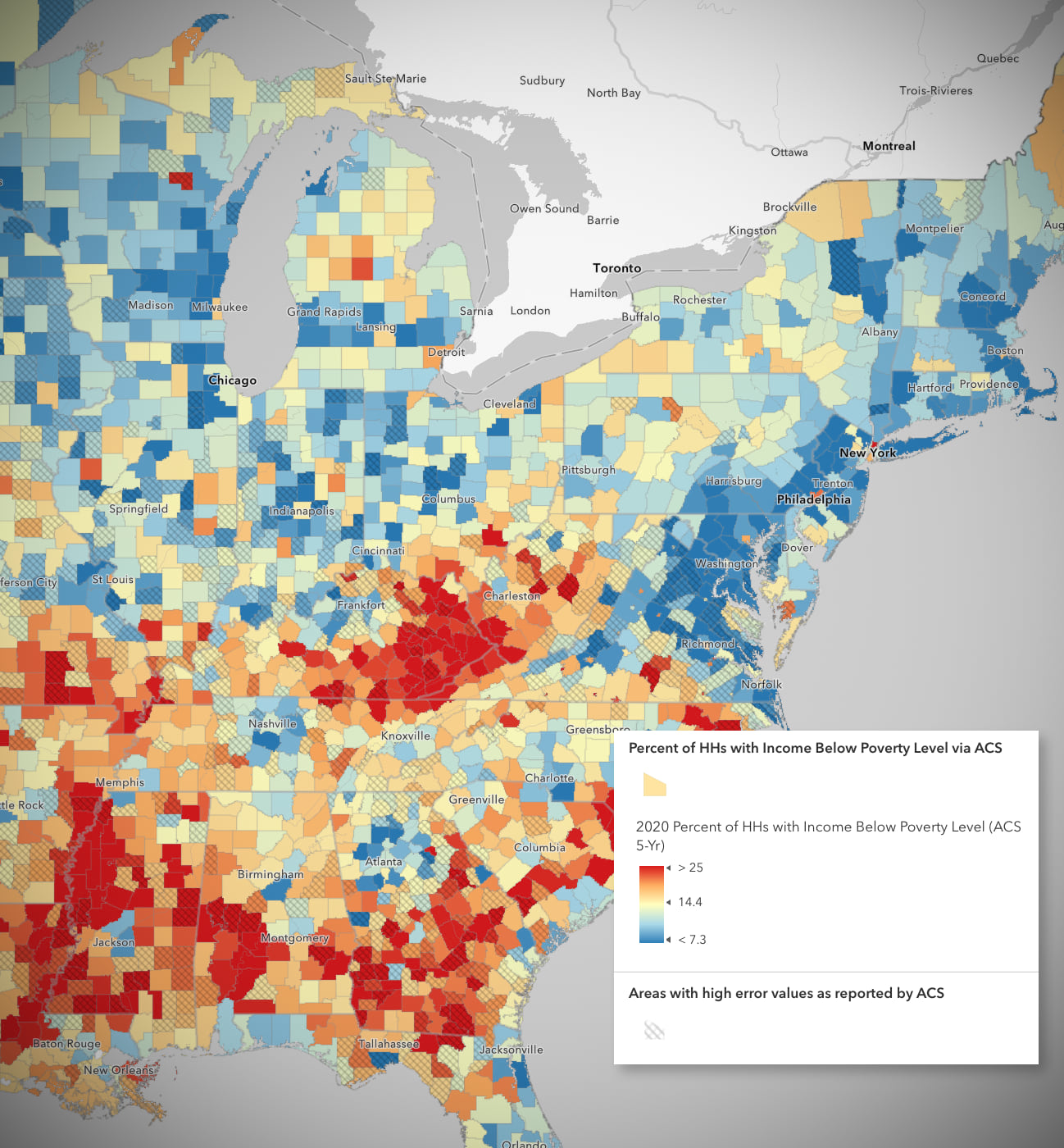
A great example of showing uncertainty using a cross-hatch texture was created by my colleague Jeremy Bartley. Here he takes advantage of the measure of error that is reported along with Poverty Data from the American Community Survey. On his map the colors tell us about the data, while the texture tells us where we should be cautious in interpreting the data.
Before going further, if you haven’t used the new-and-improved symbol styler in Map Viewer read this great introduction by Russ Roberts to get you up and running. He also covers the basics of texture fills.
Texture Fills are Awesome
One of my favorite new additions to Map Viewer is the ability to use texture fills any place I might have previously used a solid color. You don’t need to create these textures yourself, we have a bunch exported from ArcGIS Pro and ready to go. Best of all, you are free to customize properties of these textures like their color(s), transparency, and line width, so really they are just a starting point.
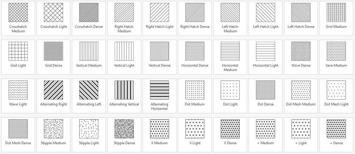
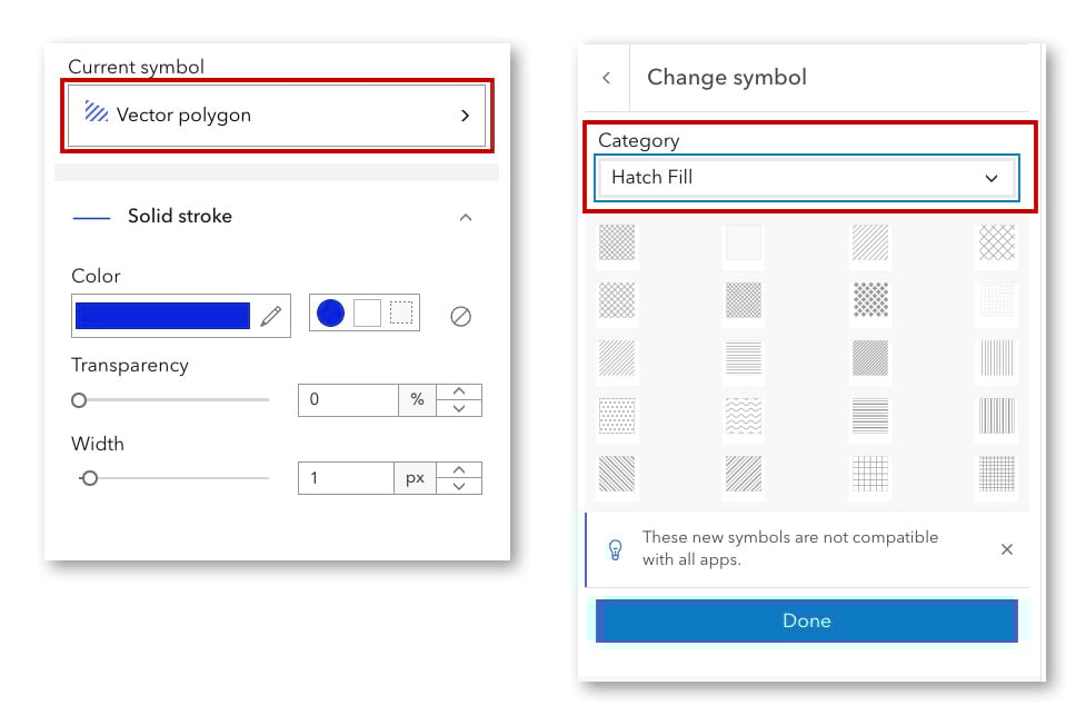
When you’re styling the look of your polygons in the symbol styler, it may say either “vector polygon” or “basic polygon” but click on that to swap out the solid color fills and replace them with texture fills. Be sure to browse the “Category” pulldown.
Reasons I like texture fills
- Adding hatch lines or stippled Zip-a-tone style patterns is a wonderful throwback to manual mid-century cartography.
- Textures have the advantage over solid color fills of being see-through. Yes, blend modes and transparency allow us to make solid colors less opaque but they usually change the original colors to achieve this.
- Textures can work in grayscale and don’t need to introduce new colors or compete with other colors already on the map. This means we can overlay textures on top of other map layers to add additional context about those layers. I often think of added textures like this as “editorializing” what sits beneath them.
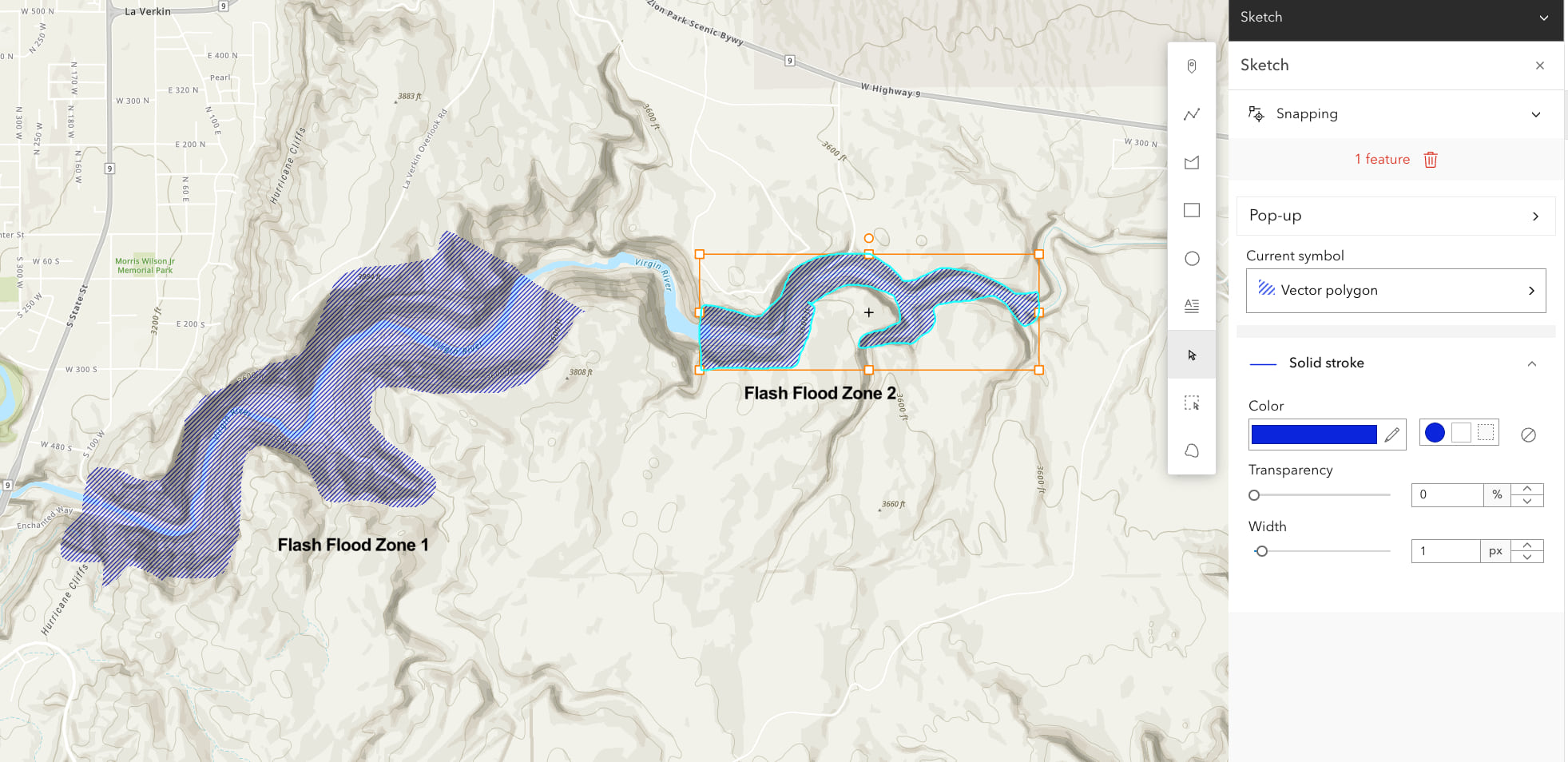
In the next map I have added a Sketch layer over top of the base map so I could quickly trace a (fictional) flash flood zone to a river canyon in Utah. Since I didn’t want to obscure the gorgeous basemap and lose the sense of the topography, I used a see-through blue hatch pattern which I hope suggests “intermittent water”. If you haven’t used Sketch, watch this 5-minute video (YouTube) to see how easy it is to draw directly on top of our maps.
How about a texture-based choropleth map? Texture fills aren’t just for manually drawn Sketch layers. They can just as easily be used with data-drawn polygons such a map of US Counties showing rates or figures. In the map of median age below I used three densities of cross-hatching to replace the solid colors of the choropleth map (aka Counts and Amounts: Color). I could have kept the original colors and superimposed them onto the texture, but I like the elegance of monochrome maps.
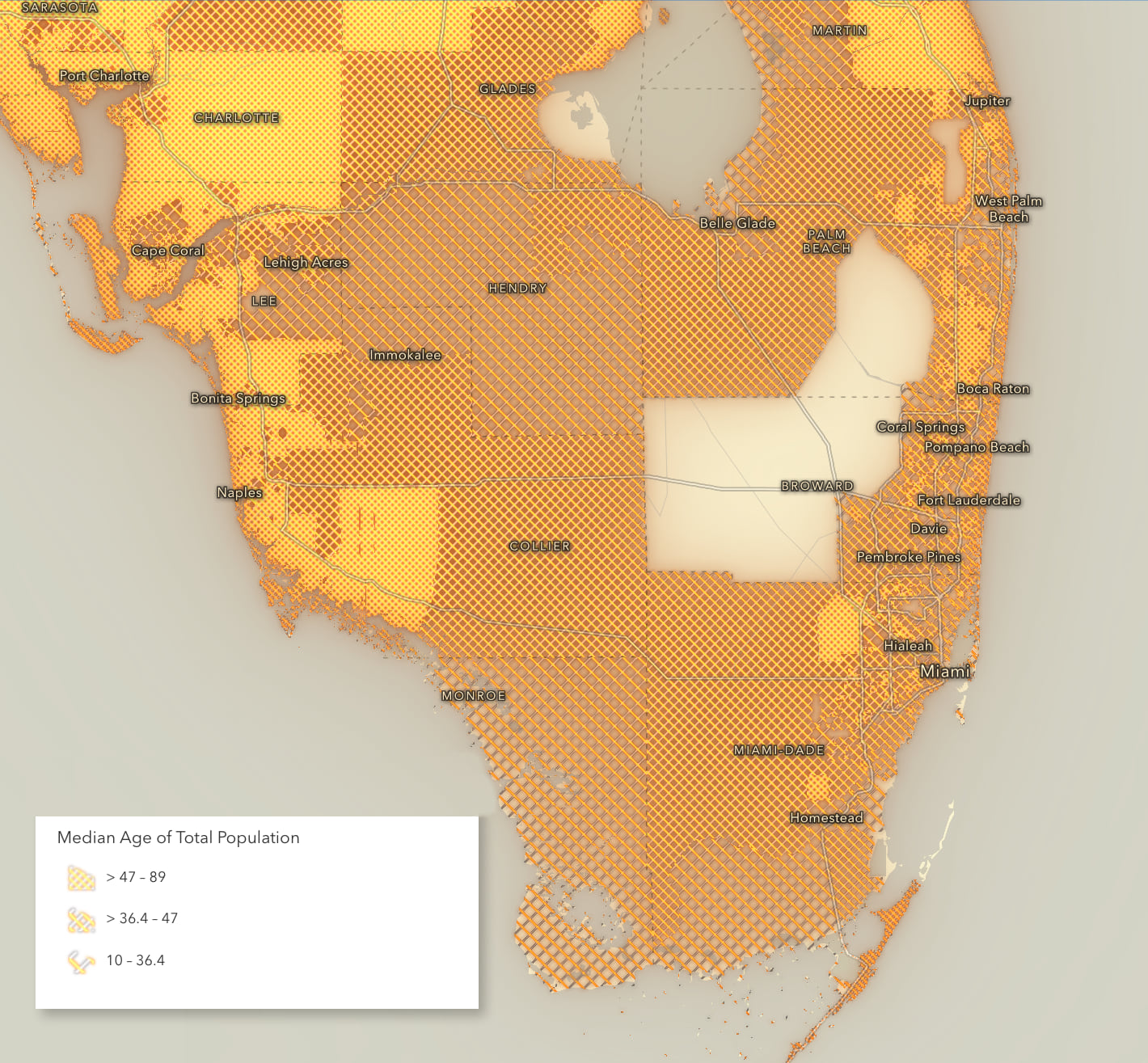
Drop shadow can be added to your textures (like in the map above), along with any of the other map Effects, to help make them pop or look their best!
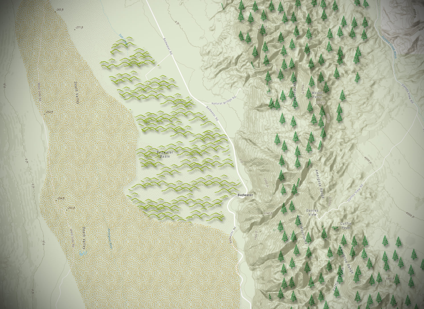
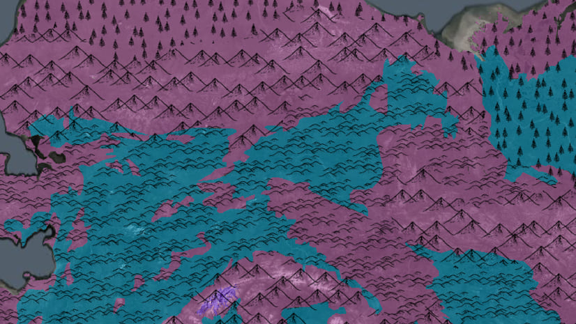
This next map uses landscape fill patterns for polygons I drew in Sketch to emphasize different landcover types, slightly reminiscent of Erwin Raisz landscapes of the 1940s. The advantage of highly iconic symbology is they work well even without a legend since they, well, look like the thing they are.
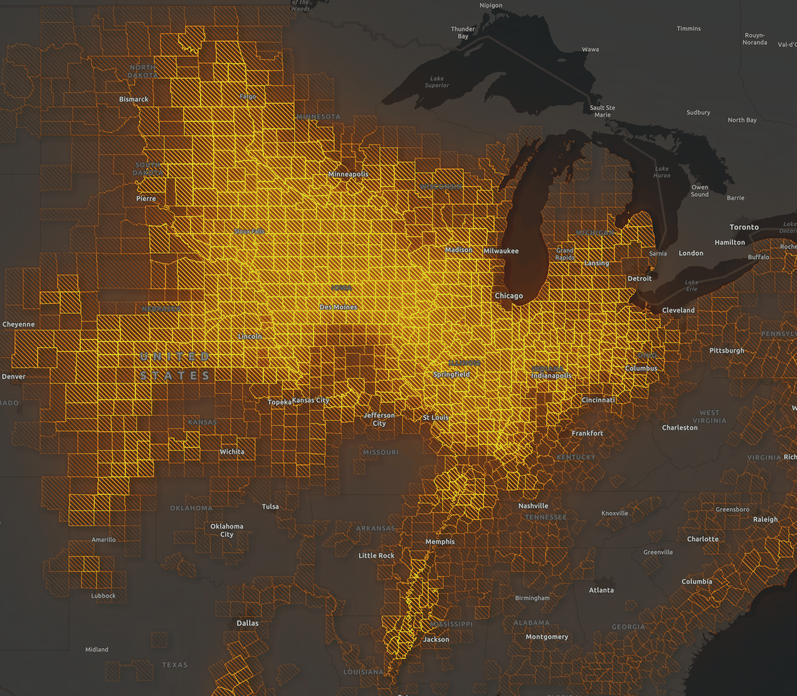
This last map shows how we can combine three techniques together to create something new. First, the map starts off about as simple a map can get: Simple Symbol map of the counties of the US! Then a transparency function is applied that proportionally reduces the strength of those fills from 100% solid down to 0%, proportional to how many acres of corn are harvested in each county. In other words, places that produce lots of corn are bright. Lastly, Hard Light blending plus both a dropshadow and a bloom are applied to really make the “corn belt” in the Midwest pop.
Texture Limitations
Textures can easily get lost on busy maps or imagery. While you could use stronger textures such as a really bold black a white zebra stripe, it starts to feel a bit shout-y and unprofessional. Better to turn down the volume on the rest of the map—which is where Esri’s muted Canvas basemaps can be great—so textures can be seen clearly without needing to yell.
Also bear in mind that humans aren’t as skilled at seeing subtle distinctions in textures and patterns as we are differences in color. This means I recommend sticking to a max of 3 or 4 textures on a map if you expect people to rank the different textures from high-to-low. In the example above I only used 3 hatch densities so that the visual differences are large. If I had used 10 different hatch densities, I’m not sure anyone could reliably pick out class 7 from class 8.
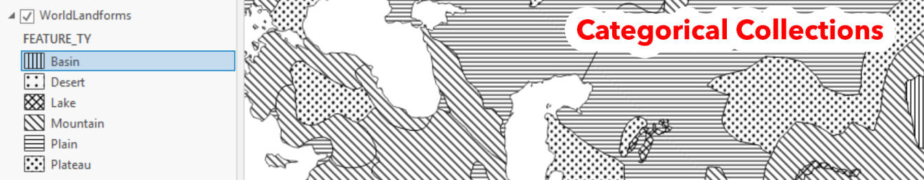
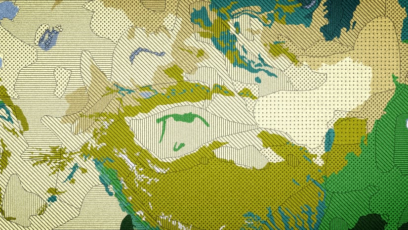
However, if you want to show categorical differences using texture fills (like soil types or landcover classes) you can push that number a lot higher, especially if you use color + texture in combination. That’s because these don’t need to be ranked from high-to-low, they just need to look different from one another. Polka dots look different from vertical strips look different from horizontal stripes. John Nelson has a great blog post, which is where I stole the image from.
Next Steps
Texture-filled polygons add one more tool to the mapping toolbox in Map Viewer. Whether they’re used as a second layer sitting over top of other layers, or are used in lieu of solid color fills, they can add a unique look to your map. My advice is to use them sparingly, much as we use bold and italics sparingly in our writing, when added emphasis or attention is needed. And don’t forget to experiment with blend modes and effects (bloom, blur, dropshadow in particular) since textures can really come alive with those tweaks.
Happy Mapping!

Hi Mark, Thank you for this amazing article. You have really opened up my eyes to some new awesome new tricks and how to improve my maps for my customers. I can’t wait to start using these new ideas right away.
Thanks,
John