After the initial release of the Presence-Only Prediction (MaxEnt) tool in ArcGIS Pro 2.9, we have been connecting with users trying to use the tool to solve very diverse problems, from analyzing the suitability of croplands to forecasting the probability of wildfire incidents. We’re glad the initial blog post has helped lots of users successfully start using the new tool, but we’re also frequently asked if they’re getting a good model, or how to tweak the parameters to improve the models. So, we hear you! And this short blog post will share some tips with you!
1. Train and tweak first, predict later.
The tool can be run to train a model, or to train and predict. We recommend that you first start by only training a model and using the optional training outputs to understand and settle on a “happy” model before you proceed to predict.
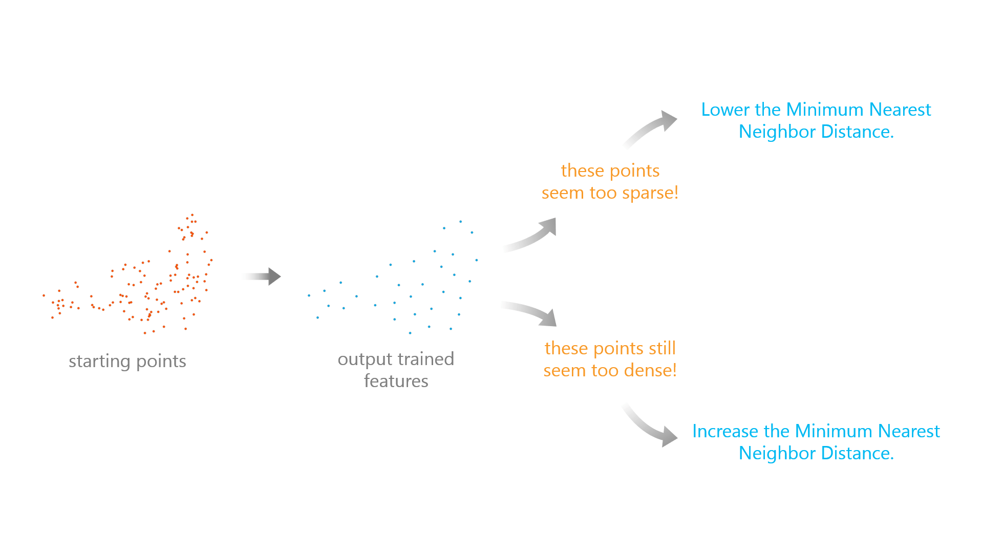
2. Tweak the Minimum Nearest Neighbor Distance.
We know that many of you have set the Minimum Nearest Neighbor Distance to 10 kilometers as a starting point. To further decide if this distance suits your data, you can use the Output Trained Features to check if this is appropriate. If the points are too sparsely spread out and information may be lost, lower the Minimum Nearest Neighbor Distance. If the points are not spread out enough, increase the Minimum Nearest Neighbor Distance.
3. Increase the Number of Knots.
When using the Hinge or Threshold Explanatory Variable Expansions (Basis Functions), the tool uses a default Number of Knots of 10 to save time. This is different from the R library maxnet which uses 50 as a default. If some of your Hinge and Threshold variables appear to be important to your model, you can increase the Number of Knots to 20, 30, 40, or even 50 to check if the model gets improved AUC or a lower omission rate.
4. Try changing the Relative Weight of Presence to Background.
This parameter gives different importance to presence versus background points, and its default value is 100, meaning presence is much more important than background. It’s worth testing how your results change when you try a value of 75, 50, 25, or even 1 to see the corresponding changes.
5. Try different basis expansions.
The tool uses Explanatory Variable Expansions (Basis Functions) to transform and evaluate different variables. It’s worth testing with several combinations of these; some may lead to better interpretation and higher AUC. For example, a product expansion may better capture the effect that two variables have together on the presence of the event.
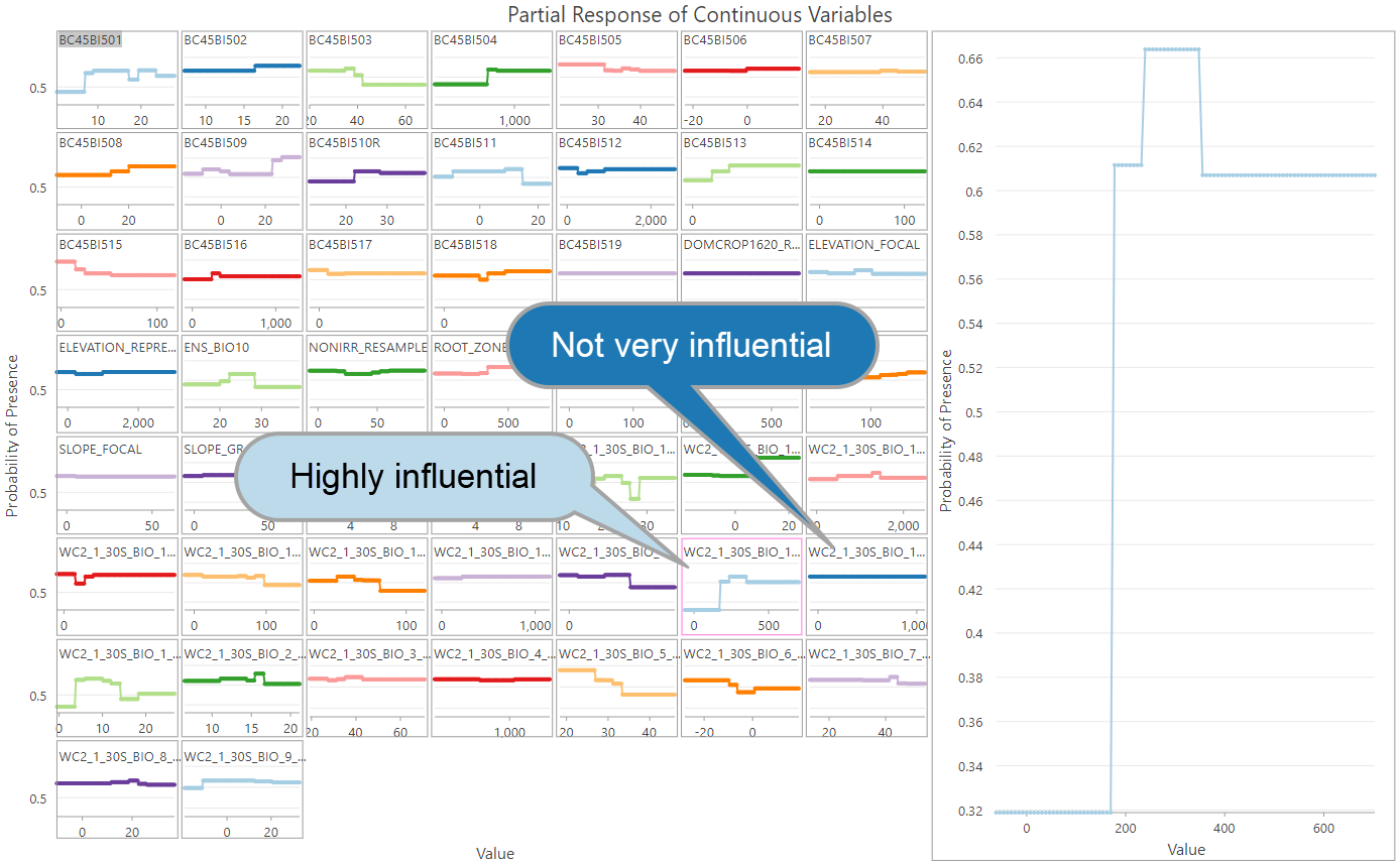
6. Use the output charts!
Always use the two charts created with the Output Response Curve Table. These will help you understand the direction and magnitude of the impact of each variable on the probability of presence.
The variable importance charts in Forest-based Classification and Regression are quite popular… to interpret variable importance in Presence-only Prediction a good practice is to check the range of the y-axis of each small response curve to get a sense of the variable importance. In general, the larger the range, the more that the variable is impacting the probability of presence (holding the other continuous variables at their mean value and the other categorical variables at their majority value). Be careful when interpreting variable importance this way though: even in cases when the range is not that great, the variable could be changing rapidly between high and low probability values, meaning it still has an important effect on the probability of presence.
7. Use a python script to help you quickly test different parameters.
The tool has a lot of parameters to tweak. You can write a python script to list the options of each parameter you want to test, run the arcpy command for each combination, name the results in a way that reflects the parameter settings, and grab a big cup of coffee or leave it running overnight.
From the results, you can then record the Omission Rates and AUC in an Excel kind of thing. Remember: Lower omission rates and larger AUC are good signs of a better model. When faced with many models with similar omission rates and/or AUC, use Occam’s Razor: the simplest and easiest model to interpret is often the best.
8. Make it a fair comparison, when comparing Presence-only Prediction models with models from other tools.
We’ve seen many of you comparing the results from Presence-only Prediction (MaxEnt) and Forest-based Classification and Regression tools. While these comparisons are welcome and needed, there are some careful considerations as you make them: Presence-only Prediction does some fancy work on the input data, including data processing steps like spatial thinning, creating artificial background points, and transforming the variables with basis expansions. Besides, regularization and variable selection via the elastic net is also conducted through model optimization. So, the results from Presence-only Prediction tend to be less biased and overfit than other models. As a result, running the two tools with the same exact Input Point Features (aka Input Training Features in the Forest-based Classification and Regression tool) and Explanatory Training Rasters (plus Explanatory Training Variables/Distance Features if background points are contained in your Input Point Features) is often not a fair comparison.
We suggest playing with your Presence-only Prediction models first to generate the Output Trained Features of your “happy” model and use that as Input Features in the Forest-based Classification and Regression tool, selecting the variables that are significant in the Presence-only Prediction tool as Explanatory Variables. These steps would make it a much fairer comparison.
Hopefully, these tips will help you dive deeper into the tool and find the optimal model for your analysis!


Article Discussion: