***** Do you want to give feedback on Data Engineering? Check out this blog post! *****
Data is interesting. Mapping and analysis with ArcGIS Pro helps you discover, learn from, and communicate with your data.
But data is also messy! Important data preparation work precedes mapping and analysis; work that is critical to understand your data and make it analysis-ready. This work forms a big part of many of our roles, but it can be time-consuming, and sometimes frustrating.
In ArcGIS Pro 2.8, data preparation and exploration work becomes more intuitive with the new Data Engineering view. The view brings existing functionality together with new capabilities to help you explore, clean, and prepare your data. Data Engineering is available with all license levels of ArcGIS Pro, and is compatible with all feature layers and standalone tables.

In this blog article, we’ll take a tour of some features of the view by following a workflow to explore and prepare data of affordable housing pipeline projects in San Francisco, USA. These projects help San Franciscans find affordable housing opportunities by offering units at below market rate prices. With this type of data, the city might, for example, create data visualizations to report on project status, or evaluate whether each project manager has the right balance of affordable housing units.
To follow along, download the Affordable Housing Pipeline layer (derived from DataSF) here.
The Data Engineering View
1. With the Affordable Housing Pipeline layer in a map, right click the layer in the Contents pane then click Data Engineering.

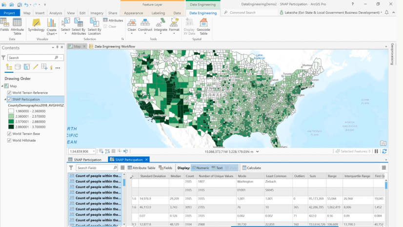
This opens the Data Engineering view. On the left is the fields panel, and on the right is the statistics panel.

When the view opens, a Data Engineering ribbon also opens. This ribbon is contextual, meaning it opens when the view is active.

Exploring fields
The fields panel shows all the fields in the layer, listed by field alias. This panel helps you view and begin exploring your fields.
2. Hover over the ABC icon next to the field Project Status.

The hover text shows you the field Name, Alias, and Type. The ABC icon next to the words Project Status also help you quickly recognize the field type.
3. Click the Create Chart icon next to the field Project Status.

This opens a new chart, which is created as an item in the Contents pane under the layer. Since the field is a text field, a bar chart is opened to show the count of projects within each of the 6 project status categories. The bar chart shows that the predominant project status is stage 5 – Construction document issued. Like all charts in ArcGIS Pro, you can open the chart properties to further configure the chart.

4. Back in the fields panel, search for the word “unit” then click the Update Symbology button.

This updates the layer symbology to show the Affordable Units field using Graduated Colors. By visualizing this variable on the map, you can see that there does not appear to be any clear spatial pattern of high or low values. You can always right click the layer then click Symbology to further refine the default symbology settings from Data Engineering.

5. Scroll through the list of fields or search to find the field “Property Informaiton Map Link”. You’ll notice that there is a spelling error in the field name and alias for this field. You can fix this by right-clicking the field, clicking Clean, then clicking Alter Field.

This opens the Alter Field tool in a floating window. An important part of Data Engineering is fixing and preparing your data. Data Engineering provides access to many Data Engineering geoprocessing tools to help this process, organized into 4 groups: Clean, Construct, Integrate, Format.
6. Populate the Alter Field tool with the New Field Name and New Field Alias as shown in the image below, then click OK.

Once the tool runs, you’ll notice that the field alias has updated in the fields panel.
7. Click the filter icon in the upper-left of the fields panel, then click Date.

This helps you gain a sense of what dates are recorded for each project. In the next section, you’ll begin to dive deeper into the values of these fields.
Understanding statistics
The statistics panel helps you gain a better understanding of the values and distribution of the fields. Each row corresponds to a field, and each column shows a different metric or statistic for each field.
8. In the fields panel, click the first date field, then click Ctrl+A to select all the fields in the current view, then right click any field and click Add to Statistics and Calculate.

This adds all the selected fields to the statistics panel, and populates the statistics cells for these fields. The Chart Preview column gives you an immediate impression of the temporal distribution of the fields. Look at the Chart Preview, Minimum, and Maximum columns together for the date fields added to the statistics panel. Notice that the Chart Preview looks abnormal for the field Estimated/Actual Construction Start Date, and that the minimum date is much earlier than all the other minimum dates. It appears as though some records may be using this date in 1899 in place of Null.

Tip: To view the Alias next to the Chart Preview while you scroll, you can right-click the Alias column header and choose Freeze/Unfreeze.
9. Right click the Minimum cell for the Estimated/Actual Construction Start Date, then click Select Rows.

This selects the rows containing this value. The indicator bar at the bottom of the panel shows you that 2 rows have been selected.

You’ll see one location in the south west of the city is now selected on the map.
10. Click the selected point on the map to open the pop-up.

By exploring the pop-up, you can see that the two selected points are different phases of the Parkmerced project, and that the building permit was issued in 2018. This confirms that 1899 is not a real date, so next you’ll replace these values with Null.
11. Right click the header rectangle at the left of the Estimated/Actual Construction Start Date row, click Construct, then click Calculate Field.

This menu has access to the same groups of tools that you saw in the fields panels. You can also access all of these tools and more from the Data Engineering ribbon.
12. In the Calculate Field tool, type “None” in the parameter Estimated_Actual_Construction_Start_Date, then click OK.

This will update the value for the field for the two selected records to Null.
13. On the ribbon, click the Clear button to clear the selection.

In addition to the Data Engineering Tools, the ribbon provides access to the Selection group, plus shortcuts to open the Fields view or Attribute Table for the layer.
14. Click the Calculate button from the top of the statistics panel to recalculate statistics with the updated data.

This updates the statistics, showing that the Number of Nulls have increased, the Preview Chart now looks more reasonable, and the Minimum date has updated. You can reference the indicator bar at the bottom to check how many records were used in the calculation – if there was still a selection applied, only the selected records would be included in the calculation.
15. In the fields panel, remove the filter by clicking the filter button and clicking Date, like you did in step 7. Now, you’ll add all of the fields to the statistics panel by clicking the field Project ID, clicking ctrl-A on your keyboard, then right clicking Project ID and selecting Add To Statistics And Calculate.

16. Click the Text and Date display filters in the top bar of the view to turn off text and date fields.

The Display filters are a useful way to temporarily apply a filter to the types shown in the statistics panel. In addition to hiding the rows that are not applicable to the currently enabled filter, they also hide the columns. For example, if only Text and Date fields are displayed, then the Skewness column will not show.
17. Explore the Supervisor District field. This is a Long field, with 11 districts (Unique Values) ranging between 1 (Minimum) and 11 (Maximum). Supervisor District 6 has the highest count (Mode) and 7 has the least (Least Common). Although this field is stored as a numeric field, it would be useful to visualize it as a categorical field. You can do this by right clicking the Chart Preview cell for this column, then clicking Create Chart, and Bar Chart.

The right-click menu for each Chart Preview enables you to open the full chart for the preview chart shown (Open Histogram) and also to choose from a list of all of the compatible charts for that field (Create Chart). This curated list of charts helps you understand the different ways you can visualize your data.

18. Back in the statistics panel of the Data Engineering view, take a look at the statistics for the Project Units, Affordable Units, Market Rate Units, and % Affordable fields.
The statistics help you understand the values and characteristics of the fields. For example, you can see that the most common (Mode) number of Project Units is 24 and that there are a total (Sum) of over 35,000 units across the city which are approximately 1/3 affordable and the rest are market rate. Based on this information, you now understand that although the supervisor districts each contain a different number of projects, each project has a variable number of units. If you wanted to explore this further, you could use the chart properties pane to update the chart you explored in step 17 to show the sum of the unit fields.

Tip: To view all of these statistics together like in the screenshot above, you can reorder the statistics by dragging them, or use the Hide Column or Freeze/Unfreeze options in the right click menu of the column header.
You can also see that Skewness and Kurtosis of the % Affordable field are not extreme (skewness is close to 0 and kurtosis is less than 3), however when looking at the Chart Preview, you can see this is because the distribution is bimodal – there are multiple peaks. Based on this information, in the next step you’ll create a categorical variable based on this field showing the two main classes of affordability.
19. Right click the Chart Preview cell for the field % Affordable, and click Reclassify Field.

This opens the Reclassify Field tool in a floating window. Many of the cells in the statistics table have quick links to geoprocessing tools that are relevant to what you see in the cell.
20. Fill out the Reclassify Field tool using the parameters shown below, then click OK to run the tool.

21. Navigate back to the fields panel, scroll to the bottom to find the new fields, then click the Create Chart button to open a bar chart of the new field.

You’ll notice that the new fields are not bold like the Location field above and most of the other fields. This indicates that the field has not been added to the statistics panel. You could choose to add these fields to the statistics panel by right-clicking, as shown before, or you can drag the fields into the panel.

Preparing data
As you’ve seen, the Data Engineering view has lots of useful tools and functionality scattered throughout. By right clicking many of the cells in the statistics table, you can select the records related to that statistic or open relevant tools. By right clicking the fields in the fields panel, and rows in the statistics table, you can access tools organized into logical groups. The Data Engineering ribbon also provides access to all of these geoprocessing tools.

Summary
You used the Data Engineering view to explore and prepare the San Francisco Affordable Housing Pipeline layer. Using the fields panel, you discovered what fields the layer contains, and started to understand the spatial patterns and values in the fields. You dived deeper into the characteristics and distribution of the fields using the statistics panel, then applied tools to clean up errors in the data and create new fields for analysis.
Feel free to continue exploring this layer with Data Engineering. If you’d like to complete a workflow to understand how the fields you’ve created can be used in an analysis, you could explore using the Build Balanced Zones tool to reassign projects to 11 supervisor districts, using the Project Units field and the new AffordabilityClass_CLASS field that you created.
Looking to learn more about Data Engineering in ArcGIS Pro? Here are some other resources you can explore:
- Data Engineering documentation
- Address hunger and food insecurity with Data Engineering – demo and workflow from the 2021 DevSummit
- Data Engineering tools – demo showing how to use 5 of the tools featured in the Data Engineering view
Got questions about Data Engineering? Feel free to post them in the Spatial Statistics Esri Community page.


Great article on data engineering in ArcGIS Pro! The way Esri integrates data prep and visualization is very practical for aspiring data professionals. For students or freshers looking to gain real-world skills, a [data engineer internship remote](https://360digitmg.com/india/data