Planning is about the future and having reliable estimates of the future population is critical for assessing demand for housing, energy, food, and infrastructure. While there are many different methods for predicting the future population, most methods follow a similar pattern. You gather historical population data, fit a mathematical model to that data, extend or extrapolate the model into the future to predict population, and finally, evaluate how well the model did. This can be an uphill task, particularly if you need to predict the population for many different areas. Often, finding reliable historical population data in an easy-to-use format can be the most challenging part. In this blog, we’ll share a source of historical county population data and introduce a set of exciting, easy-to-use forecasting tools available in ArcGIS Pro.
Historical population data
The National Cancer Institute provides two historical population datasets; Historical County Population (1969 – 2019) by Race (White, Black, Other) and Historical County Population (1990 – 2019) by Expanded Races & Hispanic/Non-Hispanic. Esri has made these datasets available in ArcGIS Online. If you’re interested in forecasting the total population, we recommend the 1969-2019 dataset since it contains a long history. However, suppose your project requires a more detailed analysis by racial or ethnic group (for example, White, Black, American Indian/Alaska Native, Asian/Pacific Islander). In that case, you’ll need to use the 1990-2019 dataset.
Time series forecasting tools
Understanding how the population has increased or decreased across time is the basis for predicting future population. Past behavior is often the best predictor of future behavior. There are many ways to describe (model) historic population patterns, and choosing the best model is essential and challenging. Fortunately, a set of new time series forecasting tools available in ArcGIS Pro 2.6 allows you to model and project population data in various ways.
The workflow
Using step by step instructions, we will show you how to:
- Prepare data for analysis
- Create a space-time cube using county-level population data (total population)
- Run three different forecasting models (Curve Fit Forecast, Exponential Smoothing Forecast, and Forest-based Forecast)
- Evaluate the forecasts for each county in the US
Prepare data for analysis
1. Create a new Pro project with the name population_forecasts.
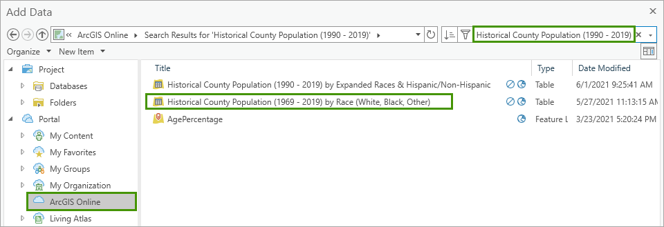
2. On the Map tab, in the Layer group, click the Add Data button.

3. In the Add Data window, under Portal, click ArcGIS Online. Then, type Historical County Population (1990 – 2019) in the search bar and press Enter. Select Historical County Population (1990 – 2019) by Race (White, Black, Other) and click OK.
Next, you’ll add a layer for the US counties from the Living Atlas.
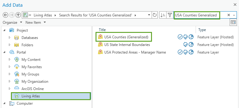
4. On the Map tab, in the Layer group, click the Add Data button.

5. In the Add Data window, under Portal, click Living Atlas. Then, type USA Counties Generalized in the search bar and press Enter. Next, select USA Counties (Generalized) and click OK.
Your map now contains a US counties layer and a table with historical population data for each county (1969 – 2019). When creating a space-time cube using the Create Space Time Cube From Defined Locations tool, you need a unique numeric identifier to link (relate) the population data in the table to the features in the map.
Since you can’t modify data stored in the Living Atlas, you’ll make a local copy of the US counties layer.
6. On the ribbon, on the Analysis tab, in the Geoprocessing group, click Tools.
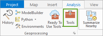
The Geoprocessing pane opens.
7. In the Geoprocessing pane, in the search box, type Copy Features. In the search results, click Copy Features to open the tool dialog.
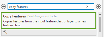
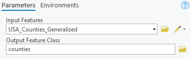
8. In the Copy Features geoprocessing tool, select USA_Counties_Generalized from the Input Features dropdown. For Output Feature Class, type counties.
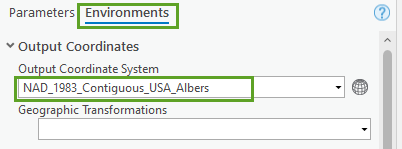
9. Click the Environments tab. Click the Select Coordinate System button (small globe) and select NAD 1983 Contiguous USA Albers (under Projected Coordinate System > Continental > North America) as the Output Coordinate System.
10. In the Geoprocessing pane, in the search box, type Calculate Field. In the search results, click Calculate Field to open the tool dialog.
11. In the Calculate Field geoprocessing tool, change the following parameters:
- For Input Table, specify counties.
- For Field Name (Existing or New), type FIPS_NUM.
- For Field Type, specify Long.
- For FIPS_NUM =, type !FIPS!.
Click Run.
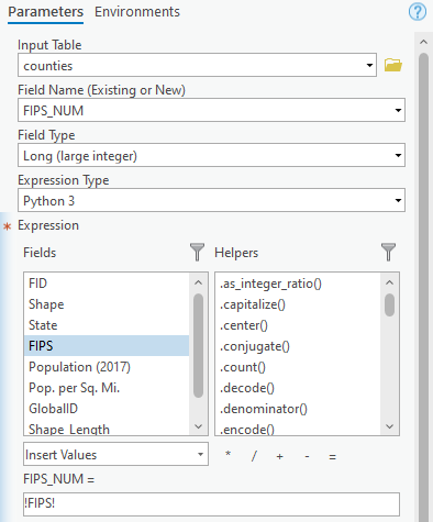
This step prepares the data for the ‘Create Space Time Cube From Defined Location’ tool.
Creating Space-Time Cube and Visualize the population trend in 2D
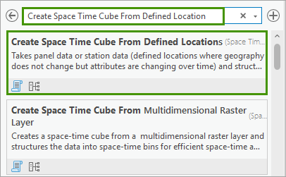
1. In the Geoprocessing pane, in the search box, type Create Space Time Cube From Defined Location. In the search results, click Create Space Time Cube From Defined Location to open the tool dialog.
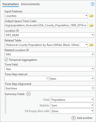
2. In the Create Space Time Cube From Defined Location geoprocessing tool, change the following parameters:
- For Input Features, specify counties.
- For Output Space Time Cube, type USA_County_Population_1969_2019.nc.
- For Location ID, specify FIPS_NUM.
- For Related Table, specify Historical County Population by Race (White, Black, Other).
- For Related Location ID, specify FIPS.
- Check Temporal Aggregation
- For Time Field, specify Year.
- For Time Step Interval, type 1 and specify Year from the dropdown list.
- For Summary Fields,
- Select Population for Field.
- Select Sum for Statistics.
- Select Zeros for Fill Empty Bins with.
Click Run.
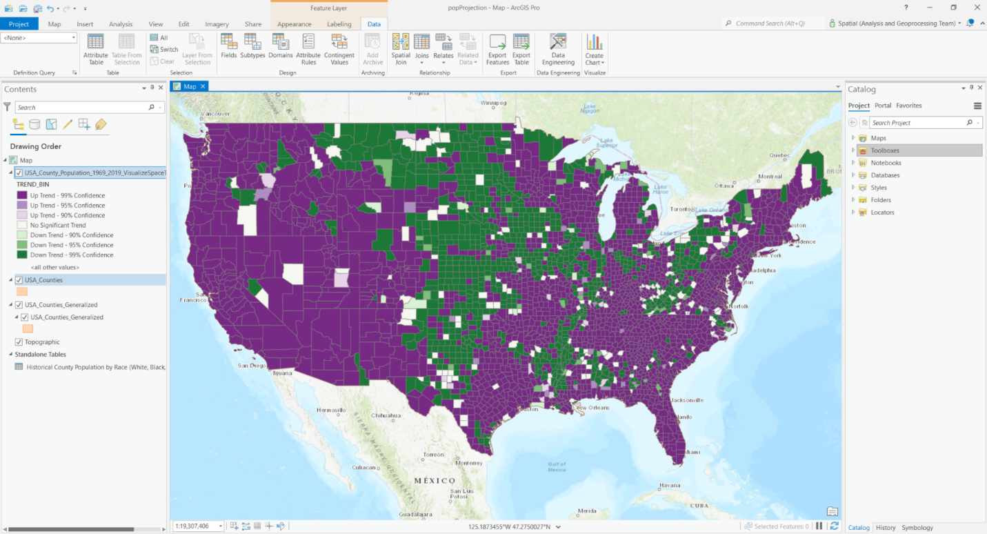
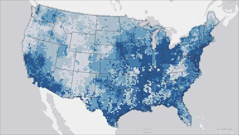
Running this tool will produce a space-time cube containing the yearly total population data for each county in the US. Before we dive into the forecasting, let’s get a quick visualization of the past trends of the population using the Visualize Space Time Cube in 2D tool.
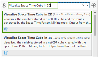
3. In the Geoprocessing pane, in the search box, type Visualize Space Time Cube in 2D. In the search results, click Visualize Space Time Cube in 2D to open the dialog.
4. In the Visualize Space Time Cube in 2D geoprocessing tool, change the following parameters:
- For Input Space Time Cube, specify USA_County_Population_1969_2019.nc.
- For Cube Variable, select POPULATION_SUM_ZERO.
- For Display Theme, specify Trends.
- Check Enable Time Series Pop-ups.
Click Run.
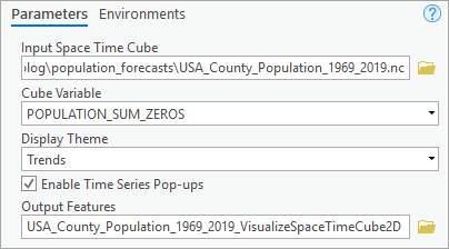
Your map now contains overall trends of population change from 1969 to 2019. The purple counties have increasing trends, while those in green have decreasing trends over the 51 years. Counties in white have no significant trend in population growth. The darker colors indicate higher statistical significance in terms of the tested trends. You can also click each individual county feature to see how the population changes in that specific county in the pop-up window.
Forecasting future population using Curve Fit Forecast
We first use the Curve Fit Forecast tool in the Time Series Forecasting toolset to project the population from 2020 to 2030, using the following four types of parametric curves: linear, parabolic, exponential, and Gompertz (S-shaped).
1. In the Geoprocessing pane, in the search box, type Curve Fit. In the search results, click Curve Fit Forecast to open the dialog.
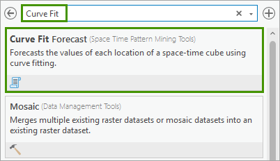
2. In the Curve Fit Forecast geoprocessing tool, change the following parameters:
- For Input Space Time Cube, specify USA_County_Population_1969_2019.nc.
- For Analysis Variable, select POPULATION_SUM_ZERO.
- For Number of Time Steps to Forecast, type 11. This means we will forecast 11 time steps out to the future, specifically, from 2020 to 2030.
- For Output Features, type USA_County_Population_2030_CF.
- For Output Space Time Cube, type USA_County_Population_2030_CF.nc.
- For Curve Type, leave it as default, which is Auto-detect.
- For Number of Time Steps to Exclude for Validation, type 10. This means we will leave observed data of the last 10 time steps for validation, which is data of 2010 to 2019.
- For Outlier Option, leave it as default, which is None.
Click Run.
This tool will fit a parametric curve to each location and forecast future time series by extrapolating the curve to future time steps. You could specify the curve type for all counties that you would like to use to forecast the data, or you can let the tool to automatically detect the optimal curve type for each location based on the overall fit or the validation result. You could also select the number of time steps to forecast (1 by default, 50% of total observed time steps as maximum), and you can also choose number of time steps excluded for validation (10% of total observed time steps by default, and 25% as maximum). For this blog, we will let the tool select the optimal curve type to use for each county and exclude the last 10 time steps as validation data. For each location, the curve type leading to the smallest validation Root Mean Squared Error (RMSE) at that location will be chosen as optimal curve and used for forecasting. In some cases, you will see “mean” chosen as the forecast method at some location, this indicates that the observed data will get the smallest validation RMSE using the mean value as fitted value for every single step, compared to using the other four types of curve. In this case, the forecasts will also the mean of observed data.
You could save the forecast results as an Output Features and an optional Output Space Time Cube, which can be consumed in the Evaluate Forecasts By Location tool to evaluate forecast results from various forecast methods. The Output Features contain the population forecasts for 11 years and the formulas of parametric curves in the attribute table. The Output Features are symbolized with the forecasted value of the final forecast time step, the population forecast of the year 2030 in this case.
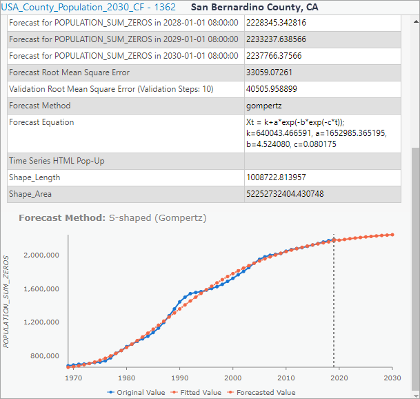
3. Click on a few of the counties on the map and explore the information in the pop-up window. It shows detailed information about the forecast and an interactive line chart. In this chart, a blue line visualizes the historic population from 1969 to 2019 for each individual county and an orange line shows the fitting and prediction using a specific curve type. The black vertical dotted line shows where the forecast starts. You can also hover over the chart to read the observed value and forecasted value at each time step. Above the chart are some statistics related to the fitted curve at the location, including forecast Root Mean Squared Error (showing the overall fit of the forecast model), the validation Root Mean Squared Error (showing the forecasting power of the validation model), chosen forecast method and its formula.
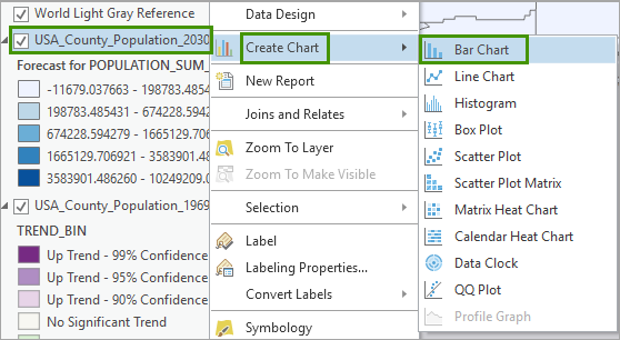
Creating an interactive bar chart counting number of locations using different forecast methods will be very helpful to understand the different patterns. Let’s do it using the following steps.
4. In the Contents pane, right-click USA_County_Population_2030_CF, point to Create Chart, and choose Bar Chart.
The Chart Properties panes and a chart view appear. Initially, the chart view is empty.
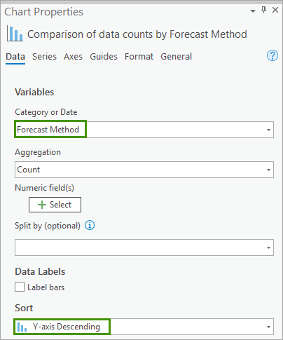
5. In the Chart Properties pane, change the following parameters:
- For Category or Date, specify Forecast Method.
- For Sort, select Y-axis Descending.
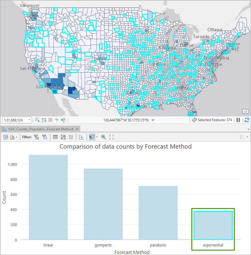
6. Click on a specific type of curve in the bar chart, all the places where the specific curve fit forecast was applied to will be highlighted on the map. This interaction makes it extremely easy for you to understand the different trends and characteristics of population growths among the US counties. You can also go one step further and symbolize the map using the Forecast Methods field.
Forecasting future population using Exponential Smoothing Forecast
Next, we would use the Exponential Smoothing Forecast to project the population in the future 11 years (2020 – 2030). The Exponential Smoothing Forecast works by decomposing the population time series at each county into seasonal and trend components. Therefore, this tool works best on population data that has moderate trends and strong seasonal behavior.
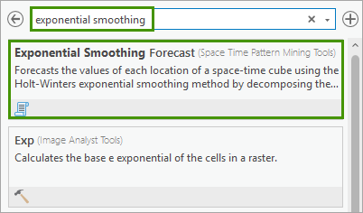
1. In the Geoprocessing pane, in the search box, type Exponential Smoothing. In the search results, click Exponential Smoothing Forecast to open the dialog.
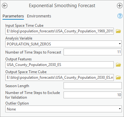
2. In the Exponential Smoothing Forecast geoprocessing tool, change the following parameters:
- For Input Space Time Cube, specify USA_County_Population_1969_2019.nc.
- For Analysis Variable, select POPULATION_SUM_ZERO.
- For Number of Time Steps to Forecast, type 11. This means we will forecast 11 time steps out to the future, specifically, from 2020 to 2030.
- For Output Features, type USA_County_Population_2030_ES.
- For Output Space Time Cube, type USA_County_Population_2030_ES.nc.
- For Season Length, leave it as default, which is empty.
- For Number of Time Steps to Exclude for Validation, type 10.
- For Outlier Option, leave it as default, which is None.
Click Run.
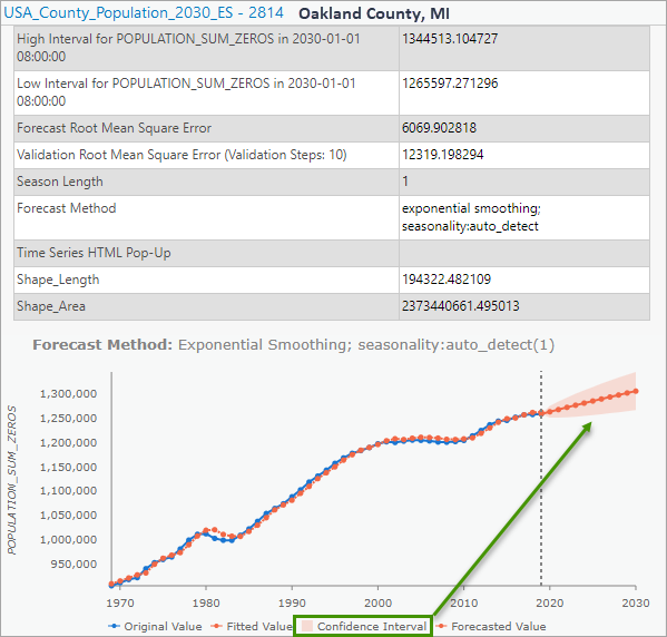
3. Click a few counties on the output features to see the detailed statistical results and informative pop-ups. Notice that the method also provides a 90% confidence interval of the forecasts, shown as the transparent orange cone around the forecasted line.
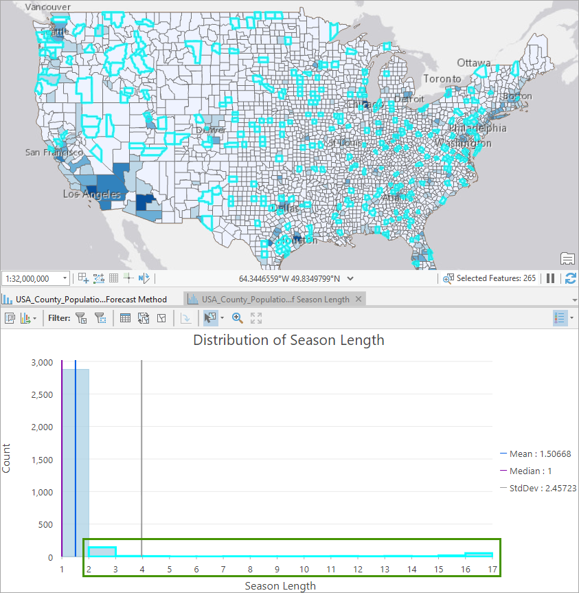
Given that the population data in most counties do not have a clear seasonal pattern, we can guess most of the counties should get a detected season length of 1, which means no periodic patterns detected by the method. Let’s create a histogram to check if it is the case.
4. In the Contents pane, right-click USA_County_Population_2030_ES, point to Create Chart, and choose Histogram.
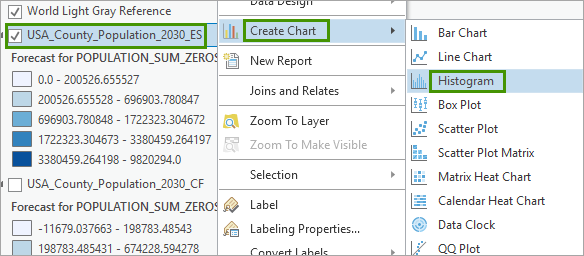
The Chart Properties panes and a chart view appear. Initially, the chart view is empty.
5. In the Chart Properties pane, on the Data tab:
- Under Variable, for Number, choose Season Length.
- Under Bins, specify 16.
The chart updates to show a histogram of temperature measurements and the chart title Distribution of Season Length appears. Additionally, the Statistics group in Chart Properties updates, showing various statistics for the Season Length histogram field.
6. In the Statistics group, leave Mean checked, and check Median and Std. Dev.
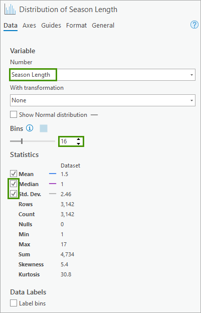
In the Distribution of Season Length histogram, a blue vertical line is displayed at the Mean season length (1.5). The Median temperature (1) is displayed in purple and the Mean plus 1 Standard Deviation (1.5 + 2.45 = 3.95) is in grey. Season length values are right-skewed, as we have guessed, most of the counties have detected season length to be 1.
7. You might be curious about the counties that have some kinds of seasonality. Drag a box over the bins large than 1 to highlight locations with season lengths greater than 1 from the histogram chart and show them on the map. You can also click to see their pop-ups to get more details.
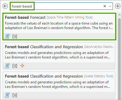
Forecasting future population using Forest-based Forecast
We could also use the Forest-based Forecast tool to predict future population for each county. Forest-based Forecast will use an adapted random forest algorithm to train space-time data based on time windows and forecast future time slices for each location.
1. In the Geoprocessing pane, in the search box, type forest-based. In the search results, click Forest-based Forecast to open the dialog.
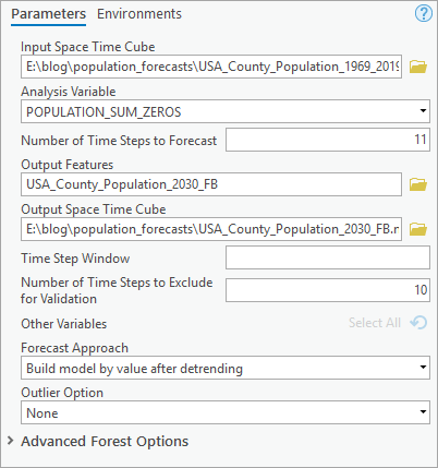
2. In the Forest-based Forecast geoprocessing tool, change the following parameters:
- For Input Space Time Cube, specify USA_County_Population_1969_2019.nc.
- For Analysis Variable, select POPULATION_SUM_ZERO.
- For Number of Time Steps to Forecast, type 11. This means we will forecast 11 time steps out to the future, specifically, from 2020 to 2030.
- For Output Features, type USA_County_Population_2030_FB.
- For Output Space Time Cube, type USA_County_Population_2030_FB.nc.
- For Time Step Window, leave it as default, which is empty.
- For Number of Time Steps to Exclude for Validation, type 10.
- For Forecast Approach, leave it as default, which is Build Model by value after detrending.
- For Outlier Option, leave it as default, which is None.
Click Run.
While you specify exactly the same values for the parameters including Input Space Time Cube, Analysis Variable, Number of Time Steps to Forecast, And Number of Time Steps to Exclude for Validation as the previous two tools, you will also notice there are some parameters specific to this tool. One important new optional parameter is Time Step Window. It indicates the number of the previous time steps which would be used for model training. If not specified, the tool will automatically detect if there are any cyclic patterns or seasons in the data, using the same algorithm as in Exponential Smoothing Forecast. For locations detected with seasons, the season length will be used as the time step window those each location. For locations detected with no seasonality, 25% of total observed time steps (T), that is 25% * T, will be used as Time Step Window. So, by leaving this parameter blank, you’re expecting to see Time Step Window varies from location to location and you can find the window size in the Forecast Method field in the Attribute Table of Output Forecast Features. If you want to set a uniform Time Step Window for all locations based on your expertise, just set a specific number in this parameter. Ideally, you should provide the number of time steps corresponding to one season. In this analysis, we will leave it blank and let the tool do the work. You can also create a histogram chart to exam the distribution of the Time Step Window across all US counties, as we did for Season Length in Exponential Smoothing Forecast.
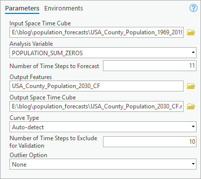
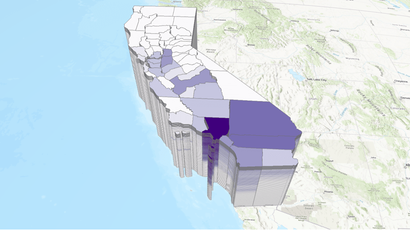
Here is a map of the forecasting results in 2030 produced by the Forest-based Forecast tool.
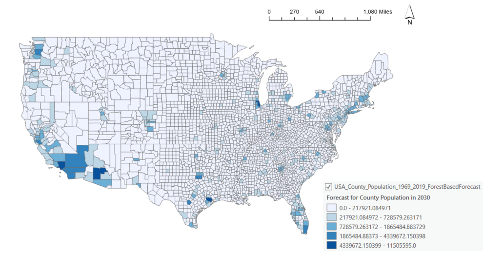
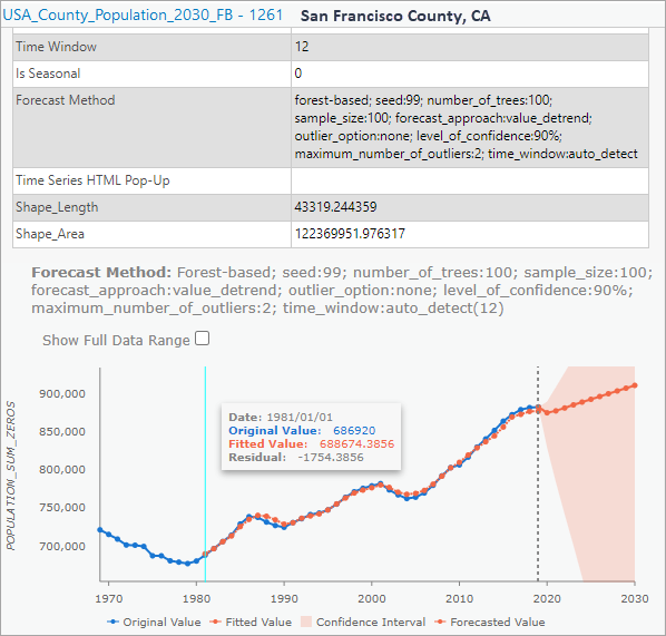
3. If you click on some of the counties and look at the pop-up charts, the line chart of the observed value and fitted values will indicate how well the model forecasted the yearly population in the county. You can also see the Time Window used in that location and if any seasonality is detected at that location. In the following case, no seasonality is detected at San Francisco County, CA therefore 25% of total time steps, which is rounded down (25% * 51) to 12 steps and used as the time window.
Selecting best prediction using Evaluating Forecasts By Location
Finally, we will explore model comparison and evaluation. We will compare the forecasting results for each time step from the Curve Fit Forecast, the Exponential Smoothing Forecast, and the Forest-based Forecast and select the best forecast for each location. As mentioned earlier, you need to save forecasts as Output Space Time Cubes when you run the three tools on the same Input Space Time Cube. We will refer to these cubes as Forecast Cubes in this blog, and these forecast cubes will be the inputs in the Evaluation Forecasts by Location tool, and the output will be a hybrid forecast cube where each location is forecasted using the best forecast method.
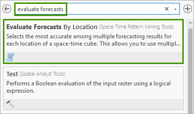
1. In the Geoprocessing pane, in the search box, type evaluate forecast. In the search results, click Evaluate Forecasts by Location to open the dialog.
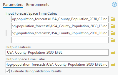
2. In the Evaluate Forecasts by Location geoprocessing tool, change the following parameters:
- For Input Forecast Space Time Cube, add USA_County_Population_2030_CF.nc, USA_County_Population_2030_ES.nc, USA_County_Population_2030_FB.nc.
- For Output Features, type USA_County_Population_2030_EFBL.
- For Output Space Time Cube, type USA_County_Population_2030_EFBL.nc.
- Check Evaluate Using Validation Results.
Click Run.
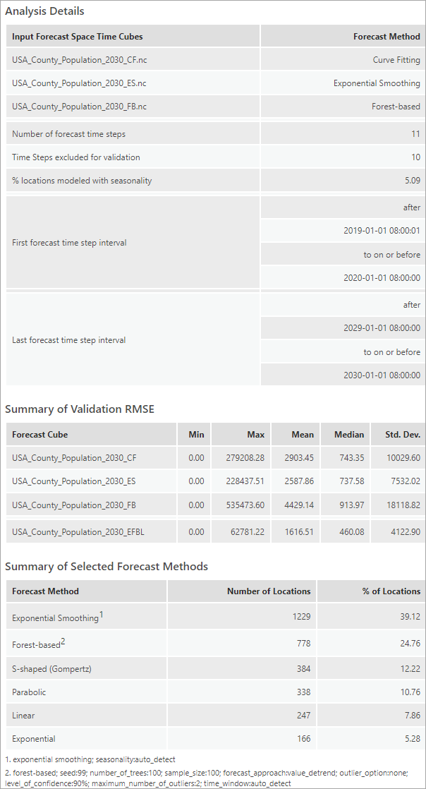
This tool could evaluate the forecasting models by validation or overall fitness of observed values. If the Evaluate Using Validation Results box is checked, the tool will determine the best forecast method for each location based on the smallest Root Mean Square Error for the validation set, the Validation RMSE. Remember that we have excluded the last few time steps as validation set before training the model – therefore the validation RMSE reveals the model’s performance in predicting unseen data. One reminder here is to set the same number for Number of Time Steps to Exclude for Validation when running the forecast tools. This ensures that the Validation RMSE of forecast cubes are comparable. On the other hand, if we uncheck the Evaluate Using Validation Results box, the tool will use the forecasting RMSE to evaluate model performance, which generally represent the overall fitting between the line of original values and the line of the forecasted values. In this analysis, we use Validation RMSE as the criteria for choosing the best method.
3. Click View Details in the geoprocessing progress bar, click Messages tab to check diagnostics.
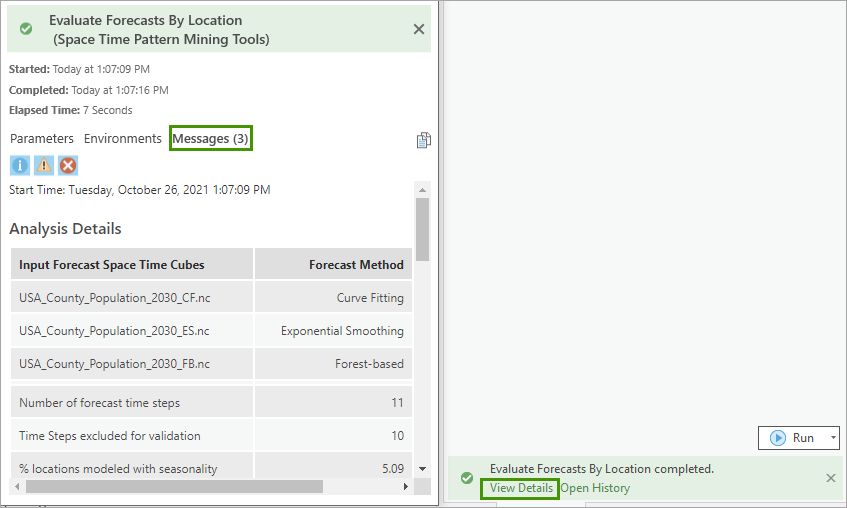
This tool creates geoprocessing messages to help you understand the results. The messages contain information about the structure of the forecast cubes, summary statistics of the RMSE across forest cubes, and summaries of each forecast method is chosen by how many locations as the best method.
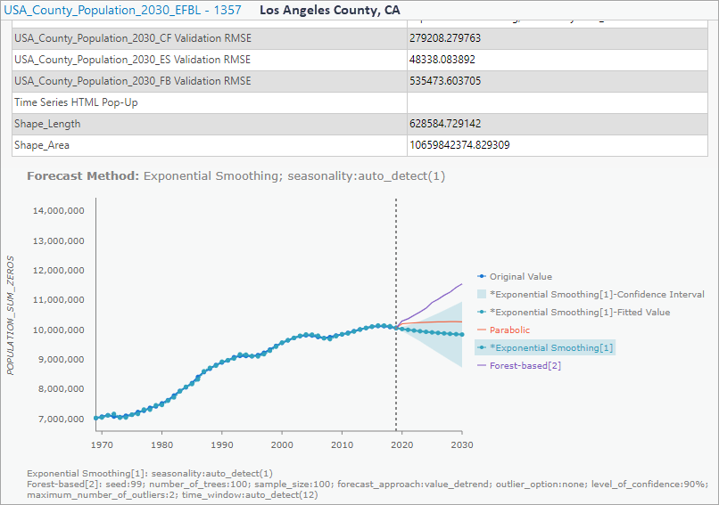
4. Click a couple of counties of interest and explore the pop-up chart. The best forecast method at that location will be highlighted in the legend to the right of the chart. You could also click on other methods in the legend to visualize the forecasted values of a specific method, or hover over the chart to check the details of each time step.
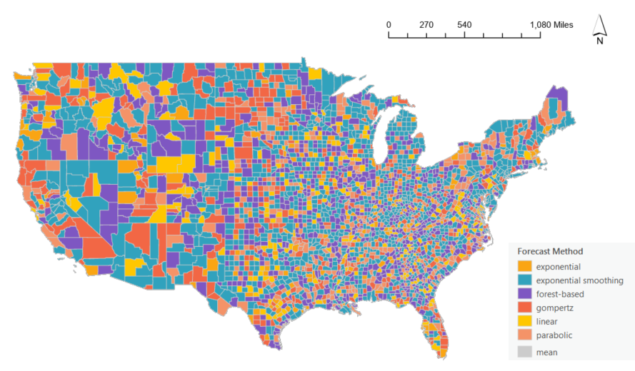
The Output Features will be added to the map and symbolized based on the value of final forecasted time step of the selected method at each location. An alternative way to visualize the result is to symbolize the map using the Forecast Method chosen at each location. Let’s quickly adjust the symbology.
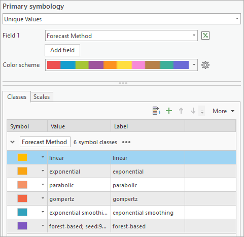
5. In the Contents pane, right-click USA_County_Population_2030_EFBL, choose Symbology.
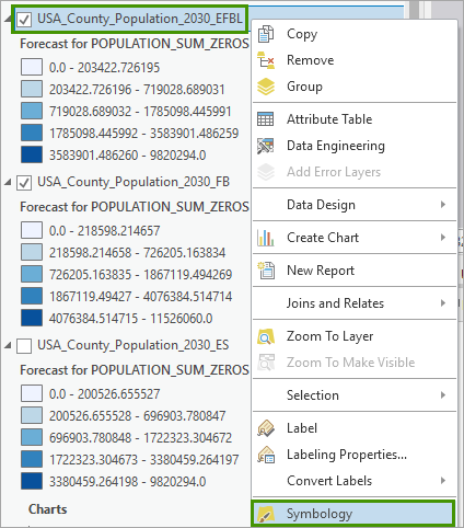
6. In the Symbology pane, change the following settings:
- For Primary Symbology, specify Unique Values.
- For Field 1, specify Forecast Method.
- For Symbol, manually adjust the order, colors, and labels as you prefer. Here is an example of how we generated the following map:
Symbol color (RGB) Label [255, 199, 0] linear [250, 165, 19] exponential [244, 147, 104] parabolic [242, 103, 69] gompertz [49, 162, 189] exponential smoothing [126, 87, 194] forest-based [204, 204, 204] mean
Conclusions
By using ArcGIS Pro as your spatial data science workstation, urban planners can get their population projection work done easily with the new Time Series Forecasting toolset, explore different scenarios of population growth, and plan for the future.


Article Discussion: