We’re two months into 2020 and it has already been very busy in terms of emergency response events. In January, there were five major events that required government and public safety agencies in different regions around the world, to respond in a timely and organized manner.
I’m humbled (and proud) to work at esri, where the ArcGIS Platform was deployed to help provide solutions to support emergency response personnel in these crisis events. These teams and government leadership require data visualized in an efficient and effective way to provide situational awareness and to help in their decision-making processes.
I work with the team that creates Operations Dashboard for ArcGIS, a configurable web app that enables the creation of dashboards. A dashboard is typically a single display that visualizes data with charts and gauges (showing key performance indicators – KPIs), enabling the monitoring of assets and resources in real-time. In January 2020, there were several dashboard examples created with Operations Dashboard that have (and still are) helping with the emergency response efforts of these events. I wanted to share these examples and highlight the power of dashboards in the ArcGIS Platform.
Corona Virus Outbreak Dashboards
At the start of 2020, a corona virus outbreak originated from Wuhan City, Hubei Province, China. The virus causes respiratory problems and has similar symptoms as the flu. It is believed to have started in the South China Seafood Market, but specifics about the transmission of the virus are still being investigated. Wuhan is a major transportation hub, so unfortunately the virus has spread quickly within China and globally in a matter of weeks. To learn more, checkout this excellent Storymap.
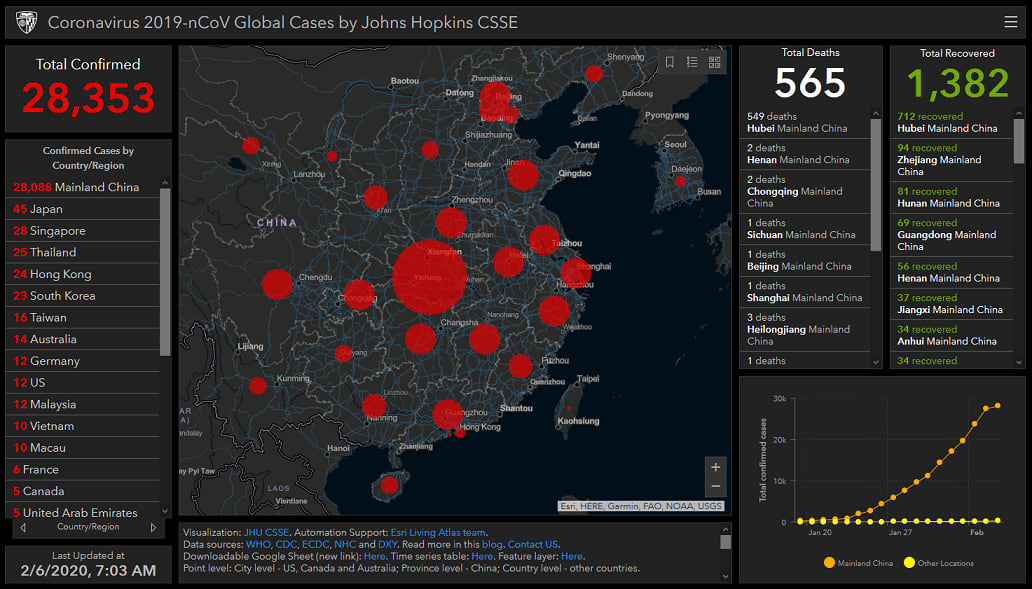
Several dashboards have been created to provide situational awareness of the outbreak. The first was created by Lauren Gardner from John Hopkins University Center for Systems Science and Engineering (CSSE). Read their blog to learn more. It’s been featured on CNN, Fox News, and in Nature magazine.
Coronavirus 2019-nCoV Global Cases by Johns Hopkins CSSE
(Mobile version dashboard)
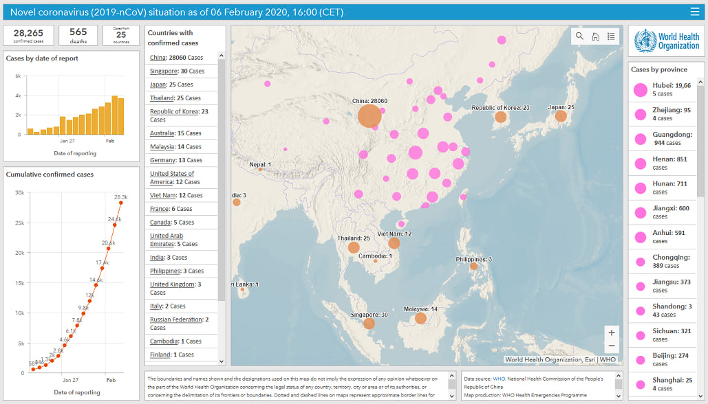
Another dashboard was released by the World Health Organization (WHO) to help monitor and track the virus outbreak.
Novel coronavirus (2019-nCoV) situation dashboard (WHO)
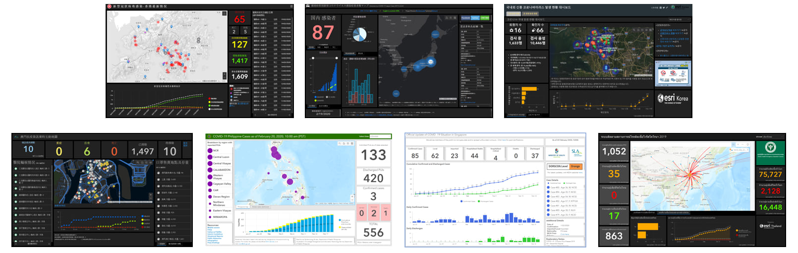
UPDATE 3/10: Several region-based dashboards about the corona virus have been published,
- European Region by World Health Organization
- Germany by esri Germany
- Hong Kong by the Government of Hong Kong
- Italy by the United Nations World Food Programme – Division of Emergencies
- Japan by J.A.G JAPAN Corp
- Korea by esri Korea
- Macau by esri Hong Kong
- Philippines by the Philippines Dept of Public Health
- Portugal by esri Portugal
- Singapore by the Singapore Ministry of Public Health
- Spain by esri España
- Thailand by the Ministry of Public Health
- United Kingdom (UK) by UK Dept of Health and Social Care
Australian Bushfires Dashboards
The 2019-2020 Australian bushfire season was probably one of the worst in recent history. Starting Sept 2019 and still continuing as of Feb 2020, it’s estimated that bushfires have burnt 18.6 million hectares (46 million acres; 186,000 square kilometres; 72,000 square miles), destroyed over 5,900 structures, and sadly caused the deaths of at least 34 people.
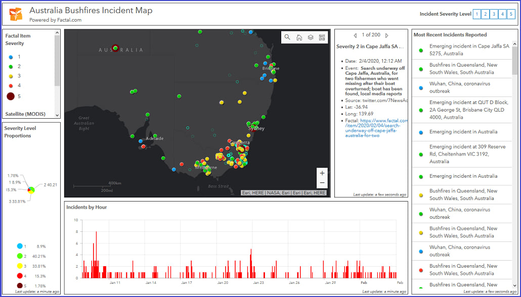
Direct Relief – the humanitarian aid organization, created a dashboard displaying the ongoing bushfires occurring in Australia and classifies them based on severity level.
Australia Bushfires Incident Map – Direct Relief
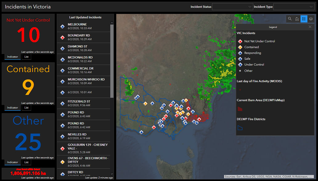
Another dashboard to help notify the public about the bushfire status in the state of Victoria was created by Simon Jackson from esri Australia.
Bushfire Incidents in Victoria
Puerto Rico Earthquake Response Dashboards
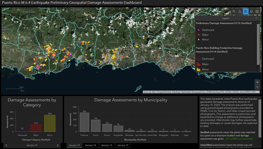
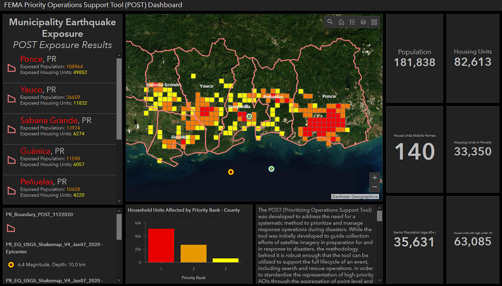
On Jan 7, the southwestern part of Puerto Rico was hit by a magnitude 6.4 earthquake; this followed several smaller earthquakes that occurred previously. To help with emergency response efforts, the US Federal Emergency Management Agency (FEMA) created several dashboards to help with their operations.
FEMA Damage Assessment dashboard
FEMA Priority Operations Support Tool (POST) Dashboard
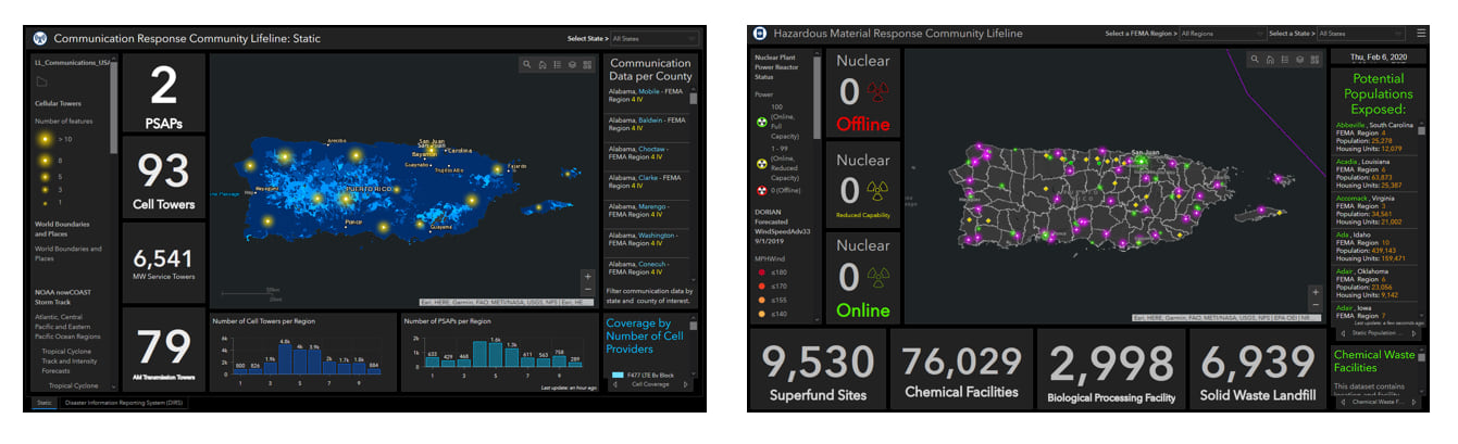
FEMA has deployed several other dashboards on their FEMA Puerto Rico Earthquake Hub site.
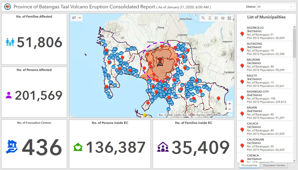
Taal Volcano Eruption Report Dashboard
In the Philippines, the Taal volcano unexpectedly erupted on Jan 12. Tens of thousands of people who lived in range of the eruption were affected. GeoData Systems, the local esri Distributor created a dashboard showing relevant statistics of affected people, available shelters, etc.
Province of Batangas Taal Volcano Eruption Consolidated Report dashboard
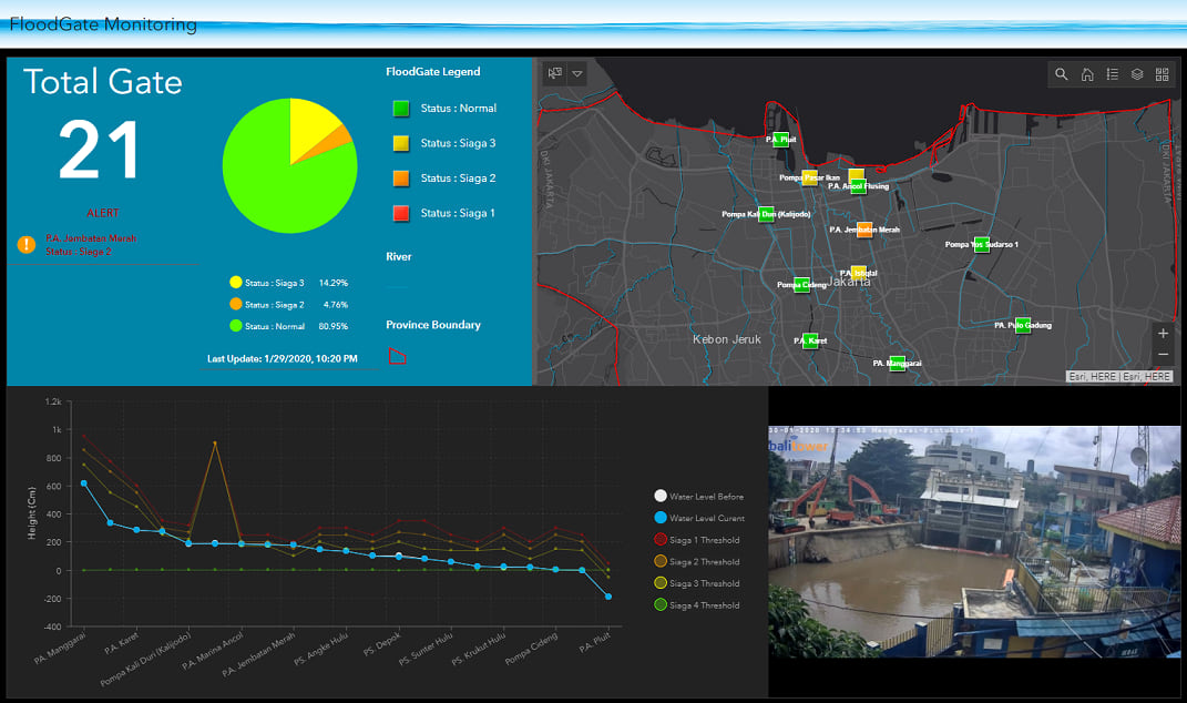
Floodgate Monitoring Dashboard
On Jan 1, heavy rains caused severe flooding in Jakarta, Indonesia. The Emergency Spatial Support Center (ESSC), a branch of esri Indonesia, created a dashboard to help monitor floodgates in the city. Read this blog to learn more about this use case.
Be advised that if you’re in need of technical assistance with ArcGIS technology during an emergency response event, you can reach out and contact esri’s Disaster Response program. Esri is available to help.
While these examples demonstrate how Operations Dashboard can be used for situational awareness, it can also be used to support other business workflows for tactical, strategic, and informational use cases. Many other Dashboard examples are highlighted in this blog: Dashboards in ArcGIS.
To get started with dashboards, you can leverage some awesome industry focused dashboard templates from the ArcGIS Solutions team, Dashboard templates.
FYI: a good resource blog for dashboards, Operations Dashboard for ArcGIS – Useful Links
Thanks for reading,


Commenting is not enabled for this article.