In the blog, “Our Four Favorite Ways to Map American Agriculture”, four ArcGIS Living Atlas colleagues discuss different methods to map agricultural data. This blog will discuss how to create the dashboard Top Counties Receiving Federal Agriculture Payments.
Every five years, the U.S. Department of Agriculture completes a census of all U.S. farms, ranches, and their operators with the most recent census conducted in 2017. This gives us an in-depth look at the agricultural industry, including how the government distributed $8,943,574,000 in federal payments to farms across the country.
The dashboard takes a simple map showing Federal Payments – Receipts in US Dollars and displays on-the-fly statistics about the layer using chart and list widgets so we can visualize where the money is being spent. The list widget on the upper left displays the top 50 largest federal payments. Selecting a county from the list will zoom into the county on the map and display the pop-up, which contains a breakdown of federal payments toward agriculture. The map also contains USA Cropland, so when zoomed into a county, we can see what crops are grown in that area.
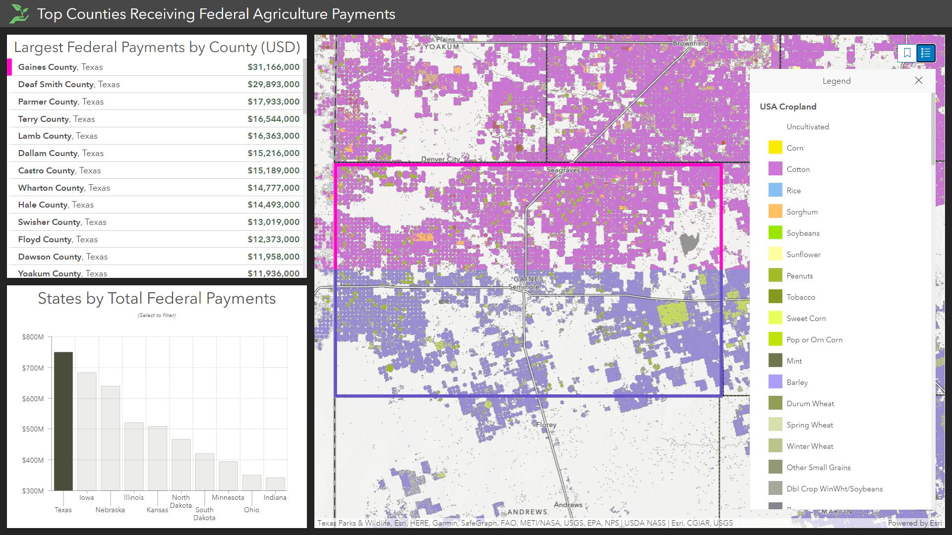
Below the list widget is a serial bar chart depicting total federal payments by state. The chart is also interactive. By selecting the bar for Texas, both the map and the list filter to show only Texas features. Start exploring below!
How to make this dashboard?
There are five overall steps to create the census agriculture dashboard. You can also follow along by creating your own copy.
Step 1: Open Dashboards
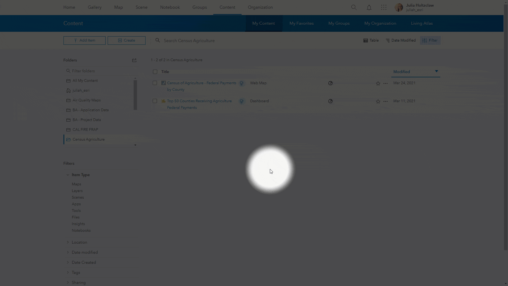
First, let’s get some pre-requisites out of the way. ArcGIS Dashboards requires maps to be added from ‘My Content’ or via shared groups. To use the Federal Payments map, save a copy to ‘My Content’ as detailed in this documentation. Now we are ready to begin. Open ArcGIS Dashboards from ‘My Content’ using the App selector in the upper right-hand corner, select Dashboards, and ‘create dashboard’.
Step 2: Add the map
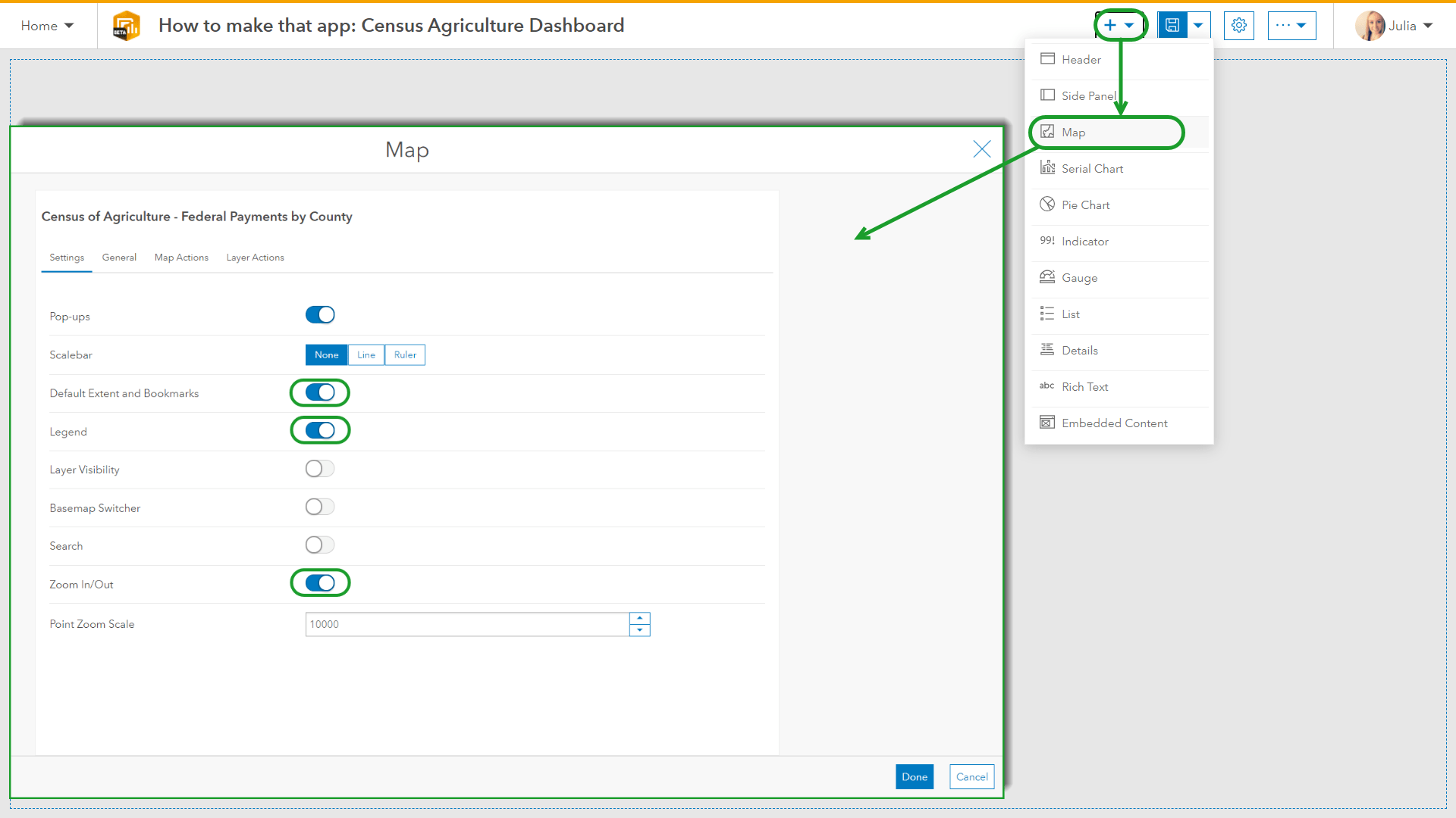
To begin, add the map widget. This provides a good starting point for the dashboard because any layers included in the map will be readily available as data sources for additional widgets. To add our Federal Payments map, select the ‘+’ then Map, and choose the map from ‘My Content’. Turn on any capabilities you want the interface to have such as legend, bookmarks, or zoom, and select ‘Done’.
Step 3: Add the list
Next, let’s add the ordered list widget by selecting List from the dropdown and ‘USDA Census of Agriculture 2017 – Federal Payments’ as the layer. The list simply shows which counties have received the largest federal payments. For conciseness, the maximum features displayed is set to 50. Set the ‘Sort by’ field to GOVT PROGRAMS, FEDERAL – RECEIPTS, MEASURED IN $ in descending order.
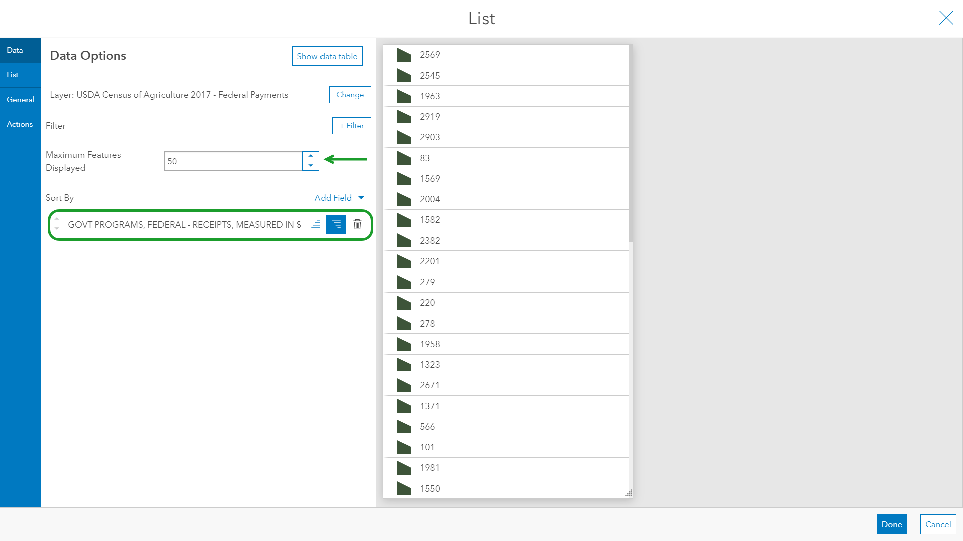
You’ll notice the list adjusts on-the-fly but does not show the actual payment amount instead defaulting to Object ID. This can be remedied by adjusting the ‘Line Item Template’ section on the List tab. Change the template to: ‘{county_name} County, {state_name} ${GOVT_PROGRAMS_FEDERAL_RECEIPTS_}‘. Now the list has meaning, and we can verify that our settings are correct.
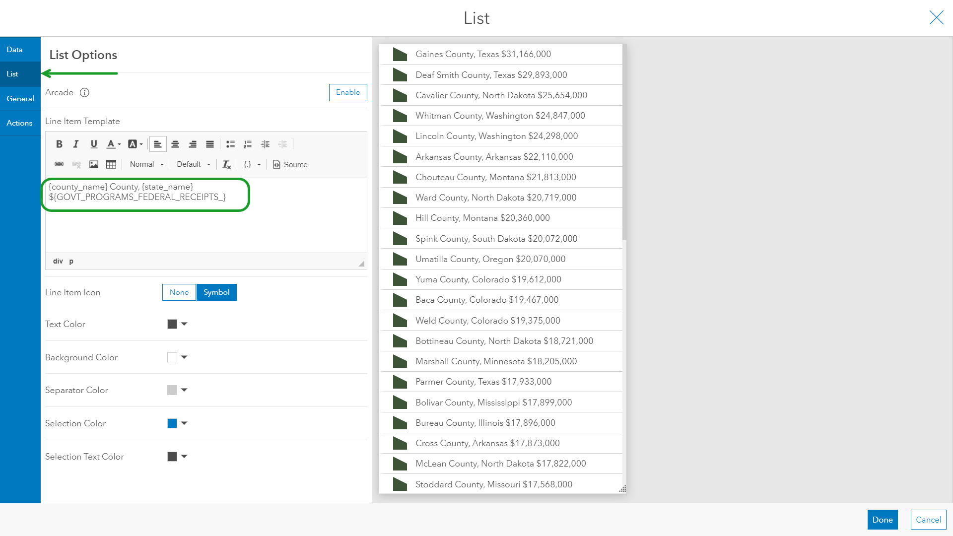
Lastly, it is important to set the list actions. This makes the widget interactive with the map in the dashboard. On the ‘Actions’ tab, set the Zoom, Flash, Show Pop-up action on the Agriculture Federal Payments layer. Click ‘Done’ on the lower right and select an item in the list to test the functionality and explore the map.
Step 4: Add the serial chart
Last but not least – the serial chart. The purpose of this chart is to sum county values by their state, grouping the values together. With this theory in mind, use ‘Grouped Values’ for the ‘Category From‘ input and State_Name as the ‘Category Field’. The statistic we want to sum is again the GOVT PROGRAMS, FEDERAL – RECEIPTS, MEASURED IN $ field, third on the list. This gives us the total federal payments for each state. For clarity, I chose a maximum of 10 categories sorted in descending order by the statistic (i.e. sum) to show only the top ten states receiving the largest payments.
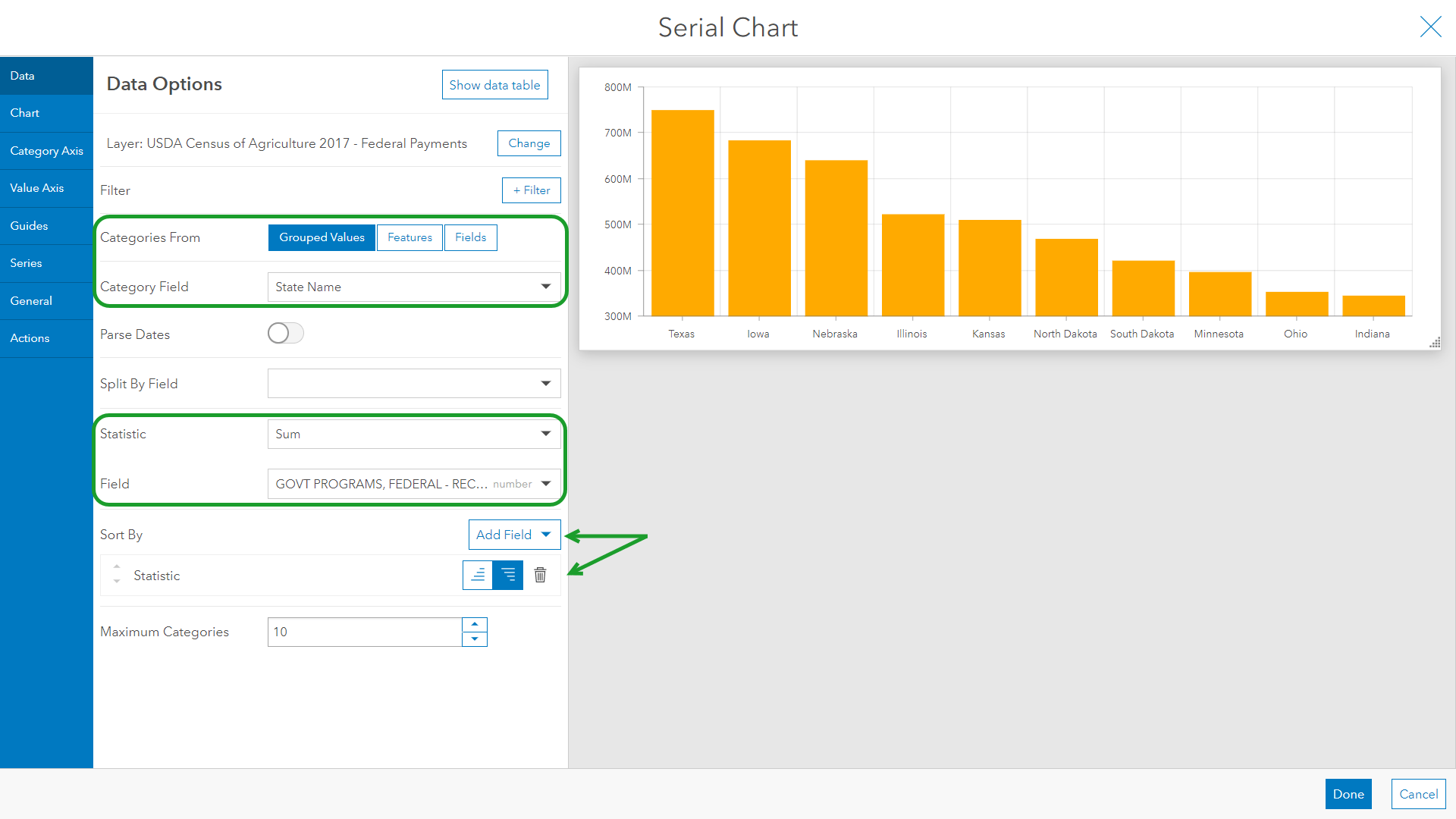
Time to set actions and make the chart interactive. Using the default ‘Single’ selection mode, set a Filter on both the layer and List. Close the widget configuration and test that the filter is working properly.
Step 5: Design
Functionally, the Top Counties Receiving Federal Agriculture Payments dashboard is complete. However, you will probably notice that your dashboard does not look quite the same as the original. Dashboard has many additional design configurations such as light or dark mode and background colors. Each widget configuration has additional settings to adjust font, colors, titles, descriptions, and more. Widgets can also be size adjusted, stacked, or docked into different positions.
Make the dashboard your own and explore the multitude of design settings. You may wish to make the dashboard compliment the map as in this example, or maybe match the theme to your organization’s preferred color scheme. Check out this gallery for more inspiration.

Article Discussion: