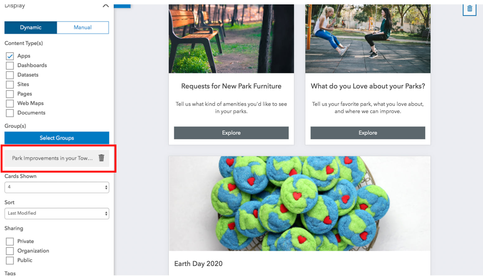
One of the most popular tools used to display content on a site is the Gallery card. This card can display a mix of items, including dashboards, apps, web maps, and even other sites and pages using the item’s thumbnail and summary.
In this guide to good galleries, we’ll look at the following:
- How to add a gallery to your site
- Choosing which items you want to display
- Rearranging items using the Sort tool
- Tips and tricks for making your gallery stand out
Add a gallery card to the layout
Go to your site’s layout editor by opening an ArcGIS Hub Basic site or an ArcGIS Hub Premium initiative site. Then, click Layout on the side panel and drag a Gallery card onto an existing Row card.
Every new gallery is automatically populated by the items that you or your team members have added to the Content Library.
Choose your content
To change the content displayed in your gallery, you can choose from the following workflows:
- Continue to use the Content Library (default)
- Add your own groups
- Select individual items manually
Let’s take a closer look at how these work.
Using the Content Library
Every site includes a Content Library for organizing the content (items and groups of items) that you want to share as part of your site’s search catalog.

Still not seeing what you want? Ensure that the item or a group of items has been added to the Content Library. You can learn more about adding content in this post.
Adding groups
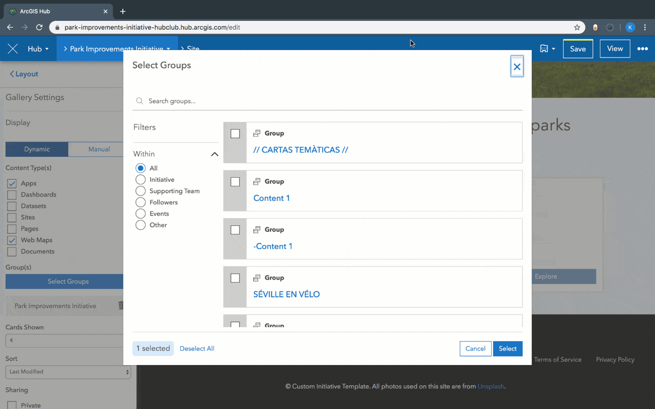
You can also use your own groups, public groups, and any group shared with your organization, to populate a gallery. This includes the core team group (included with ArcGIS Hub Basic and ArcGIS Hub Premium) and the followers group (ArcGIS Hub Premium only), so that you can create galleries for specific audiences.
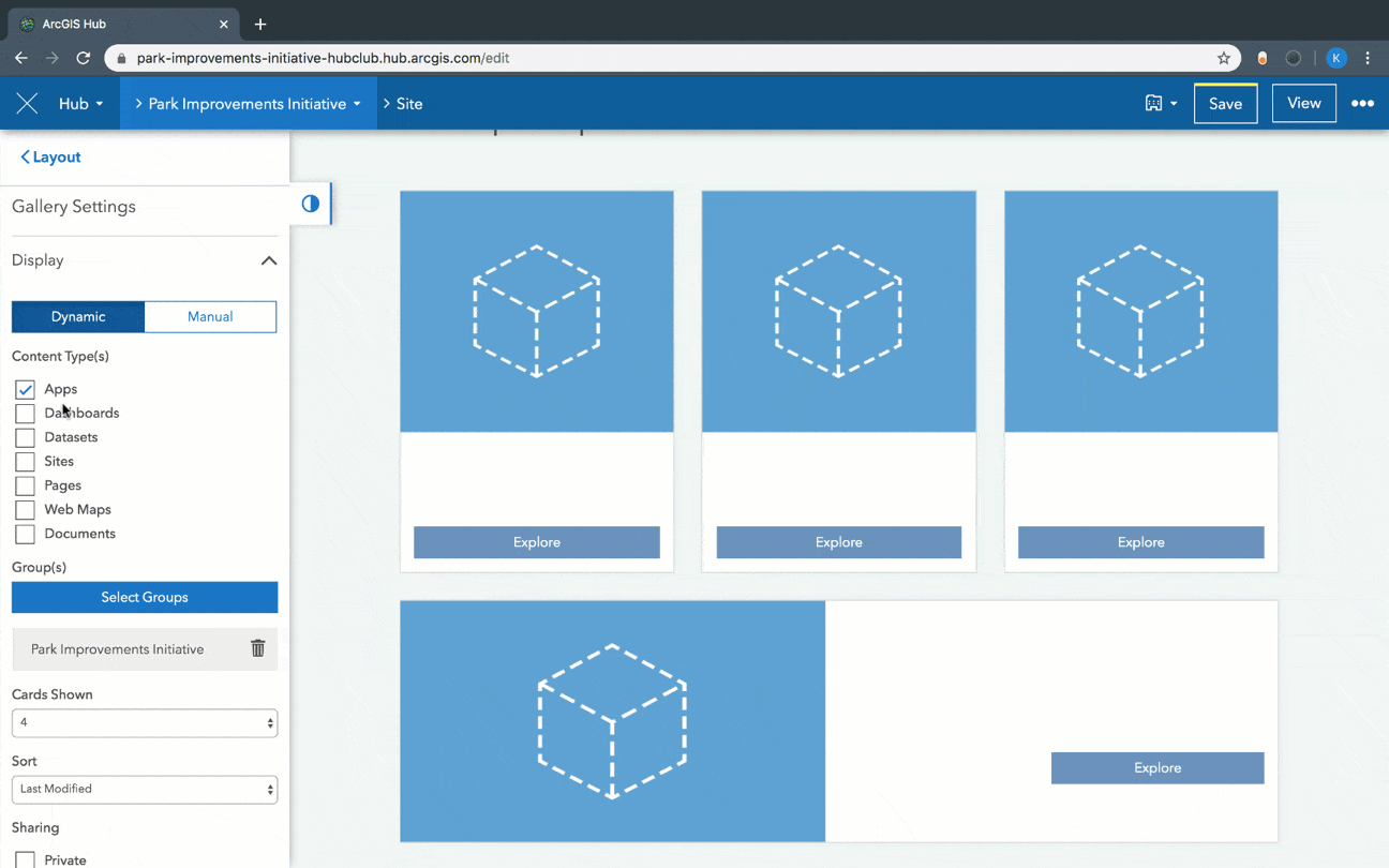
To add a group, choose Dynamic under Gallery Settings and click Select Groups. Search for and select the group or groups that you want to add, then click Select.
In this example, the Get to Know the Wildlife in Your Backyard story map is added to the gallery by selecting the group to which it’s shared (Backyard Buddies).
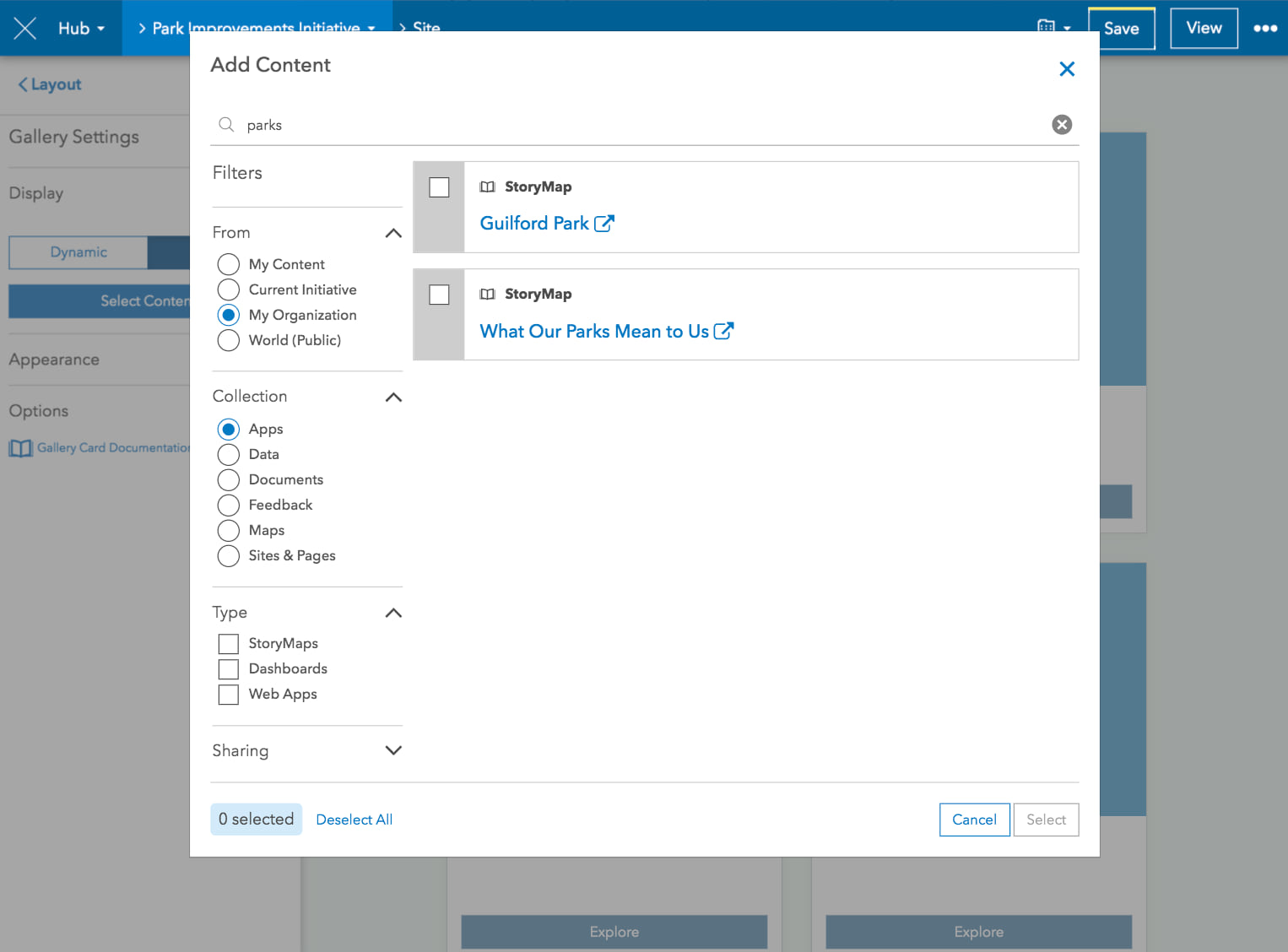
Selecting individual items
Manually selecting items is an alternative to using groups or your site’s Content Library. To choose which items you want to display, click Manual under Gallery Settings, and use the Add Content window to search for and filter the item you want to add.
Just like adding groups to a gallery, adding items to a gallery won’t automatically add them to your site’s Content Library. So, if you’d like for your gallery items to also be discoverable in your site’s search results, follow these steps on adding them to your library.
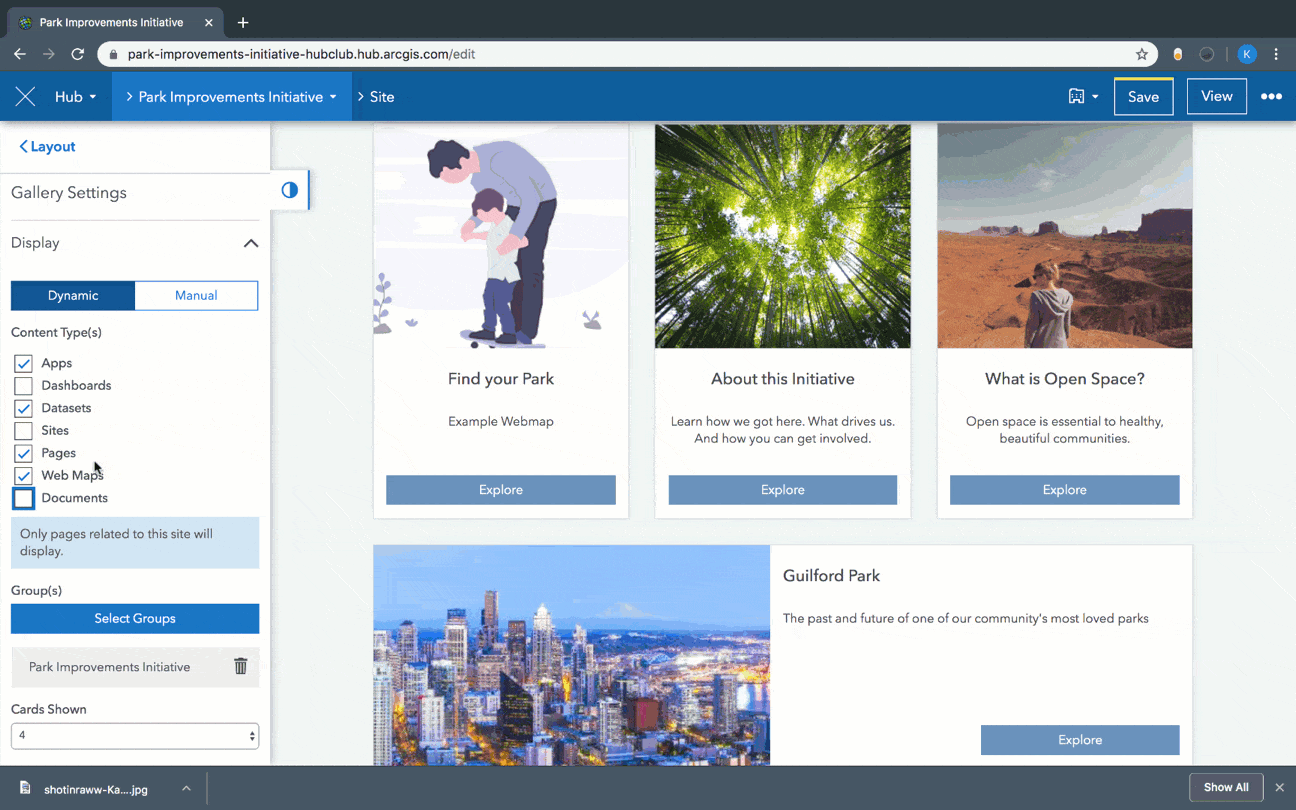
Fine tuning the display
Galleries that use the Dynamic option include the following filters for customizing what and how many items are displayed from the Content Library and/or groups.
What types of content do you want to display?
The Content Type(s) option enables you to choose which kind of item appears from your selected group. For example, if your group contains 7 datasets, 1 dashboard, and 2 pages and you select only Pages, only pages from the selected group will appear.
Who can see the gallery?
All items have their own sharing level. These levels are similar to your site’s visibility settings: share with core team, share with organization, and share with public.
The gallery card supports multiple sharing levels, meaning that you can share private and public content in the same gallery. For example, you can have a public site with a private page attached in the site’s header. This page provides staff with access to internal data, charts, and galleries of apps and dashboards. Staff just need to make sure that they’re signed in to view private content.

To populate a gallery with private content, simply select Private and/or Organization. Private refers to an item that’s private or privately shared to any selected group. Organization refers to items shared with all members who have access to your organization’s subscription to ArcGIS Online.
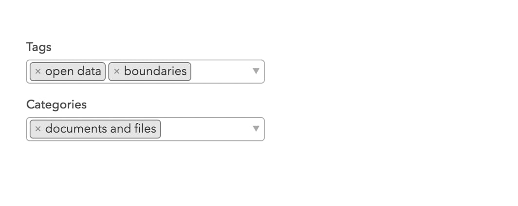
Using tags and categories
You can also use a tag using the Tags field to identify specific items in a selected group or groups. For example, you could narrow your display to items tagged with open space, even if the group contains dozens of related items.For more information on getting the most out of tags, see Using tags effectively.
Similarly, you can use any Categories that your organization may have in place. For more information, see Categories are now a Hub thing too.
Reordering items on display
Once you’ve decided what types of items you want to display, you can choose in what order these items are shown using the Sort option.
This option can display items from selected groups based on the following criteria:
- Newest
- Last Modified
- Alphabetical
- Most Views
If you don’t want the items to be sorted you can choose None.
Making your gallery shine
Here are the two most important things you can do to make your gallery standout:
- Create a thumbnail image
- Add a summary
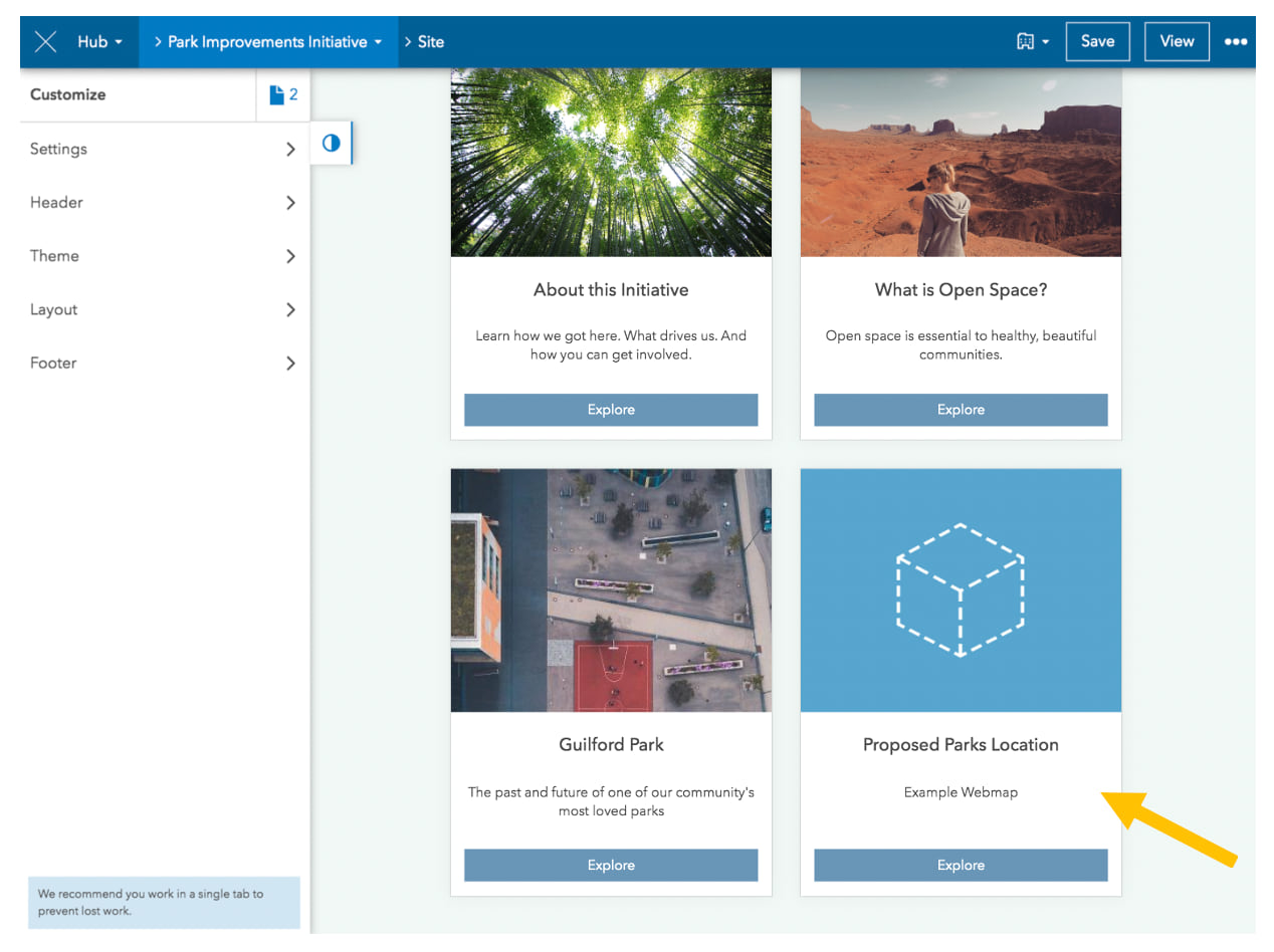
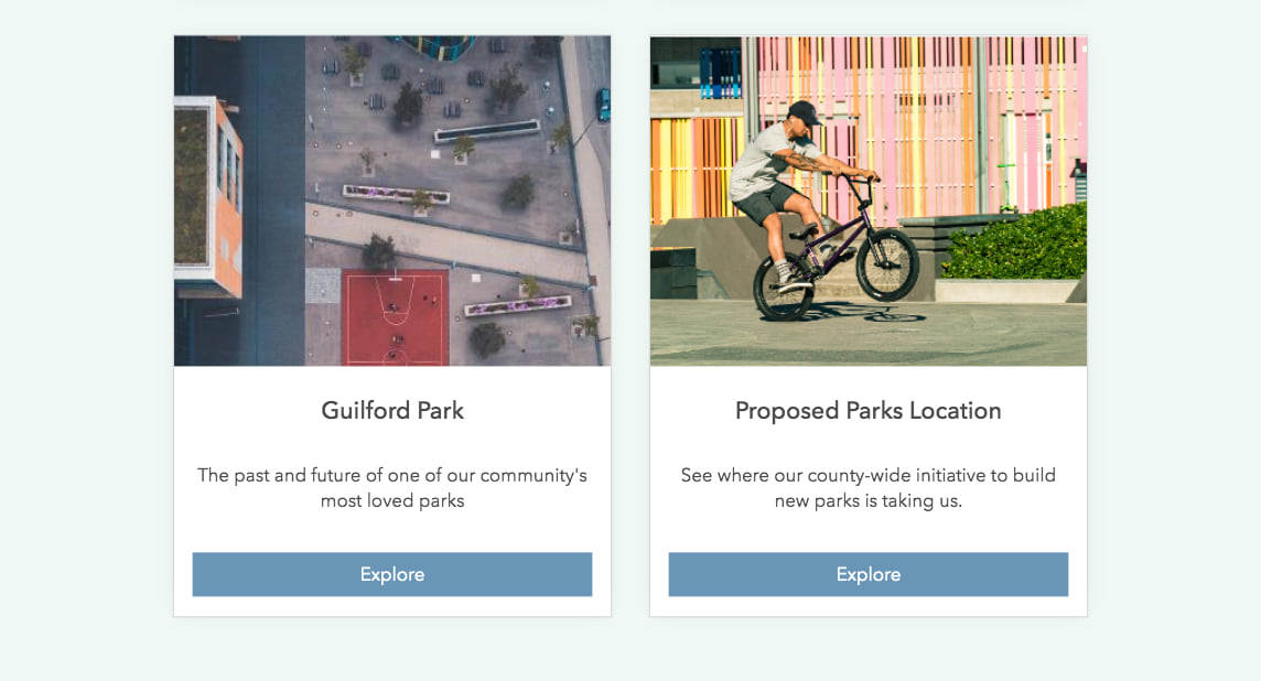
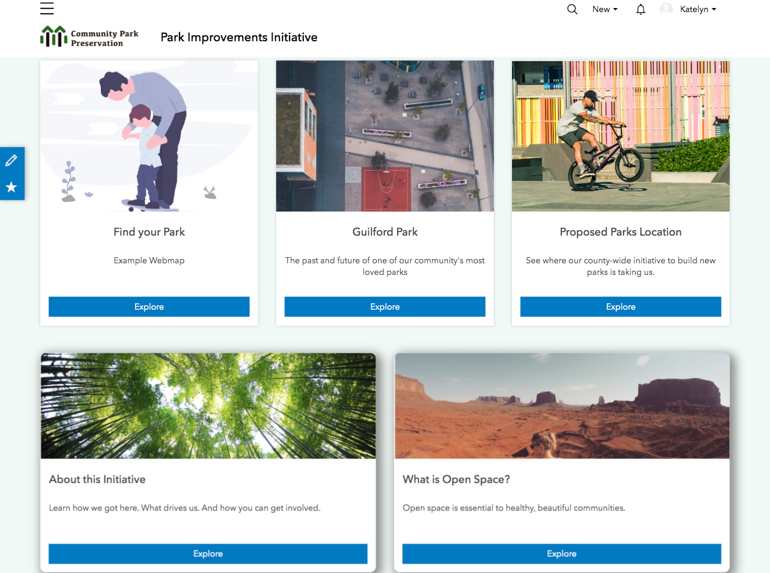
For example, I just created a new web map called Proposed Parks Locations using the New button in the site’s Content Library. This new item is automatically added to the site’s default content group which is what powers the Content Library.
The site already has a gallery card that’s pointing to the Content Library (remember, all new gallery cards automatically point to the Content Library). This means that the new item which was just added will automatically appear in the gallery.
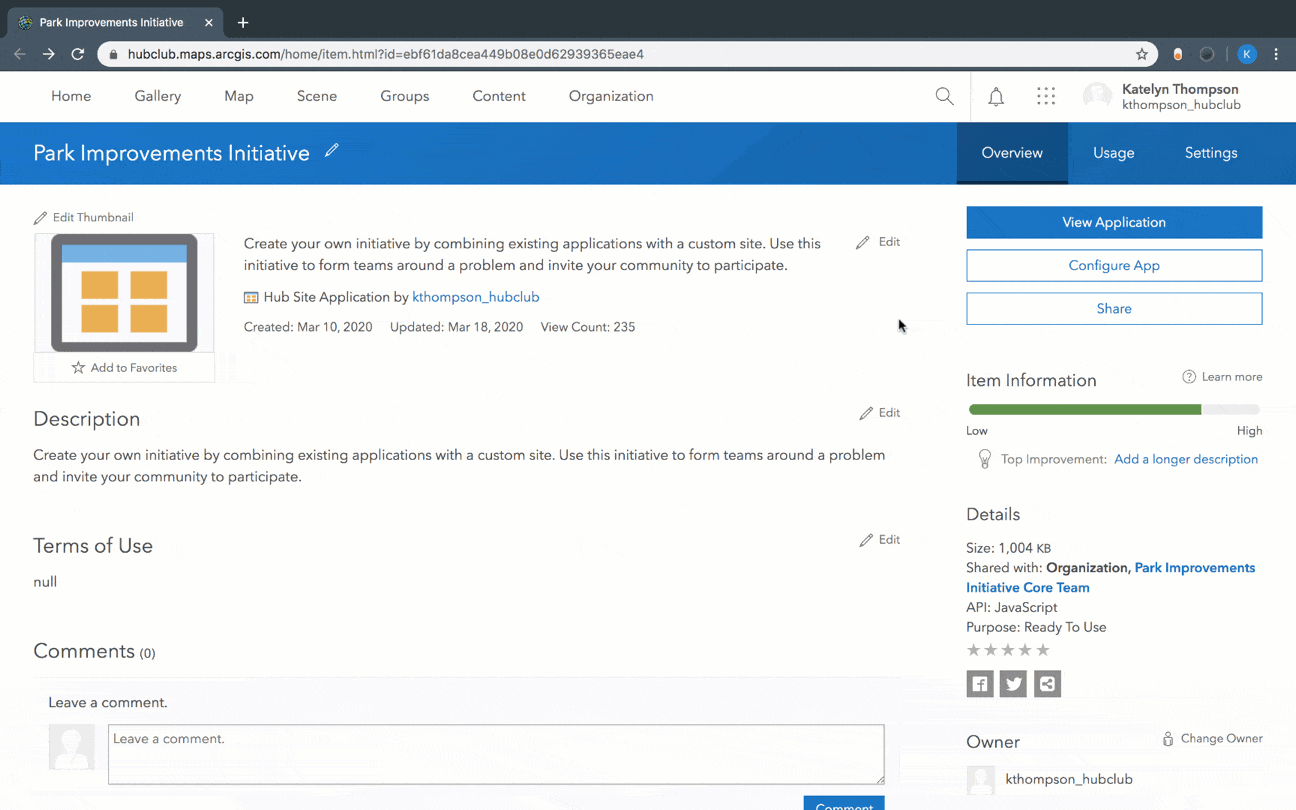
However, unlike the others, this new item doesn’t have a thumbnail image or summary. To change this, I must go to ArcGIS Online by clicking the more button in the edit navigation bar and choosing Edit in ArcGIS Online.
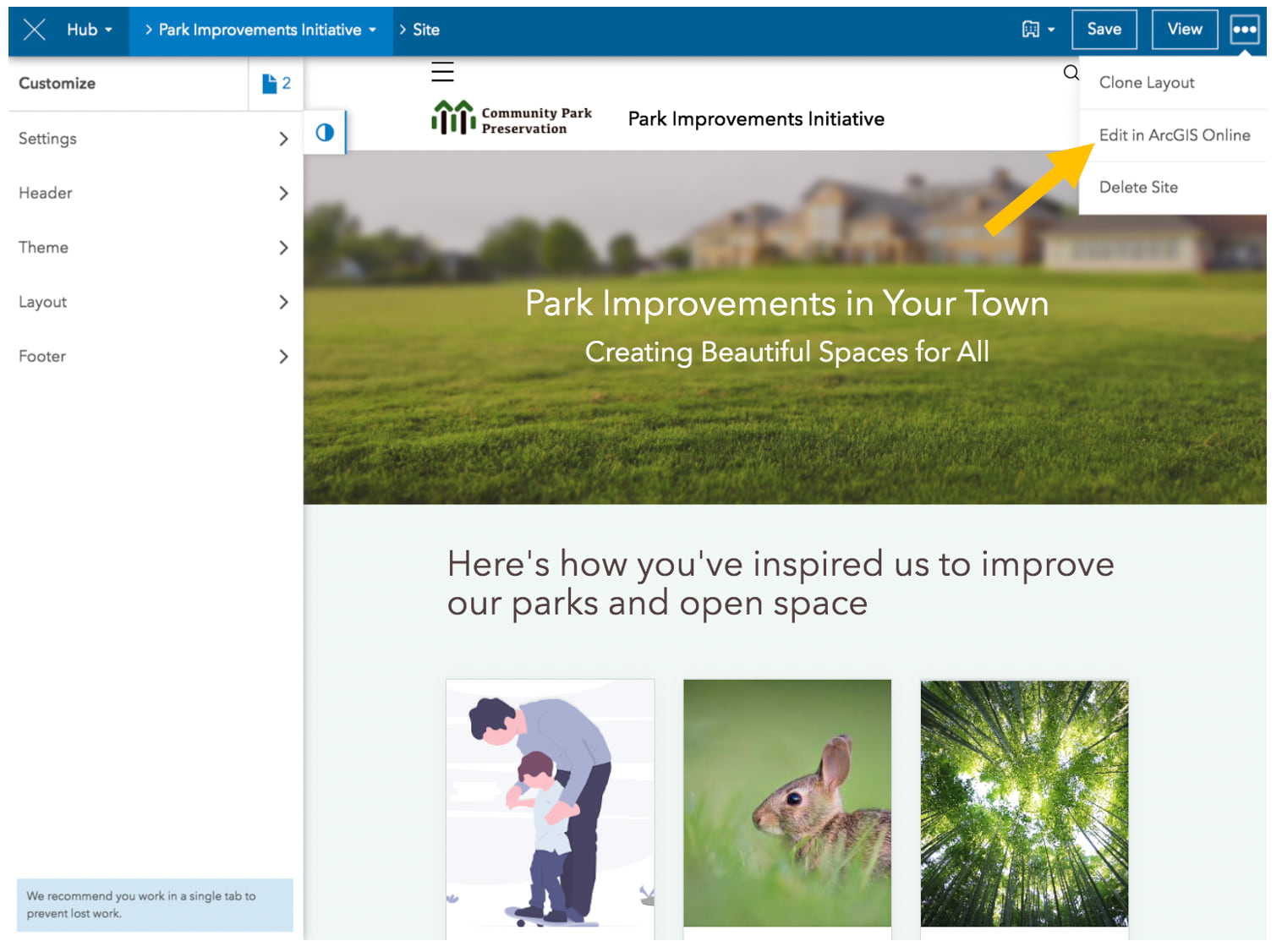
After clicking on Edit in ArcGIS Online, we’ll land on the site’s (or initiative’s) item details page.
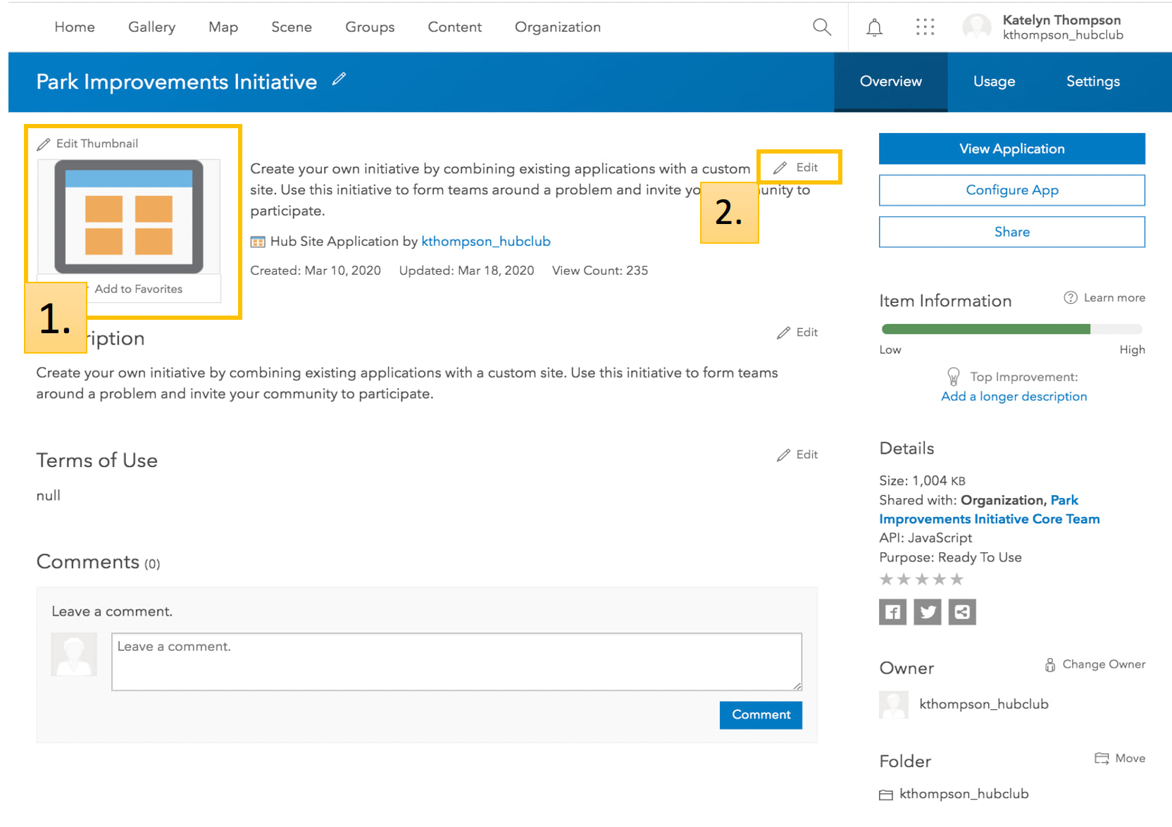
From here, I’ll click Content and choose the new item, Proposed Parks Locations, from the list.
After accessing the Proposed Parks Locations item’s details page, we can edit the thumbnail and summary.
- Thumbnail– an image representing the item. For tips, see Put your best thumbnail forward.
- Summary– tell your audience what the item is about and why they might be interested. Summaries that are three sentences or more are truncated when on display in the gallery.
While this particular exercise requires us to only update two elements of the item’s details page, we can make additional changes to the item, including it’s name and visibility by returning to this page at anytime.
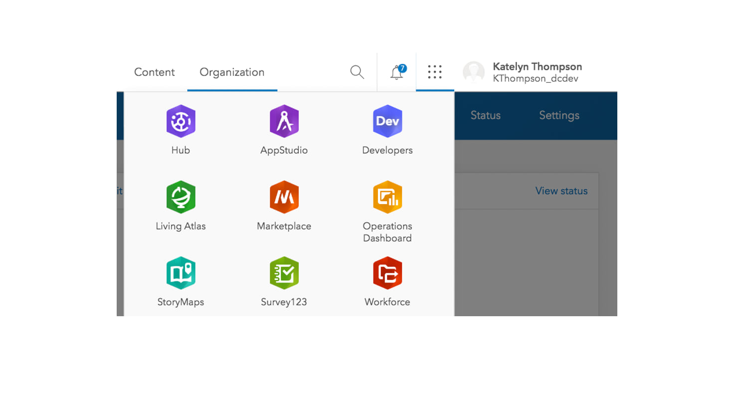
To get back to the Site Builder, I can return to the previous browser window or click the App Switcher next to my user profile and choose Hub.
Once we’re back in the Site Builder, I’ll refresh my site in edit mode to confirm my changes.
Now that we’ve updated the gallery card with a new item, thumbnail and summary, we can put some final touches on the gallery using the Appearance menu.
Corners and shadows
To give your gallery rounded corners, click the Corners dropdown menu and choose Rounded or stick with squared corners. You might consider using rounded corners when displaying one or two cards, to give more depth to your gallery, while sticking with square corners for galleries with several items.
In the image below, you can compare the first row with the second row. The first row has Square corners with a Light Shadow, while the second row uses Rounded corners and a Heavy Shadow.
Editing button color and text
Lastly, you can configure the button on each card using the Appearance menu. In the Button Text you can provide an alternative to “Explore,” such as “Learn More,” or “Visit”.
To change the color of the button, open the side panel and choose Theme to edit the button background color and button text color. For more information on managing colors on your site, see Formatting text on your ArcGIS Hub and ArcGIS Enterprise Sites.
Learn more
Adding a gallery is a fast and fun way to add shine to your site. Don’t forget about pages, too. You can add a gallery card to a page layout to make space for secondary information, so that it doesn’t distract from the MVP content shared on your primary site.
If you’re interested in creating a gallery, but don’t have a site yet, get started with ArcGIS Basic by signing in with your ArcGIS Online account. Or, if you have ArcGIS Hub Premium, you can get started by launching a new initiative.
Questions? Add a comment to this post or reach out to us on GeoNet. For product updates and tips and tricks, sign up for our e-newsletter and follow us on Twitter.

Article Discussion: