Part 3 of a 4-part series on creating this set of posters for the Esri Germany and Esri Switzerland joint user conference.
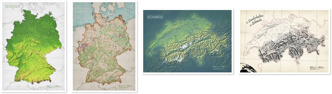
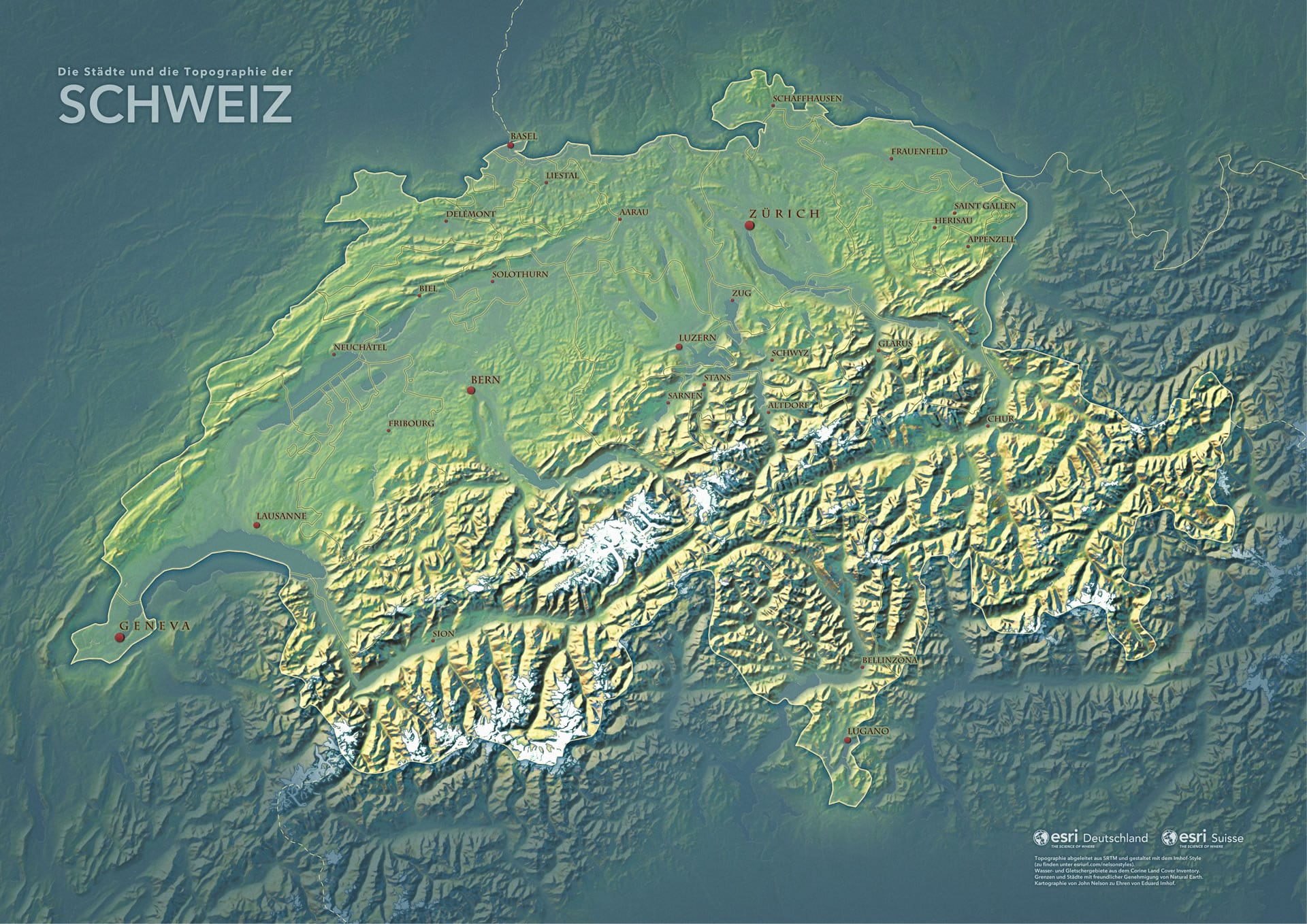
Here is a map of Switzerland attempting to call to mind the aesthetic of legendary Swiss Cartographer Eduard Imhof.
My digital delving into replicating Imhofian aesthetics, and the resulting Imhof style for ArcGIS Pro (hereafter referred to colloquially as Pro), isn’t new so I won’t bore you with those details (unless you haven’t seen it, in which case I’ll point you to this summary).
This post will concentrate on some newish things or tweaks to the old things done for this map. Namely…
- Adding a Slope overlay to the Imhof terrain effect
- Isolating and applying a glacial hillshade
- Creating and labeling Imhof-inspired point symbols
- Adding an Area of Interest fade around Switzerland
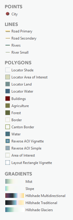
As a result, I’ve done some updating to the Imhof style to add: city points, canton borders, reverse-AOI vignette, slope gradient, glacier hillshade gradient, and tweaks to the hillshade gradients.
Fine-Tuning the Hillshade
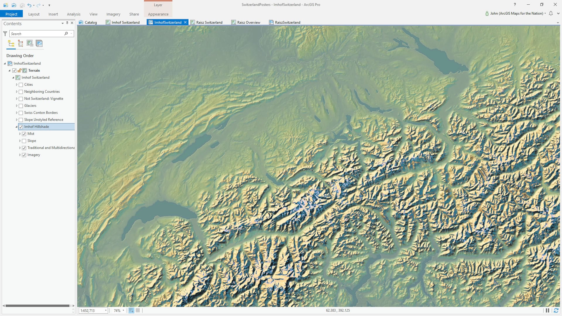
The standard method of using the Imhof style for Pro is applying a special hillshade gradient to both a traditional hillshade layer and a multidirectional hillshade layer, then applying a special mist gradient to the source DEM (and some imagery under it all and some styled up water vectors under the mist). If you are familiar with this style, there’s no surprises here. Looks like this:
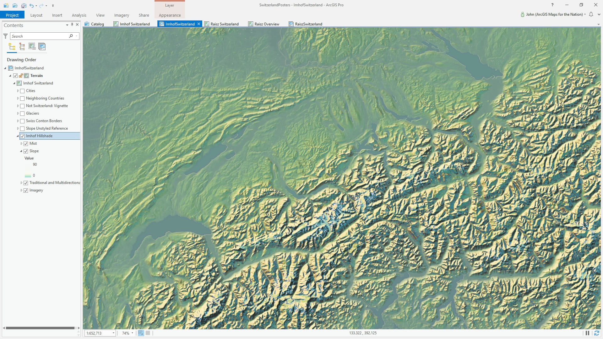
But when I was at the 2019 NACIS cartography conference I met Sean Fleming, a student at Humboldt State. He wields some serious chops when it comes to crispy hillshade visuals (check out his Instagram feed). Sean used a terrain treatment that I had never paid much mind to. He was using Slope to isolate areas of flatness and apply a misty gradient to that (I had always just used the raw DEM). Somehow it just gave his maps nuance and pop. And that’s as technical as I can get in my description. I was eager to try it out.
Here is a default black (flat) to white (steep) slope map (find it in the Raster Functions’ “surface” group).
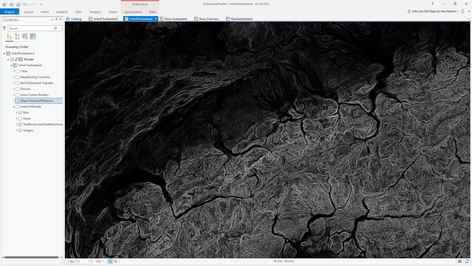
Here it is with a subtle marine aqua applied to the flatter areas. I find that it brings out the subtle undulations in the topographically tamer parts of Switzerland. Let’s go with it. Thanks Sean!
Ah Those Swiss Glaciers
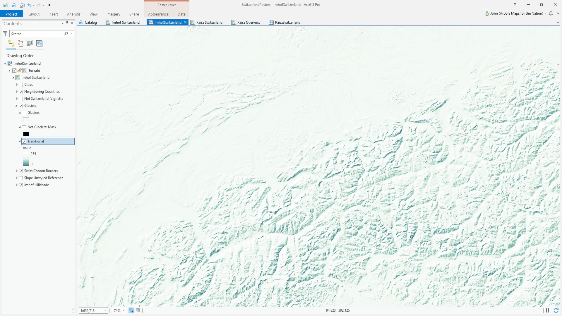
What Imhof-inspired map of Switzerland would be complete without a careful accommodation of nature’s frigid bulldozers? I took a close look at some of Imhof’s glacial hillshades and sampled some colors that he tended toward. If I apply a traditional hillshade to the elevation model, and use these colors, it looks like this map of Hoth:
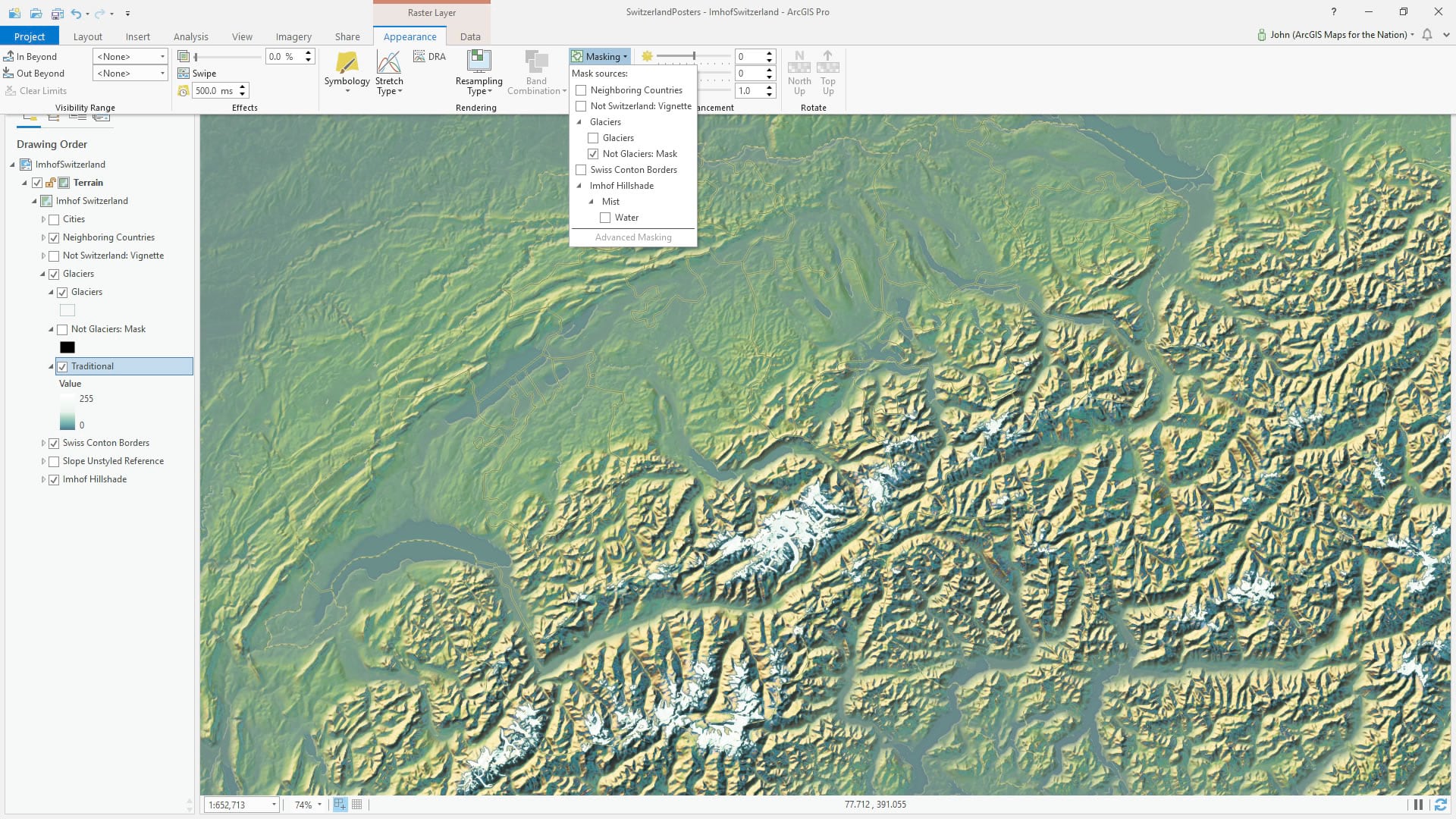
Then I found some glacier polygons from ever-helpful Natural Earth. I could also have extracted the glacier polygons form the amazingly detailed Corine Land Cover data used in this map, but…I don’t know, I just like, didn’t. Anyway, I made a reverse of these polygons with the global background layer and the Erase tool (here’s a one-minute video showing how to do that here, or follow along with a more detailed blog post here).
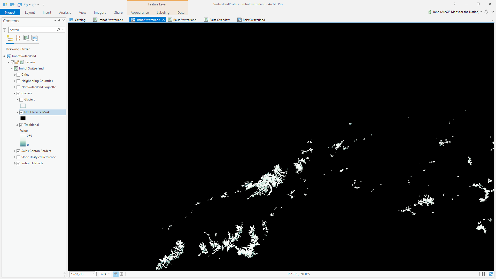
I used this not-glaciers layer as a masking layer to hide all ice Hillshading where glaciers don’t occur. Think of masking like masking tape. Now the icy hillshade appears right where it belongs. I also styled up the original glaciers layer to have a slight deep blue perimeter stroke, as Imhof maps have.
Points and Labels
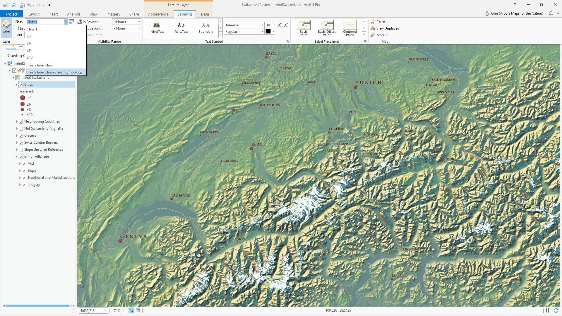
I wanted to include city points and labels to this map so I looked at the various point symbols Imhof used in his maps. I saw some instances that had a sort of minimal 3D effect with a faint offset shadow. I recreated this in ArcGIS Pro by giving a circle symbol a linear gradient color that shifted from a lighter red at top to a deeper red at bottom. The I duplicated the symbol, moved it down and to the right, and gave it a shade-like fill of semi-transparent black to a more opaque black. You can see me do something similar in this video. I have included this symbol in the Imhof style, so you can have access to it.
I applied a graduated scale symbology to a world cities layer from Natural Earth, based on a “scalerank” attribute. Bigger cities have bigger points. I want to label these cities similarly. But how do you apply different fond sizes to the features in your layer? Label classes! There is a really convenient feature called “create label classes from symbology” which takes the range breaks of the layer and makes individual label classes out if them. Now I can apply my font, color, size, and placement rules for each range within the layer.
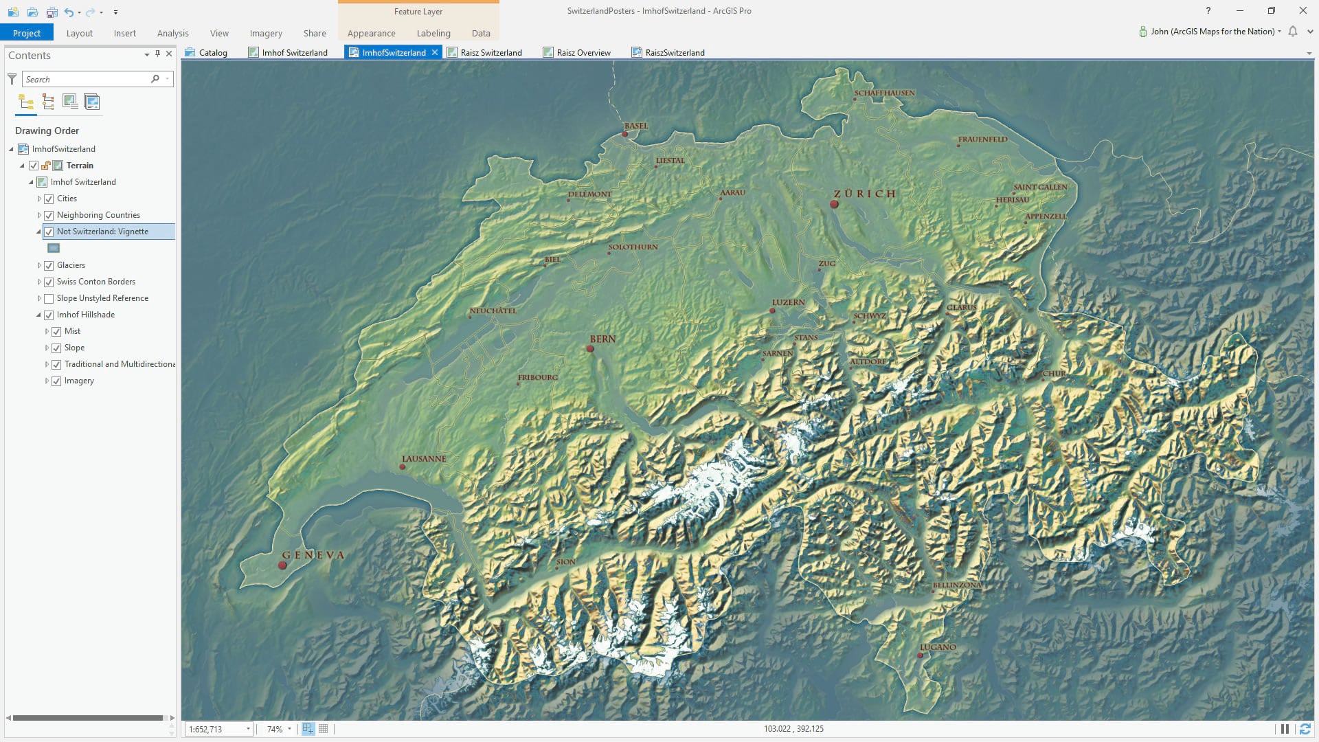
Faded Area of Disinterest
Somebody came up with this clever name as an alternative to a “reverse AOI” or “masked AOI.” Whatever you call it, it’s just a polygon that covers everything except for your area of interest. You can apply a flat symbology to this but I’ve found there is a nice graceful elegance to areas of interest with feathered edges. Learn more about this blurred/feathered/faded area of interest border at this blog post or just dive right in and grab the style. I’ll wait.
Ok, back? Good, here’s what it looks like with a neutral aqua background color. See the nice subtle gradient around the perimeter of Switzerland, gently guiding our eye in to the subject and minimizing exterior visual noise? Yeahhhh.
And that’s it! With the Imhof style and a DEM (here’s a Living Atlas terrain image service, or you can download your own 30m res or 90m res) you can make this map in a handful of minutes after a bit of practice. It’s worth it. Have fun!
Happy Mountain Mapping! John

Commenting is not enabled for this article.