
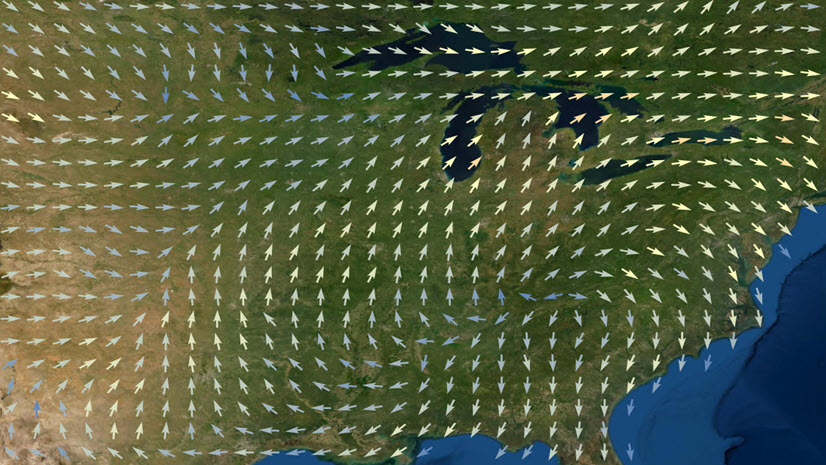
We are pleased to announce a new way to visualize magnitude and direction data in imagery layers in Map Viewer. The Flow renderer now appears as a mapping option if you have tiled imagery layers or dynamic imagery server tiles (learn more) that contain magnitude and direction data. UV or MagDir raster datasets are popular in meteorology, climatology, hydrology, and oceanography for capturing things like wind speeds and directions, or ocean currents. To learn more about this kind of data and how to publish it, check out Visualizing raster using a vector field in ArcGIS.

Don’t have this kind of data? No worries, the Living Atlas of the World has this dataset of ocean currents to get you started. More specifically, look for source type Vector-UV or Vector-MagDir.
Once you have this data you can add it to Map Viewer using the add layers panel. Then open the Style pane and you should see the Flow style appear. Click Style options to adjust the map.

Why using map animation works
While the value of this new map style might feel self-evident, it’s worth noting that there is a strong conceptual congruence when we use animated maps to depict an animated world. Static maps are great at showing snapshots in time. But the world is a dynamic and complex place that is constantly changing. So when we want to know how things are changing, where things are moving, where things are speeding up or slowing down (and so on) map animation makes the cognitive task easier. Humans are deeply wired to “see” motion and infer things like direction and acceleration at a glance without feeling like we even have to think about it; it’s just *there* in front of our eyes. As a result, we can impart an enormous amount of information in a few second of map animation. And it doesn’t require years of cartographic training for your readers to see: Fast moving, brightly colored flow lines will pop in our visual fields. Flocking behavior—where groups of lines move in unison—is also very easy to see with the Flow renderer and allows us to discern large structures from potentially gigabytes of data. Such is power of map animation.
.
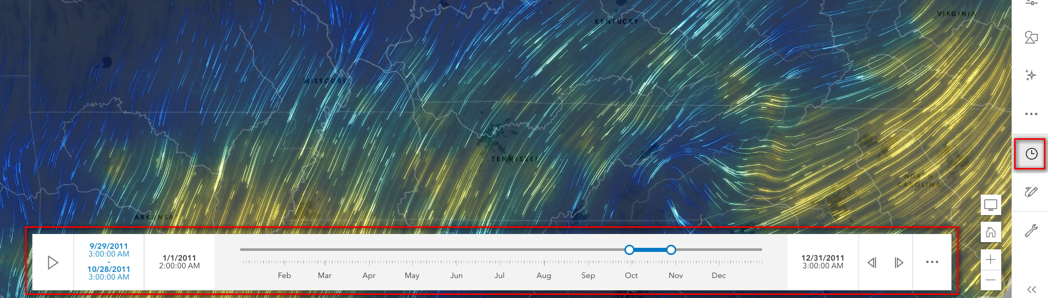
Wind Speed Map: Flowlines
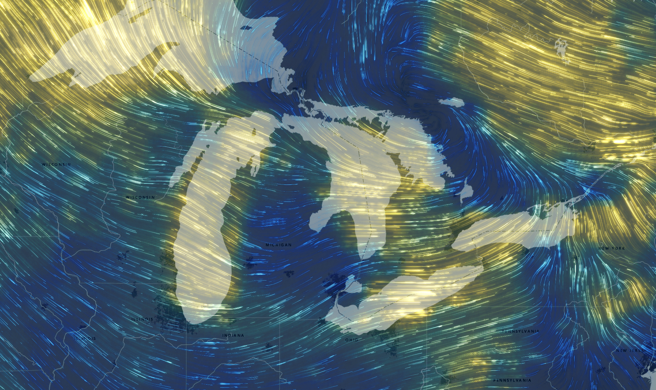
This map uses flowlines to depict daily wind speed and magnitude for one year in the US. Fast winds create faster, thicker lines. A color ramp has also been applied to the lines to reinforce this: yellow lines show the highest wind speeds. As a map author you have a choice with flow maps to show the lines using a single color or a ramp.
With this map be sure to use the time slider to explore how winds change day-to-day; the contrast in weather systems is really dramatic and beautiful. The map loads on day 1, but the rest of the year is just as interesting!
By default, a bloom effect is applied to flowlines on dark basemaps. Authors can use any layer effects they want (hint: try dropshadow!) or modify the strength of existing effects using the Effects pane.
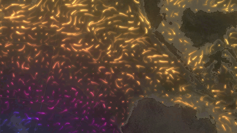
Sea Ice in Antarctica: Wavefront

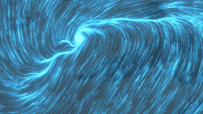
In the Flow renderer, we offer a second visualization style called Wavefront. If you think of Flowline as the body of the arrow, Wavefront is just the head of the arrow. It is meant to mimic a shockwave or wavefront travelling across the surface. Experiment to see if Wavefront of Flowline works best with your data.
In the example above sea ice movement around Antarctica shows a lot of complexity with some areas moving much faster than others. It also reveals the presence of large-scale structures like gyres that are hundreds of miles wide; there is geographic structure and order in this data that the animation makes plain to see. I especially like how the wavefront lines fade away near the edges of the pack ice, just like they do in the real world.

The UI allows you to adjust the speed, density, length and width of the lines. Switch between Flowline and Wavefront right at the top of the pane. If you use a color ramp be sure to use the handles on the side to change how the colors get applied to the data values; it can make a dramatic difference in the appearance of the map. If you don’t like the effects applied you can quickly turn them off at the bottom of the pane, or go to the Effects pane itself to tweak them or use different Effects entirely!
Pro Tip: As you can imagine this is a computationally intensive renderer that is doing a lot of really advanced math behind the scenes. For the speediest performance use tiled imagery layers, like the examples above do.
Next Steps
If you’re new to MagDir/UV imagery services, as I was, I encourage you to try this sample dataset in the Living Atlas of the World. Also note that our recent additions of blend modes and layer effects work perfectly with these kinds of maps, allowing for real creativity: This map of ocean currents that has a “Starry Night” by van Gogh vibe achieved with a strong bloom effect + vivid blending. I find bloom works especially well over top of the popular Nova basemap. Don’t be afraid to experiment and have fun.

Happy mapping!
Thanks to my colleague Anne Fitz for teaching me many things here and for the great feedback on this post.

Article Discussion: