The Dashboards team loves seeing examples of dashboards shared by the Esri community. We are always fascinated by the unique uses-cases, creative design, and ingenuity shown by dashboard authors. An example of this is a dashboard prepared by Amy Barnes, a solution engineer at Esri Australia. Amy took multidimensional weather data from NOAA and turned it into hosted feature layers before visualizing them in a compelling web map and dashboard. Along the way, many advanced techniques were used to bring out hidden meaning from the data. Amy has graciously offered to share her inventive workflows and ‘tricks of the trade’ with our community as a guest blog author. Thank you Amy!

Amy Barnes is a Solution Engineer at Esri Australia. She is an advocate for sharing the power of GIS with the world and proving your data and applications can look good at the same time. She is constantly looking for innovative ways to push the limits of ArcGIS, while keeping the simplicity of the user experience. Amy enjoys adventuring and mapping as she goes along.
Climate change has been a major concern in Australia since the turn of the century. Climate change has made Australia hotter and more prone to extreme heat, bushfires, droughts, floods, and extended fire seasons – and GIS has a big helping role to play, from citizens visualising current weather forecasts all the way to climate analysts getting deeper into data patterns.
Although weather data isn’t a new concept to ArcGIS, the latest addition of ArcGIS Arcade into ArcGIS Dashboards lets you take advantage of beautiful styling to encapsulate your data in a simple-to-read format. In the Weather Dashboard (see image below), I have brought live weather forecast data into a simple dashboard.
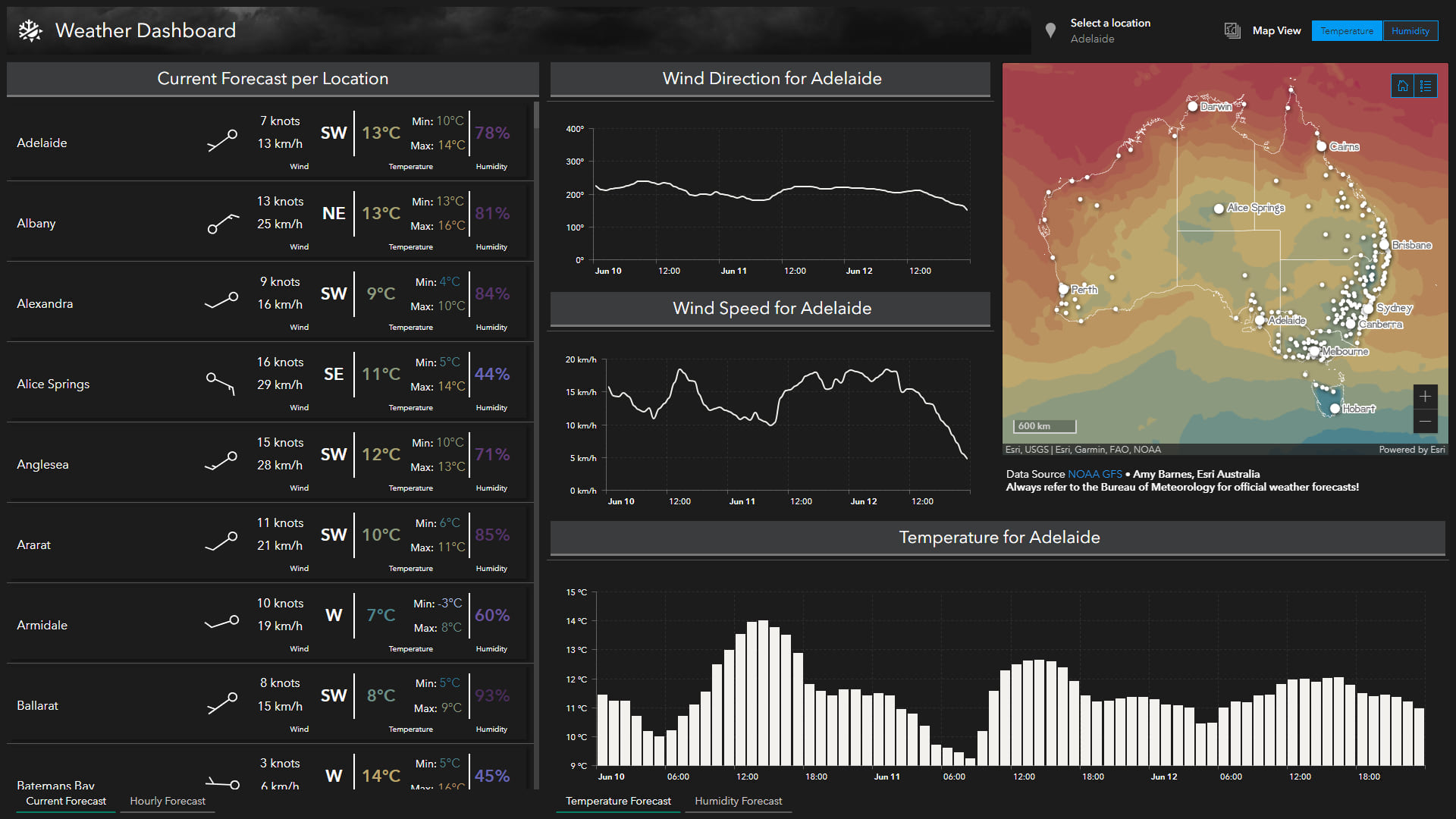
How I engineered the Weather Dashboard
This article will cover how I prepared the data, published it, and used that data to build the different elements in the dashboard.
Preparing the data
Preparing multidimensional data prior to incorporating them into any web map or application (in our use case, ArcGIS Dashboards) is critical if you want to interact with that data online. ArcGIS Pro offers many tools to import, manipulate and share your raster data – so let’s take advantage of the power of ArcGIS Pro and bring multidimensional data into your dashboards!
Because multidimensional data contains a lot of factors, my approach to handling this type of dataset was to explode the variables and bring them back together. The workflow outlined in this blog covers the process for handling 1 file and 1 variable – and having 1 result in the end. In the final steps section, I will discuss ways to automate this process.
For this workflow, I will reference the Weather Dashboard for Australia that I created. This dashboard ingests GFS model data downloaded from NOAA in GRIB format and is automated by a python script daily to update the 72-hour forecast. So, let’s jump into the workflow that I followed to bring the weather dashboard to life.
Make a multidimensional raster layer
The starting point to this process is your multidimensional raster dataset, and supported datasets for this workflow include Cloud Raster Format (CRF), multidimensional mosaic datasets, or multidimensional raster layers generated by netCDF, GRIB, or HDF files.
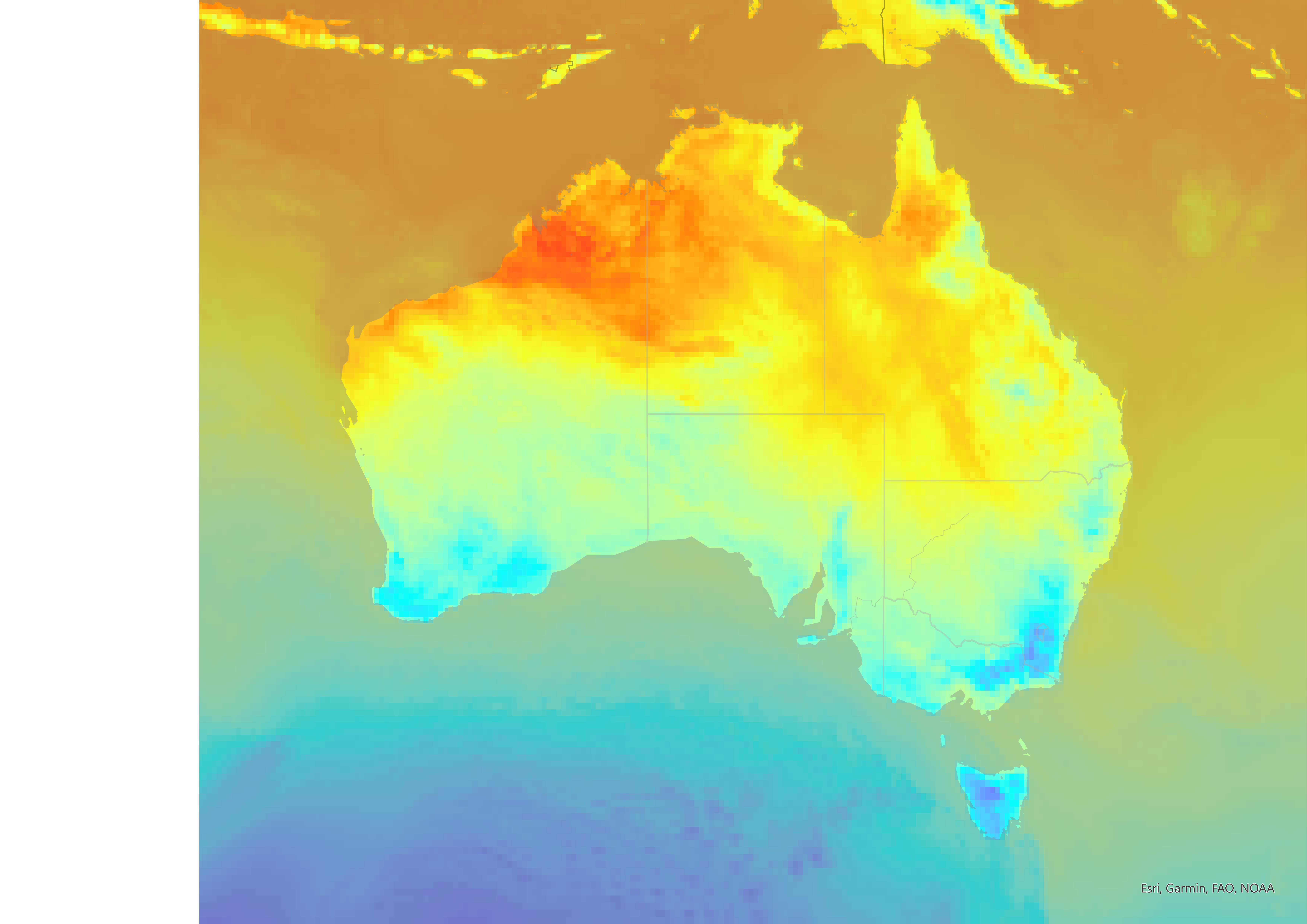
The Make Multidimensional Raster Layer tool is a required step in this workflow as it identifies the relevant variable you want to work with. This tool is available under all ArcGIS Pro licences. In the data files I worked with for the Weather Dashboard, I had downloaded temperature, humidity, pressure and the two wind components (u & v). In this example, we will focus on temperature. The image below shows the raster output after running the tool.
Interpolation
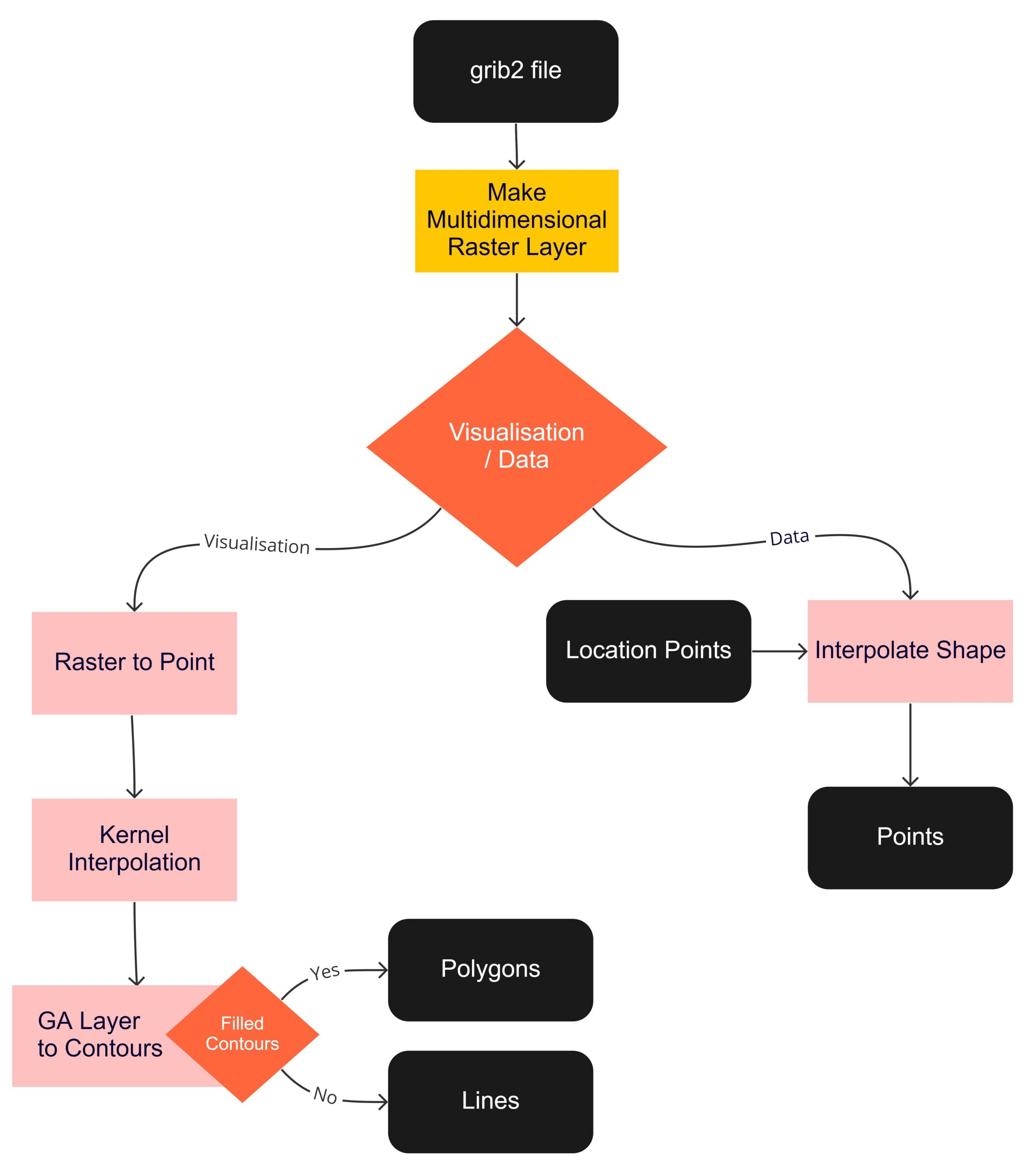
Depending on the output requirement of the data you need, be it just a point forecast or map visualisations, you have two different interpolation tools you can run. Because the Weather Dashboard incorporated both the location points and the map visualisations, I ran both interpolation tools.
To have a point forecast output, use the Interpolate Shape tool with a predefined set of locations that you want to forecast for. This tool is available with Spatial Analyst or 3D Analyst licenses.
To have a vector visualisation of your data, use the Kernel Interpolation with Barriers tool. This tool is available with the Geostatistical Analyst license. A prerequisite for running this tool is to convert your multidimensional raster layer to points. The last step is to run the GA Layer to Contour tool to export your data to a file location or database. Opting to export with filled contours will export polygons (perfect for temperature, humidity etc), and opting for contours will export lines (perfect for pressure bars). This tool is available with the Geostatistical Analyst license.
Automation
Depending on your needs, you can manually do this workflow to get a few variables or hours in. Alternatively, you can automate the workflow using python. This is the best option if you have bulk variables across time that you need to process or need to routinely run the workflow.
Visualisations & charting
Colours
I used a meaningful colour palette to symbolise my temperature points and polygons, see both images below.
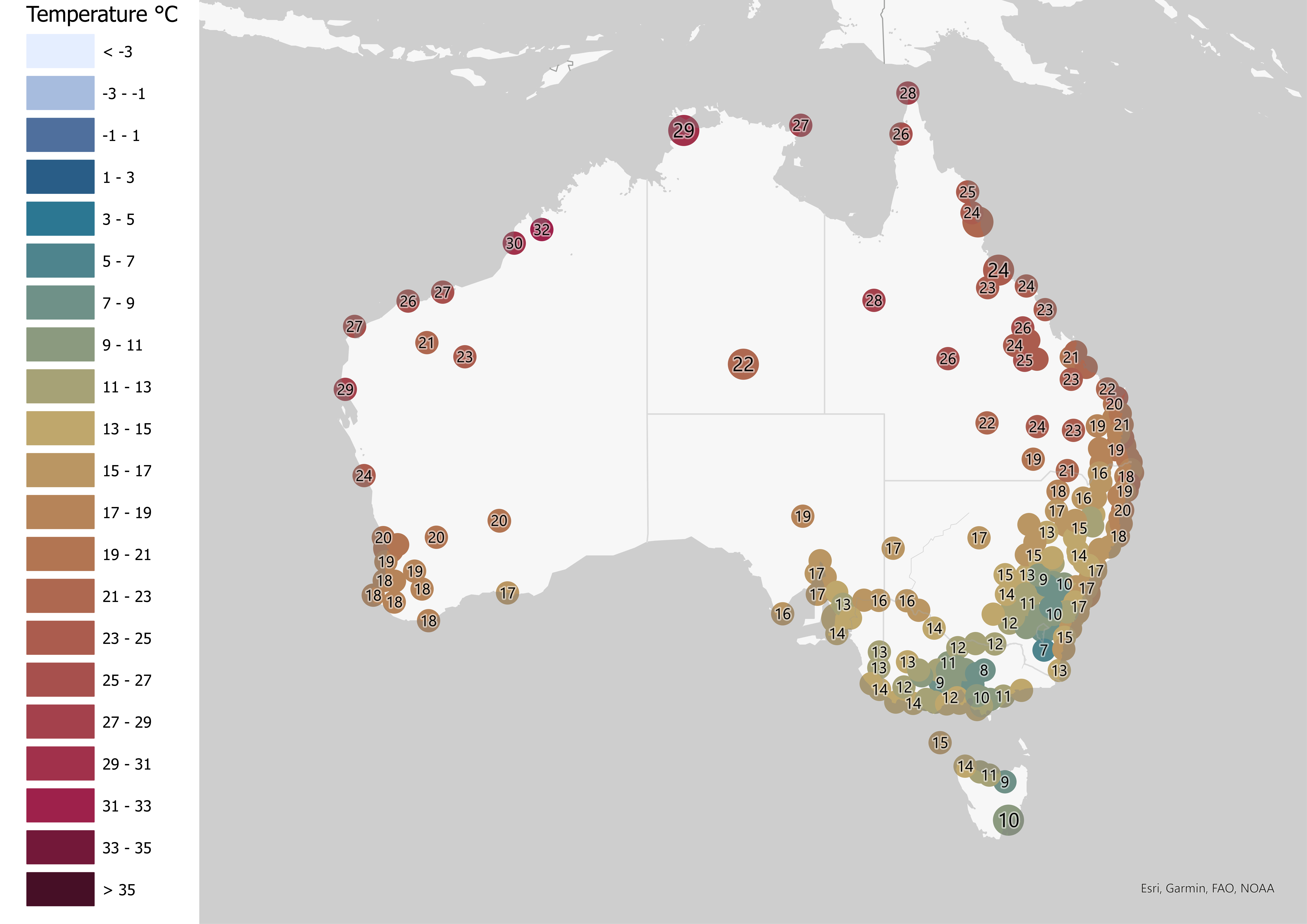
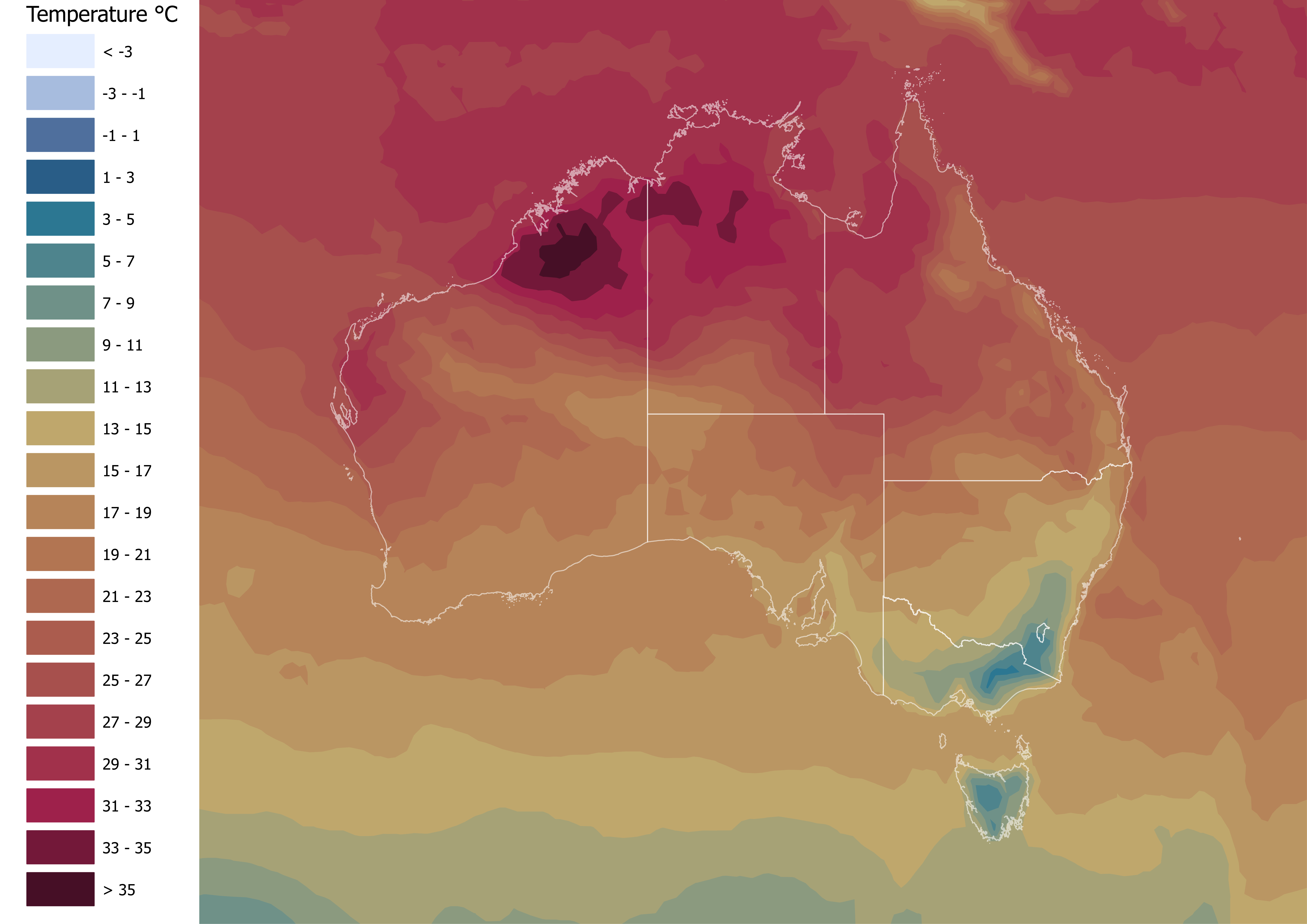
In the Weather Dashboard, I also used a light blue to dark purple gradient for the humidity. The colour palette is just as important to ensure the viewer can understand the data at a glance. These colours were directly incorporated into the Dashboard – allowing the viewer to correctly correlate colours to values/intensity.
ArcGIS Online / ArcGIS Enterprise
The data layers were published to ArcGIS Online as hosted layers, with the relevant time zone set. Adding filters in the web map to filter the temperature & humidity polygons to only within the last hour allows you to bring a live experience to the user.
The data can also be published as a reference layer to ArcGIS Enterprise using a query layer with time-enabled SQL queries to limit what the viewer sees as “now”.
ArcGIS Dashboards
Serial Charts
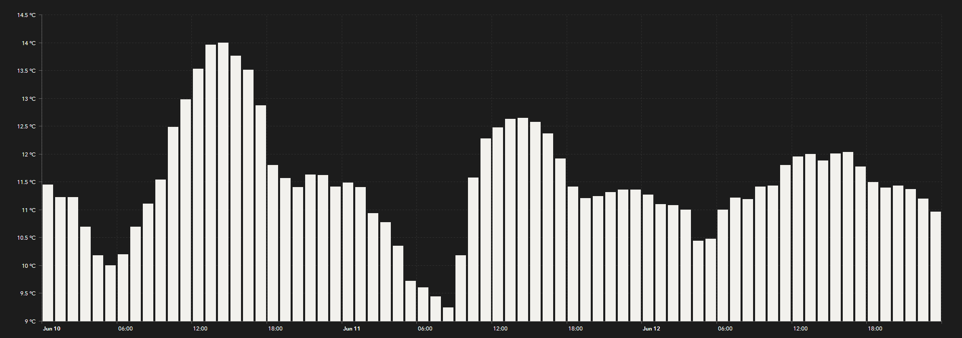
The serial charts in the Weather Dashboard each comprise of a different variable. Because we are following the temperature in this workflow (and the serial charts are all very similar), we will focus on the temperature forecast chart as seen in the image below.
To make the dashboard more user friendly, add in smaller details, such as the °C to the values on the value axis.
Lists
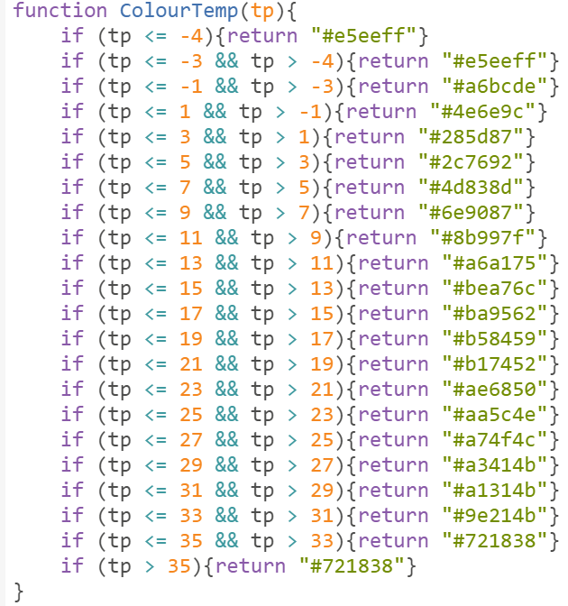
The forecast list is the most powerful part of the dashboard. It has ArcGIS Arcade enabled to bring dynamic values to life. The Arcade script within the list runs through multiple if statements to assign a colour to the value. These colour gradients correspond with the values in the map. The image below is a snapshot of the arcade script used, and it is also good to note that Arcade’s when() function can also be used.
The wind barbs in the list are SVG images that correspond to the wind speed, and dynamically rotate depending on the wind direction. The image below is an example of one wind barb, and similar to how we incorporated the temperature’s above, we run through multiple if statements and assign an image to the corresponding speed.

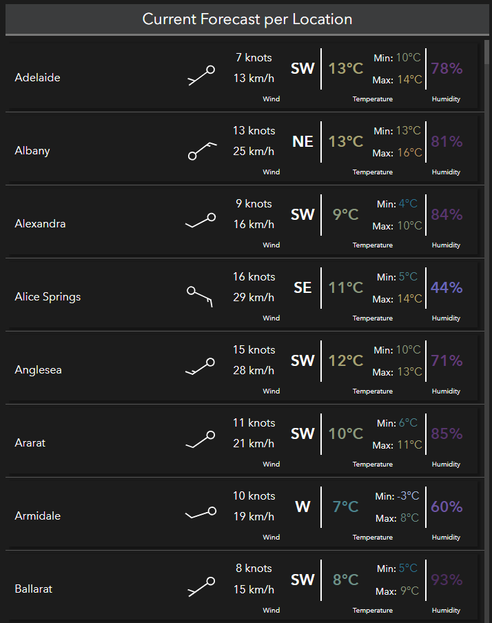
This list comes together with pulling the various variables into an HTML table. See the image below for a sample of how the list renders from the Weather Dashboard.
Filters
The Weather Dashboard makes use of two important filters. The first is a list of the locations in Australia that the user can select to filter most of the dashboard out. All charts are filtered to only one location, and by default it filters to the first in the list.
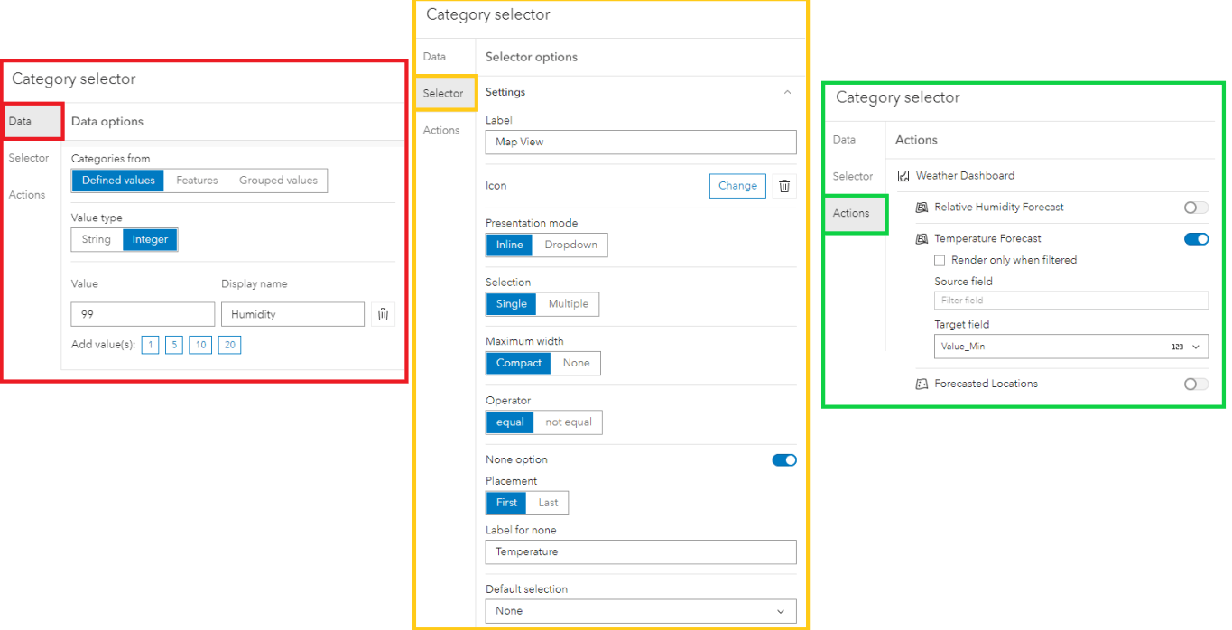
The next filter is more so a tweak of existing functionality to deliver the desired effect. See the filter in the image below, and how I implemented this workaround.

The defined value to filter is set to 99 and called “Humidity”. And the selector has the None option enabled and is called “Temperature”. Under the actions, the filter is set to filter out the temperature layer for minimum value. Because the defined value was set at 99, and the minimum value of temperature will never hit 99, the effect this creates is that the layer disappears, and when the none layer is selected, the temperature layer comes back. The humidity layer has always been visible in the dashboard, and the filter merely switches the temperature on and off.
Way Forward
There is a lot of ArcGIS help online, even if you’re new to ArcGIS Dashboards and on a path to creating your first dashboard, or you’re curious to know more about what’s new in ArcGIS Dashboards. To learn more about what ArcGIS Arcade is and how to get started, check out this Story Map. There are also training courses available on MyEsri that will help you in starting with ArcGIS Arcade.
I am looking forward to seeing how you incorporate multidimensional data in your dashboards!

Commenting is not enabled for this article.