Getting infected with the influenza virus (the flu) is no joke. If it’s been a while, let me remind you that having the flu makes you feel like you’ve been hit by a truck. You’ll be achy, feverish, coughing, congested, and maybe even nauseated. Yuck! And getting the flu is pretty common. According to the CDC, about 8% of the US population gets sick with the flu annually (almost 27 million people). But it gets worse – the flu is a killer. Depending on the year and the severity of the circulating flu viruses, between 12,000 and 50,000 people die from influenza each year. Those at the highest risk for severe disease include people 65 years and older, those with certain chronic medical conditions, pregnant women, and children younger than 5 years.
Early statistics indicate that we’re entering a devastating flu season. Combine that with the ongoing COVID-19 pandemic and spiking respiratory syncytial virus (RSV) infections and we have a “tripledemic” situation where health care may be in jeopardy as hospitals become overwhelmed with patients. The question I always ask myself as I read the news is how GIS technology can help. GIS technology and tools can strengthen health organizations’ influenza response by:
- Improving Flu Surveillance
- Managing Healthcare Capacity during Surge
- Vaccinating the Population
- Monitoring the Supply Chain
- Communicating with the Public
1. Improving Flu Surveillance
The Johns Hopkins University Dashboard for COVID-19 dashboard and its creators have been honored and awarded many times for innovation, data sharing, openness, and transparency. The entire world took notice because the map-based display of the data about COVID-19 cases and deaths was clear, easy to understand, and updated in near real-time. Similarly, tracking flu with an ArcGIS Dashboards makes sense as it provides a single source of truth for a region, agency, or organization to ensure that team members and response efforts are aligned.
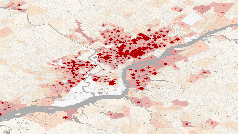
Williamson County and Cities Health District in Texas offer a great example of a flu surveillance dashboard for their jurisdiction. They’ve provided data related to confirmed flu cases and possible cases of flu called influenza-like illness (ILI). In the lower right corner, they offer a timeline of flu surveillance over the last 8 seasons. From this graph, it is clear that 2022-2023 is already extraordinary.

When flu and ILI data are combined with a digital map, it becomes much easier to compare and analyze information and think about when and where resources will be needed most. For years, Walgreens has shared their Flu Index publicly where they track their internal retail prescription data for antiviral medications used to treat influenza. It’s proven to be a good proxy measure for flu incidence across the US and is available sooner than data using confirmed cases.
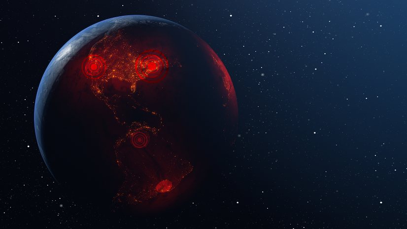
In the figure below, compare similar dates from the 2021-2022 flu season to this year’s flu season. The geographic perspective offers new information about where the highest incidence of flu is nationwide and thus the places where medical surge is a risk.

2. Managing Healthcare Capacity during Surge
We expect our healthcare system to be resilient. In other words, it should be able to quickly adapt to cope with challenges to the system. Ideally, that would happen in ways that do not compromise care or put patients at risk. COVID-19 taught us that we cannot take resiliency for granted – we need to build it into the system. Spatial analysis can help us do that.
Early in the pandemic, the general population became familiar with terms like “flattening the curve.” The idea was to slow down the spread of infections, avoiding a “peak” in the epidemic curve where the number of people requiring care exceeds the health system’s capacity. GIS can be incorporated into forecasting tools that predict when and where care may become compromised. Understanding the locations where there is high risk for medical surge supports two avenues for action:
- Preventing the rapid spread of disease.
- Strengthening public health measures like handwashing, vaccination, and social distancing are effective ways to flatten the curve. Targeting those efforts to the places of highest need further enhance results, like placing handwashing stations in communities experiencing houselessness, vaccinating populations at highest risk for severe disease and enforcing social distancing behaviors in places with high transmission risk (e.g., health clinics, nursing homes and more).
- Emergency expansion of care sites can be planned.
- This was famously done by Loma Linda University Health during the 2017-2018 flu season when their GIS-based Flu Tracker app showed a serious increase in illness in the hospital’s service area. This led to deployment of their disaster tent to increase emergency room capacity to accommodate the region’s sick.

Whether the goal is to predict the timing and location of a surge or to increase capacity to handle the surge, GIS can help.
3. Vaccinating the Population
Ideally, of course, we want people to be protected against getting the flu in the first place. So far this season, the rate of vaccination for annual flu shots aligns with rates from this time last year but is significantly lower than pre-pandemic years. We’ve seen GIS deployed in several ways to improve vaccination practices.
Digital vaccine locator app
Perhaps the simplest way to improve vaccination is to make the process as transparent and convenient as possible. Let people know where and when they can get the vaccine they need. See the example from the Manitoba Province of Canada to get some ideas for how a digital vaccine locator app works.
GIS to manage workflow for flu clinics
In some smaller, more rural places, efforts to vaccinate are ramped up with ‘pop up’ clinics during the season. Carlton County, Minnesota, used GIS to manage the entire workflow for their drive-thru flu vaccine clinic. ArcGIS Hub helped them share the clinic times and locations. ArcGIS Survey123 was used to pre-register for a vaccine and collect data onsite. ArcGIS Dashboard was used to monitor the throughput and key metrics. Their efforts with the flu readied them for COVID-19 vaccination when the time came.
Mobile vaccinations
It’s not enough to guide people to the flu vaccine with vaccine locators and ArcGIS Hub sites. Vaccination programs must also consider their residents who may not be able to get to a vaccination location for various reasons. In those cases, the vaccine must be brought to them. In Clackamas County Oregon they used GIS for their program to vaccinate immobile and homebound individuals. They began the operation during COVID-19. They used ArcGIS Survey123 to receive vaccination appointment requests, they visualized appointment locations on a web map, and then employed ArcGIS Workforce to coordinate their team of mobile vaccinators in the field by planning optimal daily routes. The program achieved their vaccination goals in half the predicted time frame. Due to its success, they have since expanded it to include many vaccinations, including the annual flu vaccine.
Distributing vaccines across a population, paying attention to underlying population risks and equitable decision-making is a job that GIS technology handles beautifully.
4. Monitoring the Supply Chain
With a potential for more than 27 million Americans becoming sick with the flu, supply chain and inventory issues are a big deal. Whether vaccinations, over the counter and prescription remedies, or in-hospital resources, it’s important to ensure that supplies are delivered to the right places, at the right time, and without spoilage. That requires spatial and temporal insight and only a GIS can provide that.
Buyers of flu supplies need to assess future demand across their territories and make purchases accordingly. Surveillance activities, such the Flu Index created by Walgreens, offers the initial insights. Geospatial analysis and modeling can leverage historical and current data to predict upcoming needs.
Manufacturers and logistics companies need to assess the entire distribution process and where threats exist for getting critical supplies to the buyers. In the case of vaccinations, where cold chain is a critical issue, then real-time information about weather, power outages, or inconsistencies in truck refrigeration needs to be monitored and mitigated with haste. GIS is well suited to work with various IoT sensors, weather data and traffic patterns to provide oversight and alerts along the route. See my article for more details about the ways a GIS can help with supply chain challenges.
5. Communicating with the Public
Reducing illness and death from flu largely depends on how well the risks and resources are communicated to the public – especially at the local level. ArcGIS Hubs sites that share information in a digestible way helped many government agencies transparently deliver data, maps and apps that helped residents answer their own questions and make informed decisions about their health needs during the pandemic. The State of Georgia did a nice job of this and similar hub sites could support flu response.


The truth is that everything we learned about the use of GIS technology to respond to the COVID-19 pandemic is relevant for responding to annual influenza. The five applications I describe herein make good sense and are proven effective. If you’d like to dive deeper, you can read my book which highlights even more stories about organizational innovations for COVID-19 response, recognizing that the same workflows can support influenza during this high threat season and other health crises as they arise. Let’s keep applying what we learned from COVID-19 to make us all a bit healthier.