Time is a theme that appears in many stories. By visualizing how a place or phenomenon evolves over time, we can gain a deeper understanding of its history and significance. There are many ways to visualize time in ArcGIS StoryMaps, and authors have used time-based visualizations to provide insights into topics as diverse as bird migrations, urban growth, and mental health. This post covers some of the most effective and creative techniques for weaving time-based maps and data into your stories.
To show time in a story, you first need to find or create layers that contain temporal data, and then add those layers to a map. Temporal data can be structured and stored in several different ways. How the data is published and presented may dictate—or at least influence—how you show it in your story. This post focuses on the two most common temporal data schemes:
- Time as a layer, where an individual layer represents a particular snapshot in time, or;
- Time as an attribute, where one or more attribute fields contain dates or other time data.
Note: For the purposes of brevity, this post focuses on web map workflows, but many of the methods described in this post can also be achieved using static maps (created in ArcGIS Pro or elsewhere).
If you’re interested in something specific, you can use these links to jump right to any section…
- Time as a layer: Map choreography, Map actions, Swipe
- Time as an attribute: Filtering by time, Smart mapping with time, Time animation widget, Embed a time-aware app, Time animation as a video
- Showing time in non-geographic ways: Timelines, Charts
Time as a layer
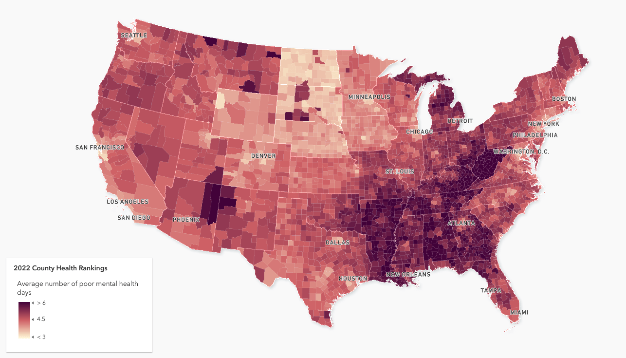
A single layer often shows a snapshot of data at a particular moment in time. For example, Esri’s Living Atlas of the World contains U.S. county health data for 2020, 2021, and 2022 (as well as other years). These layers do not have any time-stamped attributes that vary with time, but each layer as a whole represents a measurement (or measurements) at a particular point in time. Specifically, each layer contains a selection of health indicators, reported at the county level, for a single year. Together, these layers could be used to show how a community’s health has changed over time, or to compare between two or more years.
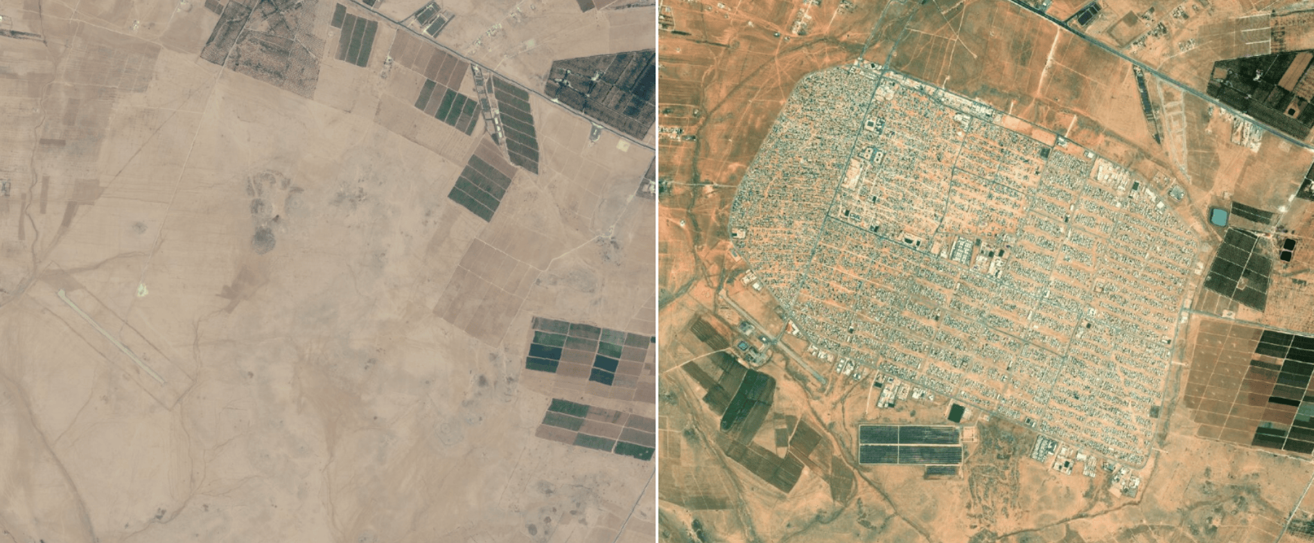
Similarly, imagery layers capture snapshots of a location at an instant in time. For example, imagery from different time periods can be used to show the extent of damage caused by a flood, or the removal of vegetation surrounding an urban area across several decades.
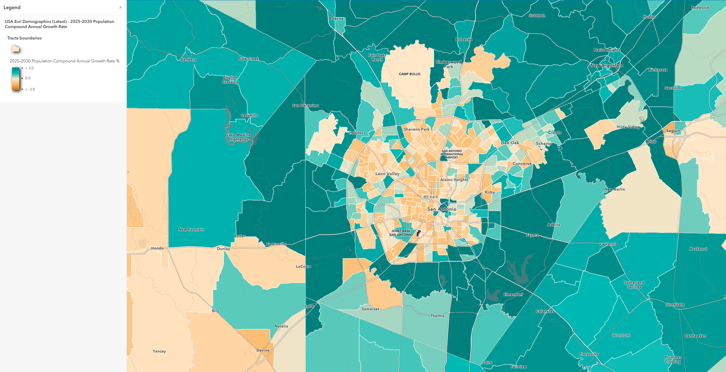
In each of the cases above, the layers represent data at a specific point (or range) in time. But a single layer can also reflect time by showing the change in an attribute over time, like in this layer showing change in land cover from 2018 to 2050, or this layer showing projected population change in the U.S. between 2025 and 2030.
Additionally, a single layer may represent the results of a spatiotemporal analysis. Advanced GIS users might use ArcGIS Pro to generate a space time cube, or to locate space time clusters or emerging hot spots. The results of these analyses can then be added to a map (or maps) and displayed in ArcGIS StoryMaps. For more information on spatial and temporal pattern analysis, check out this blog post.
Now that we’ve defined the concept of “time as a layer” and have reviewed some examples, let’s dive into the various methods and tools you can use to visualize time-based layers in ArcGIS StoryMaps.
Map choreography
Map choreography is a powerful storytelling technique in which several related map views are presented one after another in quick succession. Typically, each map view highlights a specific location or subset of map layers, and can be accompanied by some explanatory text. As the reader scrolls or clicks through the story, the map smoothly transitions from one author-configured view to the next, resulting in an elegant, frame-by-frame map animation that readers can follow at their desired speed.
Map choreography is achieved using the sidecar block in ArcGIS StoryMaps. A sidecar is made up of individual slides, each of which contains a fixed media panel (which can feature an author-defined map view) and a scrolling narrative panel. Map choreography is commonly used to deconstruct complex maps, or to focus on areas of interest in a spatial dataset. But it’s also well-suited for visualizing change through time—especially when each map layer represents a specific moment (or range) in time.
Depending on your data and the story you’re trying to tell with it, you may wish to show a single snapshot of data (such as a year, decade, century, etc.) in each slide, like in this example, which compares mental health rates in 2015 and 2019. Or, you can “stack” multiple layers to highlight cumulative changes through time—for example, to narrate eras eras of bridge construction or to visualize the projected consequences of coastal flooding.
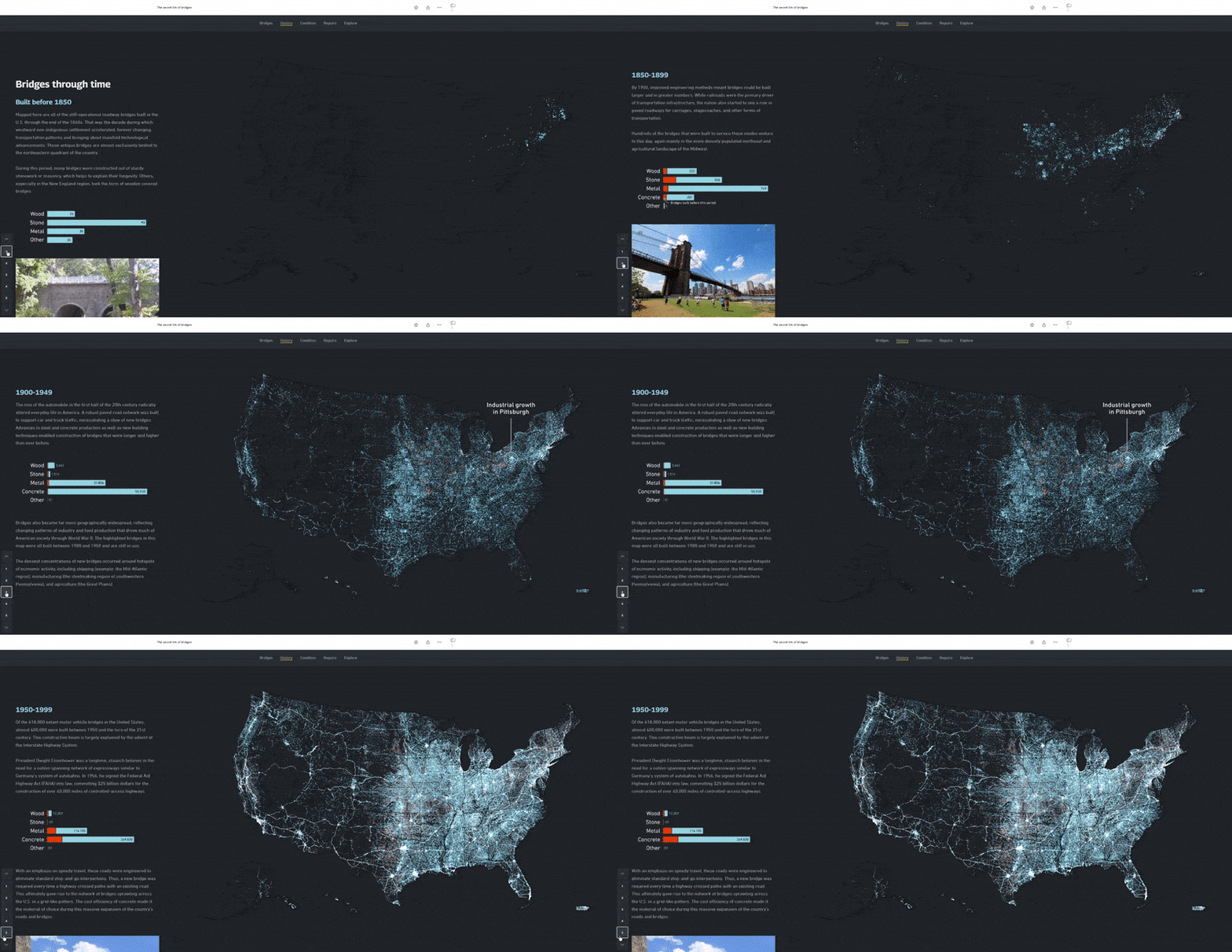
Pro tip! For performance reasons, it’s often best to add all layers to the same map, and use the capabilities of the sidecar builder to toggle layer visibility as needed for each slide in the sidecar block. But if you’re planning to choreograph lots of layers in a single sidecar block, you may achieve better results by creating individual maps for each sidecar slide. For more information on web map performance, check out this page.
- Video: Map Choreography: How to make an ArcGIS StoryMap sing and dance
- Blog post: Make your ArcGIS StoryMap sing and dance with…map choreography!
- Lesson: Build a sidecar in your story
Map actions
A map action is a special link or button that can accompany a web map in a sidecar block. When clicked, an action changes the appearance of the map to show a specific, author-configured view—such as a discrete snapshot in time. By clicking through a set of map actions, readers can easily compare a phenomenon at different points in time, highlighting for example the rise of megacities, or the ebbs and flows of naval combat in WWII.
Keep in mind that readers don’t need to interact with map actions in order to advance the narrative. This means it’s generally inadvisable to conceal essential map views behind map actions, as some readers may never see these views. But if your goal is to enrich your sidecar with supplemental time-specific map views, then map actions are a great choice.
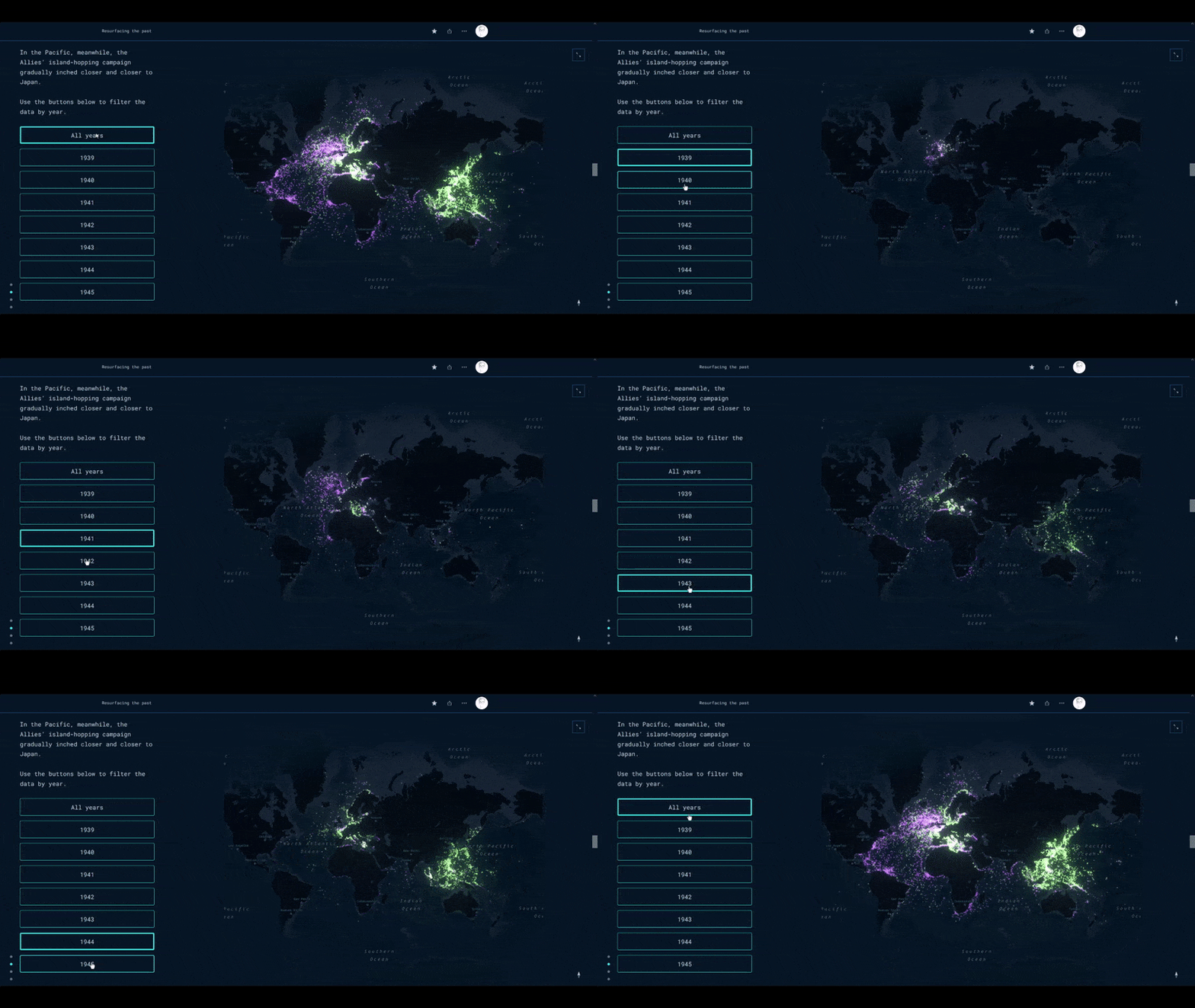
Note that only one map action can be active at a time; if it’s essential (for narrative purposes) that readers can independently toggle the visibility of multiple layers, you might instead consider creating and embedding an Interactive Legend app.
- Blog post: Supercharge your stories with map actions
Swipe
The swipe block allows readers to compare two maps (live or static), or two photos, side-by-side using an interactive slider. It can be used to create compelling comparisons of imagery or thematic data at two distinct periods in time. For example, swipe can be used to compare the extent of river flooding now and in the future, or to compare historic land cover patterns to contemporary ones.
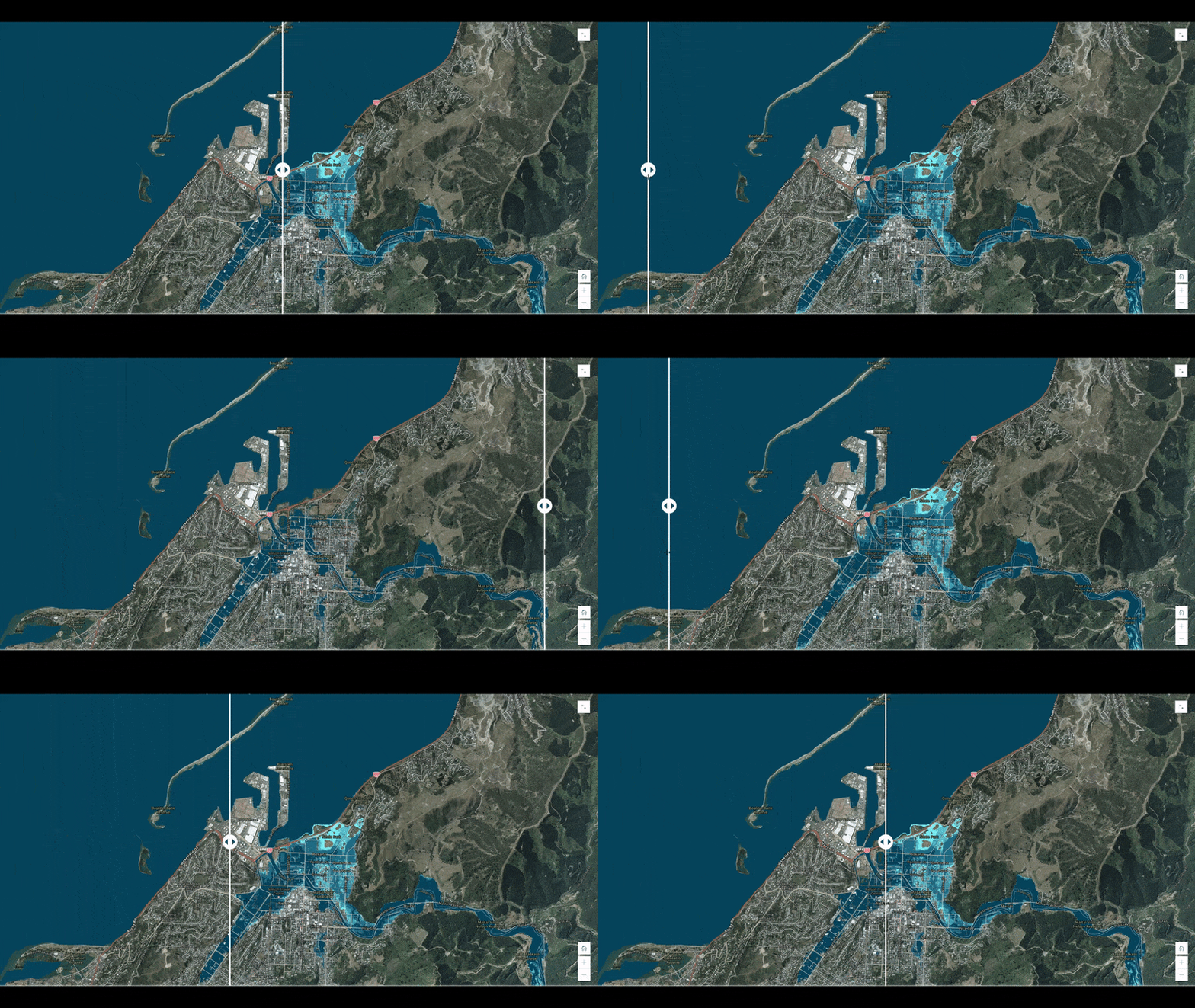
- Blog post: Swipe right for a powerful storytelling tool
- Instructional story: Add a swipe block to your story
Time as an attribute
If a layer has a time attribute (that is, an attribute in a date/time format like “date created” or “time of day”) that means its other attributes vary across time. In this case, simply rendering the layer as-is will show all available data across time, which may not reveal the interesting patterns you want to communicate in your story. For instance, a single layer might include a city’s population at three distinct points in history, but it’s unlikely that you’d want to show all three measurements simultaneously.
For storytelling purposes, you’ll instead probably want to refine your data to show specific times or ranges. To do this you can filter or style the layer by time—or even publish it as a time-enabled layer that will exhibit special behavior in ArcGIS Online.
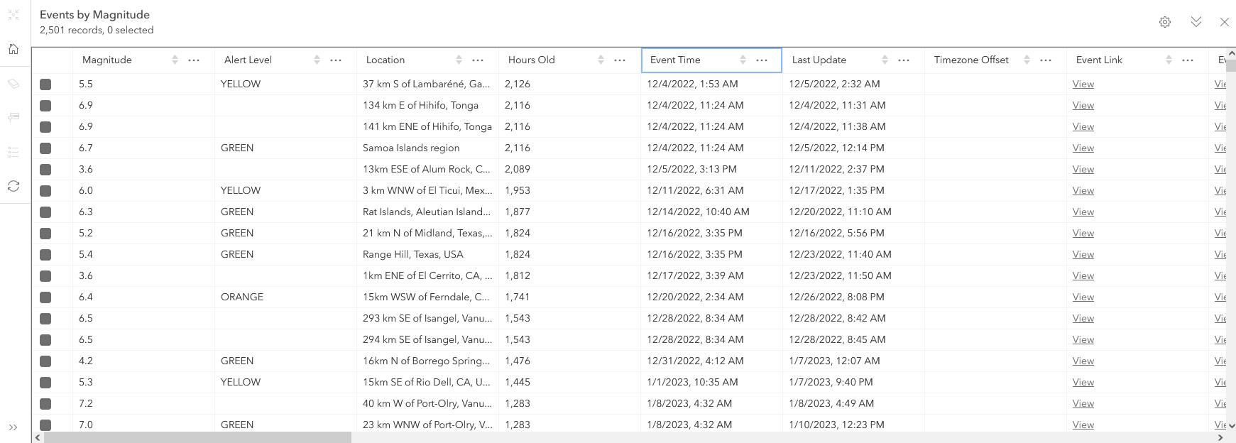
Filtering by time
Any layer with a time attribute can easily be turned into a snapshot layer using filters, and then presented in a story using the methods in the previous section. If you need more than one snapshot or range, simply create copies of the layer and apply different date filters to each copy. Choosing a date/time attribute in the filter will present date-specific operators like “is on,” “is before,” and “is between” that will let you specify a snapshot or a time range. For more information on how to filter by date see the help document on how to Apply filters.
Pro Tip! Usually publishing a single time-enabled layer gives you the most flexibility since you can create copies of it and use filters to show different snapshots or ranges. However, querying very large temporal datasets can be slow, so consider publishing individual snapshot layers if performance becomes an issue.
Smart Mapping with time
There are several ways to style layers to show time using Smart Mapping. You can use the time-based smart mapping renderers like Continuous Timeline and Age to present data that has a time attribute to answer questions like:
- Where are older features and where are newer ones?
- Which features have dates that are before or after a key date?
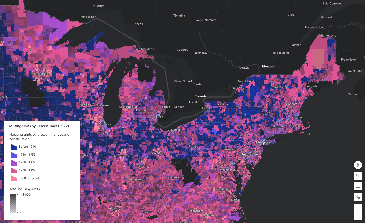
Using Smart Mapping, you can even combine a time attribute with a second numeric, category, or time attribute using the Color & Size or Types & Size renderers. These renderers let you show time and another variable simultaneously. A layer must have a field formatted with a date/time format to be used with these renderers.
Check out these resources for more information about showing time using Smart Mapping:
- Blog post: Mapping time in Map Viewer
- Instructional story: Smart Mapping: Continuous Timeline and Age
Pro Tip! If the ability to interact with a map is not critical to your story (and if your data isn’t changing) you can prepare your map (either in Pro or Online), take a screenshot or export it as a static image, and add the image to your story. Images will always perform better than live maps and are often the best way to include maps in your story. Use a mix of static map images and dynamic web maps depending on the purpose of each map in your story.
Time animation widget
Adding a time-enabled layer to a web map automatically enables a time slider in the Map Viewer, which can be used to interactively browse and animate the layer’s data through time. In the web map options, you can configure certain properties of the time slider, like its playback interval, playback speed, and whether it should display all features cumulatively or one interval at a time.
If you add a time-enabled web map to your story, you can optionally enable a time animation widget in the map editor. This widget inherits all of the time slider properties from the underlying web map and provides a set of simple playback controls for controlling the time animation. The widget is a low-complexity solution for basic time animations.
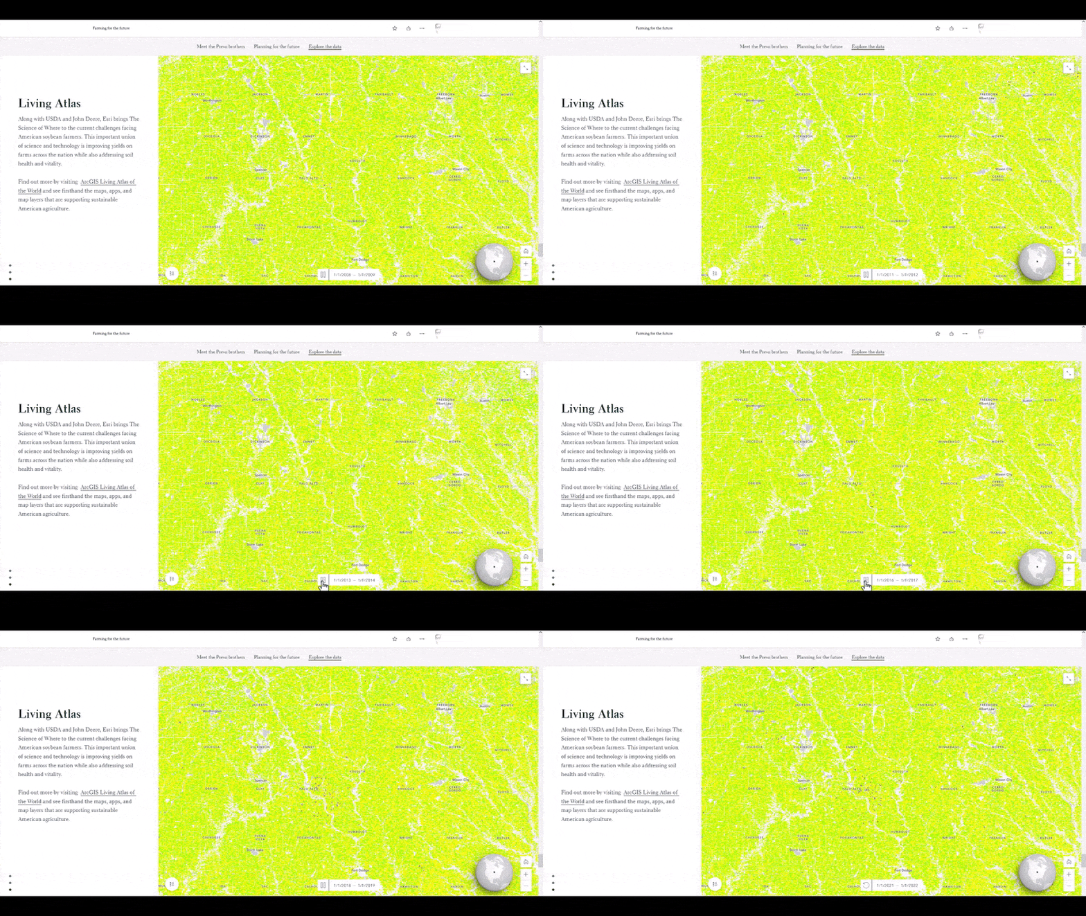
One notable advantage of the time animation widget is that it doesn’t need to be manually configured or updated when the underlying data changes, so it’s especially useful for visualizing dynamic data that may be edited after the web map and story are published.
Pro tip! The smaller and simpler your time-enabled dataset, the better it will work with the time animation widget, since each frame of the animation must be rendered in real-time. For more complex or data-rich time-based animations, you may wish to render your animation as a video instead.
Embed a time-aware app
If the web map time slider’s exploratory capabilities are essential for your narrative, you can create a configurable app that features the fully interactive time slider—such as the Slider template or the Media Map template—and then embed that app directly into your story.
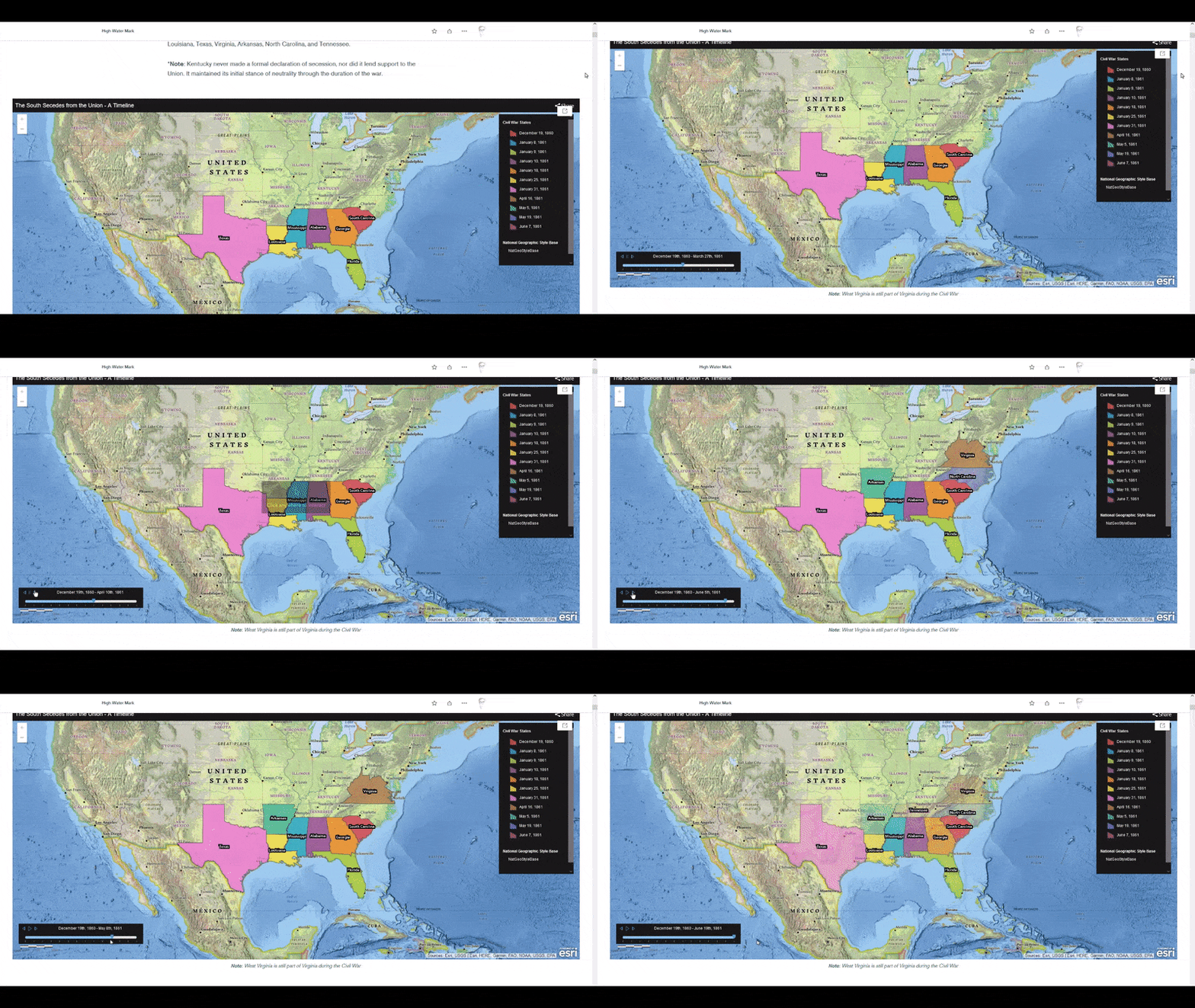
Keep in mind that some readers may not interact with the full slider. And, as with all embeds, be sure to consider the mobile display options and to preview your story on a mobile device before publishing. You may wish to display the live embed on mobile, or to instead replace it with a pre-rendered, GIF-based version of the animation.
Time animation as a video
If you wish to exercise greater directorial control over your time-based animations than the widget allows, you can create a custom animation in ArcGIS Pro, export it as a video, and then upload the video to your story. While complex animations can be difficult and time-consuming to produce, this approach enables you to take full advantage of Pro’s vast cartography toolset. Plus, pre-rendered animations will usually load faster in a story than a dynamic web map.
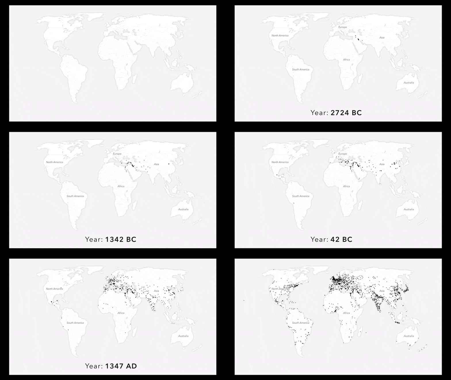
Time animation videos have been used in ArcGIS StoryMaps to highlight historic sea ice loss, the astounding journeys of migratory birds, and Japanese-American Internment camps. In all of these examples, the animations include dynamic text that identifies the currently visible date(s).
- Instructional story: Getting the most from animated maps
Showing time in non-geographic ways
This is a good time to mention that not all time-enabled data needs to be visualized on a map (gasp!). It’s true. There are many other visualization techniques that don’t involve a map. A few are highlighted below.
Timelines
You can use a timeline to represent a simple series of events. The timeline block in ArcGIS StoryMaps provides a fun and intuitive way to add chronological visualizations to your story in a more flexible and dynamic presentation than static images or purely text-based lists can offer. You can drop a timeline almost anywhere in the story, even in a sidecar narrative panel.
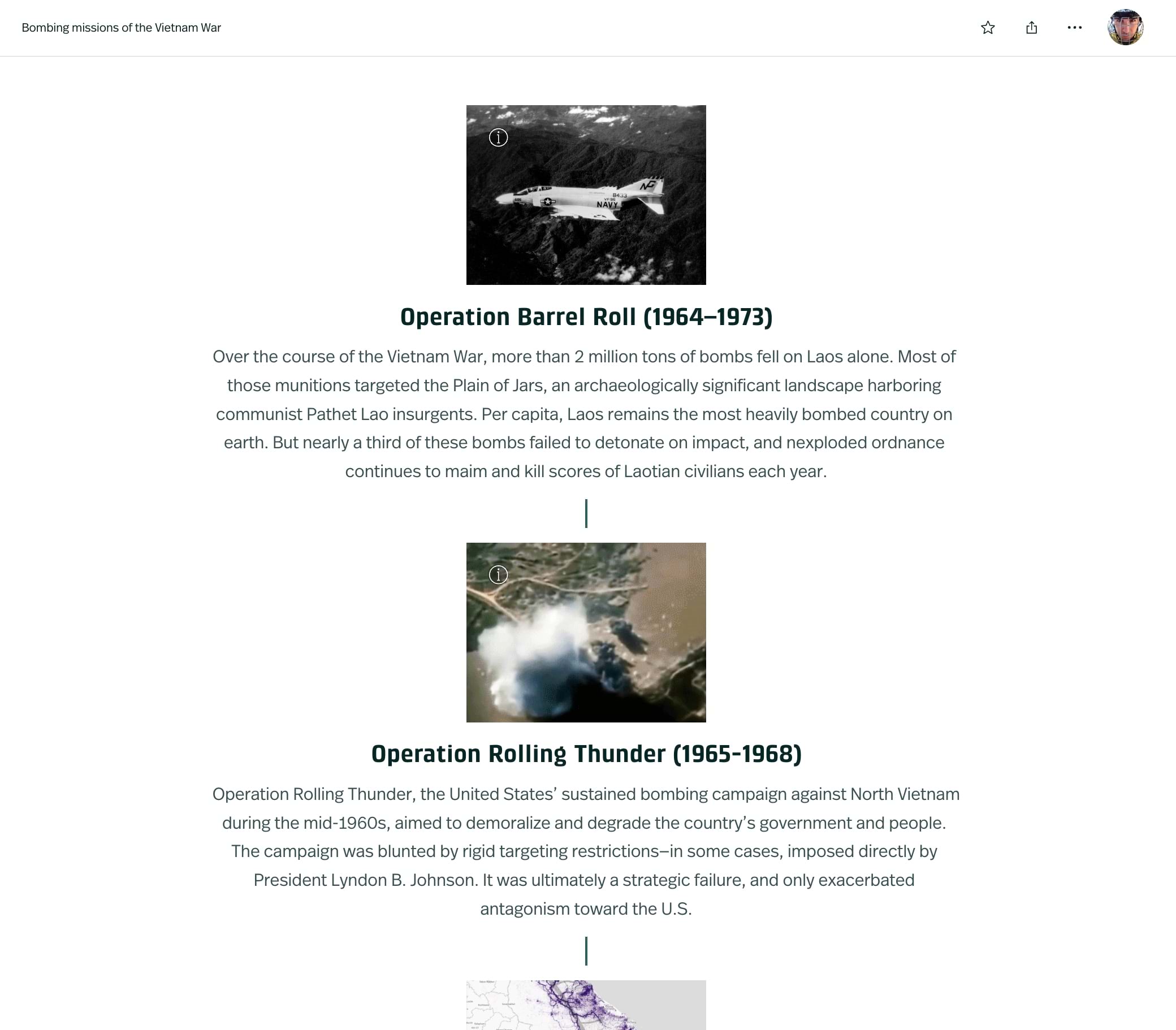
- Blog post: ArcGIS StoryMaps Presents the Timeline Block
- Example: 2022 Tribal ArcGIS StoryMaps Challenge
- Example: Bombing missions of the Vietnam War
There are other tools on the web that you can also use to create timelines, and those can be embedded in a story using the Embed option. Below is an example of a custom horizontal timeline.
- Example: The lines that shape our cities
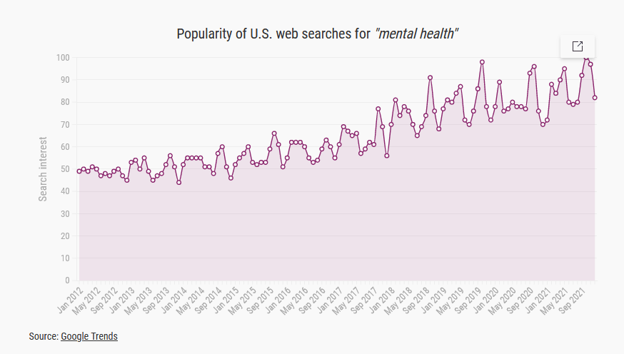
Charts
If there isn’t a compelling geographic dimension to the data, then a static or interactive chart may communicate your messages more effectively than a map.
Static charts can be created apps like ArcGIS Pro (learn more about making charts in ArcGIS Pro) or Excel and then added to a story as screenshots. Alternatively, interactive charts can be created with web-based tools like ArcGIS Dashboards or ArcGIS Insights, and then embedded into a story.
- Instructional story: Including charts in ArcGIS StoryMaps
It’s your story…
As the examples above collectively illustrate, there are myriad reasons for visualizing time—and myriad methods for implementing time-based visualizations in ArcGIS StoryMaps. As you evaluate the options covered in this post, be sure to consider not only the structure of your time-aware data, but also the role it plays in your story, and the key messages you’re trying to communicate.
Is change over time a central pillar of your narrative? If so, you may want to use map choreography, due to its prominence, flexibility, and reader-controlled navigation. Is time more of a secondary element in your story? In that case, you might instead use map actions or a pre-rendered video, as these options are less narratively intrusive. At the end of the day though, there’s no “right” or “wrong” approach. After all, it’s your story to tell.


Article Discussion: