Creating a highly usable, intuitive web layer or map sometimes means going beyond the defaults. Using the many tools available in ArcGIS Pro and Online, this process can be very straightforward. Whether it’s a feature or raster layer, there are some common workflows that can transform your data…and they don’t take much time.
Tip #1: Turn overlapping features into an informative map
Overlapping point data can be hard to distinguish and reveal patterns. Thoughtful cartography can help especially if you have a layer like Tornadoes 1950-2022 which has 68,701 records.
In ArcGIS Pro search for Tornadoes from Living Atlas. The layer comes in symbolized by tornado damage and fatalities and at this scale it’s difficult to discern.
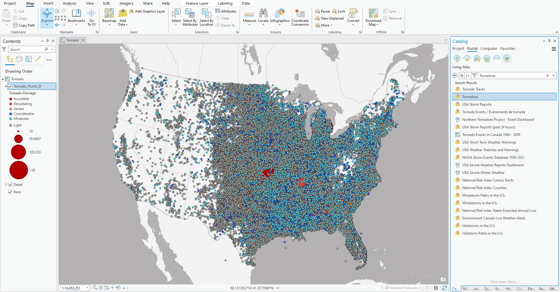
First let’s adjust the size and palette for the symbols so that the lowest class of “Unknown” has a tiny symbol with no fill (just the outline/stroke) and the highest class of “Incredible” is the largest size with an orange fill. Size and color are tried and true methods for hierarchy and this palette is more earthy and reminiscent of one of the most famous movie tornadoes.
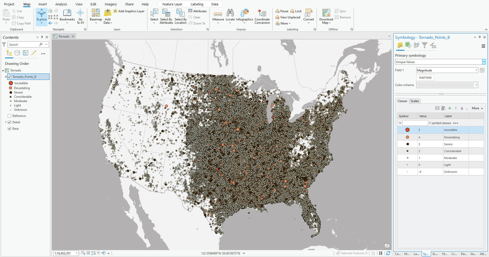
Like the magic of movies, we can add transparency to our symbols giving them a see-through effect into another time. Let’s adjust each layer’s fill and outline to slightly transparent so that the overlapping features can be differentiated more clearly.
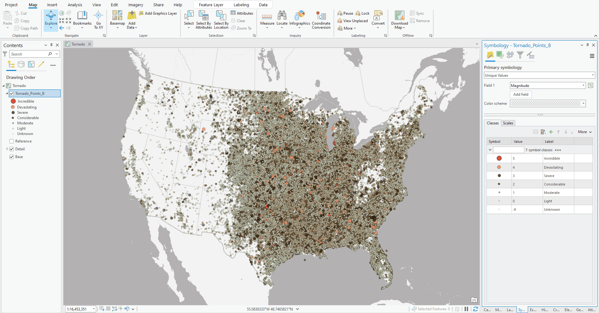
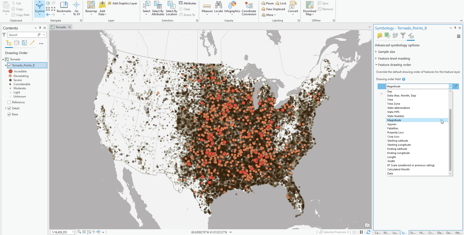
The last thing we want is to show the most significant tornadoes on the top which is accomplished with Feature Display Order when you are in the Symbology tab. By switching it to magnitude this map now reveals a clear story showing states like Iowa, Illinois, Kansas, Oklahoma, Mississippi, and Alabama all having more frequent and significant tornado events.
Tip #2: Use custom symbols in ArcGIS Online
There are best practices involved with publishing your own symbols. The maximum size should be 120×120 pixels and keep in mind that using many unique custom symbols can slow your map down. The symbols should be .png with a transparent background or an .svg so the color can be modified. The symbol should be applied to the layer or webmap in ArcGIS Online and not through the publishing process of the service.
Here’s an example of points of NOAA’s Storm Reports (past 24 hours). If I were to publish the custom symbol directly from ArcGIS Pro, the symbols are converted to text-encoded images. These effectively impact your map’s performance since the web browser is trying to decipher these complex strings.
Instead, publish initially as simple point symbols:
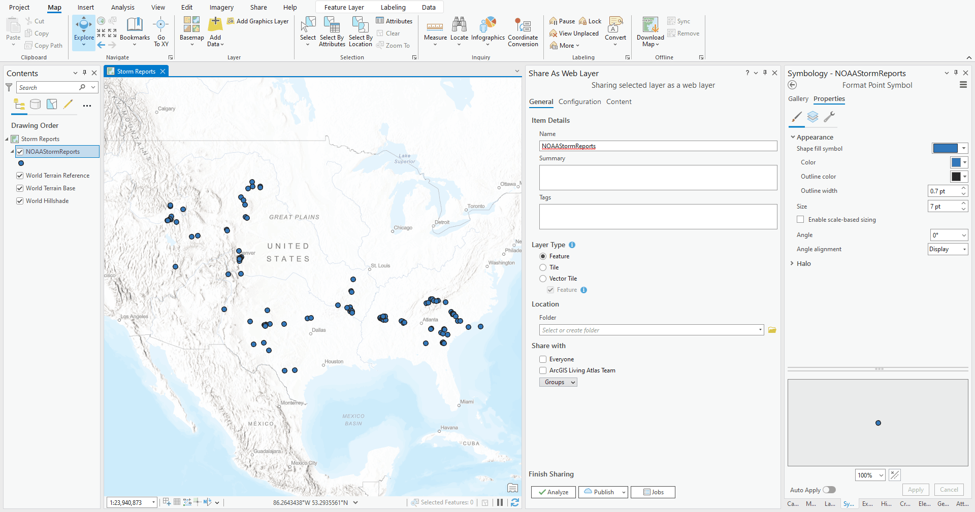
Then apply the custom symbols in ArcGIS Online.
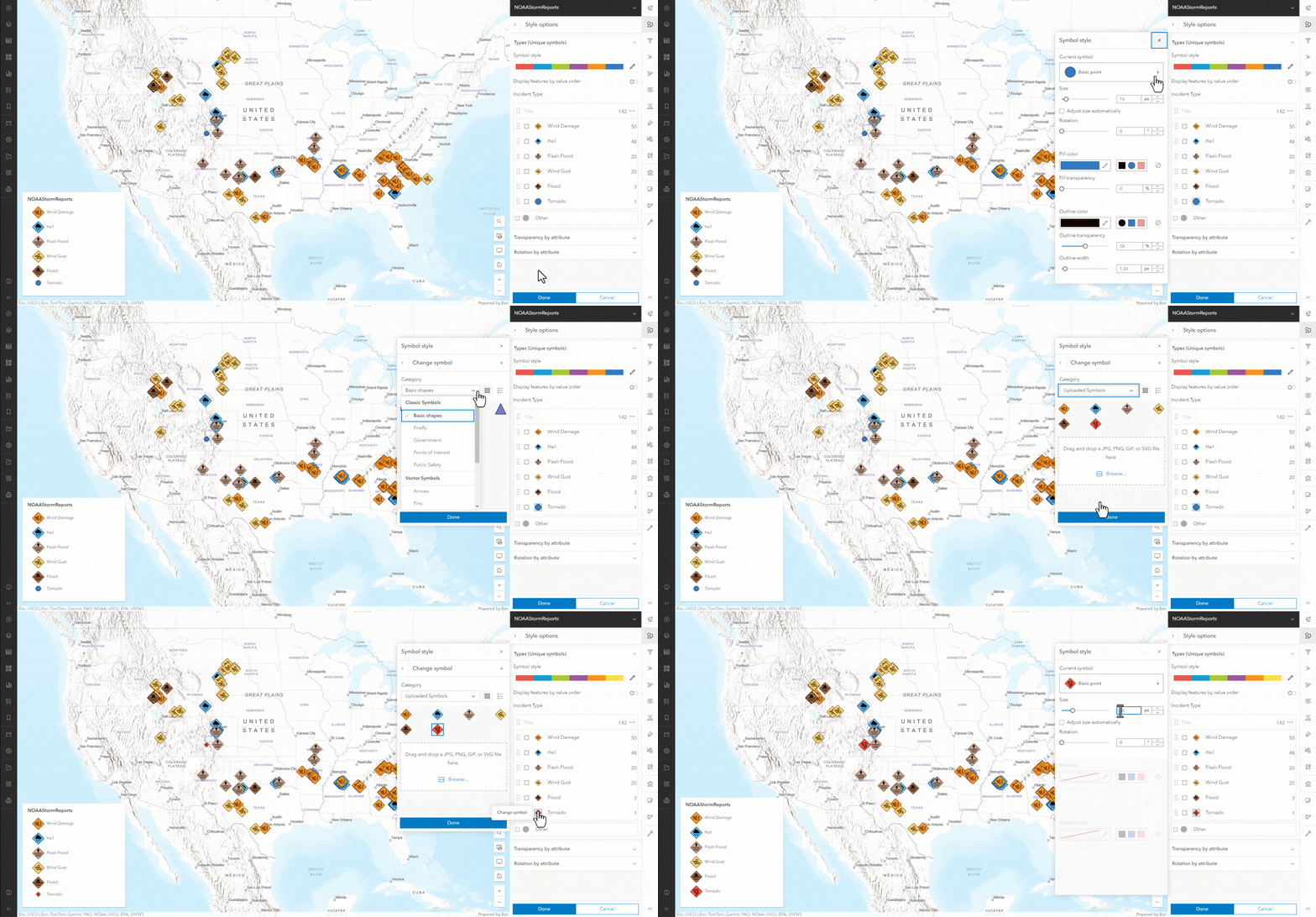
Tip #3: Create custom raster color palettes
Ever want more from the raster styling options in ArcGIS Online? Wouldn’t it be great if you could apply your custom styling from Pro? Well you can. The trick is to edit the JSON file in ArcGIS Online that manages all the metadata associated with an Item. To do this, log into the ArcGIS Assistant. (Note: ArcGIS Assistant is in Beta and is not a fully supported product.)
Here’s our general workflow:
Create a palette in ArcGIS Pro using the Stretch symbology. If your color stops are evenly spaced, record the RGB values for each stop. If not evenly spaced, export or screenshot the color palette. Then use a color picker tool to sample the RGB values at equal intervals along the image. Make sure you have enough samples to capture any critical color values or transitions.
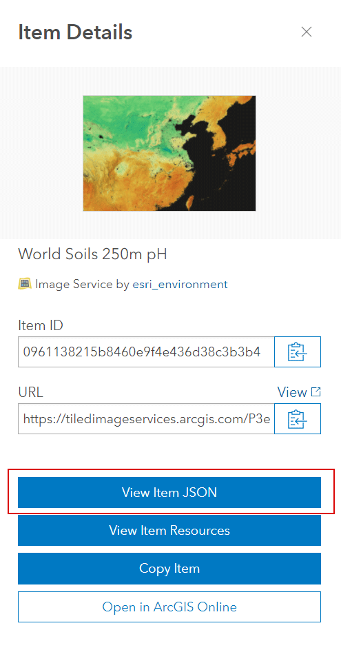
Open the ArcGIS Assistant. Navigate to the raster Item you want to modify and click the link. On the Item Details, select View JSON.
Next you’ll see a screen with the JSON configuration. First click the Data tab and then click Edit JSON. Note: it’s a good idea to copy the JSON as a backup before editing.
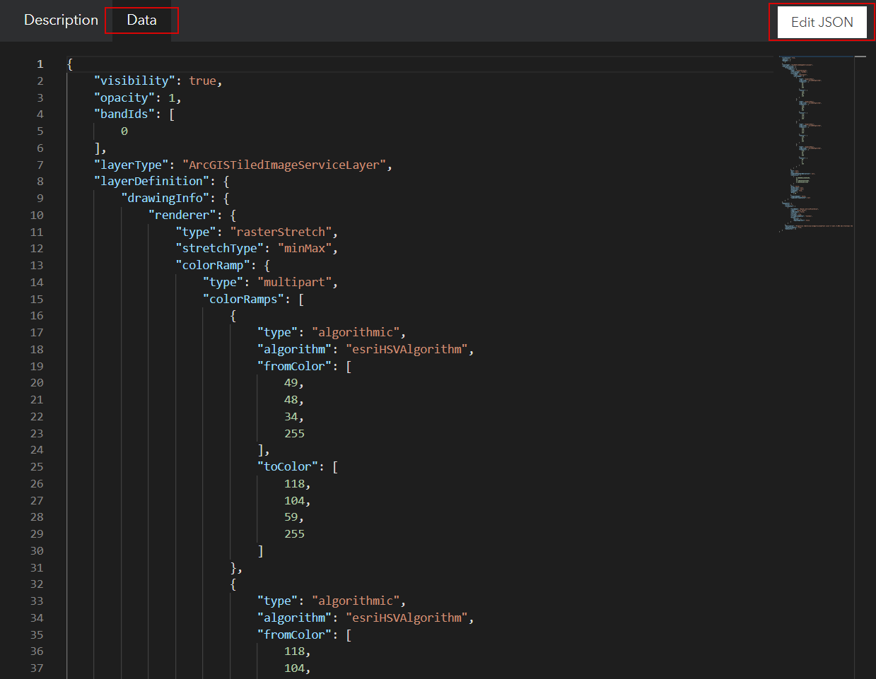
Scroll down and you’ll see a series of “fromColor” “toColor” statements. Editing these is the where the magic happens. Each has 4 comma separated values. R, G, B and transparency. In the first “fromColor” place your first color’s values. In the first “toColor” place the next color’s values. In the second “fromColor” you’ll repeat the value from the first “toColor” and just keep repeating the pattern: 1-2, 2-3, 3-4, 4-5, 5-6. You may need to add additional from/to pairs. Just be sure to copy/paste code with the included brackets.
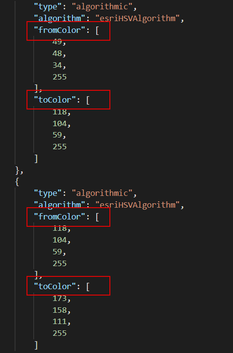
When done, click Save. If there’s an error in your code (probably a bracket or comma), the Save cannot be clicked.
Go back to your layer in ArcGIS Online. Hit refresh and your colors should be there. You can adjust the data range values or gamma if needed. Click the layer options and select Save.
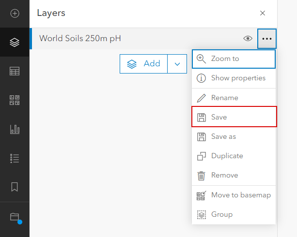
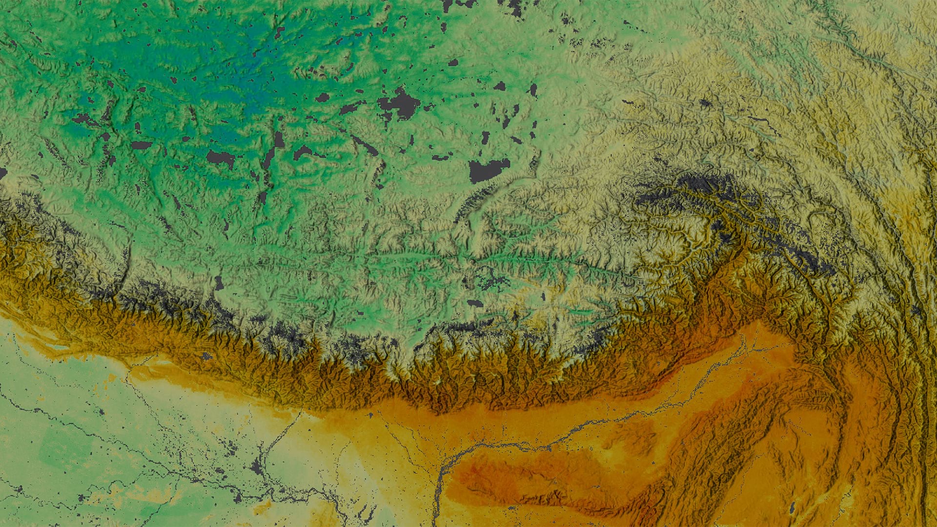
This trick works in all layer types, including features or classified rasters, not just stretched rasters. Keep in mind that these style changes are applied only to the Item and not the REST service endpoint.
Tip #4: Quick edits in the Vector Tile Style Editor
Basemaps are the foundation of all our web maps. But sometimes the ones you have with your ArcGIS Online Organization aren’t exactly perfect. It’s easy to fix that. The Vector Tile Style Editor can make customizing Esri basemaps a snap. You can use it as a global resource for base layers, labels, road lines, urban areas, bathymetry overlays, contour lines, vegetation shading, you name it. Maybe you need to turn some features on/off, or maybe a color could be tweaked for more contrast.
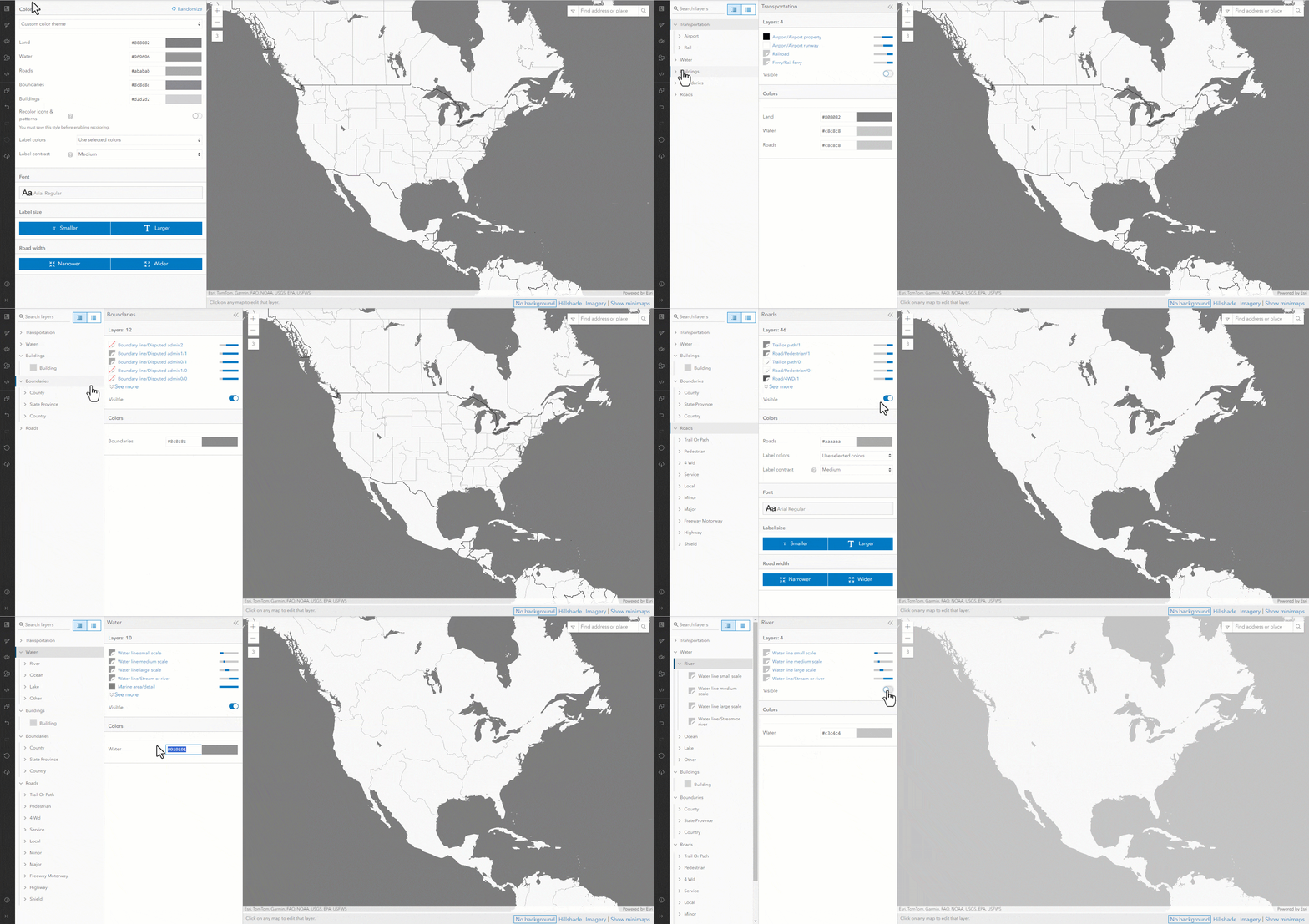
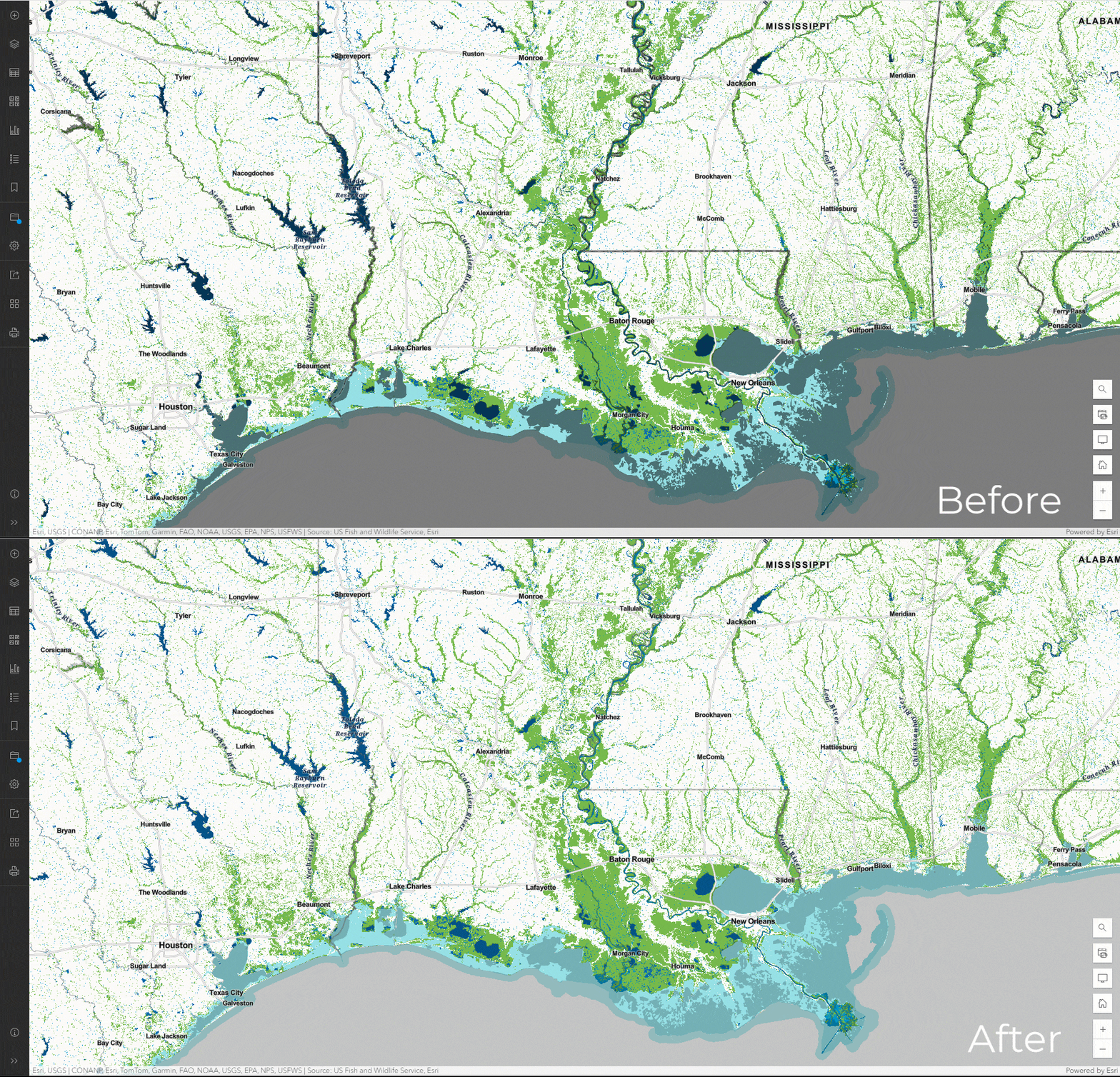
Let’s do a quick update to the ocean’s color in the Human Geography Detail basemap for a map of USA Wetlands. In the Style Editor open Human Geography Detail:
- Turn off Transportation, Buildings, Boundaries, and Roads
- Expand water and change the color to to #c3c4c4
- Turn off Rivers and Save
Once saved, you can add in the new Human Geography Detail layer from My Content to a webmap, like this one. Notice the gray lakes and ocean make a suitable neutral background to highlight the wetlands layer.
Tip #5: Make a pop-up worth reading
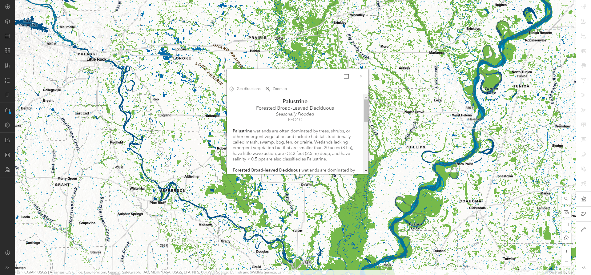
Repeat after me: No one cares about the ShapeArea value. So why is it in almost everyone’s pop-up? Instead of using the default attribute list pop-up, configure something that provides more meaning. I always go with a Text pop-up. It could be as simple as a nicely formatted list of attributes, or could be more complex with images, charts, graphs, and dynamic queries. And keep in mind, the fewer attributes that a pop-up needs to display will create a faster service. But if you must List, at least use field aliases…no one knows what vtx_name means.



Informative, Thank you authors.
Thank you Ayesha!