Geoprocessing tools are unmatched in their ability to transform and analyze spatial datasets. But not every step of the map-making process requires heavy data processing. In fact, you don’t even need to own the data or have it stored locally with modern GIS methods. With the power of web GIS and ArcGIS Online, we can create strong visuals and pop-ups with spatial data in just a few clicks.
In some cases, especially when a project is just starting, we are asked to prototype an idea or quickly provide insight about a spatial topic. In these more “lightweight” cases, we may not need to run any analysis tools at all. For simple things like a join, clip, or summarize, there are ways to get a quick visualization or quick statistics as a starting place without running analysis within Map Viewer in ArcGIS Online.
This is not to say that these are a full replacement for the powerful things that analysis can provide, but sometimes there are ways to accomplish similar end results that help us communicate the most critical information.
The benefit of these techniques is that they save time and processing. Normally, when you run an analysis tool, either in ArcGIS Online or ArcGIS Pro, you often end up with a new layer. This means that you have to re-host or reconfigure your map’s settings to use the new result. With the quick tips and tricks in this blog, you can avoid these steps and work with your existing map layers. You can even work with layers you don’t own. No need to read/write values to a table. This opens the possibility of working with layers from colleagues, OpenData Hub, or ArcGIS Living Atlas of the World. You can calculate values for your pop-ups on the fly, bring data in from other layers, and even perform geographic assessments without ever leaving your web map.
Below are a few examples of what can be done on-the-fly in ArcGIS Online using capabilities like ArcGIS Arcade and Blend modes for your pop-ups and visualizations.
Visualization
With the introduction of Blend Modes and Effects in ArcGIS Online, we can now create on-the-fly visualizations that mimic the results of certain analysis tools. This can save a great deal of time when trying to do a quick overlay of two or more features.
Want to Clip your features? Try a Blend mode for a quick visual comparison
There are many ready-to-use layers in Living Atlas that offer nationwide datasets for topics such as poverty, housing, racial equity, and more. If you wanted to visualize just the features within your city boundary, you’d traditionally need to run a Clip to extract the features within your boundary of interest. But with the power of Blend modes, you can overlay the area of interest over your data features and mask out all other features on-the-fly with just one click.
For example, if I want to visualize poverty within the city of Chicago boundaries, I can use this method.
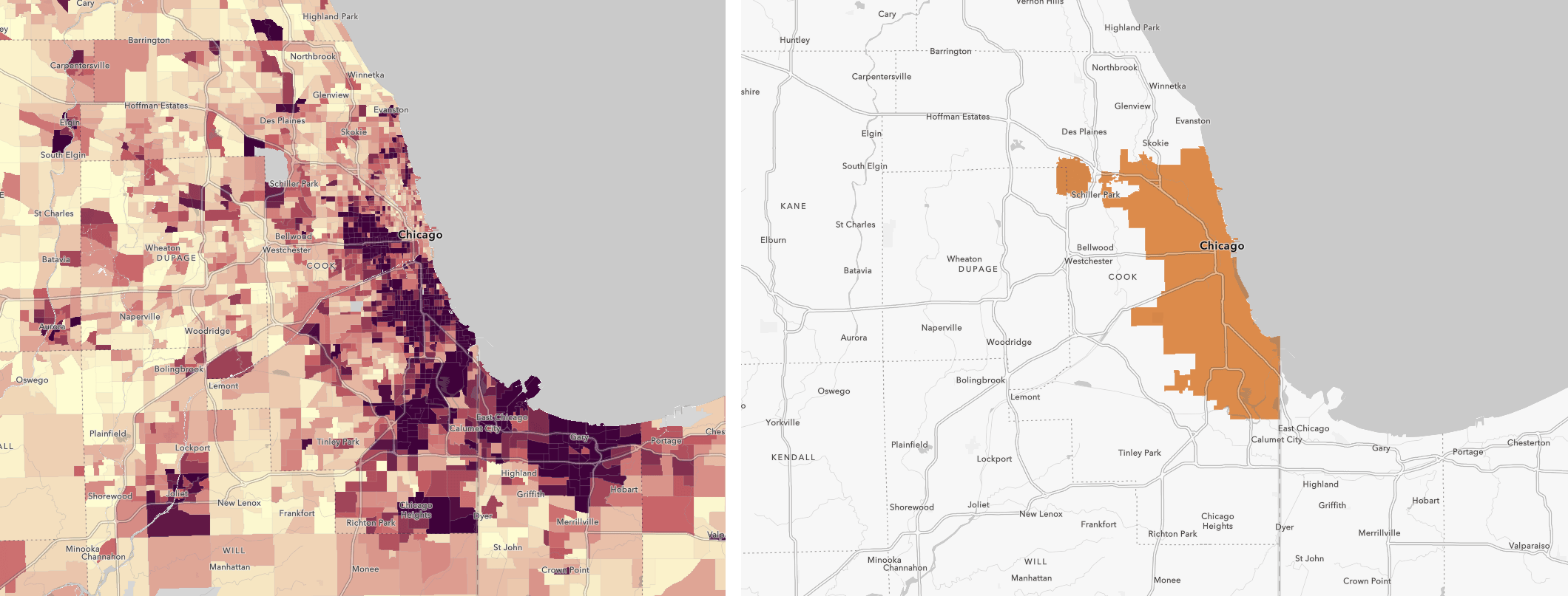
The key to this technique is to place your “clip boundary” features on top of the features you want to “clip”. By putting the area of interest (in our case, the city boundary) on top of the features (in our case, Census tracts), we can apply a “Destination Atop” blend mode to the layer on top. This makes it so we only see the tracts that fall within the city boundary:
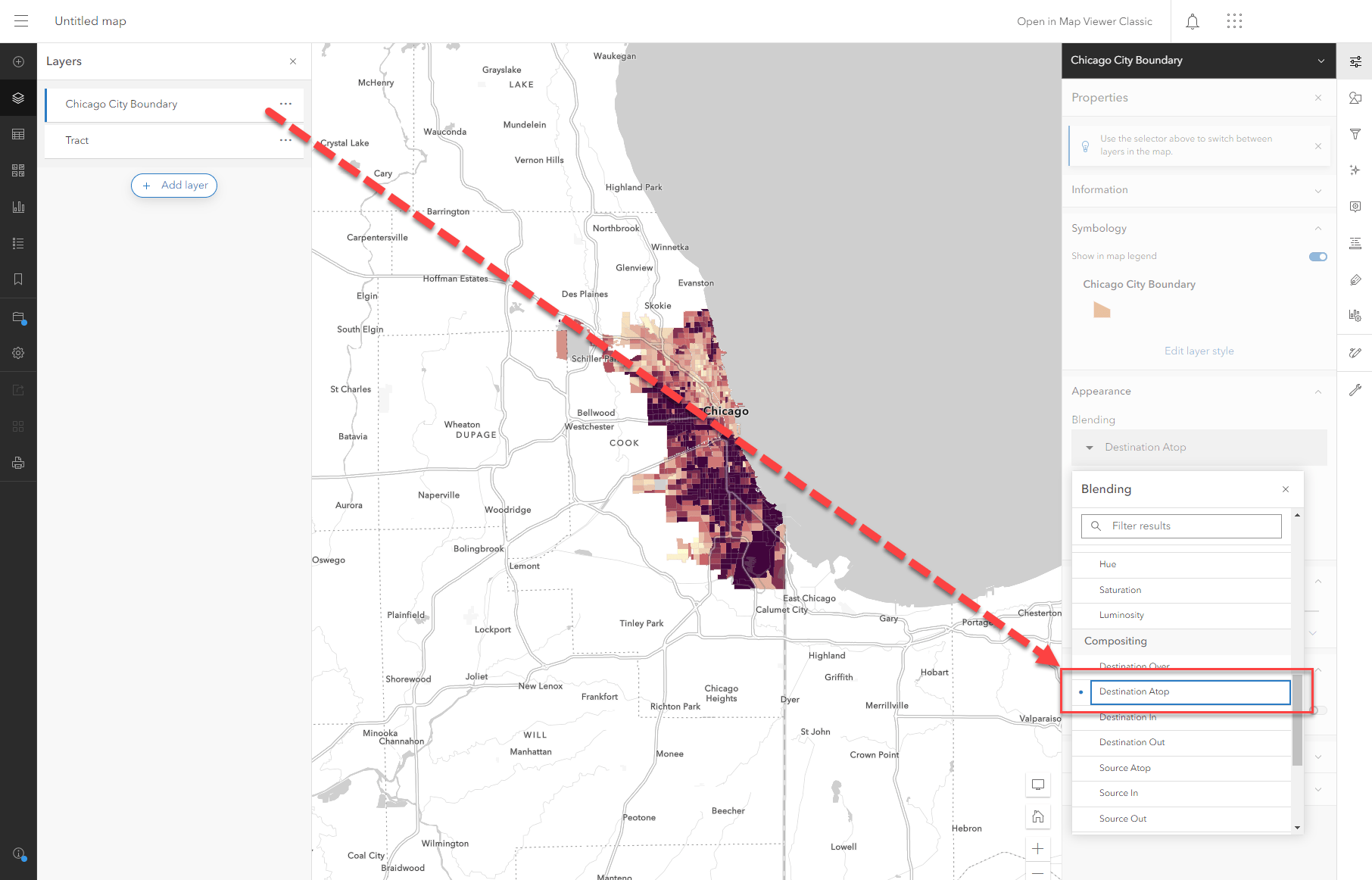
To see the example above and the settings used, visit this web map. Note that this technique can be replicated with your own layers too!
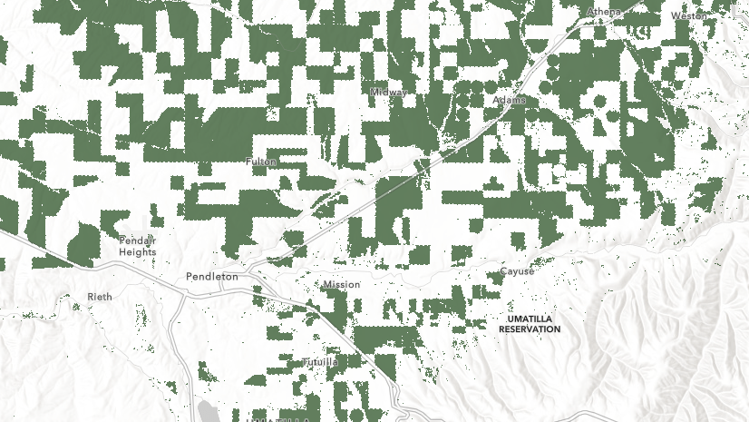
You can also use this technique with raster datasets. Imagine if I want to show the cropland in the state of Kansas. I can use the US state boundaries layer from Living Atlas and filter it to show only Kansas. If I overlay the Kansas boundary on top of the USA Cropland layer from Living Atlas and apply the Destination Atop technique, I get similar results:
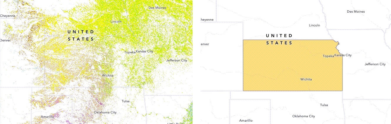
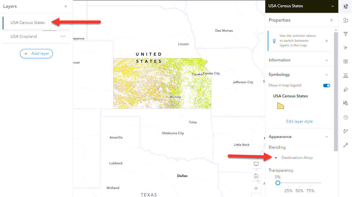
To see the example above and the settings used, visit this web map. Note that the cropland layer requires an ArcGIS Online subscription, so you may be prompted to log in.
Notes about this technique: This does not actually filter or clip your data. The Blend mode is a visual tool only. This may impact you if you plan to use the map within analysis or tools like a dashboard. The entire dataset is still present, but this technique is a quick way to visualize the intersection of two layers. Also note that if your data has a field to filter with (for example, the poverty layer above has a county and state field), it is best practice to filter the data if possible.
Tip: make sure your boundary has a fill and no transparency. Otherwise you won’t get the results you expect.
Pop-ups
Pop-ups are a powerful way to summarize key information in a digestible way. With just a few lines of Arcade, you can combine data from multiple data layers to communicate critical pieces of information. Note that the following techniques utilize Arcade FeatureSets, which are great for pop-ups, but can’t be used for visualization on-the-fly. If you want these results permanently, consider calculating a new field or running the analysis tool you need.
Familiar with Summarize Within? You’ll love Arcade FeatureSets
If you need to know the count of features that fall within a boundary, Arcade allows you to do this within your pop-ups on-the-fly using an Arcade FeatureSet. Think of a FeatureSet as just that… a set of features. Within your expression, you can call to the hosted layer you want to reference using a FeatureSet. You can do this by finding the function and filling in the information required by the function. If the layer is already in your map, it is even easier to add the FeatureSet directly to your expression from $map in the Arcade Editor.
Once you call to the layer as a FeatureSet, you can determine which features fall within your boundary using the Intersects() function, and then count how many are in the boundary using the Count() function.
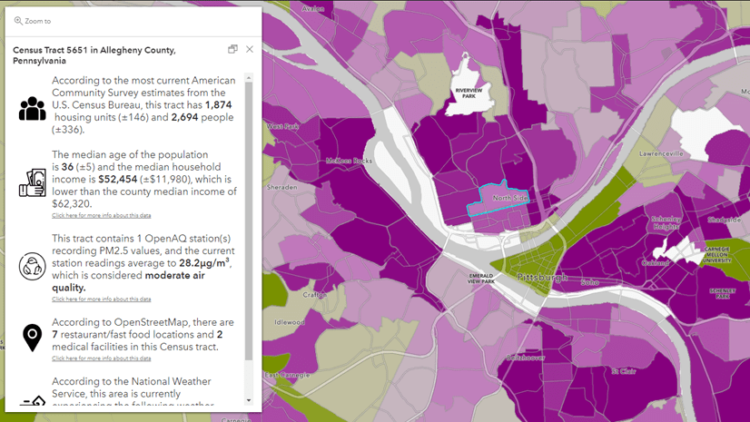
For example, if I want to summarize how many crimes happened within each Chicago Census tract in a month, this can be done in a few lines of Arcade on the tract layer (the layer you want to click on and summarize information to):
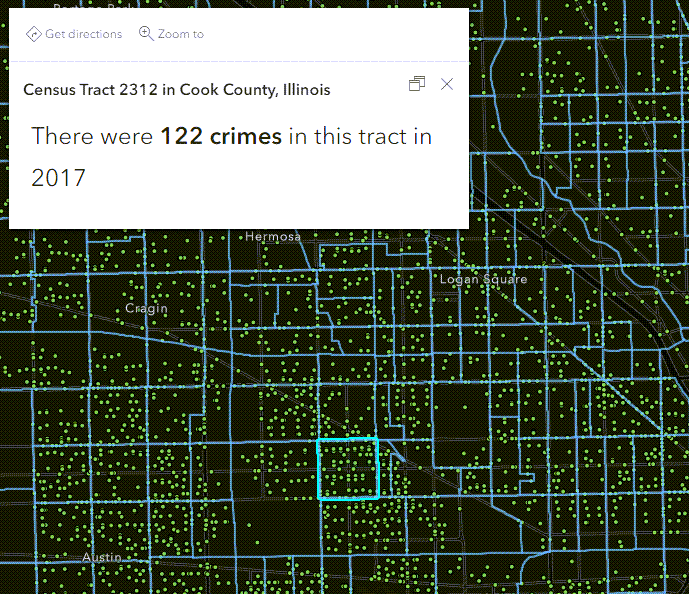
To see the example above and the settings used, visit this web map and view the expression within the tract layer.
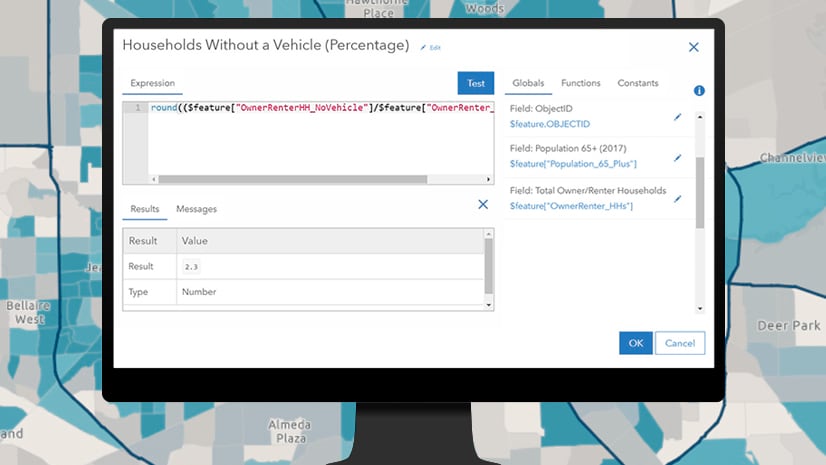
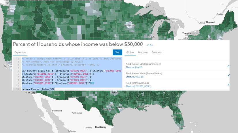
Similarly, if you like Summary Statistics, try Arcade to calculate statistics
Like the example above, you can intersect two layers on-the-fly with Arcade and summarize information from one into the other’s pop-up. Built-in mathematical functions like Average(), Min(), and Max() allows you to summarize the statistics.
For example, the OpenAQ Air Quality PM2.5 live feed layer from Living Atlas is updated regularly with up-to-date air quality values. Running a summary statistics analysis would mean the analysis results would be outdated as soon as the underlying data is updated. Using Arcade allows the pop-up to stay up to date while summarizing key statistics about the PM2.5 values in the map.
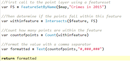
The map below contains three expressions summarizing the PM2.5 values: one for the average, one for the minimum, and one for the maximum PM 2.5 within each county. Using an approach similar to the one in the previous example, we can not only get key statistics, but return the values with a meaningful key phrase communicating if the PM2.5 is considered good/hazardous/etc.
Let’s look at the expression used for the average value. You first call to the layer you want to summarize, then intersect it with your boundary, and use the arcade function to provide the statistics. Notice how the returned statistic is then rounded to a nicer value and translated into a meaningful phrase to help the audience understand the result:
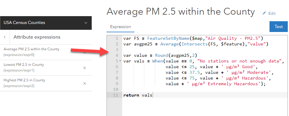
To see the example above and the settings used, visit this web map and view the expression within the County layer pop-up.
If you are more comfortable with Arcade, you can also accomplish this type of summarization using the GroupBy() function. This function allows you to pass a FeatureSet and get back statistics for the field(s) you want summarized.
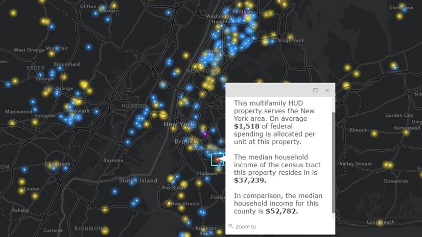
Need to Join Field or run a Spatial Join? Give an Arcade FeatureSet a shot
Like the examples above where we intersect data, we may also want to access field values directly from an intersecting dataset. We can use methods like the ones above to do the equivalent of a spatial intersection, but in cases where another layer shares a unique identifier (just like a join field), we can avoid running a Join by using an Arcade FeatureSet.
For example, the USDA has a Census of Agriculture layer in Living Atlas which helps us better understand the country’s agricultural resources.
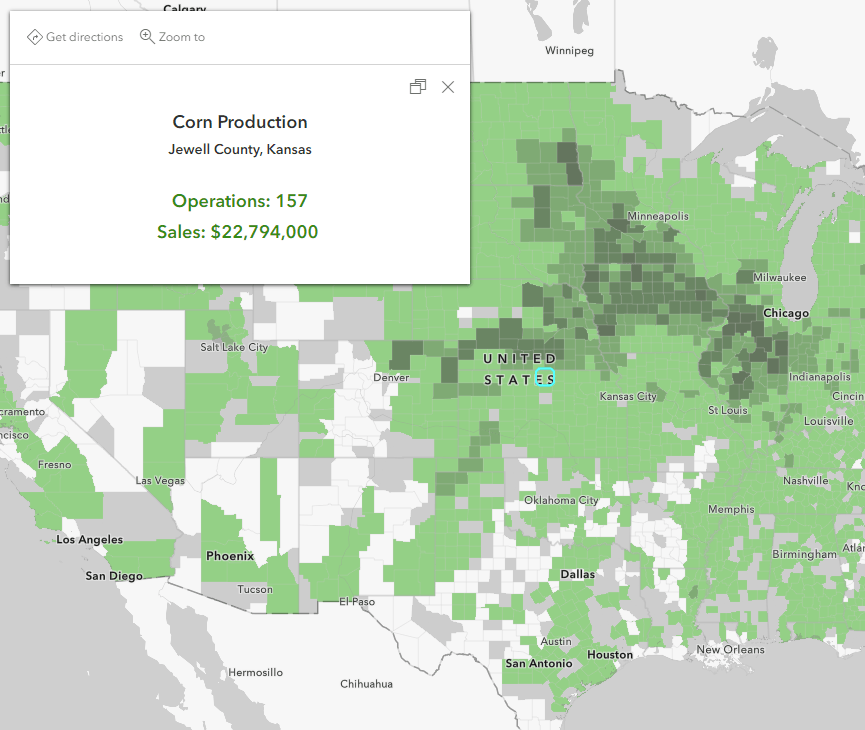
It might be helpful for a policymaker to also understand how many people live within each county, which is an attribute that can be found in the Census ACS Population Variables layer from Living Atlas. Both layers have a field with the county FIPS/GEOID, which can be used in our pseudo-join.
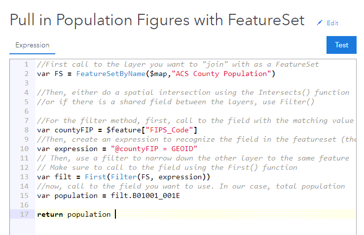
To get the population data value from the ACS layer and bring it to the Census of Agriculture map, we can use an Arcade FeatureSet like in the previous examples, but we are going to access the data using the Filter() function instead since there’s a similar field between the two layers. This method is generally faster than a spatial intersection because it is a more straightforward request from the hosted service. Using a SQL expression to filter the ACS population layer, we can then access the first (and only) matching result for each FIPS, and then call to the field we want using a dot notation:
Once we have the value we want, we can add this directly into our pop-up as a new piece of critical information in our map.
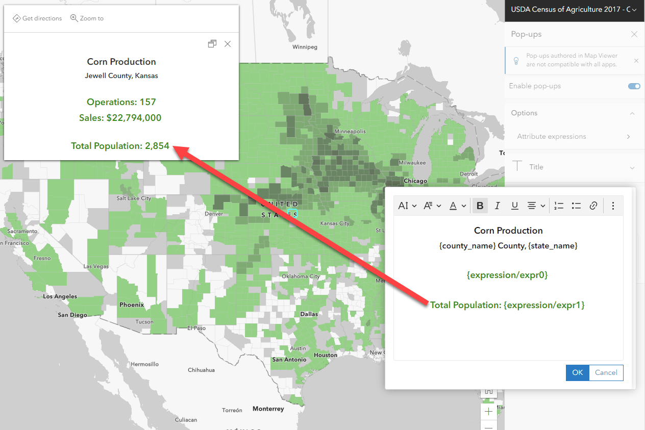
To see the example above and the settings used, visit this web map and view the expression within the Census of Agriculture layer pop-up.
To see a more detailed example, check out this blog. To see how to accomplish this without even needing to add the layer into your map, check out this version of the blog.
Need to use a Buffer to intersect two dataset? Try the Arcade BufferGeodetic function
Another common GIS analysis is to run a buffer to see if two or more features are within a distance of each other. An alternative to running the Buffer analysis tool is to summarize nearby information on-the-fly using the BufferGeodetic() Arcade function. Easily buffer a feature by specifying the size and units you want the buffer to be.
For example, if I wanted to see which Medicare hospitals were within 2 miles of a primary or secondary main road, I could easily calculate this with Arcade.
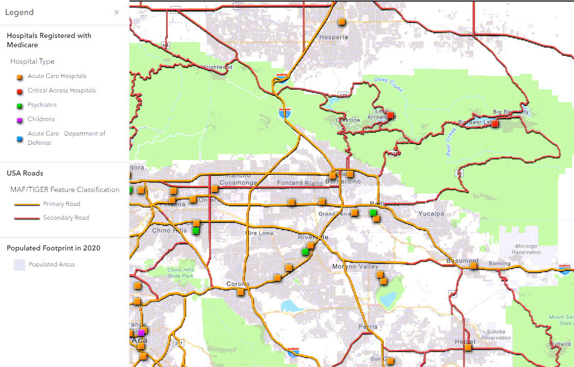
With a few lines of code, we can create an understandable phrase that tells us if each hospital falls within 2 miles of a major road or not.
The example below uses a FeatureSet to call to the Roads layer, buffers each hospital by 2 miles, and then check if the two features intersect. If the count of intersections is 0, it specifies that the hospital is not within 2 miles of a major road. If the count of intersections if over 0, this implies that the features intersect.
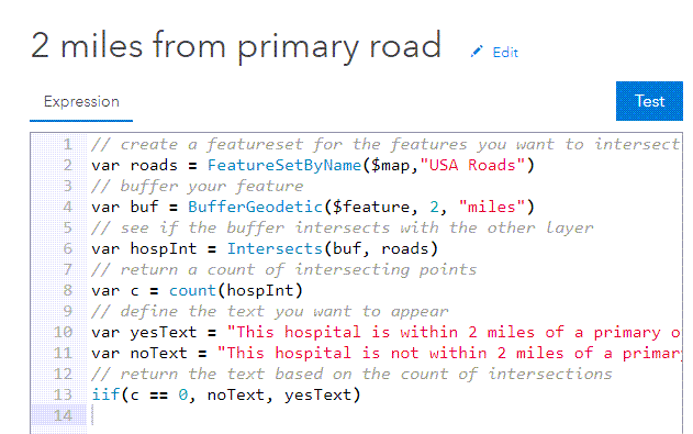
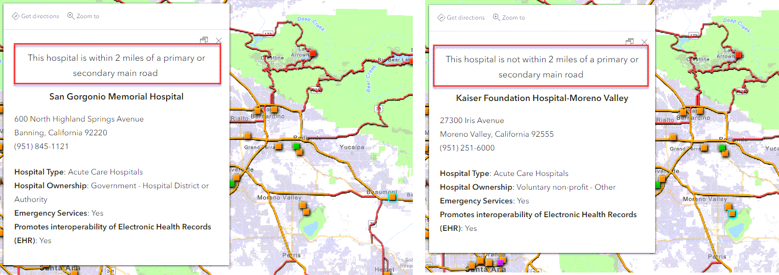
To see the example above and the settings used, visit this web map and view the expression within the hospital layer layer pop-up.
Note: This method does not produce a visual representation of the buffer but allows me to do things like see if other feature intersect with my buffer or measure the size of the buffer.
Concluding thoughts
These Arcade and Blend mode tricks help us save a great deal of time and re-processing by avoiding the creation of a new layer. Keep in mind that this is a good place to start, but if you need the results to persist in the database or if you need to use the results for other analysis, consider using the traditional geoprocessing route. There are a few reasons you may want the results to persist: data performance, future analysis, using the results in a downstream analysis. Another reason would be if you need the numbers to determine an ascending/descending list of highest and lowest values for a ranking. The methods listed in this blog might be a good way to “test” an analysis before actually running it.
Arcade FeatureSets unfortunately can’t be used for visualization purposes, as defined by the documentation. This doesn’t detract from how useful they can be for pop-ups, which is why the examples above emphasize summarizing information into the pop-up in a meaningful way. Instead of just putting the resulting number/value in your pop-up, turn it into a meaningful and easy-to-understand phrase or result so that the pop-up provides the most key information to your audience.
Arcade is performed client-side, meaning it runs the calculation when you interact with the map live. If your Arcade expression is complex or the data is large, you may experience performance issues. In these cases, traditional methods of analysis and field calculations are most likely the best approach for your map.
A final note from the documentation about the buffer method listed above: Be aware that using $feature as input to this function will yield results only as precise as the view’s scale resolution. Therefore, values returned from expressions using this function may change after zooming between scales. Read more here.
Questions? Check out these valuable resources:
Blog: Taking a stroll through FeatureSets part 1
Blog: Taking a stroll through FeatureSets part 2
Learn Lesson: Get Started with Arcade
Learn Lesson: Access Attributes from another layer with Arcade FeatureSets

This is very true. The underlying tone of Deadlines up against Quality Data, and the unfortunate consequence of sacrificing the integrity of Map Templates, GDB Templates, and the associated Python & Arcade scripts that process, analyze, display, and communicate the data in your organization templates.
Every day, at minimum 3 times a week and once on weekends, does the GIS SME get a unique request to calculate data and communicate specific information for project: bids, pricing, reporting, projecting timelines, etc… And it always needs to be done yesterday.
At the intersection of Deadlines and Data, the schema of the templates, .aptx & .gdb, and scripts, .py & .txt, are compromised and manipulated.
I look forward to utilizing the workflow mentioned in the article.
Thank you for reading,
Thank you for this comment and set of observations! We are glad these methods might help you and others in their tight deadlines, prototyping, and general web mapping creation.