The U.S. Census Bureau’s COVID-19 data hub—a collaboration between the Census Bureau and Esri—makes critical data accessible to the public. Through the hub, government leaders and citizens can access Census data in easy-to-use infographics, dashboards, and maps. The Census hub provides vital information for communities as they respond to COVID-19.
Using ArcGIS Hub, Living Atlas, and Business Analyst, any ArcGIS user now has the power to leverage data for public information and crisis recovery. Accessing and using the data on the hub site is easy. Understanding how to create a similar hub site is useful for informing the public about the impacts of the coronavirus, and for creating hub sites that serve a variety of purposes.

1. Create and customize a hub site
To create a site similar to the U.S. Census Bureau’s COVID-19 hub, you will use ArcGIS Hub Basic. The first step is creating your hub site by signing in to your ArcGIS account and opening the Hub app. (You can also sign in directly at hub.arcgis.com.) On the Hub Overview page, click New to create a site. Name your site and click Create Site. From here, you will be taken to your site in edit mode. You’ll see your site in the main window, and a side panel on the left named Customize—you will use this side panel to add most of your content. From this panel, you can also change the layout and themes of your site. And by clicking the Settings button on any component in the site, the side panel will then show editing options for that component. For example, if you want to change the banner image at the top of your site, hover over the banner image and click the Settings button. The side panel will show you all the options for this component.
You can start customizing your site by matching its color themes and fonts to your organization’s branding. In the side panel, select Theme. Alter the background colors, text colors and fonts, and link appearance to align with your brand and your organization’s other web pages.

2. Add statistics
 in a section of the Census COVID-19 hub site.")
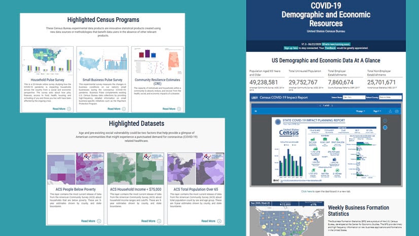
On the Census Bureau’s COVID-19 hub, the US Demographic and Economic Data At A Glance section includes a row of four statistics along the top of the page content (Population Aged 65 Years and Older, Total Uninsured Population, Total Employer Establishments, and Total Non-Employer Establishments). You can replicate this style using Summary Statistics cards in ArcGIS Hub. These cards draw from the data you upload to accompany your hub site—the content library.
Here’s how you can do it:
- Add content to the content library. Content can include datasets, web maps, documents, and map layers—and many more types of content. Learn more about adding content to a site or an initiative.
- Insert Summary Statistics cards and link them to the datasets you want to highlight. Use the Summary Statistics cards to show key performance indicators and more.
3. Incorporate infographics
A popular feature of the Census Bureau’s COVID-19 hub is its display of large batches of dynamic infographics. These infographics display pertinent information for responding to and recovering from the impacts of COVID-19. The ArcGIS Business Analyst team worked with the U.S. Census Bureau to design and embed the infographics dashboard in their hub site. This involved using a custom batch export tool to create infographics for each county and state in the U.S. and hosting the HTMLs on a web server. The team then used feature service layers that contain the URLs of the infographics to create a dashboard through ArcGIS Dashboards, which was then embedded in the hub site.
However, anyone can customize and embed infographics into their own hub sites using a fairly simple workflow. The result will not look exactly the same as the custom version of the player on the Census site, but it will maintain much of the functionality and look similar to the player’s polished appearance.

Here’s how you can do it:
- Customize your infographic to match your organization’s brand and reflect the interests of your constituents.
- Create a batch of infographics for your sites of interest and share them using Classic Story Maps (an earlier version of ArcGIS StoryMaps).
- Embed your Classic Story Maps story in your hub site using an iframe card. Be sure to switch Allow Scrolling to Auto.
4. Add gallery links to content

ArcGIS Hub provides many tools that allow the user to gather and display information in straightforward, aesthetically pleasing ways. The Census COVID-19 hub uses Gallery cards in both the Surveys and Estimates section and the Highlighted Datasets section. These galleries link to dashboards, web pages, and datasets—but Gallery cards can be used to link to any content, including web apps and stories. Your gallery can display many different types of items while maintaining a consistent and polished appearance across the gallery.
Here’s how you can do it:
Add a gallery of content to your hub site.
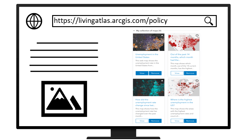
5. Create a policy maps collection

The Demographic and Economic Analysis section of the Census COVID-19 hub begins with a collection of eight policy maps chosen from Esri Maps for Public Policy for their relevance to the topic at hand: COVID-19. The search bar allows anyone to center these nationwide maps at their area of interest, and then easily rotate through each map. The Share interface allows people to email the collection, or post the collection on various social media channels. If the viewer has an ArcGIS Online login, they can even add all the maps in the collection directly to My Favorites, allowing them to access these maps while working in ArcGIS Online. Web maps can be used in many ways: as a starting place for users to modify and create their own web maps, for additional context for any analysis needs, or directly in a story or dashboard.
Here’s how you can do it:
- Explore the Esri Maps for Public Policy site to select one of the existing collections, modify them, or create your own collection to fit your needs.
- Then embed the collection into the hub site using the embed with iframe option.
These policy maps collections also work in ArcGIS StoryMaps.
6. Include search

The Census COVID-19 hub includes a Categorical Datasets search, which features clickable icons that link to various categories of data available through the U.S. Census Bureau. This makes it easier to search for particular types of datasets, and requires a small amount of organization on the back end of the hub site. You can create a similar section for your own site by using Category cards that link to category groups in your content library.
Here’s how you can do it:
- Group the data in your content library into categories, and then add the groups using Group Manager.
- Insert Category cards to connect to your categories.

7. Add optional enhancements
Add a footer
To match the appearance and content of your organization’s web presence, you can add a custom footer to your hub site. To do this, open the side panel and select Footer. Select Custom. You can obtain the desired footer code from your organization’s webmaster and paste it into the HTML field.
Request feedback
The Census COVID-19 hub also has a feedback link. This allows site visitors to provide feedback via a short survey powered by Survey123. When building your own hub site, consider whether or not you need to solicit feedback from your audience. If so, Survey123 offers a simple way to deploy a survey and captures the results in the larger ArcGIS platform, which allows mapping and analysis of the results.
Using Hub Basic and Hub Premium
All of the workflows discussed in this article can be done in ArcGIS Hub Basic, which is available through your ArcGIS Online subscription. ArcGIS Hub features a gallery of exemplary COVID-19 response websites from state and local governments, which may provide inspiration for your own work. You can also use ArcGIS Hub Premium, which expands on the functionalities included in the Basic platform. These additional functionalities include the ability to open your hub to your community of stakeholders and members of the public, so they can create their own web maps and stories, contribute to a team, and sign up for email updates from your team.
Using ArcGIS Hub Premium, you can also share events, create supporting teams, and use the template builder to create templates of your sites, apps, and other content. Members of your organization and the public can adopt these templates for configuration with their own data and branding.
As the site creator, you will also have access to Esri templates, which can be adopted to address COVID-19 and other major use cases, such as ensuring transparent elections, reducing homelessness, and tackling the opioid epidemic. ArcGIS Hub Premium also allows you to create supporting teams for an initiative, so you can share content with stakeholders for review and feedback.
Whether you are a Basic or Premium user, ArcGIS Hub offers hub templates for addressing COVID-19, including templates for coronavirus response, coronavirus business continuity, and grocery store inventory websites. These templates allow organizations to increase communication and community engagement as they respond to the crucial challenges of a global pandemic.
Keeping the public informed
We have bid farewell to the era when interpreting and using Census data was expensive, cumbersome, and relegated to the few trained to understand it. The partnership between Esri and the U.S. Census Bureau is, in a way, the story of “how data became free,” says Esri’s State/Provincial Government Industry Solutions Manager Richard Leadbeater. How will you use ArcGIS Hub to make your data free?


Hi Diana and Gemma, the link in §1 ” hub.arcgis.com” 404’s? Great article otherwise! Andrew
that’s https://www.esri.com/arcgis-blog/products/arcgis-hub/sharing-collaboration/how-we-did-it-covid-19-data-hub/hub.arcgis.com
https://hub.argis.com works, however #whew
Good catch! I just fixed this link, and it seems to be working now. Thank you!